Sephora Design System
A full-bleed black nav, Helvetica Neue on every tier and a single red #cf112c CTA pill: Sephora's chrome as colors, type and components for React.
- Primary color
- #cf112c
- Typeface
- helvetica neue
- Shape
- Sharp
- Base radius
- 6px
- Colors
- 11
- Type tokens
- 13
- Components
- 14
- Spacing values
- 8
About Sephora DESIGN.md
Curated by Dov Azencot, updated May 18, 2026. Source sephora.com (opens in a new tab).
Sephora's marketing chrome opens with the most identifiable header strip in the beauty-retail category: a flush-black band running full-bleed across the top of the page, with white nav labels (New / Brands / Holiday / Beauty Offers / Gifts) flanking the centered Sephora wordmark and a thin promotional sub-band sitting beneath it. Below that band the page returns to pure white floor and a 4-column product grid — every tile a white card with a centered packshot, a brand name above the product name, a price, and a row of star ratings — and the page's only chromatic moments are the brand red (#cf112c) round CTA pill on the rewards-program promo block and the seasonal banner-tile backgrounds further down the page. Where Ulta paints its marketing surfaces in heavy orange-and-warm-photography, and where Glossier leans into pale pink as a constant ambient tone, Sephora keeps the chrome austere: black band on top, white floor beneath, red reserved for the single voltage moment.
The DESIGN.md file packages the captured surface into a machine-readable spec for React and AI tools. Inside: 11 colors tokens drawn from the brand-red voltage tier (#cf112c with frequency 5, declared as `--color-error` and `--color-red`), a structural tier of pure black (frequency 2450 — the single most-used token across text, border, shadow, and the top-nav fill), pure white (frequency 811), a 60%-grey for secondary text (frequency 168, declared as `--color-gray`), a default link blue (#136bea with frequency 26, declared as `--color-link`), and a small set of seasonal accent tones for the banner tiles. Twenty-one typography tokens run Helvetica Neue exclusively across every display, body, button, and nav surface, with the single Georgia serif tier (28px / 400) reserved for the the brand-mission tagline brand tagline overlay. Three radius values dominate: 4px on cards (frequency 136), 9999px pills on the primary CTA (frequency 64), and a rare 6px on a single card surface.
Feed this file to Claude or Cursor and it will reproduce Sephora's specific moves: the flush-black top-nav band as the page's first chromatic anchor, Helvetica Neue everywhere with the all-caps 10px / 700 micro-label tier for category headers ("CHOSEN FOR YOU", "BRAND WE LOVE"), 4px rounded white product cards with no border and no shadow, and the round brand-red CTA pill reserved as the single voltage moment. The token references resolve cleanly — `{colors.brand-red}` for the voltage, `{colors.ink}` for the top-nav fill, `{typography.button-primary}` for the all-caps round pill — so the AI never has to invent a value. The one move worth borrowing only if you have a strong photography pipeline: the willingness to put NO chromatic accent inside the product grid. Sephora gets away with it because the product packaging is the color.
What makes it distinct
5 highlights
- Black-band top navThe header strip is full-bleed black #000000 with white labels and a centered logo, the most identifiable chrome moment in the entire system
- Single brand red voltage#cf112c appears as the round CTA pill and as the error / promotional emphasis fill; reserved, never spread across the page chrome
- Helvetica Neue across every tier10-32px display, 12-16px body, 12px bold buttons in all-caps for the highest-emphasis CTAs, with Georgia serif only on the brand-tagline overlay
- 4px card radius defaultFrequency 136, the universal product-card and content-card rounding; pills at 9999px reserved for the primary CTA only
- Product-photography-led gridEvery tile is a white card with a centered packshot, a product name, a price, and a star-rating row; no chromatic backgrounds, no lifestyle photography on the homepage chrome
Live at sephora.com
Sephora in production, as captured. Scroll the window to see the whole page.
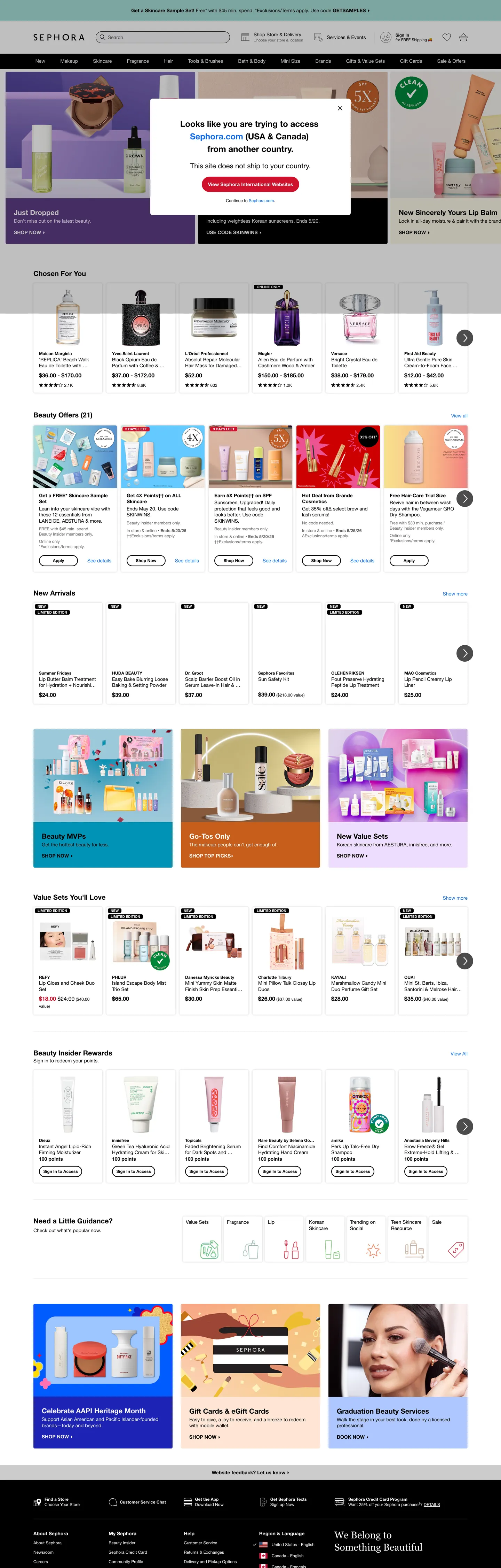
11 colors
Sephora's system runs on #cf112c as its primary voltage, used in 2 of 14 components. Type is set in helvetica neue across 13 tokens from 10px to 28px, weights 400–700. Shape language is sharp — components average 1px corner radius, favoring crisp rectangles.
Brand & Accent
Sparing, CTA-only voltage · 2
Surface
Page and card backgrounds · 4
Text
Headlines, body, captions · 4
Borders & Hairlines
Dividers, outlines, rules · 1
13 type tokens
Set in helvetica neue across 13 tokens, from 10px to 28px, weights 400–700. Shown in its own stack: where the font isn't installed, the fallback the file names stands in.
- display-xl28px · weight 400 · lh 35pxThe quick brown fox jumps over the lazy dog
- display-lg24px · weight 700 · lh 36pxThe quick brown fox jumps over the lazy dog
- display-md20px · weight 700 · lh 25pxThe quick brown fox jumps over the lazy dog
- heading-md16px · weight 700 · lh 20pxThe quick brown fox jumps over the lazy dog
- body-md14px · weight 400 · lh 17.5pxThe quick brown fox jumps over the lazy dog
- body-md-bold14px · weight 700 · lh 17.5pxThe quick brown fox jumps over the lazy dog
- body-sm12px · weight 400 · lh 15pxThe quick brown fox jumps over the lazy dog
- body-sm-bold12px · weight 700 · lh 15pxThe quick brown fox jumps over the lazy dog
- caption11px · weight 400 · lh 13.75pxThe quick brown fox jumps over the lazy dog
- micro-label10px · weight 700 · lh 13pxThe quick brown fox jumps over the lazy dog
- button-primary14px · weight 700 · lh 14pxThe quick brown fox jumps over the lazy dog
- button-tab12px · weight 700 · lh 12pxThe quick brown fox jumps over the lazy dog
- nav-link14px · weight 400 · lh 17.5pxThe quick brown fox jumps over the lazy dog
Radii and spacing
7 corner radii and 8 spacing values. Shape language: sharp, on a 6px base radius.
Radii7
- none0px
- xs2px
- sm4px
- md6px
- lg8px
- xl10px
- full9999px
Spacing8
- xs4px
- sm8px
- base12px
- md16px
- lg24px
- xl32px
- 2xl48px
- 3xl64px
14 components
Each rendered from its tokens (color, type, radius, padding) on Sephora's own canvas.
- Button PrimaryButton Primarybutton-primary
- Button SecondaryButton Secondarybutton-secondary
- Button TabButton Tabbutton-tab
- Top NavTop Navtop-nav
- Promo StripPromo Strippromo-strip
- Nav LinkNav Linknav-link
- Hero HeadingHero Headinghero-heading
- Section HeadingSection Headingsection-heading
- Micro LabelMicro Labelmicro-label
- Body ParagraphBody Paragraphbody-paragraph
- Body Paragraph MutedBody Paragraph Mutedbody-paragraph-muted
- CardCardcard
- Card PromoCard Promocard-promo
- Type here…Text Inputtext-input
The system, in use
Sephora's tokens on the kind of product it builds.
New season, new essentials
The latest arrivals, made to wear every day. Free shipping and returns on every order.
Sephora design system FAQ
Sephora's tokens, its components and how to use this DESIGN.md in your project.
What are the color tokens in the Sephora DESIGN.md?
What is Sephora's primary color hex code?
How do I use Sephora's colors in Tailwind CSS?
What is Sephora's primary brand color?
What fonts does Sephora use?
What is Sephora's type scale?
What can I use if I don't have Sephora's font?
What typeface does Sephora use, and what should I use as a substitute?
Which components does the Sephora DESIGN.md define?
What corner radius and spacing does Sephora use?
Why does Sephora use a black nav band?
What corner-radius scale does Sephora use?
How do I apply the Sephora design system to a shadcn/ui project?
How do I use the Sephora DESIGN.md with Claude Code or Cursor?
Is the Sephora DESIGN.md free to download?
How was the Sephora DESIGN.md made?
Is the Sephora DESIGN.md official?
Why is there a Georgia serif on a Helvetica-only system in the Sephora design system?
Can I use this DESIGN.md to build my own beauty-retail marketing site in the Sephora design system?
Related reading
Specs, directories and component libraries that pair with this design system.
- Browse all design systemsThe full directory of DESIGN.md files on shadcn.io, with live mockups for each.shadcn.io
- Sephora — official siteSephora's public marketing site — the source of truth for the live tokens captured in this file.sephora.com (opens in a new tab)
- The DESIGN.md specificationGoogle Labs' open spec for machine-readable design system files — the format this page is built on.github.com (opens in a new tab)
Use Sephora in your project
One machine-readable file. Drop it into Claude Code, Cursor, VS Code or any AI tool that reads DESIGN.md.
Download the DESIGN.md
One machine-readable file: every color, type, radius, spacing, and component token of Sephora.
Feed it to your AI tool
Drop it into Claude, Cursor, or GitHub Copilot. The agent writes React components and Tailwind classes that match Sephora's visual language.
Reference the tokens directly
Or paste the values into your Tailwind config, CSS variables, or component library: every color, size and radius is a quoted, ready-to-copy value.
Read the full DESIGN.md overview, rationale, do’s and don’ts
Overview
Sephora's marketing chrome opens with the most identifiable header strip in the beauty-retail category. Black-band nav. A flush-black header runs full-bleed across the top of every page at pure {colors.ink} with white nav labels (New / Brands / Holiday / Beauty Offers / Gifts / Beauty Insider) flanking the centered wordmark; beneath it sits a thin promotional sub-band carrying seasonal offer copy. The band is the page's first chromatic anchor — a dark strip that establishes editorial / luxury positioning before the product grid begins. Where Ulta paints its marketing surfaces in heavy orange-and-warm-photography and uses a white nav with a red accent, and where Glossier leans into pale pink as a constant ambient tone, Sephora keeps the chrome austere: black band on top, white floor beneath, brand red ({colors.brand-red} — #cf112c) reserved for the single voltage moment.
The system's chromatic restraint reinforces the move. There is exactly one brand voltage — the saturated red — and it appears on the captured page only 5 times: as the round CTA pill on the rewards-program promo block, as the in-page seasonal banner tile, as the "Save more on the app" promotional strip fill, and once each as a text and border tone. The CSS unusually collapses the brand red and the form-validation error color into the same hex (--color-red and --color-error both resolve to #cf112c). Pure {colors.ink} carries the dominant chromatic load — frequency 2450 across text, border, shadow, and the top-nav fill — but it reads as a structural ink tone rather than as a brand accent.
The typography is Helvetica Neue, full stop. The CSS declares --font-family-base: 'helvetica neue', helvetica, arial, sans-serif and runs it across every display, heading, body, button, and nav tier. The single exception is the the brand-mission tagline overlay, which renders in Georgia serif at 28px / 400 — the only serif moment on the entire captured surface, reserved as the editorial voice for the mission-statement banner. The system has a 10px / 700 all-caps micro-label tier for category headers ("CHOSEN FOR YOU", "BRAND WE LOVE") that does the small-caps work other systems would assign to a separate display family.
Key Characteristics:
- Flush-black top-nav band (
{colors.ink}— #000000) with white labels and centered wordmark, the most identifiable chrome moment in the system. - Held-in-reserve
{colors.brand-red}(#cf112c) reserved for the round CTA pill, the seasonal banner tile, and the rewards-program promo block — 5 total occurrences on the captured page. - Helvetica Neue across every display, body, button, and nav tier; Georgia serif used exactly once on the brand-tagline overlay at 28px / 400.
- 10px / 700 all-caps micro-label tier carries category headers ("CHOSEN FOR YOU", "BRAND WE LOVE") — the small-caps voice in a sans-only system.
- 4px corner radius on every product card and content card (frequency 136) — the universal default; the round 9999px pill is reserved for the primary CTA (frequency 64).
- Product-photography-led grid — every tile is a white card with a centered packshot, brand name, product name, price, and a star-rating row; no chromatic backgrounds, no lifestyle photography on the homepage chrome.
- 12px body text is the most-used size on the page (frequency 118), with 14px close behind (frequency 78) — both render in Helvetica Neue 400.
- Default browser-link blue (
{colors.link}— #136bea) wired as--color-link; Sephora does not override the system default for inline text links.
Colors
Brand
- Brand Red (
{colors.brand-red}— #cf112c): frequency 5. Used as background (3), text (1), border (1). The single brand voltage — reserved for the round CTA pill on the rewards-program promo block, the in-page seasonal banner tile, and the "Save more on the app" promotional strip. Wired in CSS as--color-redand overloaded as--color-error— unusual; most systems hold the brand color separate from the semantic error tone, but Sephora collapses both into the same hex.
Structural
- Ink (
{colors.ink}— #000000): frequency 2450 — the single most-used color in the entire system. Used as text (1163), border (1163), background (55), shadow (69). Carries the top-nav band fill, every body and product-name text, every divider rule, and every form-input border. Wired as--color-base,--color-black,--color-darken1/2/3, and--color-divider. Pure #000000 with no warmth. - Canvas (
{colors.canvas}— #ffffff): frequency 811 — the page floor. Used as background (93), text (359 — primarily on the black top-nav and brand-red CTA), and border (358). Pure white; the secondary near-white--color-nearWhitevalue is merged into the same token. - Ink Muted (
{colors.ink-muted}— #666666): frequency 168 — the dominant secondary text tone. Used as text (84) and border (84). The 60%-grey reserved for product subtitles, footnote rows, and disabled-state labels. Wired as--color-gray. - Ink Soft (
{colors.ink-soft}— #3f3f3f): frequency 0 captured, declared as--color-darkGray. A secondary running-text tone used inside long-form copy. - Hairline (
{colors.hairline}— #cccccc): frequency 1, used as background. Wired as--color-midGray. A neutral mid-grey for divider rules and disabled chrome.
Seasonal Accent
- Surface Cream (
{colors.surface-cream}— #faf6e6): frequency 1 background. A pale cream used as the seasonal banner-tile fill on the "Brand We Love" promotional strip. Wired as--color-lightRed(the variable name is misleading — the rendered color is a warm cream, not a red). - Surface Blue (
{colors.surface-blue}— #e5f2fd): a pale blue declared as--color-lightBlueand (overloaded)--color-lightGray. Used on seasonal promotional banners and on the rewards-program block background. - Surface Peach (
{colors.surface-peach}— #ffe5d4): frequency 1 background. A pale peach used on a single seasonal feature tile. - Accent Yellow (
{colors.accent-yellow}— #f8d15d): declared as--color-goldenYellow. Used on the loyalty-program tier badges (Beauty Insider, VIB, Rouge) but not on the captured homepage chrome.
Link
- Link Blue (
{colors.link}— #136bea): frequency 26 (13 as text, 13 as border). Default browser-blue used for inline text links. Wired as--color-linkand--color-blue. Sephora does not override the system default here.
Typography
Font Family
The system runs Helvetica Neue across every display, heading, body, button, and nav tier — the CSS declares it as --font-family-base: 'helvetica neue', helvetica, arial, sans-serif. There is no second sans family, no monospace, and (almost) no serif.
The single exception is Georgia — declared as --font-family-serif: georgia, times, serif — used exactly once on the captured surface: the the brand-mission tagline overlay at 28px / weight 400 / 35px line-height in white text on a photographic background. The serif appearance is the editorial / mission-statement voice (similar to how a print magazine would set a pull-quote in serif) and contrasts with the otherwise-sans system.
Hierarchy
| Token | Size | Weight | Line Height | Use |
|---|---|---|---|---|
{typography.display-xl} | 28px | 400 | 35px | the brand-mission tagline overlay (Georgia serif, the only serif moment) |
{typography.display-lg} | 24px | 700 | 36px | Editorial display moments, brand-feature headlines |
{typography.display-md} | 20px | 700 | 25px | h2 section labels ("Chosen For You", "Beauty Offers", "Browse Mini Sets") |
{typography.heading-md} | 16px | 700 | 20px | Card titles, emphasis labels |
{typography.body-md} | 14px | 400 | 17.5px | Default running text — paragraph body, nav labels, product names |
{typography.body-md-bold} | 14px | 700 | 17.5px | Bold emphasis inside body copy, h3, product brand names |
{typography.body-sm} | 12px | 400 | 15px | Caption rows, footnote text, micro-labels (most-used size at frequency 118) |
{typography.body-sm-bold} | 12px | 700 | 15px | Bold caption emphasis — price, "FREE" badges, sale labels |
{typography.caption} | 11px | 400 | 13.75px | Footnote disclaimer rows, legal copy |
{typography.micro-label} | 10px | 700 | 13px | All-caps category headers ("CHOSEN FOR YOU", "BRAND WE LOVE") |
{typography.button-primary} | 14px | 700 | 14px | Primary round-pill CTA label in title-case |
{typography.button-tab} | 12px | 700 | 12px | Category-tab pill labels |
{typography.nav-link} | 14px | 400 | 17.5px | Top-nav link labels in the black band |
Principles
The page leans heavily on small body sizes — 12px (frequency 118) and 14px (frequency 78) carry almost all running text. The display tier is restrained: 20px / 700 is the standard section heading, with 24px / 700 reserved for editorial moments and 28px / 400 (Georgia) reserved for the single brand-tagline overlay. There is no 32px / 48px / 56px display tier on the captured chrome — Sephora's hierarchy is built on weight contrast (400 vs. 700) and on all-caps treatment (the 10px micro-label), not on size jumps.
The all-caps 10px / 700 micro-label is the system's small-caps voice. It does the work that a separate label-tier display family would do in a typical editorial system — and because it sits at 10px with 13px line-height, it reads as a quiet category marker rather than as a loud caps shout.
Note on Font Substitutes
Helvetica Neue is a licensed Linotype family. Inter at the same weights is the closest open-source substitute; the proportions transfer cleanly at every body and display tier. For a tighter alternative with similar Swiss-grotesk proportions, Neue Haas Grotesk (also licensed) is the closer cousin. For the Georgia serif tier, Georgia itself is part of the system stack (georgia, times, serif) and needs no substitute.
Layout
Spacing System
- Base unit: 4px (
--space-1), with 8px (--space-2) and 16px (--space-4) as the dominant modules. Spacing frequency on the captured page:12px 0px 0px(56),16px(53),8px 0px(47),4px(42). - Tokens:
{spacing.xs}4px ·{spacing.sm}8px ·{spacing.base}12px ·{spacing.md}16px ·{spacing.lg}24px ·{spacing.xl}32px ·{spacing.2xl}48px ·{spacing.3xl}64px. - Card padding: 12×16×16px on product cards (the asymmetric top padding accommodates the centered packshot above the brand/product label rows).
- Top-nav padding: 8×16px on the black band; the promotional sub-band beneath uses the same horizontal padding but tighter vertical.
Grid & Container
- Max content width: ~1248px on the body content (the captured h2 width is 1236px and the bodyText paragraph width is 1248px), with edge padding flushing to the page floor.
- Top-nav band: full-bleed
{colors.ink}strip running viewport-wide, with content centered to the same ~1248px container. - Product grid: 4-column grid at desktop on the "Chosen For You" and "Browse Mini Sets" carousels; each card holds a centered packshot, brand name, product name, price, and star-rating row.
- Editorial banner row: 3-column grid of seasonal promotional tiles (pale-blue rewards block, "Brand We Love" cream banner, pale-peach feature tile).
Rhythm
The page alternates between dense product grids (4-column carousels of product cards) and single-feature editorial bands (the seasonal banner row, the the brand-mission tagline overlay, the loyalty-program promo strip). The dense product rows carry the e-commerce work; the editorial bands carry the brand-positioning work. There is no atmospheric gradient between bands; every section terminates on the same white canvas, and the black top-nav stays sticky as the only persistent chromatic anchor.
Elevation
The system has a minimal shadow tier. The captured page has 69 occurrences of {colors.ink} used as shadow ink — almost all concentrated on the dropdown menus that descend from the black top-nav and on the round-pill CTA hover state. The product cards themselves carry no shadow; depth comes from the 4px rounded corner and from the photography contrast against the white floor.
- Flat (no shadow): product cards, content cards, the editorial banner row, the footer — 95% of surfaces.
- Dropdown shadow:
--shadow-light: 0 0 6px rgba(0,0,0,.2)and--shadow-medium: 0 0 12px rgba(0,0,0,.2)are declared for the nav dropdown panels — the only meaningfully-elevated surfaces in the system. - CTA elevation: the round-pill primary CTA carries a subtle hover-state lift; not exposed in the resting captured state but declared in the CSS hover rules.
- Hairline outlines:
{colors.ink}1px borders mark form input edges (frequency 1163 as border — the dominant border tone). There is no second hairline tone on the captured chrome.
Shapes
The radius scale is small + pill:
{rounded.none}0px — declared as--rounded-0. Used on form inputs (the email-signup field has 0px corners), on the top-nav band, and on text-only emphasis blocks.{rounded.xs}2px — declared as--rounded-1. Rare; reserved for inline chip labels.{rounded.sm}4px — declared as--rounded-2. Frequency 136 — the universal default for product cards, content cards, dropdown panels, and seasonal banner tiles.{rounded.md}6px — declared as--rounded-3. Frequency 1 — a rare middle value used on a single card surface.{rounded.lg}8px — declared as--rounded-4. Declared in CSS but not rendered on the captured chrome.{rounded.xl}10px — declared as--rounded-5. Declared but unused.{rounded.full}9999px — frequency 64 (plus 40 occurrences at the slightly larger 99999px value, which renders identically). Reserved for the primary CTA pill, the category-tab pill set, and the round play / favorite icon buttons.
The system is binary in practice: 4px on every card surface or a full pill on the interactive chrome. The 6 / 8 / 10px middle tier is declared in CSS but rarely used — the captured page demonstrates the discipline by sitting almost entirely on 4px and 9999px.
Components
top-nav — The signature chrome moment. Flush-black {colors.ink} band running full-bleed across the top of every page, 60px height, 8×16px padding. Houses the Sephora wordmark flush center, the main-category nav links (New / Brands / Holiday / Beauty Offers / Gifts / Beauty Insider / Sale) flanking the wordmark, and the right-aligned utility cluster (Sign In / Stores / Community / Basket).
promo-strip — White {colors.canvas} sub-band beneath the black top-nav, 32px height, 8×16px padding. Carries the seasonal promotional offer copy ("Get a Skincare Sample Set! Free* with $45 min. spend") at {typography.body-sm} (12px / 400). The single thin band of white between the black nav and the page body.
nav-link — Transparent background, white {colors.canvas} text in {typography.nav-link} (14px / 400), 8px padding, 44px height. The nav-link sits on the black band — the white text on black is the system's signature contrast pair.
button-primary — The signature CTA. Brand-red {colors.brand-red} fill, white {colors.canvas} text, fully-rounded {rounded.full} 9999px pill, 4×16px padding, 44px height, weight 700. "View Sephora International Websites" is the captured canonical instance; on the broader site the same component carries "Add to Basket" and "Sign In Now" labels.
button-secondary — White {colors.canvas} fill, black {colors.ink} text, 1px black border, fully-rounded {rounded.full} pill, 4×16px padding, 44px height. Used for non-primary actions ("Learn More", "View Details"). The inverse-fill variant of the primary CTA.
button-tab — White fill, black text, 1px black border, fully-rounded {rounded.full} pill, 4×12px padding, 32px height. Smaller than the primary CTA, used for the category-tab strip ("All / Skincare / Makeup / Fragrance / Hair").
hero-heading — White {colors.canvas} text on the photographic hero background, {typography.display-xl} (28px / Georgia 400 / 35px line-height). The single serif moment on the captured surface — reserved for the the brand-mission tagline overlay.
section-heading — Black {colors.ink} text at {typography.display-md} (20px / 700 / 25px line-height). Used for "Chosen For You", "Beauty Offers", "Browse Mini Sets", "New Arrivals" — every product-carousel section header.
micro-label — Black text at {typography.micro-label} (10px / 700 / 13px line-height) in all-caps. The system's small-caps voice — carries "CHOSEN FOR YOU", "BRAND WE LOVE" category headers and any quiet category marker that should not shout.
body-paragraph — Default black text at {typography.body-md} (14px / 400 / 17.5px line-height). The workhorse paragraph style — used for promotional offer copy, product descriptions, and footer body.
body-paragraph-muted — {colors.ink-muted} (#666666) variant at {typography.body-sm} (12px / 400 / 15px line-height). Used for product subtitles, footnote rows, and metadata captions.
card — White {colors.canvas} surface, black text, {rounded.sm} 4px radius, 12×16×16px asymmetric padding. The universal product-card and content-card chrome. Holds a centered packshot, a brand-name row at {typography.body-md-bold}, a product-name row at {typography.body-md}, a price row at {typography.body-sm-bold}, and a star-rating row at {typography.body-sm}. No border, no shadow — depth comes from the photography contrast against the white floor.
card-promo — Brand-red {colors.brand-red} fill, white text, {rounded.sm} 4px radius, 16px padding. The seasonal banner-tile chrome — used for the rewards-program promo block and the "Save more on the app" promotional strip. The single chromatic surface on the editorial banner row.
text-input — White {colors.canvas} fill, black text, 1px {colors.ink} border, {rounded.none} 0px radius, 0×12×0×16px padding, 42px height. The email-signup field in the footer uses this resting state — hard-cornered to match the editorial / Swiss-grotesk feel of the chrome.
Do's and Don'ts
Do keep the top-nav band flush-black with white labels. The black band is the system's most identifiable chrome moment — it establishes editorial / luxury positioning before any product appears. Swapping to a white nav with a black wordmark inverts the contrast and reads as a Ulta / mass-retail chrome rather than as a Sephora / editorial chrome.
Do reserve {colors.brand-red} (#cf112c) for the round CTA pill and the seasonal banner tile only. The system has frequency 5 on the brand red — it is the single voltage moment. Painting product cards red, or using red as a body text color, dilutes the chromatic anchor that makes the red CTA read as the page's most-tappable element.
Do use Georgia serif strictly for the brand-tagline overlay at 28px / 400. The serif is reserved for the editorial / mission-statement voice — using Georgia anywhere else (product names, button labels, body copy) dilutes the typographic split and breaks the Helvetica-Neue-everywhere principle.
Do use {rounded.sm} (4px) on every product and content card. The system has frequency 136 on this single radius — it is the universal default. Adding a 6 / 8 / 10px middle tier softens the chrome out of the gallery-spare product-grid aesthetic that makes the page read as editorial rather than as catalog.
Don't render display headlines at 36px or larger. The captured chrome tops out at 28px (Georgia, brand tagline) and 24px (Helvetica, editorial display). The system's hierarchy is built on weight contrast and on all-caps treatment, not on size jumps. Bumping the section headings to 36 / 48px reads as borrowed from a SaaS marketing site rather than from Sephora's own editorial-retail chrome.
Don't add a chromatic background to the product grid. The captured product cards are white-on-white with no border and no shadow — depth comes from the packshot photography itself. Adding a cream / pink / pale-blue tile background turns the gallery-spare grid into a busy catalog and competes with the product packaging for chromatic attention.
Don't swap the brand red ({colors.brand-red} — #cf112c) for the slightly-more-orange Sephora-store red. The web chrome uses the saturated cooler red consistently across CTA, banner, and error states; the in-store wayfinding and signage use a slightly different red that does not transfer to the web chrome.
Don't soften the top-nav from pure {colors.ink} (#000000) to a near-black charcoal. The maximum-contrast black-on-white pair is the chromatic anchor that makes the chrome read as editorial; softening it to a near-black charcoal muddies the contrast and reads as a generic dark-band nav rather than as Sephora-specific.
Known Gaps
- Product detail pages: the captured chrome is the homepage. Product detail surfaces (the variant picker, the shade-swatch grid, the ingredients list, the review-and-rating panel) introduce a fully-rounded shade swatch and a sticky add-to-basket bar at the bottom of the viewport that are not represented here.
- Beauty Insider loyalty tiers: the loyalty-program surfaces (Beauty Insider / VIB / Rouge) carry their own tier-color logic (the
{colors.accent-yellow}golden-yellow for Beauty Insider, a deeper red for Rouge) that does not appear on the captured homepage chrome. - Checkout and basket flows: the basket, address-entry, payment-form, and order-confirmation surfaces carry their own form-field hairline tone and a persistent total-strip at the bottom of the viewport not exposed on the homepage.
- In-store wayfinding: Sephora's in-store signage uses a slightly different brand red and an all-caps Helvetica display tier at much larger sizes (48 / 64px) that does not transfer to the web chrome.
- Hover and focus states: documented for resting states only; the full state matrix (hover lift, focus ring, active press, disabled tint) is not exposed on the captured surface.
- Motion: the homepage carries a hover-zoom effect on product cards and an autoplay carousel on the editorial banner row; the spec captures end-state values only.
- Mega-navigation panels: the captured surface shows the closed nav state only. The full mega-dropdown panels (Brands / Holiday / Beauty Offers category trees) carry their own column-grid and hover-state styling not represented here.
- App-specific chrome: the mobile app uses a bottom-tab nav with the same brand red on the active state, but the bottom-tab and pull-to-refresh chrome live in the native app and are not exposed on the web surfaces.
More systems like this
adidas, Alo Yoga, Arc'teryx and 83 more in E-commerce & Retail: each brand's colors, type and components in one file your AI agent builds from.
Build it with Pro
The DESIGN.md files are free. Pro adds 6,000+ blocks, premium templates and the MCP server, so your AI editor builds in your system for you.
4.9/5 out of 5 · 150+ reviewsfrom 150+ founders and developers.
- Secure checkout via Stripe
- Code lives in your repo
- Keep what you've shipped if you cancel
- License terms
4.9 out of 5 from 150+ developers


Your system, built for you
Every block, template and icon, installed by your AI agent in your design system. The DESIGN.md files stay free.
- Cancel anytime
- Keep what you've shipped