Shopifi Inspired Design System
Shopify's two-track design system as a DESIGN.md file.
About Shopifi Inspired DESIGN.md
Curated by Dov AzencotUpdated Source shopify.com
- E-commerce & Retail
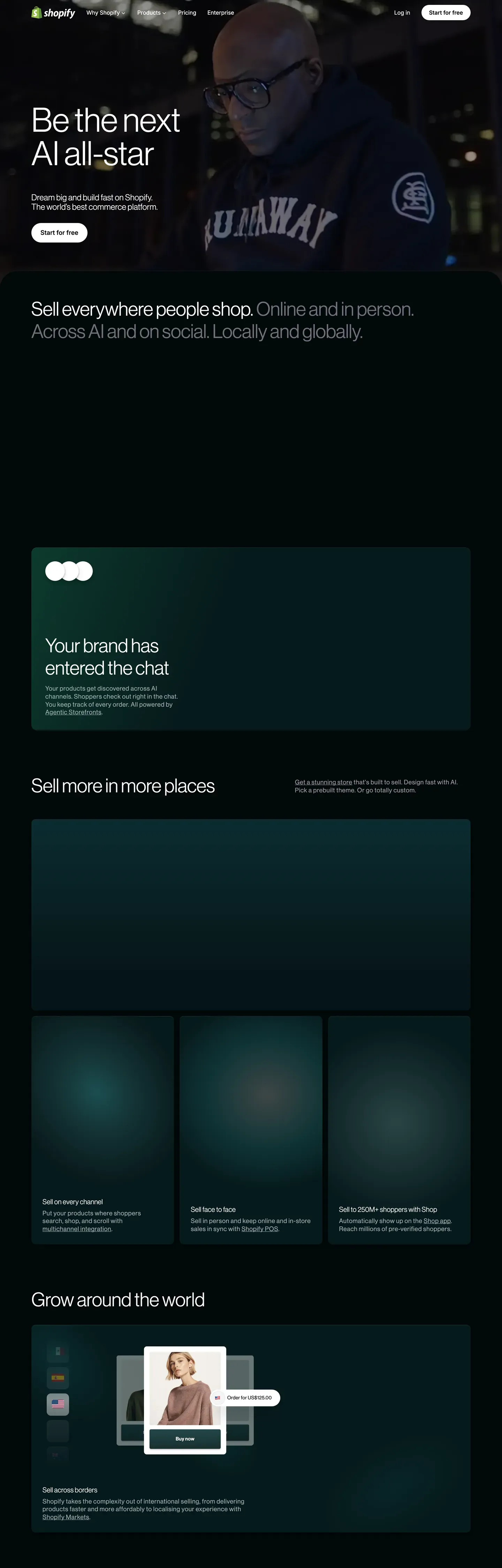
Shopify's public design language reads like two design systems sharing one wordmark. The marketing-hero and product-narrative pages live on a pure-black canvas (#000000) with full-bleed merchant photography, giant Neue Haas Grotesk Display headlines at weight 330, and a single white-stroked black-pill CTA per band. The transactional pages — pricing, signup, dashboards — flip to white #ffffff and an off-white cream #fbfbf5, with the same pill button vocabulary in inverse polarity and pastel mint #c1fbd4 and pistachio #d4f9e0 accents reserved exclusively for this lighter track. The two surfaces never blend. That polarity split is the brand's loudest design decision, more identifying than any single color or shape.
This page packages the full spec into one DESIGN.md file built on the Google Labs spec. Inside: 19 color tokens grouped into brand accents, surface ladders, shade scales, and text tones; 15 typography tokens across Neue Haas Grotesk Display (display, headlines), Inter Variable (UI body, captions), and ui-monospace (code); 6 corner radius values topped by the 9999px pill that every button uses; 8 spacing tokens on an 8px base scale; and 20 components covering buttons, pricing cards, cinematic photo frames, mint pills, light and dark nav bars, and dual-canvas footers.
Feed this file to Claude, Cursor, or GitHub Copilot and the agent produces React components that respect the two-canvas split, the thin 330 display weight, and the pill-only button shape — not a generic e-commerce theme. Or reference the tokens directly: every hex, font, radius, and spacing value lives as a quoted string you can paste into Tailwind config or CSS variables. The system is worth studying precisely because of its discipline: one shape for buttons, one weight for display, one canvas per page intent. Shopify uses constraint as a brand voice.
What makes it distinct
- Two-canvas systempure black #000000 for cinematic marketing, white #ffffff and cream #fbfbf5 for transactional surfaces, never blended
- Thin-weight display typeNeue Haas Grotesk Display at weight 330 for every headline, including the 96px hero with 2.4px positive tracking
- Pill-only button shapeevery CTA uses rounded 9999px geometry across both tracks; rounded rectangles do not exist for buttons
- Mint accents scoped to lightaloe #c1fbd4 and pistachio #d4f9e0 appear only on transactional pages, never on the cinematic black hero
- Universal ss03 stylistic setthe OpenType feature is enabled across NHG, Inter, and ui-monospace as a character-level brand signature
Live at shopify.com
A snapshot of the brand in production. Hover the frame to scroll the page; click to visit.
 shopify.com
Explore Shopifi Inspired
Pick what you want to see — mockups, colors, typography, layout, or the full component list.
Brand & Accent
Sparing, CTA-only voltage.
Surface
Page and card backgrounds.
Text
Headlines, body, captions, muted.
Borders & Hairlines
Dividers, outlines, structural rules.
Other
Specialty colors.
Shopifi Inspired design system FAQ
Common questions about Shopifi Inspired's tokens, components, and how to use this DESIGN.md in your project.
Related reading
Specs, directories, and component libraries that pair with this design system.
The DESIGN.md specification
Google Labs' open spec for machine-readable design system files — the format this page is built on.
Browse all design systems
The full directory of DESIGN.md files on shadcn.io, with live mockups for each.
React blocks for shadcn/ui
Production-ready hero, pricing, CTA, and dashboard sections built with the same Tailwind + shadcn primitives.