Under Armour Design System
Under Armour runs on near-black #1d1d1d and white, with NeuePlakUA at weight 800 in uppercase and pill CTAs, as tokens for React and AI tools.
- Primary color
- #444444
- Typeface
- NeuePlakUA
- Shape
- Sharp
- Base radius
- 8px
- Colors
- 14
- Type tokens
- 10
- Components
- 15
- Spacing values
- 9
About Under Armour DESIGN.md
Curated by Dov Azencot, updated May 19, 2026. Source underarmour.com (opens in a new tab).
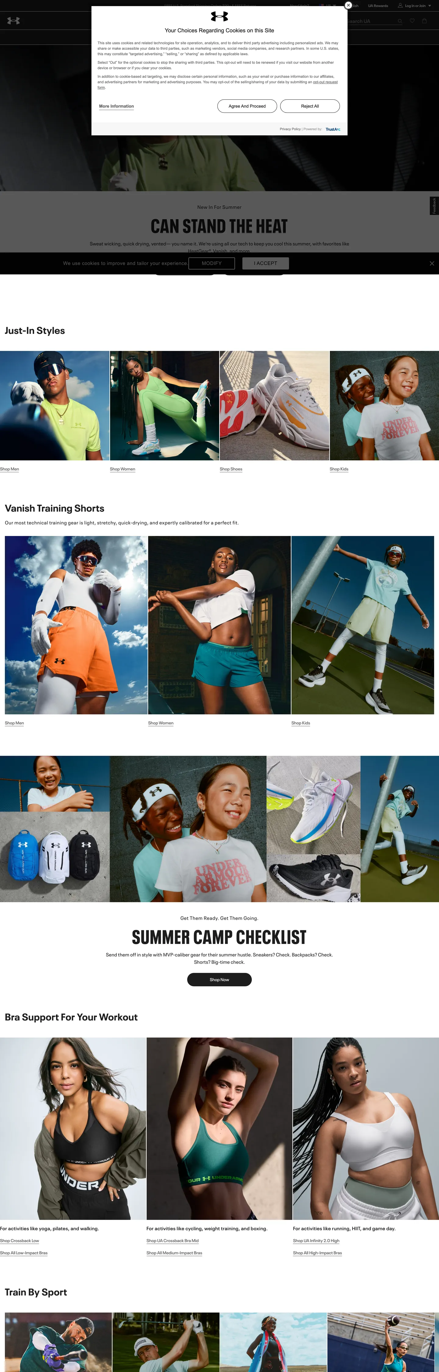
Under Armour's marketing site is achromatic by design — and not as a restraint, but as a strategy. The nav bar, primary CTA buttons, icon set, product-card borders, and tooltip backgrounds all render in the same near-black (#1d1d1d), while the page floor and card surfaces are pure white. There is no brand-voltage red, no accent blue, no highlight color applied anywhere in the chrome. The photography — athlete shots in neon training gear, colorway flats of shoes, outdoor action sequences — does every chromatic job the design system refuses to do. Where Nike draws a full-bleed gradient and Adidas adds a yellow accent strip, Under Armour withholds.
The DESIGN.md file packages the system into a machine-readable spec for React and AI tools. Inside: 14 colors tokens drawn almost entirely from an achromatic scale — near-black ink, mid-gray muted text, light-gray surface accents, pure white canvas — plus a handful of declared but rarely-rendered semantic colors (error red, amber, green) that live in form-validation states rather than brand chrome. Ten typography tokens run NeuePlakUA, a condensed grotesque Under Armour commissions for the brand; display tops at 64px weight 800 in uppercase with 2px tracking, body sits at 14–16px weight 400–600, and labels run 12px. Fifteen components cover the pill CTA, the near-black nav bar, the photography-first hero, hairline-bordered product cards, and the flat text input.
Feed this file to Claude or Cursor to reproduce Under Armour's specific moves: near-black-on-white chrome with zero chromatic interruption, NeuePlakUA condensed grotesque at athletic weights, 9999px pill buttons as the only rounded surface, and photography as the sole source of color on the page. The system is worth studying not for what it does with color but for what it refuses to do — the achromatic discipline is the brand's confidence signal, and every colorful product image reads louder against it.
What makes it distinct
5 highlights
- Achromatic brand disciplineThe entire marketing chrome runs on near-black and white with zero chromatic accent; all product photography carries the color
- NeuePlakUA weight 800 uppercase64px / 2px tracking hero headlines are the loudest typographic moment; the brand shouts in condensed grotesque, not color
- Pill-only CTA geometryPrimary buttons are 9999px radius pills at 44px height with no other rounded surface in the system
- Photography-as-chromatic-strategyProduct and athlete images supply every color the chrome deliberately withholds
- Weight 600 as the system's emphasis ceilingLinks, nav labels, and button text sit at 600; 800 only appears in uppercase display moments
Live at underarmour.com
Under Armour in production, as captured. Scroll the window to see the whole page.
14 colors
Under Armour's system anchors on #444444 (ink-mid) as its primary color. Type is set in NeuePlakUA across 10 tokens from 12px to 64px, weights 400–800. Shape language is sharp — components average 1px corner radius, favoring crisp rectangles.
Surface
Page and card backgrounds · 4
Text
Headlines, body, captions · 3
Borders & Hairlines
Dividers, outlines, rules · 2
Semantic
Status, errors, success, links · 3
Other
Specialty colors · 2
10 type tokens
Set in NeuePlakUA across 10 tokens, from 12px to 64px, weights 400–800. Shown in its own stack: where the font isn't installed, the fallback the file names stands in.
- display-xl64px · weight 800 · lh 64px · tracking 2pxThe quick brown fox jumps over the lazy dog
- display-md32px · weight 700 · lh 40px · tracking 0.5pxThe quick brown fox jumps over the lazy dog
- heading-md24px · weight 600 · lh 32px · tracking 0.5pxThe quick brown fox jumps over the lazy dog
- heading-sm20px · weight 600 · lh 28px · tracking normalThe quick brown fox jumps over the lazy dog
- body-lg16px · weight 400 · lh 24px · tracking 0.5pxThe quick brown fox jumps over the lazy dog
- body-md14px · weight 400 · lh 20px · tracking normalThe quick brown fox jumps over the lazy dog
- body-sm12px · weight 400 · lh 20px · tracking normalThe quick brown fox jumps over the lazy dog
- label-md12px · weight 600 · lh 20px · tracking normalThe quick brown fox jumps over the lazy dog
- button-md14px · weight 600 · lh 24px · tracking normalThe quick brown fox jumps over the lazy dog
- nav-link16px · weight 600 · lh 24px · tracking normalThe quick brown fox jumps over the lazy dog
Radii and spacing
5 corner radii and 9 spacing values. Shape language: sharp, on a 8px base radius.
Radii5
- none0px
- xs3px
- md8px
- lg16px
- full9999px
Spacing9
- xxs2px
- xs4px
- sm8px
- base16px
- md24px
- lg32px
- xl48px
- 2xl64px
- 3xl80px
15 components
Each rendered from its tokens (color, type, radius, padding) on Under Armour's own canvas.
- Button PrimaryButton Primarybutton-primary
- Button SecondaryButton Secondarybutton-secondary
- Top NavTop Navtop-nav
- Nav LinkNav Linknav-link
- Hero HeadingHero Headinghero-heading
- Section HeadingSection Headingsection-heading
- Body ParagraphBody Paragraphbody-paragraph
- Body Paragraph MutedBody Paragraph Mutedbody-paragraph-muted
- CardCardcard
- Product LabelProduct Labelproduct-label
- Pill ChipPill Chippill-chip
- Pill Chip ActivePill Chip Activepill-chip-active
- Type here…Text Inputtext-input
- TooltipTooltiptooltip
- FooterFooterfooter
The system, in use
Under Armour's tokens on the kind of product it builds.
New season, new essentials
The latest arrivals, made to wear every day. Free shipping and returns on every order.
Under Armour design system FAQ
Under Armour's tokens, its components and how to use this DESIGN.md in your project.
What are the color tokens in the Under Armour DESIGN.md?
What is Under Armour's primary color hex code?
How do I use Under Armour's colors in Tailwind CSS?
What is Under Armour's primary brand color?
Why does Under Armour use no accent color in their design system?
What fonts does Under Armour use?
What is Under Armour's type scale?
What can I use if I don't have Under Armour's font?
What typeface does Under Armour use, and what should I use as a substitute?
Which components does the Under Armour DESIGN.md define?
What corner radius and spacing does Under Armour use?
What is Under Armour's button shape and size?
How do I apply the Under Armour design system to a shadcn/ui project?
How do I use the Under Armour DESIGN.md with Claude Code or Cursor?
Is the Under Armour DESIGN.md free to download?
How was the Under Armour DESIGN.md made?
Is the Under Armour DESIGN.md official?
Can I use this DESIGN.md to build a sports e-commerce site in React in the Under Armour design system?
Related reading
Specs, directories and component libraries that pair with this design system.
- Browse all design systemsThe full directory of DESIGN.md files on shadcn.io, with live mockups for each.shadcn.io
- Under Armour — official siteUnder Armour's public marketing site — the source of truth for the live tokens captured in this file.underarmour.com (opens in a new tab)
- The DESIGN.md specificationGoogle Labs' open spec for machine-readable design system files — the format this page is built on.github.com (opens in a new tab)
Use Under Armour in your project
One machine-readable file. Drop it into Claude Code, Cursor, VS Code or any AI tool that reads DESIGN.md.
Download the DESIGN.md
One machine-readable file: every color, type, radius, spacing, and component token of Under Armour.
Feed it to your AI tool
Drop it into Claude, Cursor, or GitHub Copilot. The agent writes React components and Tailwind classes that match Under Armour's visual language.
Reference the tokens directly
Or paste the values into your Tailwind config, CSS variables, or component library: every color, size and radius is a quoted, ready-to-copy value.
Read the full DESIGN.md overview, rationale, do’s and don’ts
Overview
Under Armour's marketing site treats chromatic restraint as a performance stance. Achromatic authority: the nav bar, every primary CTA, product-card borders, tooltip backgrounds, search input, and icon set all render in near-black (#1d1d1d). The page floor and cards are pure white. There is no brand-voltage red, no accent color, no gradient — nothing between the two neutrals except a mid-gray (#5f5f5f) for secondary text and a lighter gray (#f7f7f7) for alternate surface rows. Where Nike drops a full-bleed hero sweep and Adidas holds a yellow accent for navigation moments, Under Armour withholds every chromatic signal and lets the product photography carry all of it.
The typographic system reinforces the athletic identity. Condensed grotesque at maximum weight: NeuePlakUA, a brand-commissioned condensed grotesque, tops out at 64px weight 800 in uppercase with 2px tracking — the loudest typographic moment on the page and the only place the system shouts. Below the hero, everything steps down to 600 and 400 weights at 12–16px. There is no middle display tier; the system is binary — one heavyweight moment at the top, then functional body text everywhere else.
Shape language is minimal: pill-only for CTAs (9999px radius), nearly flat for every other surface (3px on form inputs, 8px on a handful of secondary surfaces, otherwise 0px). This is the inverse of brands like Spline or Airbnb that use generous rounding across the system — Under Armour reserves curvature as a signal for the single most important action on the page.
Key Characteristics:
- Near-black #1d1d1d as the dominant tone — 792 total occurrences split evenly between text and border uses.
- Zero chromatic accent in the marketing chrome — all vivid color comes from product and athlete photography.
- NeuePlakUA weight 800 at 64px all-caps with 2px tracking — the only display-weight moment, reserved for hero headlines.
- Pill-only CTA geometry (9999px radius) — every other surface runs 0–8px rounding.
- 44px button height across primary and secondary CTAs — the brand's consistent tap-target standard.
- Mid-gray #5f5f5f for secondary text (tabs, form labels, placeholder text, muted links).
- Light gray #f7f7f7 as the surface-1 elevation tier — used for accordion backgrounds and alternate section fills.
- Eight-point base spacing with 16px as the dominant layout unit (appears 49 times in extracted spacing).
Colors
Structural
- Ink (
#1d1d1d): frequency 792. Used as text (390), border (390), background (11), shadow (1). The system's single dominant tone — wired as--base-color-black,--Button-primary-background-color,--color-nav-background,--color-primary-text, and 40+ component tokens. This is not decoration; it is the system's entire chromatic vocabulary. - Canvas (
#ffffff): frequency 128. Used as text (61) on dark surfaces, border (61) on dark-fill components, background (6) on cards and dialogs. Wired as--base-color-white,--color-page-background,--Button-secondary-background-color,--Dialog-background-color,--Card-background-color. - Ink Muted (
#5f5f5f): frequency 74. Used as text (37) and border (37) — secondary text across tab labels, form field placeholders, floating label text, "text"-variant button labels, and autocomplete default state. Wired as--color-secondary-text,--Tabs-text-color,--form-field-border-color. - Surface-2 (
#f0f0f0): frequency 5. Used as the selected/active background on autocomplete rows and pill-button default state. Wired as--color-grey-2,--PillButton-default-background-color,--Message-alert-background-color. - Surface-1 (
#f7f7f7): declared but not rendered on the captured page — reserved for accordion large backgrounds and quote block containers. Wired as--base-color-grey-1,--Accordion-large-background-color,--QuoteBlock-background-color. - Hairline (
#d0d0d0): frequency 0 rendered, declared as divider — tab borders, accordion default borders, dialog action dividers, disabled radio states, and the arc-scale background. Wired as--Accordion-default-border-color,--Tabs-border-color. - Hairline Mid (
#949494): frequency 5. Carousel pagination dots in inactive state, secondary nav tone. Wired as--color-grey-4,--color-secondary-nav,--Pager-bullet-color. - Canvas Dark (
#000000): frequency 4 as background — the screen-overlay scrim and transparent-variant button base. Wired as--color-screen-background(at 50% opacity),--Button-text-background-color.
Semantic
- Error (
#dc0019): the resolved error color in form states, arc-scale fill, and tertiary-button background. Wired as--base-color-red,--form-field-error-color,--Button-tertiary-background-color. Not rendered in the captured marketing chrome. - Error Bright (
#e51b24): a second declared red, slightly lighter than the error tone. Wired as--base-color-red-1,--color-red-1. Not rendered in captured chrome. - Success (
#008850): declared as--color-dark-green,--color-green. Reserved for success states; not rendered in captured chrome. - Focus Ring (
#14a1ff): the single chromatic element in the system — used exclusively as a focus shadow on checkboxes and form inputs. Wired as--color-focus-shadow,--form-field-checkbox-focus-color. Classified aslayer: brandin the extraction but never appears as a brand chrome element. - Amber (
#ffc700): declared as--color-amber. Reserved for star-rating fill or promotional badge — not rendered in captured chrome.
Typography
Font Family
The system runs NeuePlakUA — a brand-commissioned condensed grotesque that Under Armour uses exclusively. The font stack cascades to "NeuePlakUA Fallback", then ARMOUR (a separate brand-face), then Helvetica, Arial, sans-serif. There is no second family for display or body. A small portion of cookie-consent and legal text renders in plain Arial, sans-serif from an injected third-party component.
Hierarchy
| Token | Size | Weight | Line Height | Letter Spacing | Use |
|---|---|---|---|---|---|
{typography.display-xl} | 64px | 800 | 64px | 2px | Hero h1 uppercase display — "CAN STAND THE HEAT" |
{typography.display-md} | 32px | 700 | 40px | 0.5px | Section h2 ("SUMMER CAMP CHECKLIST") |
{typography.heading-md} | 24px | 600 | 32px | 0.5px | Sub-section heading tier |
{typography.heading-sm} | 20px | 600 | 28px | normal | h5 feature-cell titles |
{typography.body-lg} | 16px | 400 | 24px | 0.5px | Hero sub-paragraph, running body text |
{typography.body-md} | 14px | 400 | 20px | normal | Default product copy, caption text |
{typography.body-sm} | 12px | 400 | 20px | normal | Fine-print labels, subcategory metadata |
{typography.label-md} | 12px | 600 | 20px | normal | Section labels, h2/h3 in smaller contexts |
{typography.button-md} | 14px | 600 | 24px | normal | CTA button label ("Shop Men", "Shop Women") |
{typography.nav-link} | 16px | 600 | 24px | normal | Top-nav primary link labels |
Principles
The display tier goes to weight 800 at 64px — the most forceful weight in the system — and pairs it with 2px positive tracking and uppercase transform. This is the inverse of the no-bold-at-display approach used by brands like Stripe and Cloudflare; Under Armour's typography shouts because the color palette does not. Weight 600 is the system's emphasis ceiling below display; weight 700 appears only in the 32px section heading tier. Body and label text at 400 contrasts with the aggressive display, keeping editorial sections legible without competing with the hero.
Note on Font Substitutes
NeuePlakUA is proprietary. Barlow Condensed at weight 800 is the closest open-source substitute for the display tier; its condensed proportions match UA's hero treatment at 64px. For body and label tiers (14–16px weight 400–600), Barlow (non-condensed) or plain Helvetica Neue transfers cleanly. Avoid humanist sans alternatives — the brand's identity depends on the geometric-condensed character.
Layout
Spacing System
- Base unit: 8px, with 16px as the dominant layout gap (49 occurrences in extracted spacing).
- Tokens:
{spacing.xxs}2px ·{spacing.xs}4px ·{spacing.sm}8px ·{spacing.base}16px ·{spacing.md}24px ·{spacing.lg}32px ·{spacing.xl}48px ·{spacing.2xl}64px ·{spacing.3xl}80px. - Section padding (vertical): 80px between major editorial sections; 56px on the hero.
- Card internal padding: 16px (products and editorial cells).
- Button padding: 0×16px (handled by fixed height and width rather than symmetric padding).
Grid & Container
- Max content width: 1440px (
--max-width,--content-max-width), with--max-container-widthat 1200px for editorial content. - Hero: full-bleed photography with the headline and CTA centered in a text column.
- Product grid: 4-column at desktop, collapsing to 2-column on mobile (
--mobile-max-width432px). - Category row ("Train By Sport"): horizontal scroll carousel with 300px fixed card width.
Rhythm
The page moves top-to-bottom through photography-forward sections with editorial callouts. The hero is a full-bleed athlete shot with the CTA centered below. Below the fold, 4-column product grids alternate with full-bleed category banners. The only non-photographic section is the "SUMMER CAMP CHECKLIST" editorial block with text content on a white surface — the page's single moment of type-first design.
Elevation
The system uses no drop shadow tier. Card borders use the near-black {colors.ink} hairline as the sole depth signal — cards read as framed objects on the white floor rather than elevated ones. The single declared shadow value is 0px 0px 2px (appearing 23 times in the spacing extraction) used for focus states on form fields, not for card elevation.
- Flat cards: product cards, category tiles, editorial cells — all use a 1px
{colors.ink}border. - Dark surface elevation: the nav bar at #1d1d1d lifts above the page floor by contrast alone.
- Modal overlay:
{colors.canvas-dark}(#000000 at 50% opacity) as the scrim behind dialogs.
Shapes
The radius vocabulary is minimal — two tiers only:
{rounded.none}0px — the dominant state. Hero containers, product cards, section dividers, the search input, nav bar. Most surfaces in the system are completely flat.{rounded.xs}3px — form inputs and small chip surfaces.{rounded.md}8px — declared as--border-radius-medium; used on a small number of secondary surface elements.{rounded.lg}16px — declared as--border-radius-large; rare, used on promotional modules.{rounded.full}9999px — the primary and secondary CTA buttons, and the pill-chip filter set. The pill is the system's single warm, rounded element.
The pill-on-flat contrast is the system's shape signature. By keeping nearly every other surface at 0px rounding, the pill CTA stands out as the only "soft" element in the system — which is the visual cue for "action."
Components
button-primary — Near-black {colors.ink} fill, white text, full pill rounding at 9999px, 44px height, 212px width, 0×16px padding, NeuePlakUA 14px weight 600. "Shop Men" and "Shop Women" are the canonical hero instances.
button-secondary — White {colors.canvas} fill, near-black text, 1px near-black border, same pill rounding and height as primary. Used for "Add to Bag" and secondary actions where the filled button would dominate too strongly.
top-nav — Near-black {colors.ink} surface, white text, 97px height (includes the 50px promo banner above the primary nav row). Houses the UA wordmark, primary nav links (New, Men, Women, Youth, UA for Teams, Sale, UA REWARDS), and right-side icons (search, favorites, account, bag).
nav-link — White text on the dark nav surface, NeuePlakUA 16px weight 600, 20×10px padding, 59px height. No hover background — the underline or border-bottom carries the active state.
hero-heading — Near-black or white text (context-dependent on photo background), NeuePlakUA 64px weight 800 uppercase, 64px line-height, 2px letter-spacing. "CAN STAND THE HEAT" is the captured instance.
section-heading — Near-black text at {typography.display-md} (32px / 700) — "SUMMER CAMP CHECKLIST" and category headings below the fold.
body-paragraph — Near-black text at {typography.body-lg} (16px / 400). Product descriptions and editorial section copy.
body-paragraph-muted — Mid-gray {colors.ink-muted} text at {typography.body-md} — subcategory labels, price comparisons, secondary metadata.
card — White {colors.canvas} fill, 1px near-black border, completely flat (0px radius), 16px internal padding. Product cards use this structure with photography filling the top area and metadata below.
product-label — Near-black text at {typography.label-md} (12px / 600). Product name labels beneath product images.
pill-chip — Light-gray {colors.surface-2} fill, near-black text, full pill rounding, 8×16px padding, 36px height. The inactive state of the filter/sort chip system.
pill-chip-active — Near-black fill, white text, full pill rounding, same dimensions. The selected filter state.
text-input — Transparent background on the dark nav, white text, 0px radius, no border (the parent container provides the border), NeuePlakUA 16px weight 600. The search field sits inside the nav bar's dark surface.
tooltip — Near-black fill, white text, {rounded.xs} 3px radius, 8×12px padding. Appears on icon labels and interactive states.
footer — White canvas, mid-gray muted text at {typography.body-sm}, 48×16px padding. No surface contrast against the page floor — the footer continues the white canvas.
Do's and Don'ts
Do reserve near-black #1d1d1d for CTAs, nav surfaces, and borders. The system depends on this single tone doing all three structural jobs simultaneously — splitting it into a "CTA black" and a "border black" (even at very similar values) disrupts the visual unity.
Do use the pill shape (9999px) exclusively for CTA buttons and filter chips. It is the system's only curvature signal; applying 9999px to cards or containers blurs the distinction between "action" and "content."
Do place NeuePlakUA weight 800 uppercase only at 64px display scale. The weight is designed for the hero headline moment — using 800 at smaller sizes turns body copy into a headline-density wall.
Do let product photography supply all color. The achromatic chrome requires high-quality, chromatic photography to avoid reading as an unstyled page. Without vivid imagery, the system reads as a wireframe.
Don't add a chromatic accent color to the marketing chrome. The declared focus-ring blue (#14a1ff) appears exactly 0 times in the captured marketing render — it is a browser-accessibility utility, not a brand accent. Introducing blue or red as a hover state or link color would break the achromatic discipline entirely, a mistake that would seem natural given how bare the color palette is.
Don't use {colors.error} (#dc0019) for any decorative element. It appears in zero captured marketing occurrences and is strictly a form-validation state. Placing it on a badge or sale-price label — which many e-commerce sites do — conflicts with the achromatic strategy.
Don't reduce button height below 44px. The --button-height: 44px token is declared as a system-wide constant and matches the --Select-height: 44px standard. Shorter touch targets feel inconsistent with the brand's athletic physicality framing.
Don't introduce positive letter-spacing below the 64px display tier. The 2px tracking on the hero uppercase is intentional at that scale; applying positive tracking at 14–16px body sizes gives text a "printed label" feel that undermines the editorial tone of product descriptions.
Known Gaps
- Hero color context: the hero extraction captured a modal dialog overlaid on the page rather than the full-bleed photography hero. Color values are accurate (the modal itself uses standard system tokens), but the hero composition and photography context are partially obscured in the captured screenshot.
- Responsive breakpoints: the extraction captures the 1440px desktop viewport. Mobile nav (81px bottom bar,
--mobile-bottom-nav-height) and tablet transitions are declared in CSS but not reflected in component definitions. - Hover and focus states: documented for
{component.pill-chip-active}only; the full state matrix (button hover tint, nav-link underline, card hover border) is not captured from the static marketing render. - Color from product photography: the system's chromatic moments (neon greens, athletic teals, shoe colorways) live entirely in product imagery and are not tokenized anywhere in the design system. The token spec captures only chrome colors.
- Promotional / sale price styling: price-comparison typography (strikethrough original price, red sale price) is referenced via error-color tokens but the exact rendering on product cards was not captured.
- Dark-mode and regional variants: the site serves multiple locales (
/en-us/); regional variants (UA for Teams, UA REWARDS) may carry additional surface tokens not present in the standard marketing capture.
More systems like this
adidas, Alo Yoga, Arc'teryx and 83 more in E-commerce & Retail: each brand's colors, type and components in one file your AI agent builds from.
Build it with Pro
The DESIGN.md files are free. Pro adds 6,000+ blocks, premium templates and the MCP server, so your AI editor builds in your system for you.
4.9/5 out of 5 · 150+ reviewsfrom 150+ founders and developers.
Billing
Billed once a year in USD. Cancel anytime.
- How many people can use the license.
- Client work, SaaS products and anything you charge for.
- Page sections in 56 categories, from heroes and pricing tables to dashboards and settings, on every framework and UI library, in your theme.
- Complete Next.js sites for startups, SaaS, agencies and portfolios, every page designed, ready to ship.
- Your AI agent searches, previews and installs any component, block, icon or DESIGN.md from a prompt: 22 tools in Claude Code, Cursor, VS Code and 35 more clients.
- Buttons with motion and states of their own, from an arrow that slides in to a burst of confetti.
- Typewriters, scrambles, counters and more, for headlines, labels and numbers.
- Animated backgrounds for heroes, sections and cards, from a soft aurora to a flock that flees the cursor. Most are pure CSS.
- WebGPU shaders, from a slow aurora to a black hole, each drawing only while it's on screen.
- One design and one theme on all four: the components, blocks and effects are built for each framework.
- React on Base UI, Radix UI, React Aria or Ark UI: install the version for the library your project already uses. Vue, Svelte and Solid run on Ark UI.
- From a button to a date picker, a color picker or a guided tour: accessible, typed in TypeScript, each with live demos.
- Real-world patterns built from the components, in 53 galleries: forms, tables, menus, dialogs and more.
- Area, bar, line, pie, radar and radial charts on TanStack Charts, on every framework. React also gets the Recharts originals.
- Debounce, local storage, media queries and more: each hook is one typed file you own.
- From 222 libraries, Lucide, Heroicons, Tabler and Material Symbols among them, as SVG or a React component in one command.
- Stripe, Linear, Apple and 497 more: a brand's colors, typography and components in one file your AI agent builds from.
- Restyle every component and block at once: 8 styles, 7 grays, 18 colors and 5 radii, shared as a shadcn preset code.
- Priority requests are answered first.
Individual
For personal projects & open source
$32instead of $49/mo
$389 billed yearly
- Seats: 1 seat
- Commercial use: Personal & open source only
- Blocks: All 6,181 blocks
- Templates: All 14 templates
- MCP server: 38 AI clients
- Animated buttons: All 35 buttons
- Text effects: All 97 effects
- Backgrounds: All 100 backgrounds
- Shaders: All 100 shaders
- Frameworks: React, Vue, Svelte, Solid
- UI libraries: Base UI, Radix, Aria, Ark
- Components: All 174 components
- Examples: All 1,103 examples
- Charts: All 70 charts
- React hooks: All 35 hooks
- Icons: 294k+ icons
- DESIGN.md files: All 500 brands
- Theme builder: 8 styles × 18 colors
- Support: Standard
Team
Most popularFor freelancers, agencies & startups
$66instead of $99/mo
$789 billed yearly · ≈ $13/dev/mo
- Seats: Up to 5 seats
- Commercial use: Included
- Blocks: All 6,181 blocks
- Templates: All 14 templates
- MCP server: 38 AI clients
- Animated buttons: All 35 buttons
- Text effects: All 97 effects
- Backgrounds: All 100 backgrounds
- Shaders: All 100 shaders
- Frameworks: React, Vue, Svelte, Solid
- UI libraries: Base UI, Radix, Aria, Ark
- Components: All 174 components
- Examples: All 1,103 examples
- Charts: All 70 charts
- React hooks: All 35 hooks
- Icons: 294k+ icons
- DESIGN.md files: All 500 brands
- Theme builder: 8 styles × 18 colors
- Support: Priority
Organization
For companies with larger teams
$132instead of $199/mo
$1,589 billed yearly
- Seats: Unlimited seats
- Commercial use: Included
- Blocks: All 6,181 blocks
- Templates: All 14 templates
- MCP server: 38 AI clients
- Animated buttons: All 35 buttons
- Text effects: All 97 effects
- Backgrounds: All 100 backgrounds
- Shaders: All 100 shaders
- Frameworks: React, Vue, Svelte, Solid
- UI libraries: Base UI, Radix, Aria, Ark
- Components: All 174 components
- Examples: All 1,103 examples
- Charts: All 70 charts
- React hooks: All 35 hooks
- Icons: 294k+ icons
- DESIGN.md files: All 500 brands
- Theme builder: 8 styles × 18 colors
- Support: Priority
Billed once a year in USD. Cancel anytime.
Individual
For personal projects & open source
$32instead of $49/mo
$389 billed yearly
- How many people can use the license.Seats: 1 seat
- Client work, SaaS products and anything you charge for.Commercial use: Personal & open source only
- Page sections in 56 categories, from heroes and pricing tables to dashboards and settings, on every framework and UI library, in your theme.Blocks: All 6,181 blocks
- Complete Next.js sites for startups, SaaS, agencies and portfolios, every page designed, ready to ship.Templates: All 14 templates
- Your AI agent searches, previews and installs any component, block, icon or DESIGN.md from a prompt: 22 tools in Claude Code, Cursor, VS Code and 35 more clients.MCP server: 38 AI clients
- Buttons with motion and states of their own, from an arrow that slides in to a burst of confetti.Animated buttons: All 35 buttons
- Typewriters, scrambles, counters and more, for headlines, labels and numbers.Text effects: All 97 effects
- Animated backgrounds for heroes, sections and cards, from a soft aurora to a flock that flees the cursor. Most are pure CSS.Backgrounds: All 100 backgrounds
- WebGPU shaders, from a slow aurora to a black hole, each drawing only while it's on screen.Shaders: All 100 shaders
- One design and one theme on all four: the components, blocks and effects are built for each framework.Frameworks: React, Vue, Svelte, Solid
- React on Base UI, Radix UI, React Aria or Ark UI: install the version for the library your project already uses. Vue, Svelte and Solid run on Ark UI.UI libraries: Base UI, Radix, Aria, Ark
- From a button to a date picker, a color picker or a guided tour: accessible, typed in TypeScript, each with live demos.Components: All 174 components
- Real-world patterns built from the components, in 53 galleries: forms, tables, menus, dialogs and more.Examples: All 1,103 examples
- Area, bar, line, pie, radar and radial charts on TanStack Charts, on every framework. React also gets the Recharts originals.Charts: All 70 charts
- Debounce, local storage, media queries and more: each hook is one typed file you own.React hooks: All 35 hooks
- From 222 libraries, Lucide, Heroicons, Tabler and Material Symbols among them, as SVG or a React component in one command.Icons: 294k+ icons
- Stripe, Linear, Apple and 497 more: a brand's colors, typography and components in one file your AI agent builds from.DESIGN.md files: All 500 brands
- Restyle every component and block at once: 8 styles, 7 grays, 18 colors and 5 radii, shared as a shadcn preset code.Theme builder: 8 styles × 18 colors
- Priority requests are answered first.Support: Standard
Team
Most popularFor freelancers, agencies & startups
$66instead of $99/mo
$789 billed yearly · ≈ $13/dev/mo
Everything in Individual, plus
- How many people can use the license.Seats: Up to 5 seats
- Client work, SaaS products and anything you charge for.Commercial use: Included
- Priority requests are answered first.Support: Priority
Organization
For companies with larger teams
$132instead of $199/mo
$1,589 billed yearly
Everything in Team, plus
- How many people can use the license.Seats: Unlimited seats
- Secure checkout via Stripe
- Code lives in your repo
- Keep what you've shipped if you cancel
- License terms
4.9 out of 5 from 150+ developers


Your system, built for you
Every block, template and icon, installed by your AI agent in your design system. The DESIGN.md files stay free.
- Cancel anytime
- Keep what you've shipped