West Elm Design System
Light Sanomat serif headlines, GT Eesti Text body, zero-radius buttons and graphite ink over warm room photography: West Elm for React and AI tools.
- Primary color
- #000000
- Typeface
- GT Eesti Text
- Shape
- Sharp
- Base radius
- 0px
- Colors
- 15
- Type tokens
- 12
- Components
- 18
- Spacing values
- 8
About West Elm DESIGN.md
Curated by Dov Azencot, updated May 19, 2026. Source westelm.com (opens in a new tab).
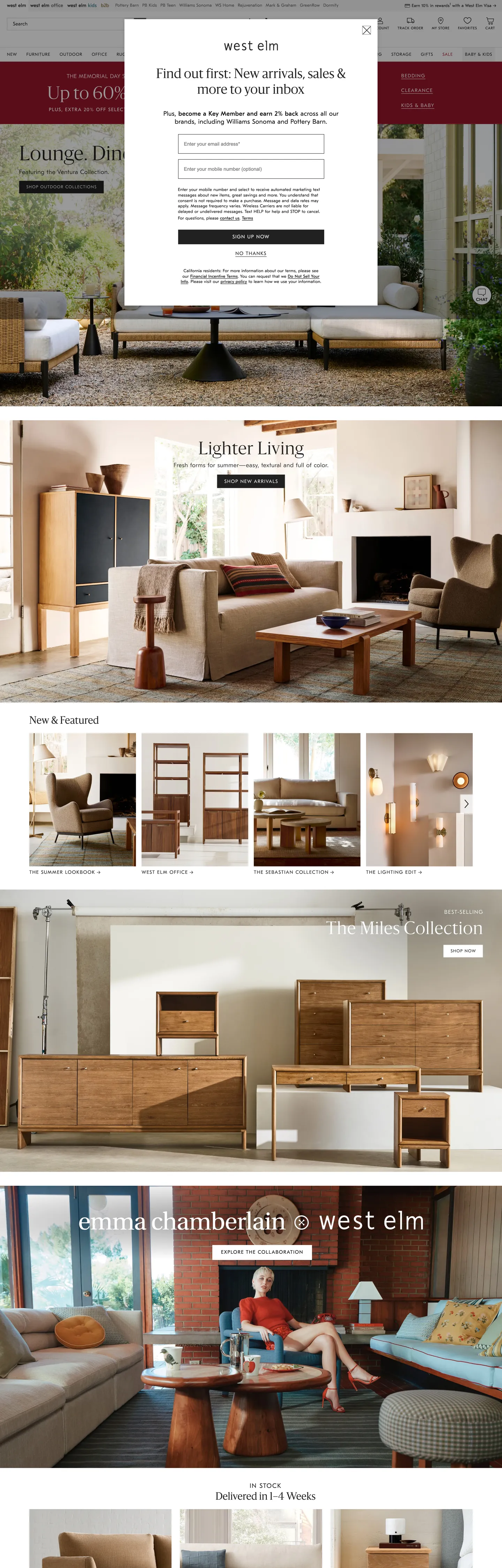
West Elm's marketing surface inverts the convention for category-leading home-furnishing retail. Where Wayfair and Article paint their landing pages with chromatic chips, sale badges, and saturated category tiles, West Elm runs an editorial layout that looks closer to a printed Kinfolk spread than to a Williams-Sonoma-owned commerce funnel. The hero is a serif headline in Sanomat at 48px in weight 300 set over a wide photograph of a styled living room — walnut credenza, cream upholstery, a single ceramic vase — and a small near-black pill CTA beneath. Every other chromatic moment on the page comes from the room photography itself: warm cream walls, oak floors, oat textiles, a single hit of olive on a planter. The brand chrome ships no accent colors at all.
The DESIGN.md file packages the system into a machine-readable spec for React tooling. Inside: 15 colors tokens drawn from graphite ink, warm-canvas neutrals, and an emergency-red error token that never appears in the hero band; 12 typography tokens across two families — Sanomat (a Schick Toikka serif licensed for editorial display) running 20-48px in weight 300 only, and GT Eesti Text carrying body at 12-18px in weight 300 plus all uppercase nav labels and chips in weight 375 with 0.96-1.6px tracking; 4 radius tokens that almost all resolve to 0px; 8 spacing values on a 4px base; and 18 components definitions covering the black-pill primary button, the zero-radius email input, the hero serif heading, the uppercase nav rail, and the editorial-photography card grid.
Feed this file to Claude or Cursor and it will reproduce West Elm's specific moves: serif display in weight 300 instead of bold sans, zero-radius chrome instead of soft rounding, graphite ink instead of pure black, and uppercase tracked sans labels carrying every nav and chip. The token references resolve without invention. One move worth borrowing only if your category permits editorial photography over product grids: the willingness to let room-shot warmth do every chromatic job, leaving the brand chrome as pure typographic restraint.
What makes it distinct
5 highlights
- Serif display over sans bodySanomat at 48px / weight 300 carries every hero headline; GT Eesti Text in weight 300/375 handles body, nav, and uppercase chips
- Zero-radius chromeEvery button, input, and modal corner sits at 0px; the only round element on the page is the search-magnifier icon
- Near-black, not blackPrimary ink is graphite #212121 (frequency 948); pure #000000 appears only inside the email-capture modal body text
- Editorial photography as paletteRoom-shot warm-walnut, cream, and oat tones do every chromatic job; the brand chrome itself ships zero accent colors
- Uppercase nav labels in weight 375GT Eesti Text at 12-16px with 0.96-1.6px tracking renders category links as small-caps, never bold sans
Live at westelm.com
West Elm in production, as captured. Scroll the window to see the whole page.
15 colors
West Elm's system runs on #000000 as its primary voltage, used in 2 of 18 components. Type is set in GT Eesti Text across 12 tokens from 10px to 48px, weights 300–375. Shape language is sharp — components average 0px corner radius, favoring crisp rectangles.
Surface
Page and card backgrounds · 3
Text
Headlines, body, captions · 5
Borders & Hairlines
Dividers, outlines, rules · 2
Semantic
Status, errors, success, links · 2
Other
Specialty colors · 3
12 type tokens
Set in GT Eesti Text across 12 tokens, from 10px to 48px, weights 300–375. Shown in its own stack: where the font isn't installed, the fallback the file names stands in.
- display-xl48px · weight 300 · lh 60px · tracking 0.96pxThe quick brown fox jumps over the lazy dog
- display-lg36px · weight 300 · lh 45px · tracking 0.72pxThe quick brown fox jumps over the lazy dog
- display-md28px · weight 300 · lh 35px · tracking 0.56pxThe quick brown fox jumps over the lazy dog
- display-sm20px · weight 300 · lh 26px · tracking 0.4pxThe quick brown fox jumps over the lazy dog
- body-lg18px · weight 300 · lh 23.4px · tracking 0.54pxThe quick brown fox jumps over the lazy dog
- body-md14px · weight 300 · lh 18.2px · tracking 0.42pxThe quick brown fox jumps over the lazy dog
- body-sm12px · weight 300 · lh 15.6px · tracking 0.36pxThe quick brown fox jumps over the lazy dog
- label-caps-lg16px · weight 375 · lh 20.8px · tracking 1.6pxThe quick brown fox jumps over the lazy dog
- label-caps-md14px · weight 375 · lh 18.2px · tracking 1.4pxThe quick brown fox jumps over the lazy dog
- label-caps-sm10px · weight 375 · lh 13px · tracking 1pxThe quick brown fox jumps over the lazy dog
- button-md14px · weight 300 · lh 18.2px · tracking 1.4pxThe quick brown fox jumps over the lazy dog
- nav-link12px · weight 300 · lh 40px · tracking 0.96pxThe quick brown fox jumps over the lazy dog
Radii and spacing
2 corner radii and 8 spacing values. Shape language: sharp, on a 0px base radius.
Radii2
- none0px
- full9999px
Spacing8
- xs4px
- sm8px
- md12px
- base16px
- lg24px
- xl40px
- 2xl84px
- 3xl128px
18 components
Each rendered from its tokens (color, type, radius, padding) on West Elm's own canvas.
- Button PrimaryButton Primarybutton-primary
- Button SecondaryButton Secondarybutton-secondary
- Top NavTop Navtop-nav
- Nav LinkNav Linknav-link
- Hero HeadingHero Headinghero-heading
- Section HeadingSection Headingsection-heading
- Editorial DisplayEditorial Displayeditorial-display
- Body ParagraphBody Paragraphbody-paragraph
- Body Paragraph LgBody Paragraph Lgbody-paragraph-lg
- Category ChipCategory Chipcategory-chip
- Card PhotoCard Photocard-photo
- Card Room FeatureCard Room Featurecard-room-feature
- Type here…Text Inputtext-input
- Modal OverlayModal Overlaymodal-overlay
- Modal HeadingModal Headingmodal-heading
- Icon CircleIcon Circleicon-circle
- Error TextError Texterror-text
- FooterFooterfooter
The system, in use
West Elm's tokens on the kind of product it builds.
New season, new essentials
The latest arrivals, made to wear every day. Free shipping and returns on every order.
West Elm design system FAQ
West Elm's tokens, its components and how to use this DESIGN.md in your project.
What are the color tokens in the West Elm DESIGN.md?
What is West Elm's primary color hex code?
How do I use West Elm's colors in Tailwind CSS?
What is West Elm's primary brand color?
What fonts does West Elm use?
What is West Elm's type scale?
What can I use if I don't have West Elm's font?
What typefaces does West Elm use, and what should I use as a substitute?
Which components does the West Elm DESIGN.md define?
What corner radius and spacing does West Elm use?
Why does West Elm use zero corner radius everywhere?
How do I apply the West Elm design system to a shadcn/ui project?
How do I use the West Elm DESIGN.md with Claude Code or Cursor?
Is the West Elm DESIGN.md free to download?
How was the West Elm DESIGN.md made?
Is the West Elm DESIGN.md official?
Why is West Elm's primary text graphite #212121 instead of pure #000000?
Can I use this DESIGN.md to build my own editorial furniture site in the West Elm design system?
Related reading
Specs, directories and component libraries that pair with this design system.
- Browse all design systemsThe full directory of DESIGN.md files on shadcn.io, with live mockups for each.shadcn.io
- West Elm — official siteWest Elm's public marketing site — the source of truth for the live tokens captured in this file.westelm.com (opens in a new tab)
- The DESIGN.md specificationGoogle Labs' open spec for machine-readable design system files — the format this page is built on.github.com (opens in a new tab)
Use West Elm in your project
One machine-readable file. Drop it into Claude Code, Cursor, VS Code or any AI tool that reads DESIGN.md.
Download the DESIGN.md
One machine-readable file: every color, type, radius, spacing, and component token of West Elm.
Feed it to your AI tool
Drop it into Claude, Cursor, or GitHub Copilot. The agent writes React components and Tailwind classes that match West Elm's visual language.
Reference the tokens directly
Or paste the values into your Tailwind config, CSS variables, or component library: every color, size and radius is a quoted, ready-to-copy value.
Read the full DESIGN.md overview, rationale, do’s and don’ts
Overview
West Elm's marketing surface reads more like a printed Kinfolk spread than a Williams-Sonoma-Inc. category page. Editorial restraint. Where Wayfair paints its landing band with chromatic sale chips and Article carries a saturated category-tile rail, West Elm runs a serif headline at 48px in weight 300 over a wide photograph of a styled walnut-and-cream living room, with a single near-black pill CTA beneath. The first chromatic moment a visitor encounters comes from the photograph itself — warm oat textiles, an olive planter, a brass floor lamp — never from brand chrome. The system ships zero accent colors at the chrome layer.
The typographic pairing is the system's distinguishing move. Sanomat (Schick Toikka's transitional editorial serif, captured at 20, 28, 36, and 48px exclusively in weight 300) carries every display tier; GT Eesti Text (Grilli Type's grotesk) handles body, nav, and chips, with the uppercase rail at weight 375 and 0.96-1.6px tracking. Display in weight 300 plus body in weight 300 is unusual — most home retail leans on bold display to drive sale messaging, and most editorial sites at least nudge body to weight 400. West Elm holds both tiers at the lightest available weight and lets size and family carry hierarchy instead. The result is a chrome layer quiet enough that the room photography reads as the protagonist.
Hairline against zero-radius is the shape signature. Every button, every input, every modal frame, every card edge sits at {rounded.none} — 0px. The only round element captured on the page is the search-magnifier icon. Buttons take a 1px {colors.ink} border instead of a fill; inputs take a 1px {colors.hairline} outline. Depth comes from photography composition, not from elevation or rounded affordances.
Key Characteristics:
- Near-black graphite ink (
{colors.ink}— #212121, frequency 948), never pure{colors.ink-deep}(#000000) — the warmth difference reads correctly against cream photography backgrounds. - Serif display in a single weight: Sanomat at 20-48px exclusively in weight 300. There is no bold serif tier anywhere on the page.
- Sans body and uppercase chips both in GT Eesti Text — body at weight 300, uppercase labels at weight 375 (a custom weight name, halfway between regular and medium) with 0.96-1.6px tracking.
- Zero corner-radius across every button, input, card, modal, and chip. The only non-zero radius (50%) lives on two icons.
- Email-capture modal renders at full width over a hero scrim — black-pill CTA, zero-radius input, "JOIN" in uppercase tracked at 1.4px.
- Editorial photography carries every chromatic moment: walnut, cream, oat, olive, brass — all introduced through room shots, not through brand tokens.
- Burgundy
{colors.burgundy}(#961529) and cream-yellow{colors.cream-yellow}(#efc261) each appear exactly once on the page as photography overlays; both are accidents of imagery rather than tokens to use in chrome. - Footer category labels stack in uppercase at
{typography.label-caps-sm}(10px / 375 / 1px tracking) — the small-caps rail is the system's only voice for navigation hierarchy.
Colors
Ink
- Graphite Ink (
{colors.ink}— #212121): frequency 948. Used as text (470), border (469), background (3), gradient (6). The dominant token across every text tier and border — the warm near-black that runs the system. Reads correctly against the cream photography backgrounds where pure black would feel cold. - Ink Muted (
{colors.ink-muted}— #646464): frequency 222. Used as text (111), border (111). The secondary text tone — nav-link inactive labels, footer category sub-rows, photo-card meta strips. Wired in CSS as--quiq-control-secondary-hover. - Ink Deep (
{colors.ink-deep}— #000000): frequency 131. Used as text (65), border (64), background (1), shadow (1). Pure black is scoped almost entirely to the email-capture modal body and the chat-widget surfaces — the digital contexts where graphite warmth would feel out of place. - Ink Soft (
{colors.ink-soft}— #363636): frequency 4. The form-input value color — slightly warmer than graphite, used inside text fields to differentiate typed text from placeholder. - Ink Dim (
{colors.ink-dim}— #2e2e2e): frequency 1. A single dark-surface fill that appears in a promotional banner block.
Surface
- Canvas (
{colors.canvas}— #ffffff): frequency 63. Used as text (27 — inside the modal CTA), background (11), border (25). The page floor below the hero photography bands. Wired in CSS as--quiq-bg-base,--quiq-bg-elevated,--quiq-bg-input-normal, and--quiq-text-on-dark-primary. - Surface-1 (
{colors.surface-1}— #f4f4f4): frequency 3 — all as background. The single elevated neutral, used inside chat-widget tooltips and "nested" containers. Wired as--quiq-bg-nestedand--quiq-bg-sunken. - Surface Warm (
{colors.surface-warm}— #e7e5e1): frequency 1 — the warm-oat band fill behind the "Lighter Living" feature row. The only surface color in the system that ships with warmth at the chrome layer rather than the photography layer.
Hairline
- Hairline (
{colors.hairline}— #c8c8c8): frequency 3 — input outlines and divider rules. Wired as--quiq-border-input-normal. The default neutral border tone. - Border Strong (
{colors.border-strong}— same hex as{colors.ink}): frequency 469 — borders use the graphite ink token wherever a strong outline is required, including the primary button outline, the email-input outline, and modal frames. The system rarely distinguishes between ink and border tones; one warm graphite carries both jobs.
Accent (photography-driven)
- Burgundy (
{colors.burgundy}— #961529): frequency 1, background only. Appears once as a photo background panel — not a brand token but an artifact of the captured imagery. Layer classified asbrandby the extractor. - Cream Yellow (
{colors.cream-yellow}— #efc261): frequency 1, background only. Same status — a single photo-panel fill, not a chrome token.
Semantic
- Error (
{colors.error}— #af1a31): frequency 2. Used inside form validation labels. Wired as--quiq-text-errorand--quiq-text-availability-unavailable. - Error Bright (
{colors.error-bright}— #e81818): frequency 2. A second validation tone reserved for required-field markers. - Teal (
{colors.teal}— #467e8b): frequency 2. The "Live chat" link in the customer-service rail.
Typography
Font Families
The system runs two families. Sanomat — Schick Toikka's transitional editorial serif, licensed by West Elm for display — carries every headline tier (20, 28, 36, 48px) exclusively in weight 300. Fallbacks walk Georgia, Times, serif. GT Eesti Text — Grilli Type's grotesk — handles every other surface: body in weight 300, uppercase chips and small-caps labels in weight 375 (a custom weight halfway between regular and medium). Fallbacks walk Helvetica, Arial, sans-serif. The pairing is editorial-magazine convention: serif for display, sans for everything else.
Hierarchy
| Token | Size | Weight | Line Height | Letter Spacing | Use |
|---|---|---|---|---|---|
{typography.display-xl} | 48px | 300 | 60px | 0.96px | Hero h1 ("Up to 60% Off"), promotional sale display |
{typography.display-lg} | 36px | 300 | 45px | 0.72px | Section h2 — "Lighter Living", "The Men's Collection" |
{typography.display-md} | 28px | 300 | 35px | 0.56px | Editorial display, modal heading ("Find out first") |
{typography.display-sm} | 20px | 300 | 26px | 0.4px | Sub-heading and card-feature display |
{typography.body-lg} | 18px | 300 | 23.4px | 0.54px | Lead paragraph, hero sub-copy |
{typography.body-md} | 14px | 300 | 18.2px | 0.42px | Default running text, nav links, body paragraphs |
{typography.body-sm} | 12px | 300 | 15.6px | 0.36px | Caption text, modal body copy, footer body |
{typography.label-caps-lg} | 16px | 375 | 20.8px | 1.6px | Section uppercase label ("New & Featured") |
{typography.label-caps-md} | 14px | 375 | 18.2px | 1.4px | Category chips, primary button labels |
{typography.label-caps-sm} | 10px | 375 | 13px | 1px | Footer column labels, footer category headers |
{typography.button-md} | 14px | 300 | 18.2px | 1.4px | Black-pill CTA labels ("SIGN UP NOW") |
{typography.nav-link} | 12px | 300 | 40px | 0.96px | Top-nav category links — the 40px line-height is deliberate and creates the wide nav band |
Principles
Display weight stays at 300, never bold. The 48px hero serif at weight 300 is the loudest typographic moment in the system, and it is the editorial-magazine treatment — confidence by leading and tracking, not by weight. GT Eesti Text body sits at weight 300 across every size, matching the serif tier; the only departure is weight 375 for uppercase chips and labels, which gives the small-caps rail a slightly heavier feel without crossing into bold. The 375 weight is unusual — it is GT Eesti Text's specific intermediate cut between Regular and Medium and signals deliberate license selection rather than a generic substitution.
Tracking does the labor of hierarchy. Body at 0.28-0.54px positive tracking reads open and airy; uppercase chips at 0.96-1.6px push the small-caps treatment into editorial-display territory. Display tracking sits between 0.4px and 0.96px positive — never negative — which is the inverse of contemporary grotesk display (where tight negative tracking signals confidence). Sanomat's transitional structure already provides density; West Elm opens the tracking to compensate.
Note on Font Substitutes
Sanomat is a licensed Schick Toikka serif. The closest open-source substitute is GT Sectra at the same sizes (also Grilli Type, also editorial transitional) or Source Serif 4 in weight 300 — both transfer cleanly with similar cap height and stroke contrast. For GT Eesti Text, Inter at weight 300 plus weight 400 (substituting for 375) handles every body and chip role; Söhne is closer in feel but not free.
Layout
Spacing System
- Base unit: 4px — with 8px and 16px as the dominant modules.
- Tokens:
{spacing.xs}4px ·{spacing.sm}8px ·{spacing.md}12px ·{spacing.base}16px ·{spacing.lg}24px ·{spacing.xl}40px ·{spacing.2xl}84px ·{spacing.3xl}128px. - Section padding (vertical): ~84px between major photography bands; the hero photograph extends to the viewport edge with no top padding.
- Card internal padding:
{spacing.xl}(40px) on feature rows; photo cards run with 0 internal padding so the imagery fills the tile edge-to-edge. - Hero padding: 0 horizontal — the photograph bleeds full-width with the headline placed on a horizontally-padded inner column.
Grid & Container
- Max content width: ~1280px on body sections; hero photography extends to the viewport edge.
- Above-the-fold: wide editorial photograph spanning the viewport, with a centered email-capture modal overlay (~480px wide, 0-radius, white fill, black-pill submit).
- Category strip: uppercase chip rail at
{typography.label-caps-lg}("Lounge, Dine", etc.) — flush rail with 24px horizontal padding between chips. - Below the fold: 3-up photo-card grid for featured collections, alternating with wide 16:9 editorial bands ("Lighter Living", "The Men's Collection", "emma chamberlain × west elm").
Rhythm
The page alternates between wide editorial photograph and constrained chip rail or feature grid. There is no atmospheric gradient between bands — every section terminates on the {colors.canvas} white floor, and warmth comes from the photography rather than from background tinting. The footer drops to a quiet uppercase-label stack at 10-12px with significant 84-128px breathing room above.
Elevation
The system has essentially no shadow tier. The captured page records zero shadow occurrences. Depth comes from:
- Photographic perspective: the hero, the Lighter Living band, and the Men's Collection band all use room photographs with their own real-world depth — wide-angle interior shots with foreshortened furniture, lamps in soft focus, natural-light falloff.
- Surface contrast:
{colors.surface-warm}(#e7e5e1) cards sit on{colors.canvas}(#ffffff) with no border, no shadow — the 8-point lightness gap reads as a tonal lift. - Hairline outlines:
{colors.hairline}(#c8c8c8) on inputs and dividers;{colors.border-strong}(graphite ink) on the primary button and email input outlines.
No modal scrim is captured beyond the email-capture overlay, which renders directly over the hero photograph with no darkening layer between them.
Shapes
The radius scale is binary: 0px or full-circle. There is no rounding tier in between.
{rounded.none}0px — every button, every input, every modal frame, every card edge, every chip, every photo tile. The system has no soft-rounded surfaces at all.{rounded.full}9999px — used only on the search-magnifier icon and the account-avatar circle. Both render at 50% on square base elements.
The decision is editorial-magazine convention. Rounded corners read as friendly and SaaS-soft; sharp corners read as architectural and printed. West Elm trades the tactile warmth of rounded chrome for the print-spread restraint of right angles, and lets the photography do the emotional work instead.
Components
button-primary — Graphite-ink {colors.ink} fill, white text, {rounded.none} 0px radius, 8x16 padding, 42px height, {typography.button-md} (14px / 300 / 1.4px tracking) all-uppercase. "SIGN UP NOW" is the canonical instance, sitting inside the email-capture modal.
button-secondary — White {colors.canvas} fill, graphite ink text, 1px {colors.ink} border, otherwise identical. Used for "Learn More" / "Shop Now" tertiary CTAs over photography bands.
top-nav — White surface, graphite-ink links, {typography.nav-link} (12px / 300 / 0.96px tracking) with 40px line-height creating a wide nav band. Zero radius, 24px horizontal padding. West Elm wordmark center-aligned, account/cart icons flush right, primary category links flush left.
nav-link — {colors.ink-muted} text in {typography.nav-link}. The 40px line-height is the system's hover-area device — links sit centered in a tall band so the click target is generous despite the small 12px label.
hero-heading — Graphite-ink text on the transparent photography overlay, Sanomat 48px / 300, 0.96px tracking. "Up to 60% Off" is the canonical instance, sitting top-left of the hero photograph.
section-heading — Sanomat at {typography.display-lg} (36px / 300 / 0.72px tracking) — section h2s like "Lighter Living", "The Men's Collection".
editorial-display — Sanomat at {typography.display-md} (28px / 300 / 0.56px tracking). Used inside the email-capture modal heading and over photograph bands as editorial sub-display.
body-paragraph — {colors.ink-deep} (pure black) text at {typography.body-sm} (12px / 300). The email-capture modal body. Pure black appears here because the modal carries a digital UI context where graphite warmth would feel inconsistent.
body-paragraph-lg — {colors.ink} (graphite) text at {typography.body-lg} (18px / 300). Lead paragraphs and editorial sub-copy.
category-chip — Transparent fill, graphite text, {typography.label-caps-md} (14px / 375 / 1.4px tracking) all-uppercase, 24px horizontal padding, zero border. The "Lounge, Dine" strip above the hero photograph renders as a flush rail of these chips.
card-photo — White surface, 0 internal padding, 0px radius — the photograph fills the entire tile edge-to-edge. Card labels sit below the tile at {typography.label-caps-md}.
card-room-feature — {colors.surface-warm} (#e7e5e1) fill, graphite text, 40px internal padding, 0px radius. The wider editorial bands use this surface treatment as the warm-canvas variant of the photo card.
text-input — White fill, soft-graphite {colors.ink-soft} value text, 1px {colors.ink} border, 0px radius, 0x16 padding, 56px height. The email-capture input is the canonical instance — tall, edge-to-edge against the modal frame.
modal-overlay — White surface, 40px padding, 0px radius. Sits directly over the hero photograph with no darkening scrim — the photograph remains visible at the modal edges. Width sits near 480px on desktop.
modal-heading — Same as {component.editorial-display} — Sanomat 28px / 300 / 0.56px tracking. "Find out first: New arrivals, sales & more in your inbox."
icon-circle — Transparent fill, graphite icon, {rounded.full} 50% radius on 24px square base. The single round element in the system, reserved for the search-magnifier and account-avatar.
error-text — Error-red {colors.error} (#af1a31) text at {typography.body-sm}. Used inside form validation labels.
footer — White canvas, ink-muted text, 84x24 padding. Footer category headers sit at {typography.label-caps-sm} (10px / 375 / 1px tracking) — the smallest uppercase tier in the system.
Do's and Don'ts
Do keep display headlines at weight 300 in Sanomat. The 48px hero serif at weight 300 is the editorial-magazine treatment — confidence by leading and positive tracking, not by weight. Bumping to weight 500 or higher turns the dek into a department-store sale headline and undercuts the entire system.
Do use {colors.ink} (#212121) for every text and border role — not pure {colors.ink-deep} (#000000). The graphite warmth is the system's primary chrome-layer warmth move; mixing pure black into the layout (outside the digital-modal context where it is scoped) reads as a system inconsistency.
Do carry uppercase nav and chip labels in GT Eesti Text at weight 375 with 0.96-1.6px positive tracking. The weight-375 intermediate cut is a specific Grilli Type license choice; substituting weight 500 (or any bolder weight) changes the texture of the small-caps rail and reads as a different brand.
Do trust editorial photography to do all chromatic work. The chrome layer ships zero accent colors deliberately. If a category genuinely needs a chromatic chip, introduce the color through the imagery (a styled photograph of an olive sofa), not through a token.
Don't introduce corner-radius to buttons, inputs, or cards. The system is {rounded.none} everywhere; even an 8px soft radius reads as a different brand. The only legitimate round elements in the system are the search and account icons at {rounded.full}.
Don't use {colors.burgundy} (#961529) or {colors.cream-yellow} (#efc261) as chrome accents. Both colors appear exactly once in the captured page as photography-overlay fills, not as brand tokens. Promoting them to button or chip backgrounds would invent a chromatic system the brand doesn't have.
Don't use {colors.error} (#af1a31) outside form validation. The error red has a single semantic role — required-field markers and validation labels — and is wired in CSS as --quiq-text-error. Using it for a promotional badge would conflate "error" with "sale" and break the semantic palette.
Don't layer modal overlays on a darkening scrim. The email-capture modal renders directly over the hero photograph with no background tint — the photograph remains visible at the modal edges. Adding a 0.5 alpha scrim destroys the editorial-photography rhythm the system relies on.
Known Gaps
- Hover and focus states: the captured marketing surface does not expose primary-button hover, input-focus, or link-hover variants. The CSS declares an active-state token (
--quiq-control-primary-active) but the state matrix is incomplete. - Product-detail surfaces: this DESIGN.md captures the landing page only. The product-detail templates (price strips, swatch grids, color selectors, configurator) carry additional component tokens not represented here.
- Mobile breakpoints: the spec captures the 1440-viewport rendering. The chip rail collapses to a horizontally-scrollable strip on mobile and the editorial bands stack to single-column — neither layout is captured.
- Photography direction: the warm-walnut, oat, cream palette comes from the imagery, not the tokens. A different photo-direction guideline (e.g. cool minimalism) would produce a different chromatic page despite identical chrome.
- Form validation surfaces: the
{colors.error}and{colors.error-bright}reds appear in CSS but no rendered error state was captured in the marketing page. Validation message styling lives inside the email-capture and checkout flows. - Sub-brand surfaces: West Elm Kids, West Elm Workspace, and the "× emma chamberlain" collaboration carry their own photographic direction and may introduce sub-brand chrome not captured at the landing-page chrome layer.
More systems like this
adidas, Alo Yoga, Arc'teryx and 83 more in E-commerce & Retail: each brand's colors, type and components in one file your AI agent builds from.
Build it with Pro
The DESIGN.md files are free. Pro adds 6,000+ blocks, premium templates and the MCP server, so your AI editor builds in your system for you.
4.9/5 out of 5 · 150+ reviewsfrom 150+ founders and developers.
- Secure checkout via Stripe
- Code lives in your repo
- Keep what you've shipped if you cancel
- License terms
4.9 out of 5 from 150+ developers


Your system, built for you
Every block, template and icon, installed by your AI agent in your design system. The DESIGN.md files stay free.
- Cancel anytime
- Keep what you've shipped