Wise Inspired Design System
Wise's design system as a DESIGN.md file.
About Wise Inspired DESIGN.md
Curated by Dov AzencotUpdated Source wise.com
- Fintech & Crypto
- Banking & Payments
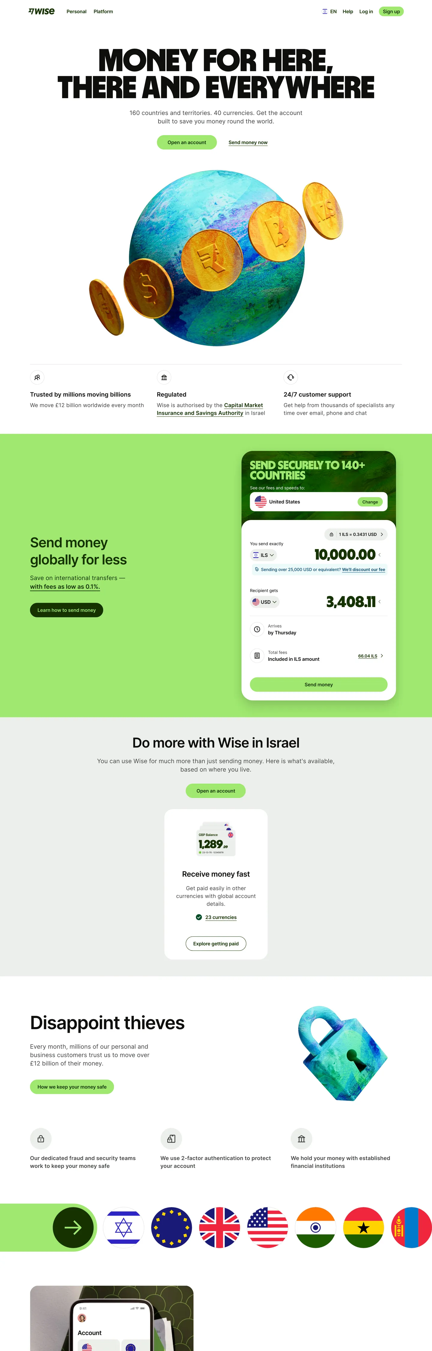
Wise is the rare fintech that reads more like a Scandinavian magazine than a bank. The brand pairs a vivid lime-green #9fe870 against a pale sage canvas #e8ebe6 and a near-black ink #0e0f0c that carries a faint olive warmth. The CTA pill is always the same lime green — never substituted, never paired with a secondary accent, never recolored as a status indicator. Hero headlines run Wise Sans, a proprietary geometric sans, at weight 900 in scales from 64px up to 126px. That display weight is unusually heavy for the category; most fintech systems sit at weight 700 or below. The shape language is generous: 24px rounded corners on every button and card, with cards floating as white plates on the sage band.
This page packages the system into a single DESIGN.md file. Inside: 18 color tokens (4-stop lime ramp, 4 surface neutrals, a full positive/warning/negative semantic palette, plus orange and cyan illustration accents), 14 typography styles spanning Wise Sans weight 900 at 126px down to Inter 12px captions, 8 spacing values on a 4px base unit, 7 corner radii, and 28 components covering navigation, cards, the signature currency-converter card, buttons, badges, and 10 auto-derived example surfaces. The spec follows the Google Labs DESIGN.md format so it's parseable by both humans and machines.
Feed the file to Claude, Cursor, or GitHub Copilot and the agent will reproduce Wise's restraint — one lime-green CTA, weight-900 hero, sage canvas, 24px pill geometry — instead of a generic fintech theme. Reference the tokens directly in Tailwind config or CSS variables, or use the file as a design audit against your own work. The system is worth studying because it proves a fintech can feel editorial and warm without abandoning trust signals: the heavy display weight reads as confident, the sage canvas reads as calm, and the lime CTA reads as energetic — three personalities held in one disciplined token set.
What makes it distinct
- Single lime-green CTA voltage#9fe870 is the sole brand accent across every primary button, badge, and dark-card text fill
- Hero type runs Wise Sans weight 900 at 126pxheaviest display weight of any fintech in the catalogue
- Sage canvas #e8ebe6 carries the hero band, white #ffffff cards float on it; surface contrast IS the elevation
- Cards and buttons share one canonical radius24px (rounded.xl) — never sharp corners on interactive surfaces
- Two-face typographyproprietary Wise Sans 900 for brand moments, Inter 600 for everything else; strict role separation
Live at wise.com
A snapshot of the brand in production. Hover the frame to scroll the page; click to visit.
 wise.com
Explore Wise Inspired
Pick what you want to see — mockups, colors, typography, layout, or the full component list.
Brand & Accent
Sparing, CTA-only voltage.
Surface
Page and card backgrounds.
Text
Headlines, body, captions, muted.
Semantic
Status, errors, success, inline links.
Other
Specialty colors.
Wise Inspired design system FAQ
Common questions about Wise Inspired's tokens, components, and how to use this DESIGN.md in your project.
Related reading
Specs, directories, and component libraries that pair with this design system.
The DESIGN.md specification
Google Labs' open spec for machine-readable design system files — the format this page is built on.
Browse all design systems
The full directory of DESIGN.md files on shadcn.io, with live mockups for each.
React blocks for shadcn/ui
Production-ready hero, pricing, CTA, and dashboard sections built with the same Tailwind + shadcn primitives.