shadcn.io is an independent project built on shadcn/ui
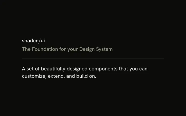
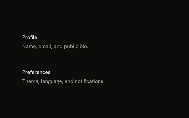
One horizontal line, and nothing else. It runs the width of its container, with no label and no neighbors.
Use the bare line inside a layout that already has its own spacing. Skip it and use a Card when the next block should be its own surface. In React, Base UI draws the line and not the space around it.
Installation
Anatomy
Usage
<Separator />FAQ
What are the default Separator styles?
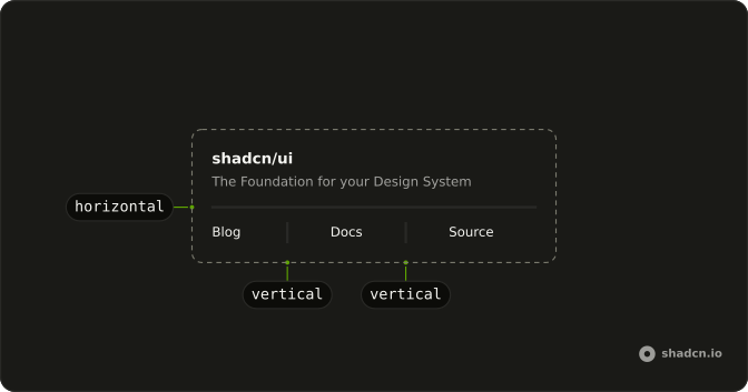
Horizontal orientation, one pixel tall, full width, bg-border and shrink-0. The color follows the --border token, so the line tracks light and dark themes without extra classes.
How do I customize the simple separator?
Add classes in className. Color is a background utility, such as bg-primary. Thickness has to use the component's orientation variant, data-horizontal:h-1, so it replaces the default height instead of losing to it.
When would I use a separator with no surrounding content?
Inside a parent that already sets the spacing, such as a flex column with a gap, or as a specimen in a style guide. Real screens almost always pair it with content, as the Horizontal Separator and List Separator examples do.
Does the simple separator have a separator role by default?
Yes. The element has role separator and an aria-orientation.
API Reference
Separator
No extra props in this demo. The rest is on the Separator page.