shadcn.io is an independent project built on shadcn/ui
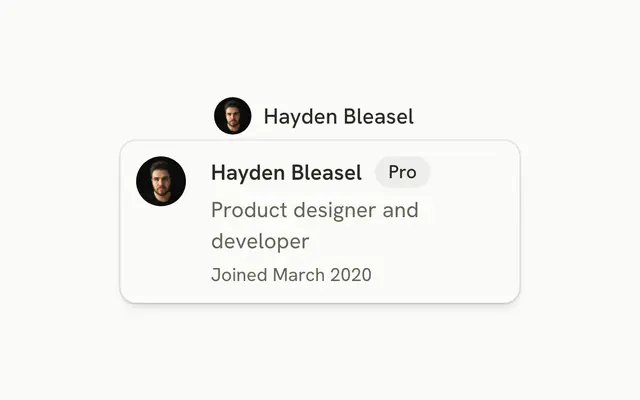
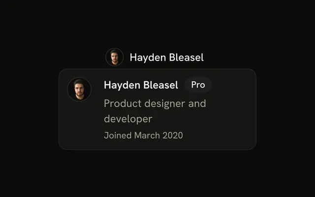
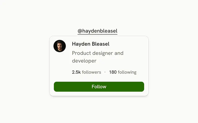
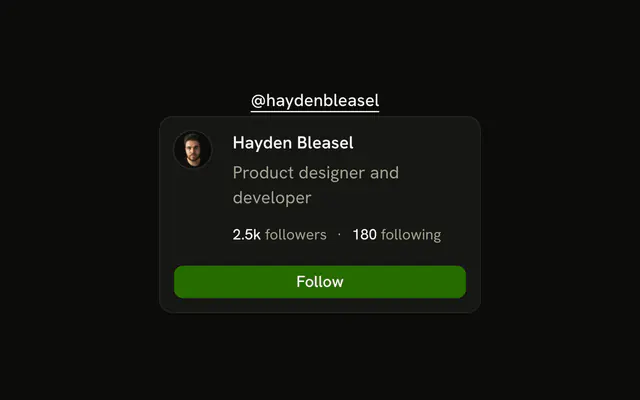
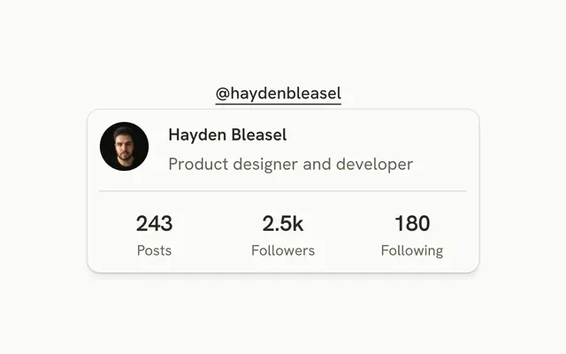
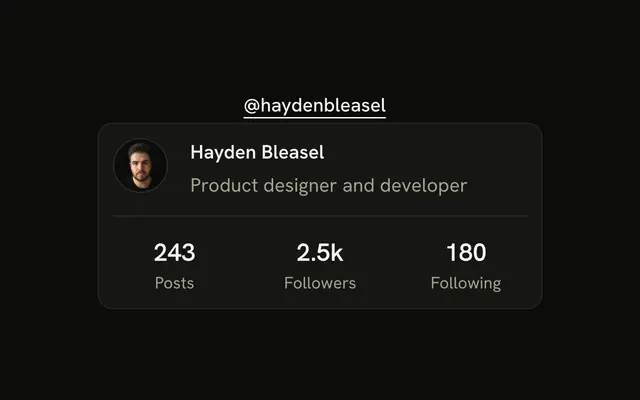
The trigger is @haydenbleasel. The card shows an avatar, Hayden Bleasel, and Product designer and developer. There is no badge and no counts.
Use it for mentions and bylines. Add stats only when activity matters. On touch, open it from a Popover. In React, Base UI does not load the person. The role is written in the file.
Preview
Installation
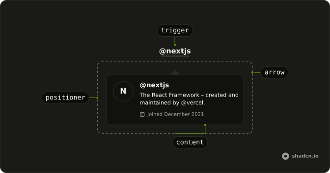
Anatomy
Usage
<HoverCard>
  <HoverCardTrigger
    className="font-medium text-sm underline underline-offset-4"
    closeDelay={100}
    delay={10}
    href="#"
  >
    @haydenbleasel
  </HoverCardTrigger>
  <HoverCardContent className="max-w-full">
    <div className="flex gap-4">
      <Avatar>
        <AvatarImage
          alt="@haydenbleasel"
          height={32}
          src="https://github.com/haydenbleasel.png"
          width={32}
        />
        <AvatarFallback>HB</AvatarFallback>
      </Avatar>
      <div className="flex flex-col gap-1">
        <h4 className="font-semibold text-sm">Hayden Bleasel</h4>
        <p className="text-muted-foreground text-sm">
          Product designer and developer
        </p>
      </div>
    </div>
  </HoverCardContent>
</HoverCard>
FAQ
What is in the card?
An Avatar beside Hayden Bleasel and Product designer and developer.
How is the username link made the trigger?
HoverCardTrigger renders an anchor itself, so the username link is the trigger with href and its classes set on it.
What if the picture fails to load?
AvatarFallback shows the initials HB instead. The image has the username as its alt.
Where does the profile come from?
It is written in the demo. In an app, load it when the card opens, and show a Skeleton while it loads.
How do I change how fast the card opens and closes?
The card opens a moment after the pointer rests on the trigger and stays up long enough for the pointer to move into it. Both delays are in milliseconds.
The demo sets delay 10 and closeDelay 100 on HoverCardTrigger. side and align on HoverCardContent place it.
Does the card open from the keyboard and on touch screens?
Focusing the username opens the card, moving focus away or pressing Escape closes it. Touch screens have no hover, so keep what matters reachable elsewhere, or use a Popover when the card has to open on a tap.
API Reference
Hover Card
Sets closeDelay={100}, delay={10} and href="#". The rest is on the Hover Card page.
Avatar
Sets alt="@haydenbleasel", height={32}, src="https://github.com/haydenbleasel.png" and width={32}. The rest is on the Avatar page.