shadcn.io is an independent project built on shadcn/ui
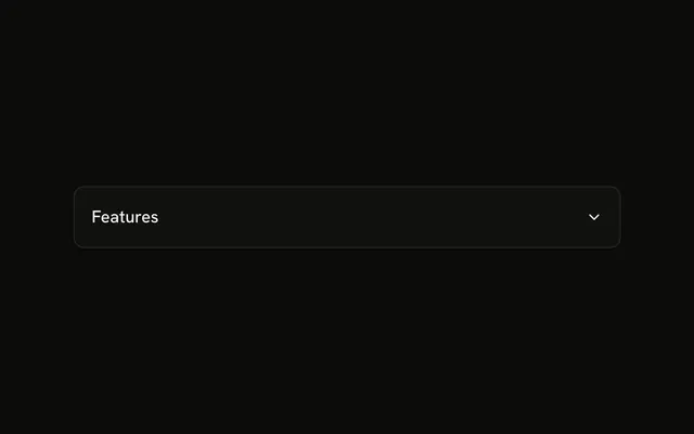
One question in its own card: Is there a free trial available? The row tints on hover, and a chevron turns when the answer opens under a divider.
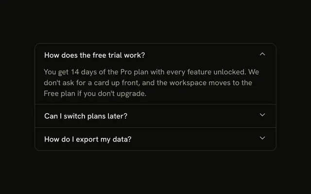
Use it when each question should stand as its own card. For one open question in a stack, use an Accordion. In Solid, Ark UI opens this card on its own.
Installation
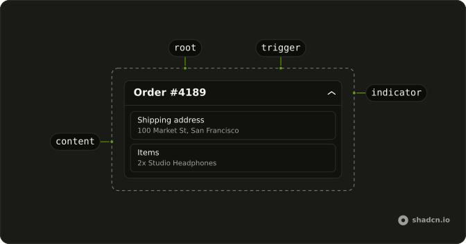
Anatomy
Usage
<Collapsible class="w-full max-w-lg overflow-hidden rounded-lg border bg-card shadow-sm">
    <h3>
      <CollapsibleTrigger class="group flex w-full items-center justify-between gap-4 p-4 text-start font-medium hover:bg-muted/50">
        Is there a free trial available?
        <ChevronDownIcon aria-hidden="true" class="size-4 shrink-0 transition-transform duration-200 group-aria-expanded:rotate-180" />
      </CollapsibleTrigger>
    </h3>
    <CollapsibleContent class="border-t px-4 py-3 text-muted-foreground text-sm">
      Yes! We offer a 14-day free trial with full access to all features. No
      credit card required to start your trial.
    </CollapsibleContent>
  </Collapsible>
FAQ
Which classes make the card?
Collapsible has rounded-lg border bg-card shadow-sm and overflow-hidden, so the hover tint stays inside the rounded corners. CollapsibleContent adds border-t px-4 py-3 above the answer.
What does hover:bg-muted/50 change?
It tints the trigger row with half of the muted color while the pointer is over it, a cue that the whole row is clickable.
Why does the trigger set text-start?
Buttons center their text by default. text-start lines a long question up with the start edge, and follows the page in right-to-left layouts.
Does the chevron rotate when the answer opens?
Yes. The trigger has the group class and sets aria-expanded while open, so group-aria-expanded:rotate-180 on ChevronDownIcon turns it, eased by transition-transform duration-200.
How do I show more questions in this style?
Repeat the card in a flex flex-col gap-2 list. Each Collapsible opens on its own. When several sit in one list and only one should be open at a time, with arrow keys between the headers, use an Accordion.
API Reference
Collapsible
No extra props in this demo. The rest is on the Collapsible page.