shadcn.io is an independent project built on shadcn/ui
Username stands on its own line. Under it, smaller muted text reads This will be your public display name.
Add a line under the label when the field needs one sentence of help. A Hint is the other place for that sentence, next to the control. In Solid, Ark UI does not tie the sentence to an input.
Installation
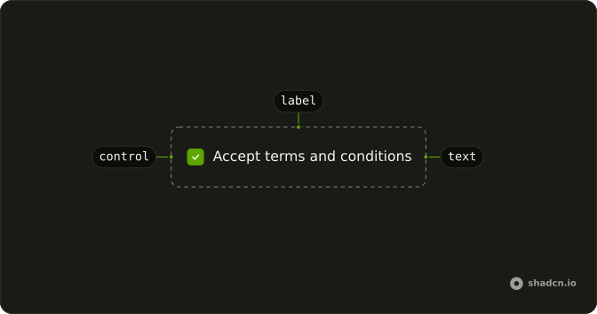
Anatomy
Usage
<div class="flex flex-col gap-1">
    <Label>Username</Label>
    <p class="text-muted-foreground text-xs">
      This will be your public display name
    </p>
  </div>
FAQ
Where does the helper text sit?
Under the label, in a p. The wrapper is flex flex-col gap-1. The label says Username. The paragraph says "This will be your public display name".
How is the helper text styled?
text-muted-foreground text-xs on the paragraph. Label keeps the default text-sm font-medium caption. The paragraph is a sibling of the label, not a child of it.
What is the space between the label and the hint?
gap-1 on the column. The file does not use a space-y class.
Is the paragraph announced with an input?
No. There is no input and no aria-describedby. Field is the part that associates a caption and a description with the control. This demo is the label and the paragraph only.
API Reference
Label
No extra props in this demo. The rest is on the Label page.