shadcn.io is an independent project built on shadcn/ui
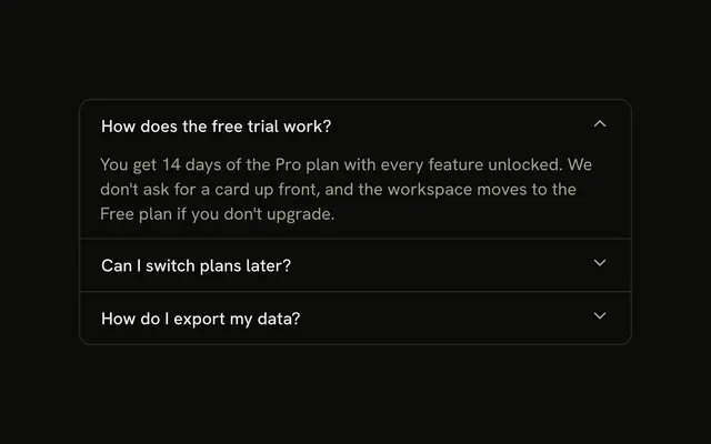
Four account questions, each in its own rounded card with a gap between them. The chevron sits on the right, and How do I change my email address? starts open.
Use it when each answer should feel separate. If people switch among them often, use Tabs. In Solid, Ark UI opens one card at a time in this demo.
Installation
Anatomy
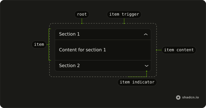
Usage
<Accordion class="flex w-full max-w-md flex-col gap-2" defaultValue={["email"]}>
    {items.map(item => <AccordionItem class="overflow-hidden rounded-lg border bg-background px-4" value={item.value}>
        <AccordionTrigger>{item.title}</AccordionTrigger>
        <AccordionContent>
          <p class="text-muted-foreground">{item.content}</p>
        </AccordionContent>
      </AccordionItem>)}
  </Accordion>
FAQ
How are the sections separated?
Accordion is flex flex-col gap-2, so each row has its own border. Each AccordionItem has rounded-lg border and px-4.
Which chevron is this?
AccordionTrigger is used with the title only, so it draws the built-in chevron on the right. This demo does not hide accordion-trigger-icon.
Why does the email question start open?
defaultValue={["email"]} opens the email question on first render. The string matches that item's value.
How do I let several items stay open at once?
One open item is the default. Add multiple to Accordion to let several stay open, and list every item that should start open in the defaultValue array.
API Reference
Accordion
Sets defaultValue={["email"]} and value={item.value}. The rest is on the Accordion page.