shadcn.io is an independent project built on shadcn/ui
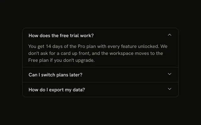
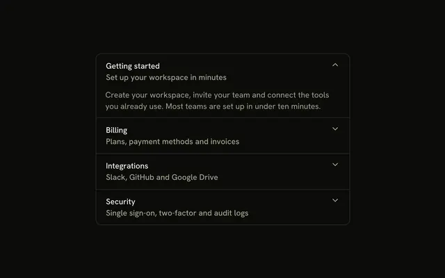
Four workspace sections in one bordered stack. Each trigger starts with an icon, Documents starts open, and the chevron sits on the right.
Use it when the sections are different kinds of content. If there is only one section, a Collapsible is enough. In Svelte, Ark UI does not remember which section was open.
Installation
Anatomy
Usage
<Accordion class="w-full max-w-md -space-y-px" defaultValue={["documents"]}>{#each items as item (item.value)}<AccordionItem class="overflow-hidden border bg-background px-4 first:rounded-t-lg last:rounded-b-lg" value={item.value}><AccordionTrigger class="hover:no-underline"><span class="flex items-center gap-3"><item.icon aria-hidden="true" class="size-4 shrink-0 text-muted-foreground" /><span class="text-start">{item.title}</span></span></AccordionTrigger><AccordionContent class="ps-7"><p class="text-muted-foreground">{item.content}</p></AccordionContent></AccordionItem>{/each}</Accordion>FAQ
What types of icons work best for accordion sections?
Icons that name the content: FileTextIcon for documents, FolderIcon for collections, SettingsIcon for configuration, UsersIcon for people. Avoid arrows and chevrons, which read as the expand indicator.
How do I change icon colors to match section categories?
The icons use text-muted-foreground so they don't compete with the titles. To color-code categories, add a color to each item in the data and apply it to its icon, using theme tokens such as text-primary or text-destructive so the colors follow light and dark mode.
Can I use different icon sizes for emphasis?
You can, but keep one size per accordion. Every icon here is size-4, which matches the trigger's text. A bigger icon on one row makes that row taller and pushes its title out of line with the others.
Why is content indented with ps-7?
ps-7 is 28px: the 16px icon plus the 12px gap-3 between icon and title. It lines each answer up under its title rather than under the icon, so the content reads as belonging to that heading.
API Reference
Accordion
Sets defaultValue={["documents"]} and value={item.value}. The rest is on the Accordion page.