solaris.shadcn.io

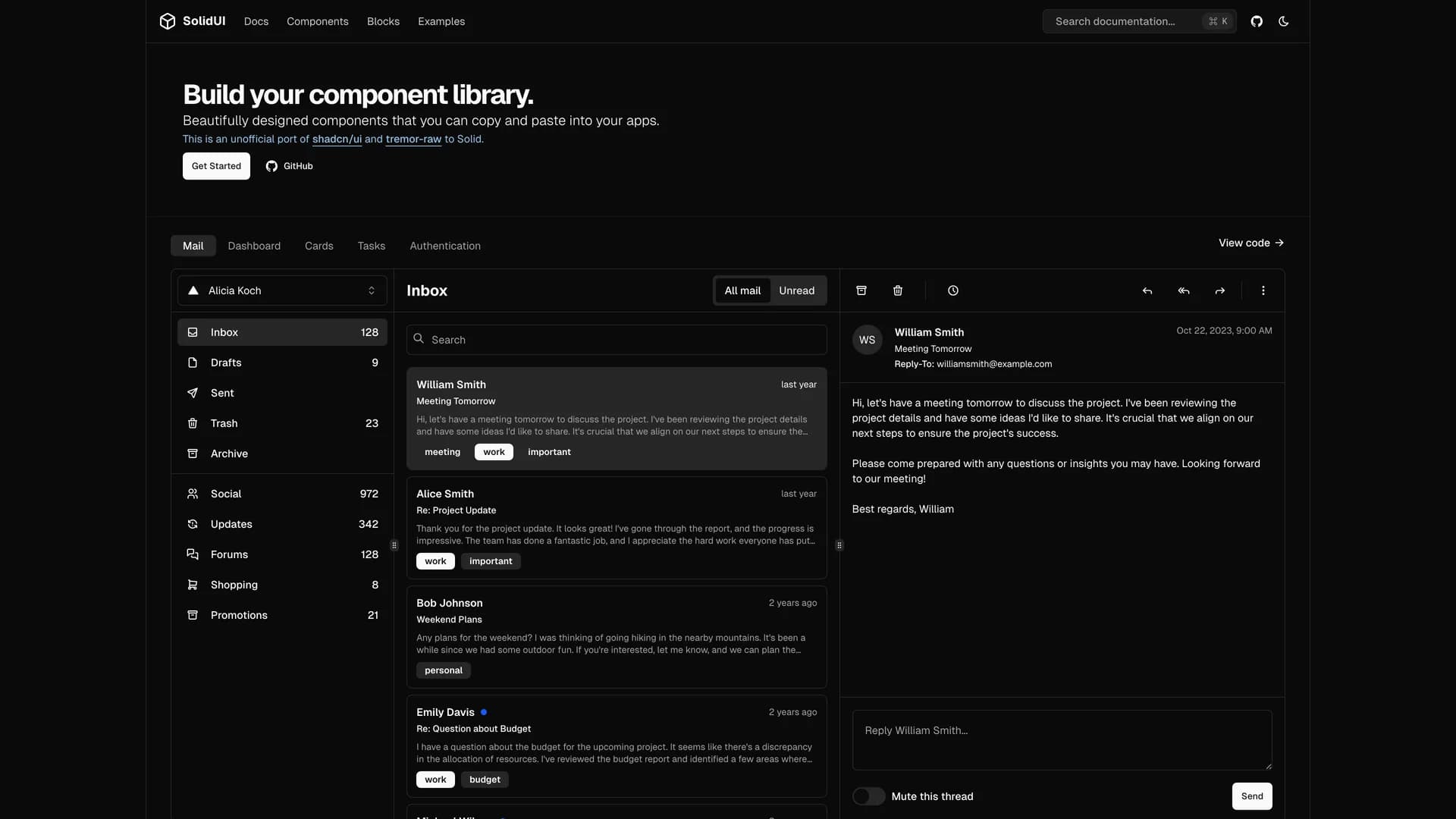
Solid UI is an unofficial port of shadcn/ui and tremor-raw to SolidJS, providing accessible and customizable components built with Kobalte, corvu, and Tailwind CSS that developers can copy and paste into their applications.
by Stefan karger · Updated October 8, 2025
Interact with the actual deployed template — every section, every interaction, no mockups.
With over 1,300 GitHub stars, this MIT-licensed library brings the shadcn/ui philosophy of component ownership to the SolidJS ecosystem, allowing developers to build their own component libraries with well-designed, accessible primitives. Built with TypeScript and leveraging Kobalte and corvu for headless, accessible component foundations, Solid UI offers a comprehensive collection of UI components styled with Tailwind CSS for rapid customization. The project maintains compatibility with SolidJS's reactive programming model while providing familiar patterns from the React ecosystem through shadcn/ui's design language.
With comprehensive documentation at solid-ui.com and active community contributions from maintainers including stefan-karger and michaelessiet, Solid UI serves developers who prefer SolidJS's performance and reactivity model but want the component quality and design consistency of shadcn/ui. Perfect for building SolidJS applications that require professional UI components without sacrificing the framework's unique advantages in bundle size and runtime performance.
Hand-built premium templates from shadcn.io — production-ready and bundled in Pro.


