shadcn.io is an independent project built on shadcn/ui
Base UI does not include this primitive, so this page uses the Ark UI component. The visuals match the Ark UI version.
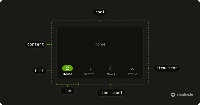
Bottom navigation keeps the three to five main sections of a phone app in a bar along the bottom of the screen, where a thumb reaches them, and lights up the one you're in. Each item is an icon over a short label, and the bar pads itself clear of the iPhone home indicator.
On a wide screen the same destinations belong in a Sidebar. To switch between views inside one screen, such as posts and replies on a profile, use Tabs.
Installation
Anatomy
Usage
import { HomeIcon, SearchIcon, UserIcon } from "lucide-react";
import {
  BottomNavigation, BottomNavigationContent, BottomNavigationItem,
  BottomNavigationItemIcon, BottomNavigationItemLabel,
  BottomNavigationList,
} from "@/components/ui/bottom-navigation";
Each BottomNavigationItem opens the BottomNavigationContent with the same value. The list is fixed to the bottom of the viewport, so the page needs room underneath for it.
<BottomNavigation defaultValue="home">
  <BottomNavigationContent value="home">Your feed</BottomNavigationContent>
  <BottomNavigationContent value="search">Search</BottomNavigationContent>
  <BottomNavigationContent value="profile">Your profile</BottomNavigationContent>
  <BottomNavigationList>
    <BottomNavigationItem value="home">
      <BottomNavigationItemIcon>
        <HomeIcon />
      </BottomNavigationItemIcon>
      <BottomNavigationItemLabel>Home</BottomNavigationItemLabel>
    </BottomNavigationItem>
    <BottomNavigationItem value="search">
      <BottomNavigationItemIcon>
        <SearchIcon />
      </BottomNavigationItemIcon>
      <BottomNavigationItemLabel>Search</BottomNavigationItemLabel>
    </BottomNavigationItem>
    <BottomNavigationItem value="profile">
      <BottomNavigationItemIcon>
        <UserIcon />
      </BottomNavigationItemIcon>
      <BottomNavigationItemLabel>Profile</BottomNavigationItemLabel>
    </BottomNavigationItem>
  </BottomNavigationList>
</BottomNavigation>Accessibility
BottomNavigationList is a tab list named Main, and its aria-label takes another name. Each item is a tab that reports aria-selected, and the open section is a tab panel labeled by its item. Only the selected item is in the tab order, so Tab can't reach a bar with no section selected. The arrow keys move along it, opening each section they land on and skipping disabled items. The icon is hidden from screen readers, so every item needs a visible label or an aria-label.
This component is built on Ark UI's Tabs rather than Base UI, so installing it adds Ark UI to your project and the keys below are Ark UI's.
- Tab
- From outside the bar, moves focus to the selected item. From an item, moves focus out of the bar to the next focusable element.
- Arrow Down
- Moves focus to the next trigger in vertical orientation and activates its associated content.
- Arrow Right
- Moves focus to the next trigger in horizontal orientation and activates its associated content.
- Arrow Up
- Moves focus to the previous trigger in vertical orientation and activates its associated content.
- Arrow Left
- Moves focus to the previous trigger in horizontal orientation and activates its associated content.
- Home
- Moves focus to the first trigger and activates its associated content.
- End
- Moves focus to the last trigger and activates its associated content.
- Enter
- Opens the focused item's section, and follows the link when the item is one. This is how an item gets selected when
activationModeismanual. - Space
- Opens the focused item's section when the item is a button. This is how an item gets selected when
activationModeismanual.
Demos
Controlled
The open section lives in the demo's own state. It goes in as value, comes back through onValueChange, and the line above the frame prints it, starting at home. Control the bar when something besides a tap picks the section, such as the current route or a back button. If only taps change it, defaultValue is less code.
Disabled
Profile has disabled on its BottomNavigationItem, so it fades, ignores taps and drops out of both the tab order and the arrow keys, while Home, Search and News switch as usual. Disable an item when its section exists but can't open yet, such as a profile before sign-in, so the other icons keep their places.
Icon only
The same four sections with no visible labels, each BottomNavigationItem named by an aria-label that matches its section. With no label beside it, each icon draws at 20 pixels instead of 16. Keep this for icons nobody has to guess, like home and search, because sighted people get no words to go on.
Root provider
useBottomNavigation creates the bar's state outside it and BottomNavigationRootProvider takes it as value. The Go to Profile button above the frame calls setValue to switch sections, and the readout beside it follows. Use this when a control outside the bar, like a header button or a notification, has to move it.
With badge
News carries a red count of 3 on the corner of its bell: a small destructive Badge positioned inside BottomNavigationItemIcon. Keep a badge for the one section with unread work. The icon wrapper is hidden from screen readers, so the item's aria-label, News, 3 unread, carries the count for them instead.
With links
Each item renders a Next.js Link through asChild, so a tap changes the URL hash as well as the section. With activationMode set to manual, the arrow keys only move focus and Enter follows the focused link. The selection starts from defaultValue and never reads the URL, so in an app set value from the current path.
FAQ
When should I use Bottom Navigation instead of a sidebar or tabs?
Use Bottom Navigation for the three to five top-level sections of a phone layout, the places someone goes back to all day, such as Home, Search, Inbox and Profile. Every item takes an equal share of the width and a long label is cut off with an ellipsis, so a sixth item rarely fits on a phone.
On a wider screen, move the same destinations into a Sidebar and render the bar only below that breakpoint. To switch views within one screen, use Tabs, which sit at the top of the content they change.
How do I use Bottom Navigation items as router links in React?
Add asChild to each BottomNavigationItem and put your router's link inside it, as the With links demo does with a Next.js Link. The item's tab props and click handler land on the link, so a tap follows the href and selects the item.
Set value from the current path rather than defaultValue, or the bar shows the wrong section after a reload or the back button.
By default the arrow keys select as they move, which on links means following each one. Set activationMode to manual, as the With links demo does, and the arrows only move focus until Enter opens the link.
How do I control the active Bottom Navigation item from state?
Hold the section in state, pass it as value on BottomNavigation and update it in onValueChange. The callback receives an object, so read the new section from details.value, as the Controlled demo does.
To move the bar from code outside it without holding the state yourself, create the state with useBottomNavigation, hand it to BottomNavigationRootProvider and call setValue, as in Root provider. For only a starting section, defaultValue is enough.
Why is the bottom of my page hidden behind Bottom Navigation?
BottomNavigationList is fixed to the bottom of the viewport above the page, so the last 3.5rem of content scrolls underneath it. The bar is translucent and blurs what passes behind it, which makes the overlap easy to miss.
Give the scrolling content bottom padding as tall as the bar plus the safe-area inset, such as pb-[calc(3.5rem+env(safe-area-inset-bottom))]. To keep the bar inside a frame or a phone mockup instead, add the static class to BottomNavigationList, which is how every demo on this page renders it.
Does Bottom Navigation handle the iPhone home indicator?
It does, once the page opts in. BottomNavigationList pads its bottom edge by env(safe-area-inset-bottom), and BottomNavigation reserves the bar's 3.5rem plus that inset as its minimum height, so the labels sit above the home indicator.
iOS reports the inset only to a page whose viewport meta tag includes viewport-fit=cover. Without it the inset is zero and the padding does nothing.
Why does a Bottom Navigation section reset when I switch back to it?
Because it left the DOM. BottomNavigation turns on lazyMount and unmountOnExit, so a section mounts when it is first opened and unmounts when another one opens, taking a scrolled list, a half-typed search and every component's state with it.
Set unmountOnExit to false on BottomNavigation to keep each visited section mounted and hidden. When the items are routes, the router decides what survives, so keep shared state above the routes or in the URL.
How do I show a notification badge on a Bottom Navigation item?
Put a Badge inside BottomNavigationItemIcon, give that wrapper the relative class and position the badge absolutely at its top corner, as the With badge demo does with a count of 3 on News.
The icon wrapper is hidden from screen readers, so nobody using one hears the badge itself. Put the count in the item's name as well, with an aria-label on BottomNavigationItem such as the demo's News, 3 unread, and update it when the count changes.
Is an icon-only Bottom Navigation accessible?
It is once every item has a name. The icon wrapper is hidden from screen readers, so an item with no label is announced as a tab with no name at all. Give each BottomNavigationItem an aria-label with its section, as the Icon only demo does.
The list is named Main, and an aria-label on BottomNavigationList changes that. Sighted people still get only the pictures, so keep icon-only bars to icons nobody has to guess.
API Reference
BottomNavigation
<div> data-slot="bottom-navigation"
value?string | null
The controlled selected tab value.
- Type
string | null
defaultValue?string | null
The initial selected tab value when rendered. Use when you don't need to control the selected tab value.
- Type
string | null
onValueChange?(details: ValueChangeDetails) → void
Callback to be called when the selected/active tab changes.
- Type
(details: ValueChangeDetails) → void- Parameters
details– { value: string }- Returns
void
activationMode?"manual" | "automatic"
The activation mode of the tabs. Can be manual or automatic
- manual: Tabs are activated when clicked or press enter key.
- automatic: Tabs are activated when receiving focus
- Type
"manual" | "automatic"- Default
"automatic"
composite?boolean
Whether the tab is composite.
deselectable?boolean
Whether the active tab can be deselected when clicking on it.
dir?"ltr" | "rtl"
The document's text/writing direction.
- Type
"ltr" | "rtl"- Default
"ltr"
hideMode?"display-none" | "activity"
How to hide content when mounted but not present.
- display-none: HTML hidden attribute. Effects stay alive.
- activity: React 19 <Activity mode="hidden">. Effects pause. Requires React 19+.
- Type
"display-none" | "activity"- Default
"display-none"
id?string
The unique identifier of the machine.
ids?object
The ids of the elements in the tabs. Useful for composition.
- Type
{ root?: string; trigger?: (value: string) → string; list?: string; content?: (value: string) → string; indicator?: string }
lazyMount?boolean
Whether to enable lazy mounting. Ark default: false.
- Default
true
loopFocus?boolean
Whether the keyboard navigation will loop from last tab to first, and vice versa.
- Default
true
navigate?((details: NavigateDetails) → void) | null
Function to navigate to the selected tab when clicking on it. Useful if tab triggers are anchor elements.
- Type
((details: NavigateDetails) → void) | null- Parameters
(details– { value: string; node: HTMLAnchorElement; href: string }- Returns
void) | null
onFocusChange?(details: FocusChangeDetails) → void
Callback to be called when the focused tab changes.
- Type
(details: FocusChangeDetails) → void- Parameters
details– { focusedValue: string }- Returns
void
orientation?"horizontal" | "vertical"
The orientation of the tabs. Can be horizontal or vertical
- horizontal: only left and right arrow key navigation will work.
- vertical: only up and down arrow key navigation will work.
- Type
"horizontal" | "vertical"- Default
"horizontal"
translations?object
Specifies the localized strings that identifies the accessibility elements and their states.
- Type
{ listLabel?: string }
unmountOnExit?boolean
Whether to unmount on exit. Ark default: false.
- Default
true
asChild?boolean
Use the provided child element as the default rendered element, combining their props and behavior.
className?string
Merged with the part's classes.
data-focus?string
Present when focused.
data-orientationstring
The orientation of the tabs.
BottomNavigationList
<div> data-slot="bottom-navigation-list"
asChild?boolean
Use the provided child element as the default rendered element, combining their props and behavior.
className?string
Merged with the part's classes.
data-focus?string
Present when focused.
data-orientationstring
The orientation of the list.
BottomNavigationItem
data-slot="bottom-navigation-item"
asChild?boolean
Use the provided child element as the default rendered element, combining their props and behavior.
className?string
Merged with the part's classes.
data-disabled?string
Present when disabled.
data-focus?string
Present when focused.
data-orientationstring
The orientation of the trigger.
data-ownedbystring
Id of the list part.
data-selected?string
Present when selected.
data-ssr?string
Present when not rendered in the browser. Useful for ssr styling.
data-valuestring
The value of the item.
BottomNavigationContent
data-slot="bottom-navigation-content"
asChild?boolean
Use the provided child element as the default rendered element, combining their props and behavior.
className?string
Merged with the part's classes.
data-orientationstring
The orientation of the content.
data-ownedbystring
Id of the list part.
data-selected?string
Present when selected.
BottomNavigationItemIcon
<span> data-slot="bottom-navigation-item-icon"
asChild?boolean
Use the provided child element as the default rendered element, combining their props and behavior.
className?string
Merged with the part's classes.
data-focus?string
Present when focused is true.
data-orientationstring
Mirrors the orientation prop.
BottomNavigationItemLabel
<span> data-slot="bottom-navigation-item-label"
asChild?boolean
Use the provided child element as the default rendered element, combining their props and behavior.
className?string
Merged with the part's classes.
data-focus?string
Present when focused is true.
data-orientationstring
Mirrors the orientation prop.
BottomNavigationRootProvider
<div> data-slot="bottom-navigation"
valueUseTabsReturn
What useBottomNavigation() returns: the state and API, made outside the component to control it.
hideMode?"display-none" | "activity"
How to hide content when mounted but not present.
- display-none: HTML hidden attribute. Effects stay alive.
- activity: React 19 <Activity mode="hidden">. Effects pause. Requires React 19+.
- Type
"display-none" | "activity"- Default
"display-none"
lazyMount?boolean
Whether to enable lazy mounting. Ark default: false.
- Default
true
unmountOnExit?boolean
Whether to unmount on exit. Ark default: false.
- Default
true
asChild?boolean
Use the provided child element as the default rendered element, combining their props and behavior.
className?string
Merged with the part's classes.
data-focus?string
Present when focused is true.
data-orientationstring
Mirrors the orientation prop.