shadcn.io is an independent project built on shadcn/ui
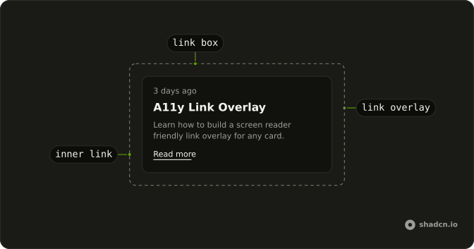
Link Overlay makes a whole card lead to one page without wrapping the card in an <a>. The title stays the real link, and a layer stretched from it covers the card, so a click on the image or the summary opens the same page while the buttons and other links inside keep their own clicks.
A card that only groups content is a plain Card, and one where only the title should be clickable needs nothing more than a link in its title.
Installation
Anatomy
Usage
import { Button } from "@/components/ui/button";
import {
  Card, CardDescription, CardFooter, CardHeader, CardTitle,
} from "@/components/ui/card";
import { LinkBox, LinkOverlay } from "@/components/ui/link-overlay";
With asChild, LinkBox merges onto the Card instead of adding a wrapper. The title's link becomes the overlay, and the button below it keeps its own click.
<LinkBox asChild>
  <Card className="w-full max-w-xs">
    <CardHeader>
      <CardTitle>
        <LinkOverlay href="/products/linen-sofa">Linen sofa</LinkOverlay>
      </CardTitle>
      <CardDescription>
        Three seats, deep cushions and covers that come off for washing.
      </CardDescription>
    </CardHeader>
    <CardFooter>
      <Button className="w-full">Add to cart</Button>
    </CardFooter>
  </Card>
</LinkBox>
Accessibility
LinkOverlay is an ordinary <a>, so the card has one link to its page, and that link's accessible name is the title inside it, not every word on the card. Its ::before layer only widens where a pointer can click: focus, the tab order and what a screen reader reads all stay with the title, and the focus ring wraps the title alone. Other links inside LinkBox keep their own names and their place in the tab order. What's left to you is a title that makes sense as link text on its own, since that is all a screen reader announces.
- Tab
- Moves focus through the overlay link and each other link and button inside the card, in source order.
- Enter
- On the overlay link or an inner link, follows it.
Demos
Product grid
Three products in a grid, each card a LinkBox with the product's name as its overlay link and a save button over the image. The button comes before the title in the markup, so it takes z-1 to rise above the layer: a click on the heart saves the product, and a click anywhere else opens its page. Use it for a shop's category page.
Article
A blog teaser in an article: a "3 days ago" date, a heading whose link is the overlay, a one-sentence summary and a Read more link. A click on the date or the summary opens the post, while Read more keeps its own href because LinkBox lifts every other link above the layer. Use it for a feed or a search result with one main destination and one extra link.
With link
A post title, a one-line summary and a Read the changelog link, in a bordered article. Here LinkOverlay takes asChild and hands its classes to the title's own anchor, a Next.js Link, so the title keeps client-side navigation and nothing adds a second anchor. Use it when the title is already your router's link component.
FAQ
How do I make a whole card clickable in React?
Wrap the card in LinkBox and put LinkOverlay on the one link the card stands for, usually the title. LinkBox makes the card relative, and the overlay's ::before layer stretches across it, so a click on the image, the description or the empty space goes to that link's href.
Merge LinkBox onto your card with asChild rather than adding a wrapper around it, as every demo on this page does. Links inside the card keep working, and the Article demo shows one next to the overlay.
Why use a link overlay instead of wrapping the whole card in a link?
Because the card holds other controls. HTML doesn't allow a button or a second link inside an <a>, and a link wrapped around a card takes every word on it as its accessible name. Link Overlay keeps one short link, the title, and widens only the area that takes its click.
A click handler on the card that calls your router loses more: the card can't take focus, isn't announced as a link, and has no middle-click, open in new tab or URL preview on hover. The overlay is a real anchor, so all of those work anywhere on the card.
Why does my Link Overlay cover more or less than the card?
The layer is absolutely positioned, so it fills the nearest positioned ancestor of the link. LinkBox is relative to be that ancestor. Leave it out and the layer climbs to the next positioned element up the tree, sometimes the whole page, and catches every click on it.
The layer stops short when something between the box and the link is positioned or transformed, such as a header with relative. Browsers before Chrome 129, Firefox 133 and Safari 18.4 also stopped it at any element with a container-type, and CardHeader has one.
How do I use Link Overlay with my router's link component?
Put asChild on LinkOverlay and your router's link inside it as the only child, as the With link demo does with Next.js Link. The overlay's classes and data-slot merge onto that link, which keeps its client-side navigation and its own props, such as prefetch. The data-slot matters, because LinkBox uses it to tell the overlay apart from the links it lifts.
How do I add a hover or focus style to a Link Overlay card?
Put the classes on the card. hover:bg-muted/50 tints it anywhere under the pointer, and has-[[data-slot=link-overlay]:focus-visible]:ring-2 rings the whole card while its title has keyboard focus. The second one is worth adding, because the overlay's own ring wraps only the title.
The overlay's look lives in components/ui/link-overlay: a transparent border and a little padding that turn into a ring on focus-visible. Change it there to restyle every overlay at once.
Is a Link Overlay card accessible to keyboard and screen reader users?
Yes, because only the title is a link. Tab stops on it once and then on each link and button inside the card in source order, Enter follows it, and a screen reader announces the title as the link's name instead of reading the whole card as one long link.
The layer adds nothing to the tab order or the accessibility tree. Write the title so it makes sense out of context, since a screen reader's list of links shows it alone, without the image or the summary.
Why can't I select text in a Link Overlay card?
The overlay's layer sits over the text, so a press on the summary lands on the link, and dragging across it drags the link instead of selecting words. That is the trade for making the whole card one target.
To keep a passage selectable, such as an order number or an address people copy, give it relative and z-1 so it rises above the layer. Clicks on that passage then stop following the link.
API Reference
LinkOverlay
<a> data-slot="link-overlay"
asChild?boolean
Use the provided child element as the default rendered element, combining their props and behavior.
className?string
Merged with the part's classes.
LinkBox
<div> data-slot="link-box"
asChild?boolean
Use the provided child element as the default rendered element, combining their props and behavior.
className?string
Merged with the part's classes.