shadcn.io is an independent project built on shadcn/ui
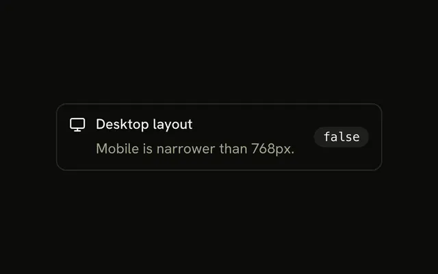
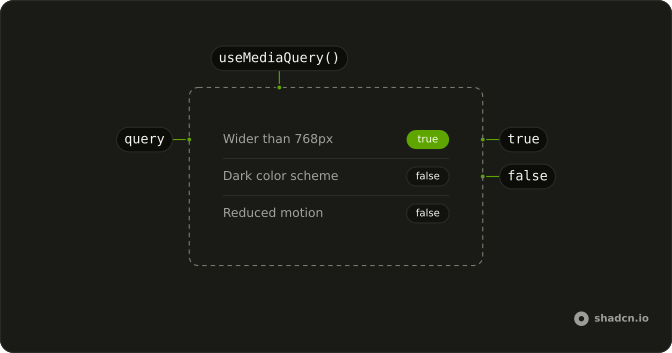
useMediaQuery takes a media query string and returns true while that query matches. Change the window size or a system preference, and the boolean updates.
Use a min-width query for a breakpoint, or a prefers query for a system setting. For the fixed mobile check, use useIsMobile instead of copying it. In React the server render uses your default, then a listener takes over on the client.
Installation
Anatomy
Usage
import { useMediaQuery } from "@/hooks/use-media-query";const isWide = useMediaQuery("(min-width: 768px)");defaultValue is false and initializeWithValue is true. Set initializeWithValue to false when the first client render should stay on the default until the effect reads matchMedia.
FAQ
How do I match a width breakpoint?
Pass the same min-width query Tailwind uses for that breakpoint. md is min-width 768px and lg is min-width 1024px, written as a normal CSS media query. The hook returns true when the viewport is at least that wide. This is separate from useIsMobile, which is a fixed narrower-than-mobile check. Call the hook once for each query you need.
Can it follow the system color scheme?
Yes. The query prefers-color-scheme dark is true when the operating system asks for a dark theme, and the light query is the opposite. The boolean updates if that setting changes while the page is open. The hook does not store a choice and it does not edit the document. It only reports whether the media feature matches.
How do I respect reduced motion?
Use the query prefers-reduced-motion reduce. It is true when the person has asked the system for less animation, and it updates if they change that setting later. Check the boolean before you start a transition, an autoplay, or a loop. The hook does not turn motion off for you. The component decides what to skip.
What does the first render return?
You get defaultValue, which is false unless you pass another boolean. On the server there is no matchMedia, so the first state is that default whether or not initializeWithValue is set. On a client-only mount, true reads matchMedia while state is created, and false waits for the effect. After the effect runs, the value is the live match.
Can one call watch two features?
One call watches one query string. CSS lets that string combine features, so min-width and max-width joined with and is still one boolean. Call the hook a second time when you want a separate boolean, such as width plus color scheme. Changing the string removes the old matchMedia listener and subscribes to the new query.
When is defaultValue used?
It is the boolean used before matchMedia can run. That covers the server render, and a client render that set initializeWithValue to false, until the effect corrects it. Once the effect has run, the returned value is the live match, not the default. Changing defaultValue on a later render does not reset the state.
API Reference
Parameters
querystring
The media query: "(min-width: 768px)", "(prefers-reduced-motion: reduce)"…
options?UseMediaQueryOptions
Its value on the server and when it's first checked.
options.defaultValue?boolean
The value on the server, and on the first render when initializeWithValue is false.
- Default
false
options.initializeWithValue?boolean
Checks the query on the first render. false starts from defaultValue and checks after mounting, for markup that must match the server's.
- Default
true
Returns
returnsboolean
true while the query matches.