Clerk Design System
Clerk’s design system centers on the brand purple #6c47ff and the Geist‑Numbers typeface, delivering a white canvas, dark ink, and a curated set of UI components for modern web ap…
About Clerk DESIGN.md
Curated by Dov AzencotUpdated Source clerk.com
- Design & Creative Tools
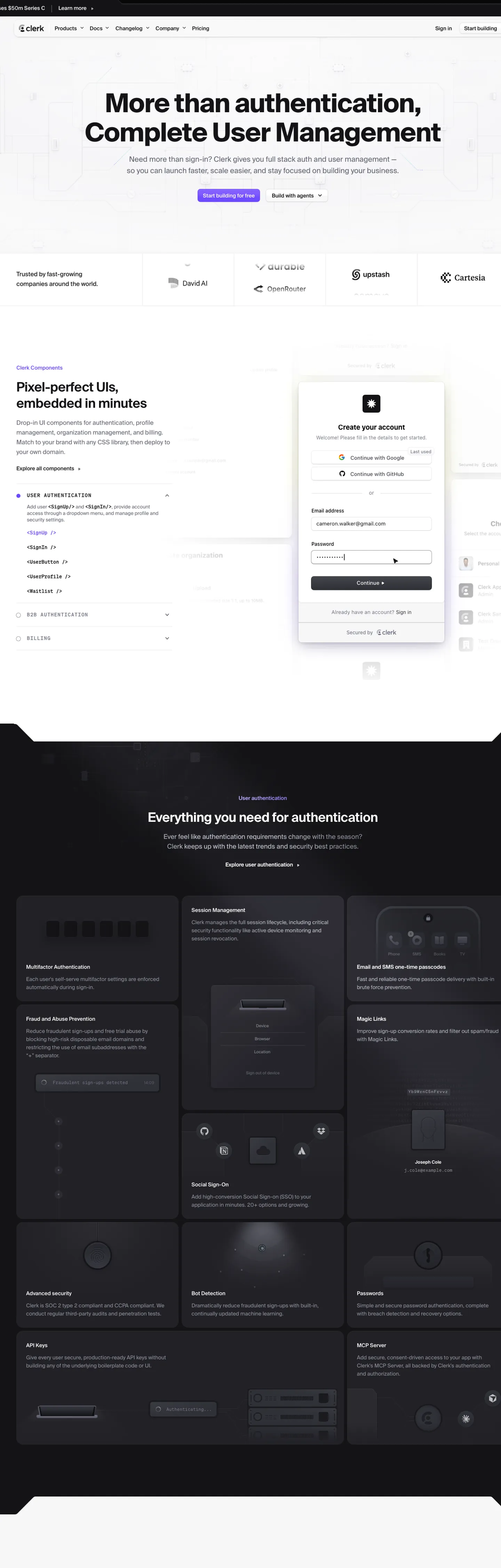
Clerk’s homepage opens on a pure white canvas (#ffffff) that frames a headline rendered in 64 px Geist‑Numbers with a weight of 700, colored in the brand purple #6c47ff. Below the hero, body copy rests on dark ink #000000, while interactive elements such as primary buttons inherit the same purple accent and a 4 px border rendered in #d9d9de. The layout interleaves neutral surfaces – #e3e3e7 for card backgrounds and #eeeef0 for input fields – establishing a rhythm of contrast and relief that guides the eye without relying on gradients or illustrations.
Inside this DESIGN.md file you will find 23 color tokens grouped into primary, ink, canvas, hairline, muted, surface‑1/2/3, link, error, warning, and several brand‑specific shades; 12 typography tokens covering display, heading, body, caption, code, and button roles; 6 rounded values ranging from 0 px to a full 9999 px radius; a spacing scale from 4 px to 24 px; and a component catalog of 20 primitives that span navigation, forms, cards, alerts, and modals. The token set follows the Google Labs design‑token specification, exposing each value as a CSS custom property ready for consumption by Tailwind, CSS‑in‑JS, or native stylesheet imports.
To use the system, import the generated token file into your project and reference tokens via the {colors.x}, {typography.x}, {rounded.x}, and {spacing.x} placeholders. In Tailwind you can map the custom properties to theme extensions, while in CSS‑in‑JS you can read the variables directly from the :root. This approach guarantees visual consistency across React components and downstream applications, and it demonstrates why Clerk’s visual language merits close study for teams building authentication‑heavy products.
What makes it distinct
- Primary accentthe brand purple #6c47ff appears on headings, CTA buttons, and interactive icons, establishing a consistent visual hook across the site.
- Ink dominanceblack #000000 powers all body copy and navigation links, delivering maximum contrast against the white canvas.
- Hairline definitionthe light gray #d9d9de is used for 1 px borders on tables, inputs, and card outlines, subtly separating content without visual noise.
- Surface layeringneutral grays #e3e3e7 and #eeeef0 provide background bands for cards and modal dialogs, creating depth while preserving a flat aesthetic.
Live at clerk.com
A snapshot of the brand in production. Hover the frame to scroll the page; click to visit.
 clerk.com
Explore Clerk
Pick what you want to see — mockups, colors, typography, layout, or the full component list.
Brand & Accent
Sparing, CTA-only voltage.
Surface
Page and card backgrounds.
Text
Headlines, body, captions, muted.
Borders & Hairlines
Dividers, outlines, structural rules.
Semantic
Status, errors, success, inline links.
Other
Specialty colors.
Clerk design system FAQ
Common questions about Clerk's tokens, components, and how to use this DESIGN.md in your project.
Related reading
Specs, directories, and component libraries that pair with this design system.
Browse all design systems
The full directory of DESIGN.md files on shadcn.io, with live mockups for each.
Clerk — official site
Clerk's public marketing site — the source of truth for the live tokens captured in this file.
The DESIGN.md specification
Google Labs' open spec for machine-readable design system files — the format this page is built on.