Datadog Design System
Datadog's deep violet accent on a midnight canvas with NationalWeb type, tuned for high-contrast observability dashboards. Colors, type and components.
- Primary color
- #632ca6
- Typeface
- NationalWeb
- Shape
- Sharp
- Base radius
- 6px
- Colors
- 15
- Type tokens
- 11
- Components
- 14
- Spacing values
- 8
About Datadog DESIGN.md
Curated by Dov Azencot, updated May 17, 2026. Source datadoghq.com (opens in a new tab).
The first glance at Datadog’s UI feels like a control room lit by a deep violet pulse against a midnight canvas. Hero headings explode at 68 px, drenched in near‑black ink, while primary buttons glow with a violet voltage that never fades. Even the smallest caption text carries the same NationalWeb DNA, making every typographic layer feel like a coordinated alert panel. It’s a visual language built for engineers who need data at a glance, not a decorative afterthought.
Why does Datadog lean into this palette? The brand treats color as a signal hierarchy: deep violet for primary actions, muted gray for secondary text, and a link‑blue that pops only where navigation demands attention. Where New Relic leans on teal gradients and Splunk sticks with grayscale, Datadog chooses a high‑contrast violet‑on‑dark scheme that amplifies metric readability. The spacing system follows a strict 4 px grid, and radii stay modest at 4 px or 6 px, reinforcing a data‑centric, no‑noise aesthetic that aligns with the observability mission.
Feeding this spec into an AI generator yields components that scream “monitoring dashboard” instead of generic web UI. The system’s explicit token values—font sizes, line heights, button paddings—let the model produce code that matches Datadog’s visual cadence without manual tweaks. The one takeaway worth stealing is the disciplined contrast: a violet accent on a dark canvas that makes every alert, button, and chart instantly legible, a trick that can sharpen any telemetry‑heavy interface.
What makes it distinct
5 highlights
- Deep violet voltageThe primary purple appears on buttons, links, and accent elements, instantly flagging actionable items and reinforcing Datadog’s brand identity across the UI.
- Midnight canvasA near‑black background underlies hero sections, boosting contrast for white ink and making metric charts pop without extra shading tricks across the interface.
- NationalWeb typographic scaleDisplay, heading, and body styles span 36 px to 16 px with weights from 300 to 700, giving hierarchy without resorting to oversized caps.
- Rounded corners strategyMost components use a 4 px radius, while cards adopt 6 px for subtle depth, creating a consistent yet tactile feel throughout the UI.
- 4‑px grid spacingPadding and margin utilities revolve around a 4 px baseline, simplifying layout decisions and keeping metric panels aligned across the interface.
Live at datadoghq.com
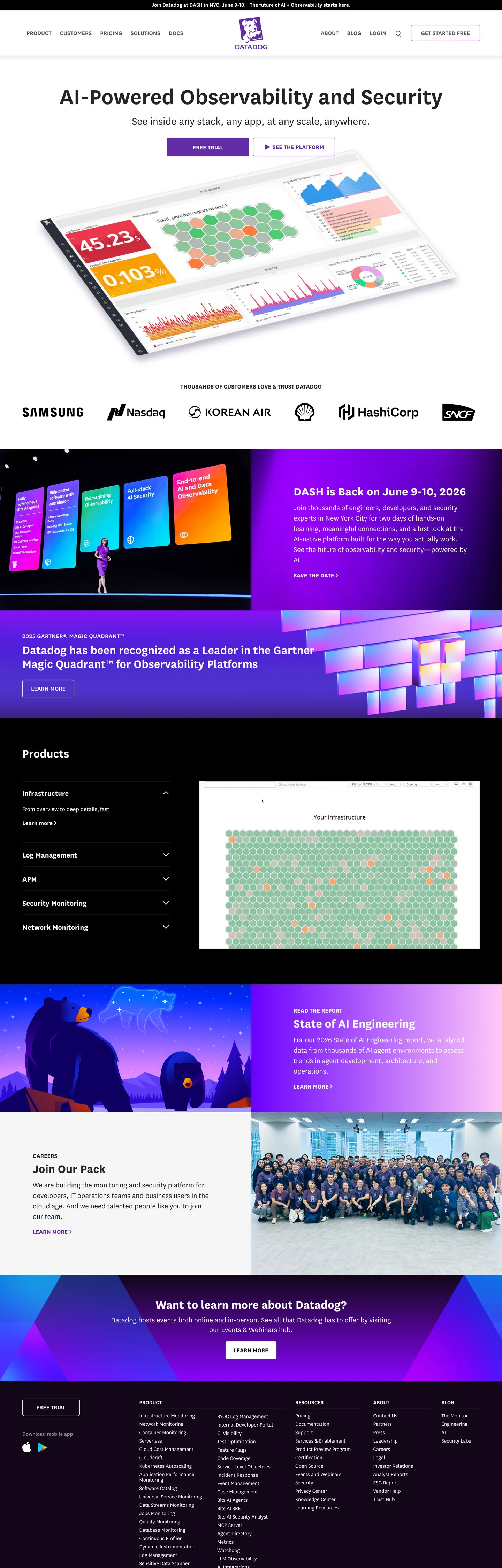
Datadog in production, as captured. Scroll the window to see the whole page.
15 colors
Datadog's system runs on #632ca6 as its primary voltage, used in 1 of 14 components. Type is set in NationalWeb across 11 tokens from 16px to 36px, weights 300–700. Shape language is sharp — components average 0px corner radius, favoring crisp rectangles.
Brand & Accent
Sparing, CTA-only voltage · 5
Surface
Page and card backgrounds · 3
Text
Headlines, body, captions · 3
Borders & Hairlines
Dividers, outlines, rules · 1
Semantic
Status, errors, success, links · 3
11 type tokens
Set in NationalWeb across 11 tokens, from 16px to 36px, weights 300–700. Shown in its own stack: where the font isn't installed, the fallback the file names stands in.
- display-xl36px · weight 700 · lh 40pxThe quick brown fox jumps over the lazy dog
- display-lg36px · weight 600 · lh 40pxThe quick brown fox jumps over the lazy dog
- heading-md22px · weight 700 · lh 28pxThe quick brown fox jumps over the lazy dog
- heading-sm22px · weight 300 · lh 30pxThe quick brown fox jumps over the lazy dog
- body-lg22px · weight 300 · lh 30pxThe quick brown fox jumps over the lazy dog
- body-md18px · weight 700 · lh 18pxThe quick brown fox jumps over the lazy dog
- body-sm18px · weight 300 · lh 22pxThe quick brown fox jumps over the lazy dog
- button-md18px · weight 700 · lh 18px · tracking 0.09pxThe quick brown fox jumps over the lazy dog
- nav-link18px · weight 600 · lh 25.7143pxThe quick brown fox jumps over the lazy dog
- label-md16px · weight 700 · lh 20pxThe quick brown fox jumps over the lazy dog
- caption16px · weight 300 · lh 16pxThe quick brown fox jumps over the lazy dog
Radii and spacing
4 corner radii and 8 spacing values. Shape language: sharp, on a 6px base radius.
Radii4
- none0px
- xs3px
- sm4px
- md6px
Spacing8
- xxs0px
- xs4px
- sm8.5px
- md12px
- lg20px
- xl40px
- 2xl48px
- 3xl15px
14 components
Each rendered from its tokens (color, type, radius, padding) on Datadog's own canvas.
- Button PrimaryButton Primarybutton-primary
- Button Primary HoverButton Primary Hoverbutton-primary-hover
- Button Primary ActiveButton Primary Activebutton-primary-active
- Button SecondaryButton Secondarybutton-secondary
- Button Secondary HoverButton Secondary Hoverbutton-secondary-hover
- Top NavTop Navtop-nav
- Nav LinkNav Linknav-link
- Nav Link HoverNav Link Hovernav-link-hover
- Hero HeadingHero Headinghero-heading
- Body ParagraphBody Paragraphbody-paragraph
- H2H2h2
- Type here…Text Inputtext-input
- Type here…Text Input Focustext-input-focus
- CardCardcard
The system, in use
Datadog's tokens on the kind of product it builds.
Plan, build and ship in one place
Bring your team's work together, from the first idea to the final release.
Datadog design system FAQ
Datadog's tokens, its components and how to use this DESIGN.md in your project.
What are the color tokens in the Datadog DESIGN.md?
What is Datadog's primary color hex code?
How do I use Datadog's colors in Tailwind CSS?
Datadog color usage for accents
What fonts does Datadog use?
What is Datadog's type scale?
What can I use if I don't have Datadog's font?
Datadog hero heading typography
Which components does the Datadog DESIGN.md define?
What corner radius and spacing does Datadog use?
Datadog primary button styling
Datadog navigation link design
Datadog spacing and radius system
How do I apply the Datadog design system to a shadcn/ui project?
How do I use the Datadog DESIGN.md with Claude Code or Cursor?
Is the Datadog DESIGN.md free to download?
How was the Datadog DESIGN.md made?
Is the Datadog DESIGN.md official?
Related reading
Specs, directories and component libraries that pair with this design system.
- Browse all design systemsThe full directory of DESIGN.md files on shadcn.io, with live mockups for each.shadcn.io
- Datadog — official siteDatadog's public marketing site — the source of truth for the live tokens captured in this file.datadoghq.com (opens in a new tab)
- The DESIGN.md specificationGoogle Labs' open spec for machine-readable design system files — the format this page is built on.github.com (opens in a new tab)
Use Datadog in your project
One machine-readable file. Drop it into Claude Code, Cursor, VS Code or any AI tool that reads DESIGN.md.
Download the DESIGN.md
One machine-readable file: every color, type, radius, spacing, and component token of Datadog.
Feed it to your AI tool
Drop it into Claude, Cursor, or GitHub Copilot. The agent writes React components and Tailwind classes that match Datadog's visual language.
Reference the tokens directly
Or paste the values into your Tailwind config, CSS variables, or component library: every color, size and radius is a quoted, ready-to-copy value.
Read the full DESIGN.md overview, rationale, do’s and don’ts
Overview
Datadog’s design system reads like a command‑center UI, where every element is tuned for rapid data consumption. The midnight canvas and violet voltage make alerts unmistakable, while the NationalWeb type family provides a familiar engineering feel.
Observability‑as‑canvas.
Unlike many SaaS products that sprinkle pastel accents over white space, Datadog treats the entire viewport as a live observability board. The contrast‑driven palette forces hierarchy without extra icons, and the 4 px grid locks metric tiles into place. This is not a decorative theme; it is a data‑first visual language that makes performance graphs and alert banners feel native.
Key Characteristics:
- Deep violet primary voltage on buttons, links, and accent ribbons.
- Midnight canvas background that amplifies white and gray text.
- NationalWeb typography ranging from 36 px display to 16 px captions, with weights from 300 to 700.
- 4 px baseline grid for padding, margin, and spacing utilities.
- Rounded corners at 4 px for most components, 6 px for cards.
- Button‑md token: 18 px, weight 700, 0.08 px letter‑spacing.
- Navigation links in muted gray with 8.5 px × 12 px × 9.5 px padding.
- Consistent use of ink‑muted gray for secondary text, preserving focus on primary data.
Known Gaps
- The current token set lacks explicit dark‑mode variants for the deep violet accent, requiring designers to manually adjust contrast for low‑light environments.
- Component documentation does not include usage examples for error or empty‑state cards, leaving developers to guess visual treatment for failure scenarios.
- No token definitions exist for animated transitions, so motion designers must create bespoke easing curves that may diverge from the system’s visual rhythm.
- Accessibility guidelines are minimal; there is no clear guidance on minimum touch target sizes beyond the primary button, which could affect mobile usability.
- The spacing table omits a dedicated token for large gutters used in multi‑column dashboard layouts, forcing ad‑hoc calculations that break the 4 px grid discipline.
More systems like this
Adobe, Boursorama, Bun and 23 more in Design & Creative Tools: each brand's colors, type and components in one file your AI agent builds from.
Build it with Pro
The DESIGN.md files are free. Pro adds 6,000+ blocks, premium templates and the MCP server, so your AI editor builds in your system for you.
4.9/5 out of 5 · 150+ reviewsfrom 150+ founders and developers.
Billing
Billed once a year in USD. Cancel anytime.
- How many people can use the license.
- Client work, SaaS products and anything you charge for.
- Page sections in 56 categories, from heroes and pricing tables to dashboards and settings, on every framework and UI library, in your theme.
- Complete Next.js sites for startups, SaaS, agencies and portfolios, every page designed, ready to ship.
- Your AI agent searches, previews and installs any component, block, icon or DESIGN.md from a prompt: 22 tools in Claude Code, Cursor, VS Code and 35 more clients.
- Buttons with motion and states of their own, from an arrow that slides in to a burst of confetti.
- Typewriters, scrambles, counters and more, for headlines, labels and numbers.
- Animated backgrounds for heroes, sections and cards, from a soft aurora to a flock that flees the cursor. Most are pure CSS.
- WebGPU shaders, from a slow aurora to a black hole, each drawing only while it's on screen.
- One design and one theme on all four: the components, blocks and effects are built for each framework.
- React on Base UI, Radix UI, React Aria or Ark UI: install the version for the library your project already uses. Vue, Svelte and Solid run on Ark UI.
- From a button to a date picker, a color picker or a guided tour: accessible, typed in TypeScript, each with live demos.
- Real-world patterns built from the components, in 53 galleries: forms, tables, menus, dialogs and more.
- Area, bar, line, pie, radar and radial charts on TanStack Charts, on every framework. React also gets the Recharts originals.
- Debounce, local storage, media queries and more: each hook is one typed file you own.
- From 222 libraries, Lucide, Heroicons, Tabler and Material Symbols among them, as SVG or a React component in one command.
- Stripe, Linear, Apple and 497 more: a brand's colors, typography and components in one file your AI agent builds from.
- Restyle every component and block at once: 8 styles, 7 grays, 18 colors and 5 radii, shared as a shadcn preset code.
- Priority requests are answered first.
Individual
For personal projects & open source
$32instead of $49/mo
$389 billed yearly
- Seats: 1 seat
- Commercial use: Personal & open source only
- Blocks: All 6,181 blocks
- Templates: All 14 templates
- MCP server: 38 AI clients
- Animated buttons: All 35 buttons
- Text effects: All 97 effects
- Backgrounds: All 100 backgrounds
- Shaders: All 100 shaders
- Frameworks: React, Vue, Svelte, Solid
- UI libraries: Base UI, Radix, Aria, Ark
- Components: All 174 components
- Examples: All 1,103 examples
- Charts: All 70 charts
- React hooks: All 35 hooks
- Icons: 294k+ icons
- DESIGN.md files: All 500 brands
- Theme builder: 8 styles × 18 colors
- Support: Standard
Team
Most popularFor freelancers, agencies & startups
$66instead of $99/mo
$789 billed yearly · ≈ $13/dev/mo
- Seats: Up to 5 seats
- Commercial use: Included
- Blocks: All 6,181 blocks
- Templates: All 14 templates
- MCP server: 38 AI clients
- Animated buttons: All 35 buttons
- Text effects: All 97 effects
- Backgrounds: All 100 backgrounds
- Shaders: All 100 shaders
- Frameworks: React, Vue, Svelte, Solid
- UI libraries: Base UI, Radix, Aria, Ark
- Components: All 174 components
- Examples: All 1,103 examples
- Charts: All 70 charts
- React hooks: All 35 hooks
- Icons: 294k+ icons
- DESIGN.md files: All 500 brands
- Theme builder: 8 styles × 18 colors
- Support: Priority
Organization
For companies with larger teams
$132instead of $199/mo
$1,589 billed yearly
- Seats: Unlimited seats
- Commercial use: Included
- Blocks: All 6,181 blocks
- Templates: All 14 templates
- MCP server: 38 AI clients
- Animated buttons: All 35 buttons
- Text effects: All 97 effects
- Backgrounds: All 100 backgrounds
- Shaders: All 100 shaders
- Frameworks: React, Vue, Svelte, Solid
- UI libraries: Base UI, Radix, Aria, Ark
- Components: All 174 components
- Examples: All 1,103 examples
- Charts: All 70 charts
- React hooks: All 35 hooks
- Icons: 294k+ icons
- DESIGN.md files: All 500 brands
- Theme builder: 8 styles × 18 colors
- Support: Priority
Billed once a year in USD. Cancel anytime.
Individual
For personal projects & open source
$32instead of $49/mo
$389 billed yearly
- How many people can use the license.Seats: 1 seat
- Client work, SaaS products and anything you charge for.Commercial use: Personal & open source only
- Page sections in 56 categories, from heroes and pricing tables to dashboards and settings, on every framework and UI library, in your theme.Blocks: All 6,181 blocks
- Complete Next.js sites for startups, SaaS, agencies and portfolios, every page designed, ready to ship.Templates: All 14 templates
- Your AI agent searches, previews and installs any component, block, icon or DESIGN.md from a prompt: 22 tools in Claude Code, Cursor, VS Code and 35 more clients.MCP server: 38 AI clients
- Buttons with motion and states of their own, from an arrow that slides in to a burst of confetti.Animated buttons: All 35 buttons
- Typewriters, scrambles, counters and more, for headlines, labels and numbers.Text effects: All 97 effects
- Animated backgrounds for heroes, sections and cards, from a soft aurora to a flock that flees the cursor. Most are pure CSS.Backgrounds: All 100 backgrounds
- WebGPU shaders, from a slow aurora to a black hole, each drawing only while it's on screen.Shaders: All 100 shaders
- One design and one theme on all four: the components, blocks and effects are built for each framework.Frameworks: React, Vue, Svelte, Solid
- React on Base UI, Radix UI, React Aria or Ark UI: install the version for the library your project already uses. Vue, Svelte and Solid run on Ark UI.UI libraries: Base UI, Radix, Aria, Ark
- From a button to a date picker, a color picker or a guided tour: accessible, typed in TypeScript, each with live demos.Components: All 174 components
- Real-world patterns built from the components, in 53 galleries: forms, tables, menus, dialogs and more.Examples: All 1,103 examples
- Area, bar, line, pie, radar and radial charts on TanStack Charts, on every framework. React also gets the Recharts originals.Charts: All 70 charts
- Debounce, local storage, media queries and more: each hook is one typed file you own.React hooks: All 35 hooks
- From 222 libraries, Lucide, Heroicons, Tabler and Material Symbols among them, as SVG or a React component in one command.Icons: 294k+ icons
- Stripe, Linear, Apple and 497 more: a brand's colors, typography and components in one file your AI agent builds from.DESIGN.md files: All 500 brands
- Restyle every component and block at once: 8 styles, 7 grays, 18 colors and 5 radii, shared as a shadcn preset code.Theme builder: 8 styles × 18 colors
- Priority requests are answered first.Support: Standard
Team
Most popularFor freelancers, agencies & startups
$66instead of $99/mo
$789 billed yearly · ≈ $13/dev/mo
Everything in Individual, plus
- How many people can use the license.Seats: Up to 5 seats
- Client work, SaaS products and anything you charge for.Commercial use: Included
- Priority requests are answered first.Support: Priority
Organization
For companies with larger teams
$132instead of $199/mo
$1,589 billed yearly
Everything in Team, plus
- How many people can use the license.Seats: Unlimited seats
- Secure checkout via Stripe
- Code lives in your repo
- Keep what you've shipped if you cancel
- License terms
4.9 out of 5 from 150+ developers


Your system, built for you
Every block, template and icon, installed by your AI agent in your design system. The DESIGN.md files stay free.
- Cancel anytime
- Keep what you've shipped