Make your AI a shadcn expert

Mem Design System

Mem's marketing system pairs a 90px Ritual VF Variable display headline in deep indigo with pill-rounded illustration tiles at 100px radius on a warm cream canvas.

About Mem DESIGN.md

Curated by Dov AzencotUpdated Source get.mem.ai

  • Productivity & SaaS
  • AI & LLM Platforms

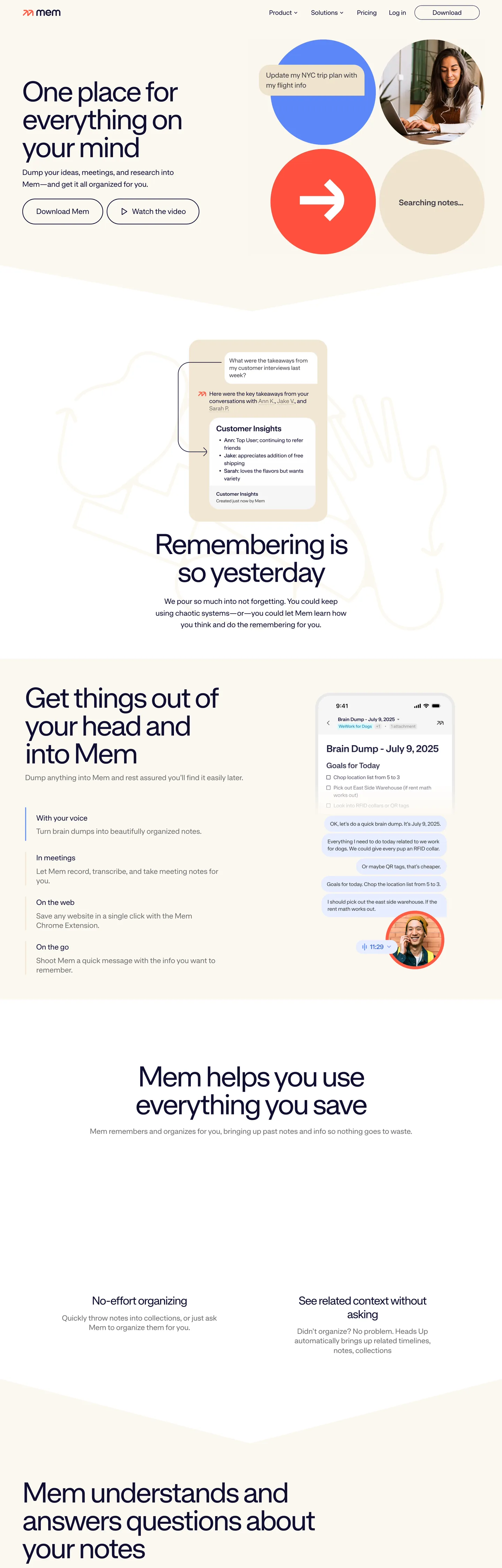
Mem's recent rebrand commits to a move that no other AI productivity tool in the directory makes: editorial-romantic. The hero is a 90px Ritual VF Variable display headline ("A match for great minds") in deep indigo on a warm cream canvas, with the descender of the y dropping below the baseline of the next line as if it were typeset in a literary quarterly. To the right of the headline, a 2x2 grid of pill-rounded illustration tiles — a cobalt circle, a terracotta square with an arrow, a warm cream notepad, and a small portrait photograph — sit at a 100px corner radius that turns them into pebbles. There is no CTA inside the hero band; the visitor scrolls.

The DESIGN.md file captures the system as a token spec for React tooling. Inside: 6 color tokens (Mem deliberately runs a minimal palette — there is essentially no brand-blue voltage in the chrome), 9 typography tokens all on Ritual VF Variable at weight 400, a 3-step radius scale anchored at 100px pill, a 10px-based spacing system, and 12 component definitions covering the pill-illustration tile, the editorial display heading, the indigo body paragraph, and the no-chrome top nav. The single most distinctive token absence: there is no styled link color. Mem leaves the browser default #0000ee on text links.

Feed this file to an AI coding tool and it reproduces the specific moves: 90px / 80px display headlines on the same single sans-serif, weight 400 across every tier, indigo-on-cream contrast instead of black-on-white, 100px pebble-pill tiles instead of rectangular cards, and the disciplined refusal to style link colors. Borrow the geometry and the typeface restraint freely. The one move to think twice about is the unstyled link color — Mem gets away with it because the editorial composition of the page reframes the default-blue as a typographic choice; on a more conventional layout it would just read as forgotten styling.

What makes it distinct

  1. Browser-default link blueMem deliberately leaves text links at #0000ee, the literal browser default, instead of styling them in a brand color
  2. Ritual VF Variable at one weightweight 400 across every tier from the 90px hero headline to 16px body, no bold variant anywhere on the page
  3. 100px pill geometry on tilesillustration cards use a 100px corner radius that makes them read as soft pebbles rather than rectangles
  4. Warm cream canvasthe page reads as warm cream because the illustration tiles, fonts, and indigo ink all carry warm undertones over a literal white canvas
  5. Indigo ink for everythingdeep indigo carries headline, body, and nav at a single tone, not a tiered ink ladder

Live at get.mem.ai

A snapshot of the brand in production. Hover the frame to scroll the page; click to visit.

Screenshot of Mem's website at get.mem.aiget.mem.ai

Explore Mem

Pick what you want to see — mockups, colors, typography, layout, or the full component list.

Surface

Page and card backgrounds.

Text

Headlines, body, captions, muted.

Mem design system FAQ

Common questions about Mem's tokens, components, and how to use this DESIGN.md in your project.

Specs, directories, and component libraries that pair with this design system.

Use Mem in your project

One machine-readable file. Drop it into Claude, Cursor, or any AI tool that reads DESIGN.md.

Download DESIGN.md