The New Yorker Design System
The New Yorker's marketing system as a DESIGN.md file.
About The New Yorker DESIGN.md
Curated by Dov AzencotUpdated Source newyorker.com
- News & Publishing
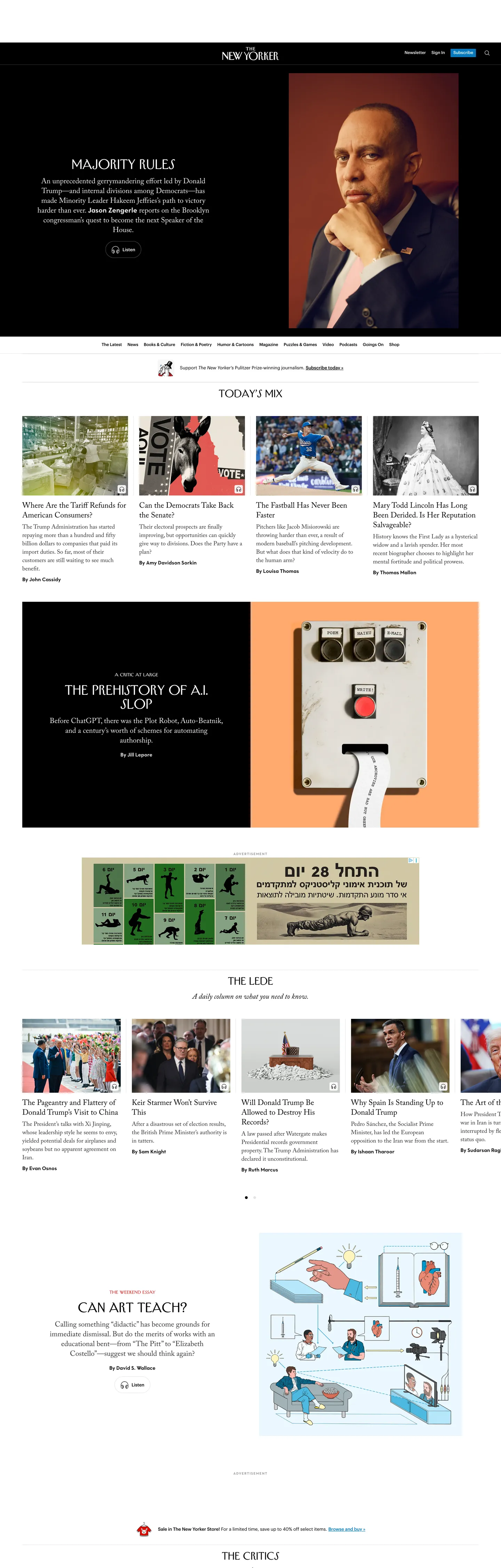
The New Yorker's website does something almost no contemporary news brand does: it sets its body copy in a true Old Style serif at 21px with a 31.5px line height, and trusts the reader to settle into a print cadence on a backlit screen. The Adobe Caslon Pro that runs every story dek and pull quote is the same family the magazine has used in print for decades; the in-house Irvin face that titles every section is cut from Rea Irvin's 1925 lettering for the masthead. Where The Atlantic moved to a custom geometric sans and The New York Times softened its serif into a screen-tuned variant, The New Yorker held the line — the body face is Caslon, period, and the size is editorial, not utility.
The DESIGN.md file packages the system into a machine-readable spec for React tooling. Inside: 7 color tokens drawn from a near-monochrome palette — ink black, soft gray text, hairline divider gray, a single editorial red lit at one breaking-news strip, white canvas, and the muted body gray for secondary text. 12 typography tokens cover the three proprietary serif and serif-display families (Caslon, Irvin, Neutraface) plus Graphik for utility chrome. 4 corner-radius tokens centered on 0px — every editorial surface is square; the only rounding belongs to the cookie banner overlay at 4px. 18 component definitions cover the masthead lockup, the bordered top-nav, the editorial article tile, the small-caps category eyebrow, the named-author byline, the photograph plate (always 0 radius, no shadow), and the single accent breaking-news strip.
Feed this file to an AI coding tool and it reproduces the moves that distinguish a magazine-on-screen from a news blog: serif body type at print size, three-tier display hierarchy rather than two, hairline-only dividers in place of cards, square corners on every editorial surface, and a single accent color reserved for genuinely urgent moments. The one move worth borrowing only if you have a 99-year typographic identity to draw from: the willingness to set a 21px serif as your default running text. Most teams need the 16px sans because their content is read rather than savored.
What makes it distinct
- Caslon body at 21pxthe running text is a serif at print magazine size, not the 16px sans every news site uses; reading rhythm matches the print edition
- Three proprietary faces, one workhorseAdobe Caslon Pro, Irvin, and Neutraface New Yorker each own a tier; Graphik handles only nav, captions, and footer
- Editorial red used once#db3334 lights a single breaking-news strip; the rest of the page is ink-on-cream with no chromatic competition
- Hairline-only dividerssection breaks come from 1px #e5e5e5 rules rather than card surfaces; the page reads as a continuous broadsheet
- Square corners across the systembuttons sit at 4px max, photographs at 0px; rounded radii belong to the cookie banner overlay, not the editorial chrome
Live at newyorker.com
A snapshot of the brand in production. Hover the frame to scroll the page; click to visit.
newyorker.comExplore The New Yorker
Pick what you want to see — mockups, colors, typography, layout, or the full component list.
Brand & Accent
Sparing, CTA-only voltage.
Surface
Page and card backgrounds.
Text
Headlines, body, captions, muted.
Borders & Hairlines
Dividers, outlines, structural rules.
The New Yorker design system FAQ
Common questions about The New Yorker's tokens, components, and how to use this DESIGN.md in your project.
Related reading
Specs, directories, and component libraries that pair with this design system.
Browse all design systems
The full directory of DESIGN.md files on shadcn.io, with live mockups for each.
The New Yorker — official site
The New Yorker's public marketing site — the source of truth for the live tokens captured in this file.
The DESIGN.md specification
Google Labs' open spec for machine-readable design system files — the format this page is built on.