Make your AI a shadcn expert

Pitchfork Design System

Pitchfork's home page as a DESIGN.md file.

About Pitchfork DESIGN.md

Curated by Dov AzencotUpdated Source pitchfork.com

  • News & Publishing
  • Music, Video & Streaming

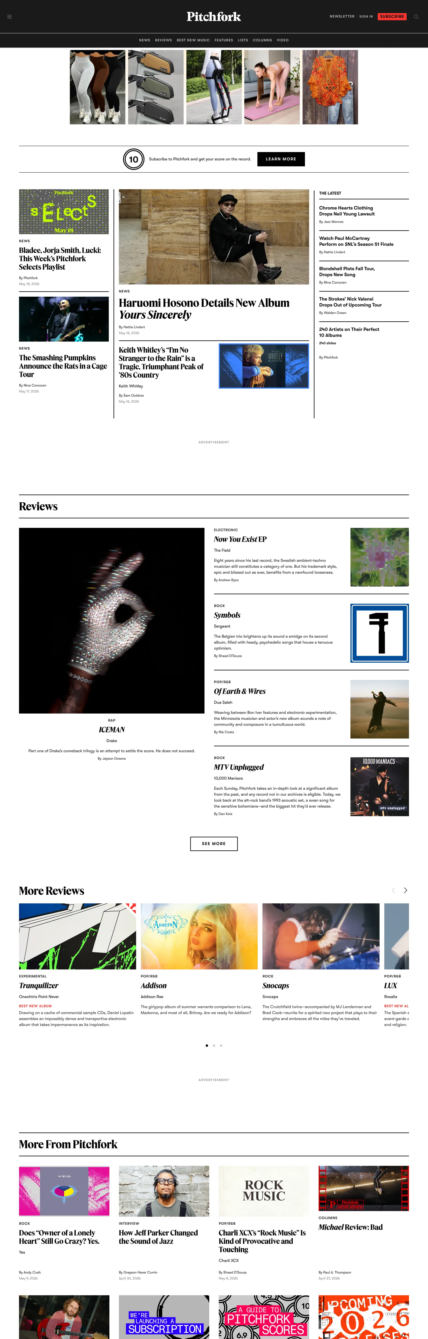
Pitchfork's home page is the rare music-publication site that does not behave like a music-product site. There is no dark canvas, no gradient hero, no large now-playing card, no album-of-the-week takeover. The page floor is pure white, the ink is pure black (#000000), and every chromatic moment on the page comes from the album-art thumbnails sitting inside a tight five-column wire-service grid. Where Apple Music throws a radial gradient under a 128px display headline and Bandcamp lets cover art bleed into a saturated brand wash, Pitchfork puts the artwork inside a hairline-edged tile and keeps the editorial chrome monochrome. The result reads like the front page of a print music section rather than a streaming surface.

The DESIGN.md file packages the captured tokens for React tooling. Inside: ten color tokens (six neutrals from pure black through #b3b3b3 gray to pure white, the saturated red badge accent #ff3530, the deep #2b2b2b primary, the soft #1a1a1a near-black, and a single warm #eeeeee surface). Two typefaces: FeatureFlatDisplay for every editorial headline (24–36px at weight 700) and Walfork for every body, label, byline, and nav link (11–16px at weights 400 and 600). The radius scale collapses to 1px — there is essentially no rounded geometry on the page. Spacing runs on a 4 / 8 / 16 / 32 / 64 ladder, and fourteen component definitions cover the album-tile, the "Best New Music" red badge, the hard-edged black CTA button, the uppercase kicker label, and the top-nav.

Feed this file to Claude, Cursor, or any agent that reads structured design tokens and it will reproduce Pitchfork's specific moves: pure-white canvas instead of a faint cream, hard 1px corners instead of the 8–16px softness that consumer-media sites lean on, uppercase Walfork small-caps as the universal label tier, and the red badge held in extreme scarcity so the BNM stamp keeps its weight. The single move worth borrowing for any editorial product: let the cover-art grid carry the chroma and starve the brand chrome of color. The harder move is restraint — most teams add a tinted hero band the moment they have one to spare.

What makes it distinct

  1. Album-art as voltagethe cover thumbnails carry the page's chromatic load, the brand chrome stays pure black on white
  2. Single red flag#ff3530 is reserved for the BNM badge and Listen tag, two surfaces total in the captured page
  3. FeatureFlatDisplay 36px / 700the editorial display tier, no second display family, no script or serif accent
  4. Walfork uppercase labels11–14px small-caps with 0.825–1.75px tracking does every kicker, byline, and category tag
  5. 1px roundingthe only radius in the captured CSS is 1px; cards, buttons, and inputs all sit at hard right angles

Live at pitchfork.com

A snapshot of the brand in production. Hover the frame to scroll the page; click to visit.

Screenshot of Pitchfork's website at pitchfork.compitchfork.com

Explore Pitchfork

Pick what you want to see — mockups, colors, typography, layout, or the full component list.

Brand & Accent

Sparing, CTA-only voltage.

Surface

Page and card backgrounds.

Text

Headlines, body, captions, muted.

Borders & Hairlines

Dividers, outlines, structural rules.

Pitchfork design system FAQ

Common questions about Pitchfork's tokens, components, and how to use this DESIGN.md in your project.

Specs, directories, and component libraries that pair with this design system.

Use Pitchfork in your project

One machine-readable file. Drop it into Claude, Cursor, or any AI tool that reads DESIGN.md.

Download DESIGN.md