Make your AI a shadcn expert

POLITICO Design System

POLITICO's homepage as a DESIGN.md file.

About POLITICO DESIGN.md

Curated by Dov AzencotUpdated Source politico.com

  • News & Publishing

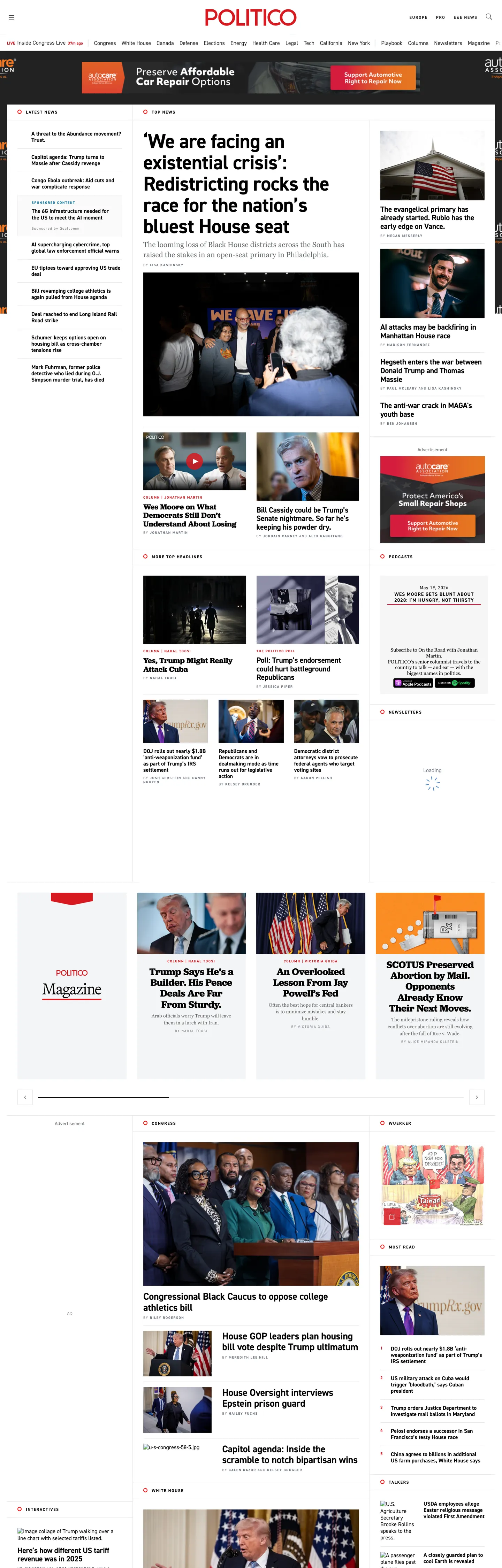
POLITICO's homepage looks like a wire-service newspaper rendered at desktop scale. The crimson POLITICO wordmark sits centered at the top of the page on a pure-white canvas; below it, a dense grid of photo-led story cards is separated by 1px hairline rules in a warm graphite gray, with no card carrying any corner radius. The hero article runs at 58px in DIN 2014 weight 700 with tight -0.96px tracking, while every section kicker above it ("WASHINGTON & POLITICS", "CONGRESS", "MAGAZINE") is set in 12px DIN 2014 UPPERCASE at 1.6px tracking and rendered in the brand's crimson red. The red never appears on a button or a primary action — it is reserved for masthead and kicker work, the way crimson reads on the front page of a print broadsheet.

The DESIGN.md file packages the system into a structured spec. Inside: 10 color tokens organized around a pure-white canvas, ink black for body type, a warm graphite gray that does both running-text and hairline-rule duty, and the crimson wordmark voltage; 11 typography tokens running DIN 2014 condensed grotesk at every tier (10px UPPERCASE kickers through 58px hero headlines), plus a small Jubilat serif tier scoped to the Magazine promo block; a deliberately tiny radius scale (the page's only rounded shape is a 50% circle for icon buttons); a spacing scale built on a 15px base; and 14 component definitions covering the hairline newspaper card, the UPPERCASE section kicker, the live-flag pill, the inline byline row, and the simple-text top-nav.

Feed this file to Claude, Cursor, or any AI coding agent that reads structured tokens and it reproduces POLITICO's specific moves: square cards on a pure-white floor, crimson scoped to masthead-and-kicker duty, DIN 2014 carrying every typographic tier, and the print-broadsheet hairline grid. The token references resolve without invention. The one disciplined move worth borrowing only if you are building a wire-service or daily-news product: the willingness to let the brand color stay out of the CTA layer entirely. POLITICO's red works because the page never asks it to also signal "click here" — it signals "this is the front page."

What makes it distinct

  1. Brand red as masthead onlycrimson appears 99 times but never on a CTA, reserved for the wordmark, section kickers, and a single LIVE flag
  2. DIN 2014 across every tierdisplay headlines, navigation, body, and tiny UPPERCASE kickers all run the same condensed grotesk in three weights
  3. Tracked-UPPERCASE metadata10-12px DIN 2014 at 1.6px tracking carries every section label, byline, and timestamp on the page
  4. Square hairline gridcorner radius is zero on every card; the page is divided by 1px graphite rules in warm gray rather than rounded surfaces
  5. Jubilat serif as feature-only signalGeorgia/Jubilat appears just 12 times, scoped to the Magazine block, so the serif reads as a longform-feature flag against the daily-news grotesk

Live at politico.com

A snapshot of the brand in production. Hover the frame to scroll the page; click to visit.

Screenshot of POLITICO's website at politico.compolitico.com

Explore POLITICO

Pick what you want to see — mockups, colors, typography, layout, or the full component list.

Brand & Accent

Sparing, CTA-only voltage.

Surface

Page and card backgrounds.

Text

Headlines, body, captions, muted.

Borders & Hairlines

Dividers, outlines, structural rules.

POLITICO design system FAQ

Common questions about POLITICO's tokens, components, and how to use this DESIGN.md in your project.

Specs, directories, and component libraries that pair with this design system.

Use POLITICO in your project

One machine-readable file. Drop it into Claude, Cursor, or any AI tool that reads DESIGN.md.

Download DESIGN.md