About ProPublica DESIGN.md
Curated by Dov AzencotUpdated Source propublica.org
- News & Publishing
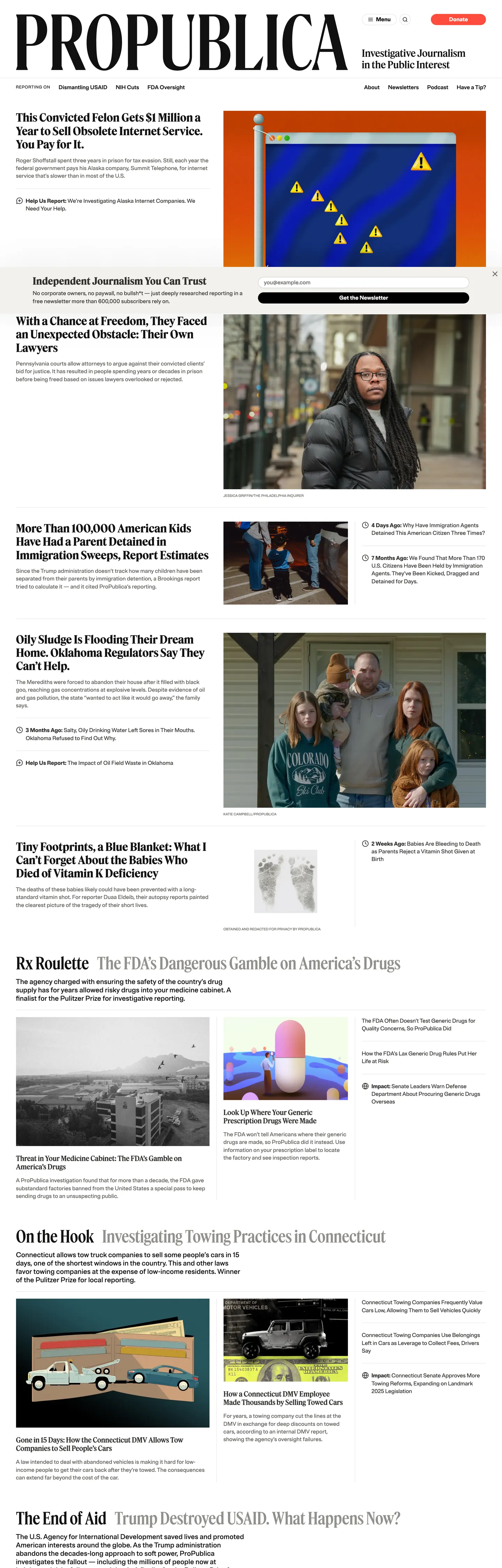
ProPublica's homepage does something most news organizations have abandoned in the age of attention-maximizing feeds: it acts like a newspaper front page. The logotype "PROPUBLICA" renders large and plain in Brut Grotesque at the masthead, the story grid below it uses a strict 14-column rule, and the only chromatic brand signal on the entire page is the salmon-red pill that says "Donate" — 16 total occurrences, all background fills, all on that one element. Where the New York Times uses its corporate blue for links and section labels, and where Axios saturates every hed with a bold accent, ProPublica reserves its brand voltage for the one financial ask that keeps the newsroom alive and nowhere else.
The DESIGN.md file packages the system into a machine-readable spec for React and AI tools. Inside: 12 color tokens organized into a brand tier (one salmon-red voltage), a structural tier of warm neutrals stepping from near-black warm-black through charcoal, mid-gray, and warm-white, and a semantic tier of two blue link tones. Fourteen typography tokens span two families — Feature Headline (a display serif) and Brut Grotesque (a grotesque sans) — across a range from a 12px/800 uppercase label up to a 120px/500 editorial numeral. The grid is 14-column at 3.7rem columns with 2.5rem gutters, and vertical rhythm steps in 2rem increments.
Feed this file to Claude or Cursor and it reproduces ProPublica's specific moves: warm-toned neutrals instead of cool grays, a serif-for-editorial-content and grotesque-for-chrome split, and a single held-in-reserve brand accent that appears only on the donate button. The one disciplined move worth borrowing regardless of editorial context: the two-family split where the sans handles all chrome (nav, bylines, timestamps, labels) and the serif handles all content (heds, deks, article bodies). It enforces a visual hierarchy without requiring color.
What makes it distinct
- Serif display hierarchyFeature Headline at 48px weight 500 anchors every story hed; a second weight-700 variant at 32px handles section fronts
- Single salmon-red voltagethe brand color appears exactly 16 times, all as background fills on the donate CTA pill; every other chromatic moment comes from editorial photography
- Brut Grotesque as chrome voiceall navigation, bylines, timestamps, and category labels run in the grotesque; the serif is editorial-only
- Warm-toned neutralsthe palette steps from near-black warm-black through charcoal, mid-gray, and warm-white; no cool grays or pure whites in the editorial surface
- 120px editorial numerala Feature Headline display numeral at weight 500 appears as a section count device, the loudest single typographic moment on the page
Live at propublica.org
A snapshot of the brand in production. Hover the frame to scroll the page; click to visit.
propublica.orgExplore ProPublica
Pick what you want to see — mockups, colors, typography, layout, or the full component list.
Brand & Accent
Sparing, CTA-only voltage.
Surface
Page and card backgrounds.
Text
Headlines, body, captions, muted.
Borders & Hairlines
Dividers, outlines, structural rules.
ProPublica design system FAQ
Common questions about ProPublica's tokens, components, and how to use this DESIGN.md in your project.
Related reading
Specs, directories, and component libraries that pair with this design system.
Browse all design systems
The full directory of DESIGN.md files on shadcn.io, with live mockups for each.
ProPublica — official site
ProPublica's public site — the source of truth for the live tokens captured in this file.
The DESIGN.md specification
Google Labs' open spec for machine-readable design system files — the format this page is built on.