Semafor Design System
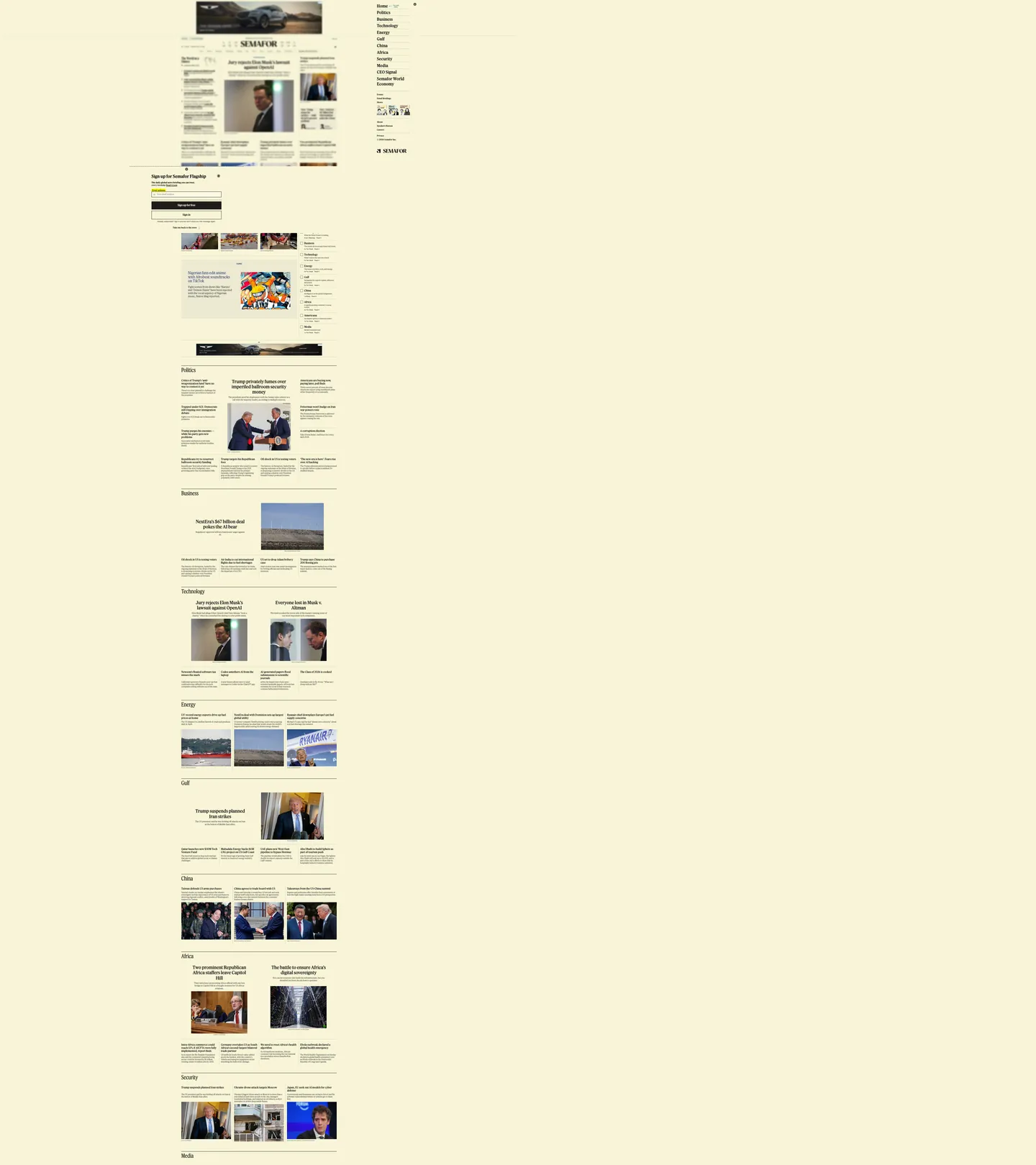
Semafor's homepage as a DESIGN.md file — warm cream canvas, Feature Flat serif throughout, no chromatic accents, and the Semaform editorial split.
About Semafor DESIGN.md
Curated by Dov AzencotUpdated Source semafor.com
- News & Publishing
Semafor's homepage commits to a single chromatic decision that no contemporary news startup makes. The entire page renders on a warm cream canvas #fffaeb — a yellow-tinted off-white that traditional broadsheets used for a century when their paper was actual newsprint, and that almost every digital-native publisher abandoned for either pure white or a dark canvas. The cream is wired into the brand's CSS as `--theme-color` and is also declared on the meta tag (#f8f5d7) so the browser tints the address bar to match. There is no marketing hero, no rotating cover image, no full-bleed photograph, no chromatic accent anywhere in the visible chrome — just the engraved "SEMAFOR" wordmark at top, the cream backdrop that fades to a slightly-deeper yellow at the page edges through a 118-occurrence gradient, and a packed multi-column story grid where every headline links to an article rendered in the publication's signature "Semaform" format.
The DESIGN.md file packages the system into a machine-readable spec for React tooling. Inside: 9 color tokens organized around the cream canvas #fffaeb (149 occurrences — 29 background, 1 text, 1 border, and 118 inside the page-edge gradient), an off-black ink ladder of #1f1d1a (465 occurrences, the dominant headline color) and #4b4a47 (1096 occurrences, the dominant body and metadata color), pure #000000 (375 occurrences) for hairline borders, and a single muted teal #3a6d78 reserved for editorial-section accents. Twelve typography tokens cover Feature Flat Headline at 13 / 15 / 16 / 20 / 24 / 31 / 34px in weights 180 / 300 / 370 / 395 / 400, plus Feature Flat Condensed at 42px for the section-bar treatments. Fifteen components describe the wordmark, the section-bar headers, the story-headline row, the dek paragraph, the Semaform-format article preview, the newsletter signup, and the hairline-divided sidebar nav.
Feed this file to an AI coding tool and it reproduces Semafor's specific moves: cream canvas #fffaeb instead of pure white or dark, Feature Flat serif across every tier, variable-weight serif type that runs at 180 / 370 / 395 instead of the traditional 400 / 700 step, right-angled chrome with no pill-rounded section chips, and the Semaform editorial split that organizes article previews into "The News" / "The View from" / "Notable" sections. The one move worth borrowing for any editorial product: the willingness to commit to a single warm canvas color and stop adding accent colors entirely. Most publishers reach for at least one brand accent for the CTA; Semafor trusts the cream backdrop and the Feature Flat serif to carry the entire identity.
What makes it distinct
- Cream-canvas-as-systemthe warm yellow #fffaeb that runs the entire page is the brand chrome, not a marketing accent; the system's only chromatic move
- Feature Flat serif throughoutevery headline, body paragraph, byline, and nav label runs the proprietary Feature Flat serif family at weights 180-395
- Variable-weight serif headlinesweight 370 is the workhorse, weight 180 the lightest body tier, weight 395 the heaviest emphasis; no traditional 400/700 step
- Right-angled chromeevery surface is right-angled or 2-5px softened; the cream canvas does the work that pill chips and rounded cards do on peer sites
- Variable headline scaledisplay headlines run 24 / 31 / 34 / 42px in Feature Flat Headline and Feature Flat Condensed, the condensed variant marking the section bars
Live at semafor.com
A snapshot of the brand in production. Hover the frame to scroll the page; click to visit.
semafor.comExplore Semafor
Pick what you want to see — mockups, colors, typography, layout, or the full component list.
Brand & Accent
Sparing, CTA-only voltage.
Surface
Page and card backgrounds.
Text
Headlines, body, captions, muted.
Borders & Hairlines
Dividers, outlines, structural rules.
Other
Specialty colors.
Semafor design system FAQ
Common questions about Semafor's tokens, components, and how to use this DESIGN.md in your project.
Related reading
Specs, directories, and component libraries that pair with this design system.
Browse all design systems
The full directory of DESIGN.md files on shadcn.io, with live mockups for each.
Semafor — official site
Semafor's public homepage — the source of truth for the live tokens captured in this file.
The DESIGN.md specification
Google Labs' open spec for machine-readable design system files — the format this page is built on.