About The Cut DESIGN.md
Curated by Dov AzencotUpdated Source thecut.com
- News & Publishing
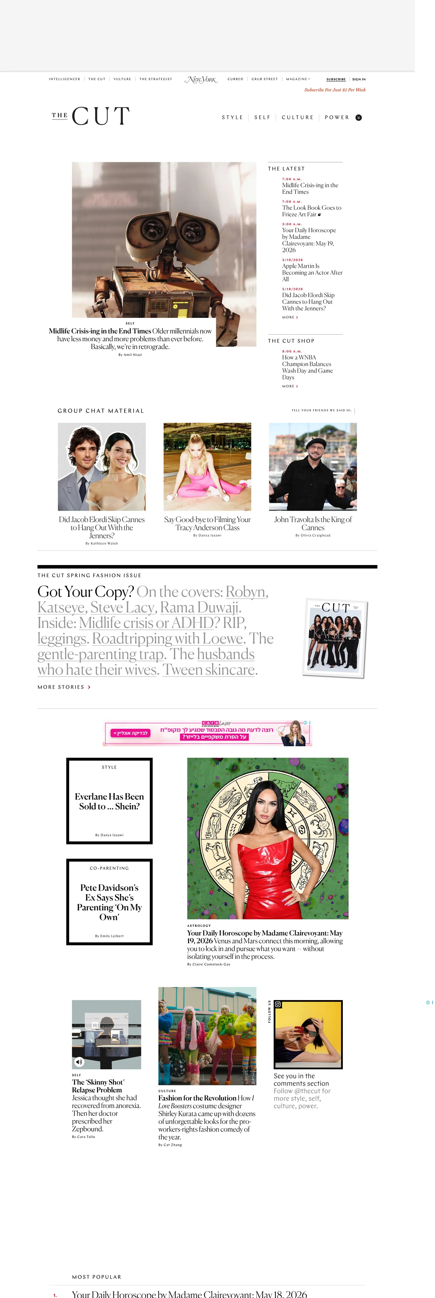
The Cut's homepage is more fashion editorial than news front. Canela, a variable-weight display serif, runs every headline at weight 300 — a deliberate choice that makes the type feel closer to a Vogue cover hed than to a Times front page. Most editorial serif systems sit at 400 or 500; The Cut's 300 weight is the defining typographic move, producing headlines that feel drawn rather than set. Chap, the geometric grotesque that runs all chrome, amplifies the contrast: where Canela is light and flowing, Chap appears exclusively in uppercase with generous letter-spacing, reading as a category label from a fashion archive rather than a navigation item.
The DESIGN.md file packages the system into a machine-readable spec for React and AI tools. Inside: 8 color tokens drawn from a pure black-and-white chromatic system, with a single crimson accent at 12 occurrences for section-specific labels. No CSS custom properties are exposed — the system is typographically rather than tokenistically organized. Ten typography tokens span two families, Canela and Chap, across display sizes from 20px to 52px and label sizes from 10px to 18px. The radius scale has a single entry: 50% for avatar circles. The spacing system is generous, with 50–70px section gaps that give the image grid room to breathe.
Feed this file to Claude or Cursor and it reproduces The Cut's specific moves: Canela weight 300 for display, Chap uppercase for labels, a black-and-white chromatic system that treats photography as the only color event, and generous inter-section spacing that frames each image cluster as its own editorial moment. The principle worth borrowing in any image-forward editorial context: suppress typographic weight until the type feels like a caption for the photography, not a competitor to it.
What makes it distinct
- Canela at weight 300display headlines run in an editorial serif at an unusually light weight; the lightness reads high-fashion rather than journalistic authority
- All-uppercase Chap everywhereevery navigation link, category label, timestamp, and button runs in uppercase spaced Chap; the grotesque and the serif never share a case convention
- Pure black-and-white chromeno CSS custom properties, no tinted surfaces; the entire layout system runs on ink black and page white with a single crimson accent for section labels
- Sparse radius scaleone value in the entire system, 50% for avatar circles; every card, image, and layout container is flush-edge
- Photography as herothe front page is a grid of editorial images with minimal typographic chrome; the type exists to credit and categorize the images, not to compete with them
Live at thecut.com
A snapshot of the brand in production. Hover the frame to scroll the page; click to visit.
thecut.comExplore The Cut
Pick what you want to see — mockups, colors, typography, layout, or the full component list.
Surface
Page and card backgrounds.
Text
Headlines, body, captions, muted.
Other
Specialty colors.
The Cut design system FAQ
Common questions about The Cut's tokens, components, and how to use this DESIGN.md in your project.
Related reading
Specs, directories, and component libraries that pair with this design system.
Browse all design systems
The full directory of DESIGN.md files on shadcn.io, with live mockups for each.
The Cut — official site
The Cut's public site — the source of truth for the live tokens captured in this file.
The DESIGN.md specification
Google Labs' open spec for machine-readable design system files — the format this page is built on.