Make your AI a shadcn expert

The Information Design System

The Information's marketing site as a DESIGN.md file — magenta CTA on a black-on-white broadsheet canvas, four Suisse fonts pulling separate jobs, no rounded corners anywhere exce…

About The Information DESIGN.md

Curated by Dov AzencotUpdated Source theinformation.com

  • News & Publishing

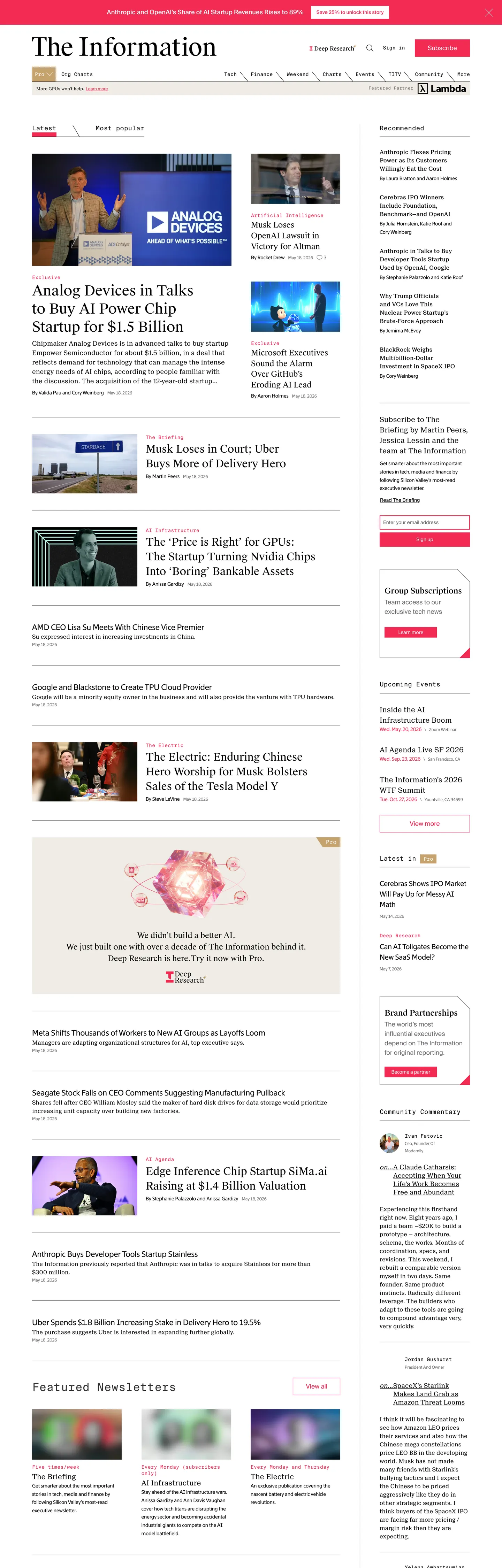
The Information's marketing site is composed like a printed broadsheet that happens to load in a browser. The above-fold band stacks a black masthead, a thin horizontal nav rendered entirely in mono small caps, and a three-column story grid: a lead story with a 40px Suisse Works display headline, a four-up cluster of secondary headlines in the same family, and a right rail of subscriber-only callouts in muted gray. Every column is divided from its neighbor by a 1px black rule. Where Bloomberg leans on its orange chrome bar and The Verge runs a neon palette, The Information holds the entire surface to black ink on white paper and lets a single saturated magenta — Primary Magenta, the Subscribe CTA color — do every brand-coded job.

The DESIGN.md file packages the system into a machine-readable spec. Inside: 14 color tokens drawn from the seven-color CSS custom-property palette (--primary-black, --primary-magenta, --primary-pink, --grayscale-gray, --grayscale-charcoal, --grayscale-beige, plus a Pro Gold for subscriber chips), 11 typography tokens spanning the four-font Suisse family — Suisse Works for editorial display, Suisse Neue for dek paragraphs, Suisse Int'l for buttons and forms, Suisse Int'l Mono for nav links and timestamps — 2 corner radius tokens (0px everywhere, 9999px on the single PRO pill), 8 spacing values on a 4px base, and 16 components covering the magenta Subscribe button, the zero-radius story card, the mono nav link, the magenta-bordered text input, and the small-caps category tag.

Feed this file to an AI coding tool and it reproduces The Information's specific moves: pure white canvas instead of cream or off-white, hard-edged 0px geometry rather than the 8-12px corners the rest of the news category leans on, the four-font Suisse split where each face has a single editorial job, and the magenta-as-voltage discipline that keeps every other surface monochrome. The move worth borrowing for any publication site: assign each typeface ONE function and never let display borrow what mono is doing. Most editorial sites overload Inter or Söhne across every tier and lose the typographic signal that separates a body paragraph from a category label.

What makes it distinct

  1. Broadsheet on a screen40px Suisse Works headlines on white, 1px black column rules, magenta confined to the Subscribe CTA
  2. Four Suisse fonts, one labor splitWorks for display, Neue for dek, Int'l for forms, Int'l Mono for nav and timestamps
  3. Zero corner roundingevery card, button, and input renders at 0px radius; only the PRO pill uses 9999px
  4. Single magenta voltagethe Primary Magenta carries 79 occurrences across Subscribe buttons, input borders, and breaking-flag accents
  5. Newspaper density24px gaps between stories, story thumbnails at 80-120px wide, ten-up grid below the fold

Live at theinformation.com

A snapshot of the brand in production. Hover the frame to scroll the page; click to visit.

Screenshot of The Information's website at theinformation.comtheinformation.com

Explore The Information

Pick what you want to see — mockups, colors, typography, layout, or the full component list.

Brand & Accent

Sparing, CTA-only voltage.

Surface

Page and card backgrounds.

Text

Headlines, body, captions, muted.

Borders & Hairlines

Dividers, outlines, structural rules.

Other

Specialty colors.

The Information design system FAQ

Common questions about The Information's tokens, components, and how to use this DESIGN.md in your project.

Specs, directories, and component libraries that pair with this design system.

Use The Information in your project

One machine-readable file. Drop it into Claude, Cursor, or any AI tool that reads DESIGN.md.

Download DESIGN.md