Skip to content

The Washington Post Design System

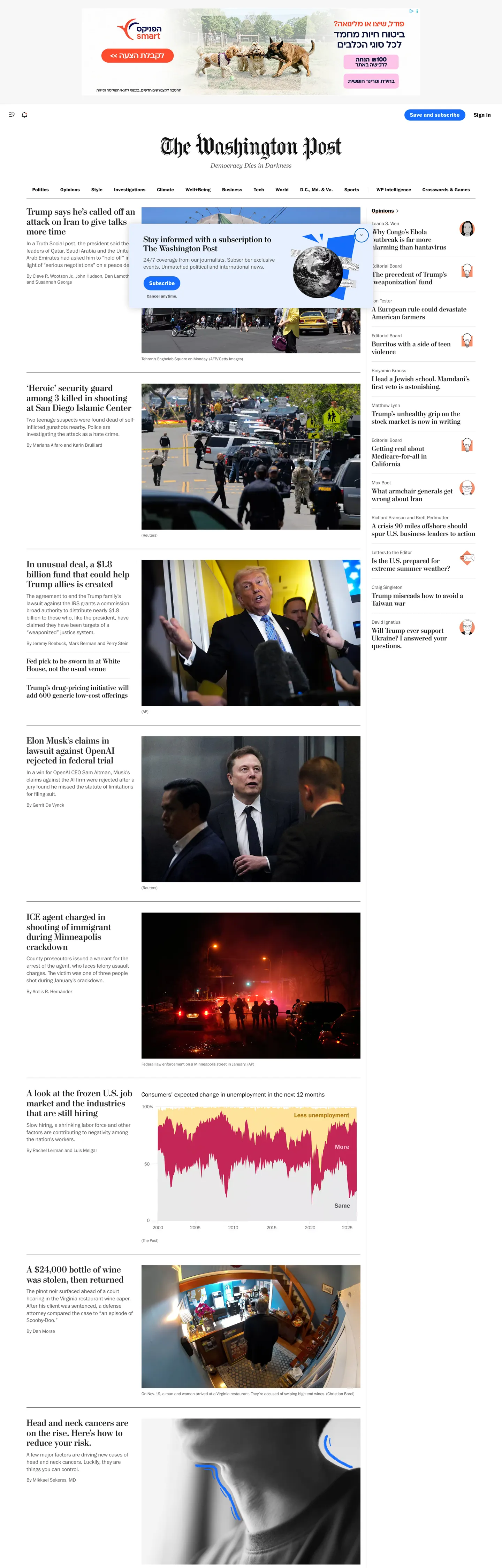
A newspaper homepage: Postoni serif headlines, Franklin Gothic body and one blue subscribe pill on pure white. The Washington Post for React and AI tools.

Primary color
#166dfc
Typeface
Franklin
Shape
Sharp
Base radius
4px
Colors
11
Type tokens
11
Components
16
Spacing values
8

About The Washington Post DESIGN.md

Curated by Dov Azencot, updated May 19, 2026. Source washingtonpost.com (opens in a new tab).

The Washington Post's homepage does the opposite of what almost every contemporary news site does. There is no marketing hero, no rotating cover image, no full-bleed gradient, no animated headline carousel. The page opens directly on a three-column editorial grid — the lead story top-left, supporting stories to its right, an opinion rail on the far right — rendered in the same Postoni serif and Franklin Gothic body that carry the print edition. The engraved Postoni wordmark sits centered above the grid the way it sits centered on the broadsheet's front page. Beneath it: the tagline "Democracy Dies in Darkness," set in small Franklin Gothic caps. The only chromatic moment in the entire visible chrome is a saturated blue rounded pill in the top-right that reads "Save and subscribe."

The DESIGN.md file packages the system into a machine-readable spec for React tooling. Inside: 11 colors tokens organized around an off-black ink #111111 that carries 841 text and 832 border occurrences in the captured page, plus near-black charcoal #2a2a2a for sub-headlines and gray-mid #595959 for dek text — collectively the entire structural typography. A single subscription blue #166dfc serves as the CTA fill and #1366b3 as the link color; everything else is white canvas, near-white hairline, and a small set of subscription-plan accent navy and pink that never surface on the homepage chrome. Eleven typography tokens cover Postoni serif at 18 / 20 / 24 / 26px (all weight 700) plus Franklin Gothic at 12 / 14 / 16 / 18px in weights 300 / 400 / 700. Sixteen components describe the masthead, the story-cell variants, the opinion rail rows, the subscription pill, the rounded sub-section chips, and the hairline dividers.

Feed this file to an AI coding tool and it reproduces the Post's specific moves: the print-newspaper grid composed in HTML rather than InDesign, the serif-headline / sans-body pairing that has carried American broadsheets for a century, the off-black ink that signals engraved type rather than glowing pixels, and the single rounded-pill subscription CTA as the only piece of chrome that betrays the page is selling something. The one move worth borrowing for any editorial product: the willingness to skip a hero entirely and let the lead story be the lead story. Most publishers add a marketing band above the news; the Post trusts that readers came for the news.

What makes it distinct

5 highlights

  1. Newspaper-as-homepageNo marketing hero, no full-bleed photo; the page opens on a three-column story grid in print-edition chrome
  2. Postoni serif as identityThe Washington Post's proprietary serif carries every headline from 18px chip stories up to the engraved 26px masthead
  3. Single subscription voltageSaturated blue used exactly once in the visible chrome, on the rounded pill CTA in the top-right masthead
  4. Off-black inkBody and headline text sits at near-black charcoal, never pure black; the ink reads as engraved newsprint rather than digital UI
  5. Hairline-only dividersStory cells are separated by 1px charcoal rules, no shadows, no card fills, no border tints

Live at washingtonpost.com

The Washington Post in production, as captured. Scroll the window to see the whole page.

The Washington Post's website at washingtonpost.com

11 colors

The Washington Post's system runs on #166dfc as its primary voltage, used in 1 of 16 components. Type is set in Franklin across 11 tokens from 12px to 26px, weights 300–700. Shape language is sharp — components average 0px corner radius, favoring crisp rectangles.

Brand & Accent

Sparing, CTA-only voltage · 1

Surface

Page and card backgrounds · 1

Text

Headlines, body, captions · 5

Borders & Hairlines

Dividers, outlines, rules · 1

Other

Specialty colors · 3

11 type tokens

Set in Franklin across 11 tokens, from 12px to 26px, weights 300–700. Shown in its own stack: where the font isn't installed, the fallback the file names stands in.

  • display-lg26px · weight 700 · lh 28.6pxThe quick brown fox jumps over the lazy dog
  • display-md24px · weight 700 · lh 26.4pxThe quick brown fox jumps over the lazy dog
  • heading-md20px · weight 700 · lh 22pxThe quick brown fox jumps over the lazy dog
  • heading-sm18px · weight 700 · lh 19.8pxThe quick brown fox jumps over the lazy dog
  • dek16px · weight 300 · lh 20.8pxThe quick brown fox jumps over the lazy dog
  • body-md16px · weight 400 · lh 20pxThe quick brown fox jumps over the lazy dog
  • body-sm14px · weight 400 · lh 17.5pxThe quick brown fox jumps over the lazy dog
  • body-sm-bold14px · weight 700 · lh 17.5pxThe quick brown fox jumps over the lazy dog
  • caption12px · weight 400 · lh 15pxThe quick brown fox jumps over the lazy dog
  • button-md16px · weight 700 · lh 16pxThe quick brown fox jumps over the lazy dog
  • section-label14px · weight 700 · lh 24.5pxThe quick brown fox jumps over the lazy dog

Radii and spacing

6 corner radii and 8 spacing values. Shape language: sharp, on a 4px base radius.

Radii6

  • none0px
  • xs2px
  • sm4px
  • lg20px
  • pill30px
  • full9999px

Spacing8

  • xs4px
  • sm8px
  • md12px
  • base16px
  • lg24px
  • xl32px
  • 2xl48px
  • 3xl80px

16 components

Each rendered from its tokens (color, type, radius, padding) on The Washington Post's own canvas.

  • Top Nav
    Top Navtop-nav
  • Masthead
    Mastheadmasthead
  • Tagline
    Taglinetagline
  • Nav Link
    Nav Linknav-link
  • Section Link
    Section Linksection-link
  • Button Primary
    Button Primarybutton-primary
  • Button Secondary
    Button Secondarybutton-secondary
  • Hero Heading
    Hero Headinghero-heading
  • Story Headline
    Story Headlinestory-headline
  • Story Chip Headline
    Story Chip Headlinestory-chip-headline
  • Body Paragraph
    Body Paragraphbody-paragraph
  • Dek Paragraph
    Dek Paragraphdek-paragraph
  • Section Heading
    Section Headingsection-heading
  • Story Cell
    Story Cellstory-cell
  • Opinion Row
    Opinion Rowopinion-row
  • Type here…
    Text Inputtext-input

The system, in use

The Washington Post's tokens on the kind of product it builds.

Marketing heroThe homepage: its nav, a headline and the main call to action.
The Washington Post
Subscribe

The stories that shape the world, told well

Reporting, analysis and opinion from journalists around the world, every day.

SubscribeToday's edition
The Washington Post
Subscribe

Support independent journalism

MonthlyYearly
Digital$4/weekSubscribe
  • Unlimited articles
  • The daily newsletter
  • Apps on every device
All accessPopular$6.25/weekSubscribe
  • Everything in Digital
  • Puzzles and games
  • The full archive
Print$9/weekSubscribe
  • Everything in All access
  • The weekend paper
  • Gift articles
Editorial articleA story page: the masthead, the headline and the opening.
The Washington PostSubscribe
WorldPoliticsBusinessScienceCulture
Climate

The cities racing to adapt before the next flood

Coastal planners are rewriting the rules for how and where we build. Not everyone agrees on who should pay for it.

The Washington Post staff · 12 min read

We are designing for water we have not seen yet. The people who build the places we live are starting to plan for decades, not seasons, and the work is already changing what gets made.

The Washington Post design system FAQ

The Washington Post's tokens, its components and how to use this DESIGN.md in your project.

What are the color tokens in the The Washington Post DESIGN.md?

The Washington Post's DESIGN.md has 11 color tokens: primary (#166dfc), link (#1366b3), ink (#111111), ink-soft (#2a2a2a), muted (#595959), canvas (#ffffff) and 5 more. Every value is a quoted hex you can copy.

What is The Washington Post's primary color hex code?

The color token `primary` is #166dfc, used by 1 component. The surface behind it is `canvas` (#ffffff).

How do I use The Washington Post's colors in Tailwind CSS?

Map the tokens to your CSS variables: `primary` (#166dfc) to `--primary`, `canvas` (#ffffff) to `--background`, `link` (#1366b3) to `--foreground`. shadcn/ui's Tailwind setup maps them to classes such as `bg-primary` and `text-foreground`, so they then use The Washington Post's palette.

What is The Washington Post's primary brand color?

The Post is functionally monochrome in its body chrome — the only saturated color that appears on the visible homepage is the subscription blue used for the rounded 'Save and subscribe' CTA pill in the top-right masthead. That fill is rendered at #166dfc and the link color #1366b3 carries section-front anchors and 'continue reading' links. Both blues are wired into the proprietary WPDS design system as --wpds-colors-cta and --wpds-colors-cta-hover. Every other color on the page is structural — off-black ink, charcoal sub-text, mid-gray dek text, white canvas, and a near-white hairline. The Post deliberately holds chromatic voltage in reserve for the act of asking the reader to subscribe.

Use The Washington Post in your project

One machine-readable file. Drop it into Claude Code, Cursor, VS Code or any AI tool that reads DESIGN.md.

Download DESIGN.md
  1. Download the DESIGN.md

    One machine-readable file: every color, type, radius, spacing, and component token of The Washington Post.

  2. Feed it to your AI tool

    Drop it into Claude, Cursor, or GitHub Copilot. The agent writes React components and Tailwind classes that match The Washington Post's visual language.

  3. Reference the tokens directly

    Or paste the values into your Tailwind config, CSS variables, or component library: every color, size and radius is a quoted, ready-to-copy value.

Read the full DESIGN.md overview, rationale, do’s and don’ts

Overview

The Washington Post's homepage inverts the convention that contemporary news sites lead with a marketing band. Newspaper-as-homepage. Where Axios, Puck, and Semafor open with a billboard headline and a single hero photo, the Post opens directly on a packed three-column editorial grid — lead story top-left, supporting columns to its right, an opinion rail on the far right — rendered in the same Postoni serif and Franklin Gothic body that carry the print broadsheet. The engraved Postoni masthead sits centered above the grid, the "Democracy Dies in Darkness" tagline underneath in small Franklin caps, and the single chromatic moment in the entire visible chrome is a saturated subscription-blue rounded pill in the top-right that reads "Save and subscribe."

The system's typographic discipline is the inverse of its peers. Serif-as-identity. Postoni at weight 700 carries every headline tier from 18px chip stories up to the 26px section heading; there is no sans-serif headline option anywhere on the page. Franklin Gothic — a sans drawing on the historical American newspaper sans family — handles body, dek, labels, and UI chrome at modest 12-18px sizes in weights 300 / 400 / 700. The pairing of a proprietary serif for headlines with a proprietary sans for body is the convention American broadsheets have held for a century; the Post's contribution is to render it in CSS without diluting it. Where Bloomberg and the FT lean on a heavier display weight, the Post stays at 700 and lets the serif do the editorial work.

Chrome is functionally monochrome. The structural ink ladder — {colors.ink} (#111111) for body, {colors.ink-soft} (#2a2a2a) for sub-headlines, {colors.muted} (#595959) for dek text — carries 100% of running text in graded charcoal tones. The only saturated color in the visible homepage is {colors.primary} (#166dfc), the subscription-CTA fill. The link color {colors.link} (#1366b3) is darker and reserves itself for section anchors and "Continue reading" affordances. The Post deliberately holds chromatic voltage in reserve for the act of asking the reader to subscribe — the single ad of the brand to the reader.

Key Characteristics:

  • Off-black ink ladder — {colors.ink} (#111111) at frequency 1673, {colors.ink-soft} (#2a2a2a) at 1199, {colors.muted} (#595959) at 300; pure black exists in CSS but never sets running text.
  • Single subscription voltage — {colors.primary} (#166dfc) appears twice on the page, both as the rounded-pill "Save and subscribe" CTA fill in the masthead.
  • Postoni serif at weight 700 across every headline tier (18 / 20 / 24 / 26px) — no sans-serif headline option exists anywhere in the system.
  • Franklin Gothic at weights 300 / 400 / 700 in 12-18px sizes carries dek, body, labels, and UI chrome.
  • Hairline-only cell separation — {colors.hairline} (#e9e9e9) marks story-cell vertical rules and the rare card divider; no card fills, no shadows, no border tints.
  • No marketing hero, no rotating cover image, no full-bleed gradient — the page opens on the news grid in print-edition chrome.
  • Rounded-pill CTA shape ({rounded.full}) is reserved for the subscription button only; every other surface is right-angled or 2-4px softened.
  • Subscription-plan accents ({colors.subs-navy}, {colors.subs-pink}, {colors.subs-navy-dark}) live in the CSS as --color-subscription-* but never render on the homepage chrome.

Colors

Brand

  • Subscription Blue ({colors.primary} — #166dfc): frequency 2 — both as background fill. Wired in CSS as --wpds-colors-cta, --subs-blue, --color-subscription-blue-normal. The rounded-pill "Save and subscribe" CTA in the masthead is the single chromatic moment in the entire visible chrome.
  • Link Blue ({colors.link} — #1366b3): frequency 146 — 73 text, 73 border. Wired as --link-color, --wpds-colors-blue80, --color-brand-blue-normal. The darker blue used for section anchors, "Continue reading" links, and any underlined inline link in body copy.

Text

  • Ink ({colors.ink} — #111111): frequency 1673 — 841 text, 832 border. The dominant structural color. Wired as --wpds-colors-primary, --color-ui-offblack, --offblack. Carries headline body, primary nav labels, and the 1px hairline rules on cards.
  • Ink Soft ({colors.ink-soft} — #2a2a2a): frequency 1199 — 600 text, 599 border. Wired as --gray-darkest, --wpds-colors-gray40, --secondary-background. The lead-story headline tone — slightly softer than pure off-black to set the hero heading off from sibling stories.
  • Muted ({colors.muted} — #595959): frequency 300 — 150 text, 150 border. Wired as --gray-dark, --wpds-colors-onBackground-subtle, --wpds-colors-accessible. The dek-paragraph tone and secondary caption color.

Surface

  • Canvas ({colors.canvas} — #ffffff): frequency 35 (the merged token also absorbs a near-white off-white surface variant). Wired as --white, --wpds-colors-background, --primary-fill. The pure-white floor of the entire page — there is no soft cream or warm white alternative.
  • Hairline ({colors.hairline} — #e9e9e9): frequency 3 — almost invisible in raw count because most divider work is carried by 1px {colors.ink} rules. Wired as --gray-lighter, --wpds-colors-faint. The rare soft-divider tone used on card surfaces below the fold.

Structural

  • Alpha Black ({colors.alpha-black} — #000000): frequency 125 — 60 text, 63 border. Wired as --black, --color-ui-black, plus a long ladder of --wpds-colors-alpha* opacity tokens. Pure black exists in the system but carries border and overlay duty only; body text never reaches it.

Subscription Accents (CSS-declared, absent from homepage chrome)

  • Subscription Navy ({colors.subs-navy} — #0c198a): wired as --color-subscription-navy-normal. Appears in subscription-tier badges (the upper-tier plan card) on the pricing page; absent from the homepage.
  • Subscription Navy Dark ({colors.subs-navy-dark} — #0e1555): wired as --color-subscription-navy-dark. The pressed-state of the navy tier accent.
  • Subscription Pink ({colors.subs-pink} — #b0578c): wired as --color-subscription-pink-normal. The all-access tier accent, also absent from the homepage chrome.

Typography

Font Families

The system runs two proprietary families. Postoni is the Post's commissioned serif and carries every headline tier — 18 / 20 / 24 / 26px, all weight 700. Fallback walks garamond, serif. Franklin (the Franklin Gothic variable) handles dek, body, labels, button text, and UI chrome at 12 / 14 / 16 / 18px in weights 300 / 400 / 700. Fallback walks Arial, Helvetica, sans-serif. There is no third typeface — no display sans for marketing, no monospace for code, no script for editorial pull-quotes. Postoni speaks, Franklin annotates.

Hierarchy

TokenSizeWeightLine HeightUse
{typography.display-lg}26px70028.6pxSection heading; lead-story headline above the fold
{typography.display-md}24px70026.4pxSecondary lead headlines
{typography.heading-md}20px70022pxColumn-story headlines
{typography.heading-sm}18px70019.8pxChip-story headlines, opinion-rail entries
{typography.dek}16px30020.8pxLead-story dek paragraphs
{typography.body-md}16px40020pxDefault running text in story cells
{typography.body-sm}14px40017.5pxSecondary body, byline metadata
{typography.body-sm-bold}14px70017.5pxNav labels, section anchors
{typography.caption}12px40015pxFigure captions, timestamp meta, footnote rows
{typography.button-md}16px70016pxSubscription CTA label
{typography.section-label}14px70024.5px"Politics" / "Opinion" / "Sports" section labels above story groups

Principles

The headline ladder runs entirely at weight 700 in Postoni — there is no weight 400 or 600 Postoni instance in the captured page. Body tier runs in Franklin at weight 300 (dek), 400 (body), and 700 (labels, button, nav). The dek tier at weight 300 is the lightest typographic moment in the system and reads as a sub-headline lead rather than a pull-quote. The pairing — heavy serif headlines, modest sans body, light-weight sans deks — is the editorial-broadsheet convention the Post has held since the print masthead was redesigned.

Note on Font Substitutes

Postoni and Franklin are proprietary. Source Serif Pro is the closest open-source substitute for Postoni — comparable cap height, similar diagonal stress, slightly looser counters. Source Sans Pro or IBM Plex Sans transfer cleanly for Franklin at the same weights; Plex Sans at 14-16px reads closest to Franklin's slightly compressed proportions. If you need a tighter sans alternative, Inter at weight 400 / 700 works at the body sizes.

Layout

Spacing System

  • Base unit: 8px (with 4px as the secondary half-step).
  • Tokens: {spacing.xs} 4px · {spacing.sm} 8px · {spacing.md} 12px · {spacing.base} 16px · {spacing.lg} 24px · {spacing.xl} 32px · {spacing.2xl} 48px · {spacing.3xl} 80px.
  • Story-cell internal padding: 0 on the left, 40px on the right — cells are separated by horizontal padding rather than card borders or background fills.
  • Inter-section vertical padding: ~32-48px between major bands (section heading, story strip, divider).
  • Top-nav padding: 12px vertical, 32px horizontal.
  • Masthead padding: 16px vertical, 32px horizontal; the engraved Postoni wordmark centers in the masthead bar.

Grid & Container

  • Max content width: ~1280px on the news grid; ~1080px on the opinion rail and below-fold sections.
  • Above-fold layout: three-column grid — lead story (~600px) on the left occupies two-thirds of the width, a stacked supporting-stories column in the middle, an opinion-rail column on the right (~340px).
  • Story strip below the fold: four-column horizontal rows of chip stories, separated by 40px right-padding rather than visible dividers.
  • Top-nav strip: full-width band, ~48px tall, fixed-position, white surface with a 1px {colors.ink} bottom rule.

Rhythm

The page is uniformly dense. There is no generous-versus-packed rhythm; every visible band carries multiple stories at high density. Section headings ({typography.section-label} at 14px / 700 with a 1px underline rule) mark the only structural pause between bands. The Post trusts the reader to scan a packed page in the same way a print broadsheet does — vertical scroll replaces horizontal newspaper folds, but the editorial density is identical.

Elevation

The system has no shadow tier whatsoever on the visible chrome. Cards, story cells, and the opinion rail all sit flat on the white canvas; depth comes from typographic hierarchy and 1px hairline dividers rather than from layered elevation. The few drop-shadow values in the CSS (--wpds-colors-alpha* opacity ladder) carry overlay-scrim duty for modals and dropdowns rather than card elevation.

  • Flat (no shadow): masthead, story grid, opinion rail, section bands — 100% of homepage surfaces.
  • Hairline dividers: 1px {colors.ink} or {colors.hairline} rules separate story cells, the top-nav from the masthead, and major sections from each other.
  • Modal scrim: --wpds-colors-alpha* opacity tokens are exposed in the CSS but not rendered on the captured homepage.

Shapes

The radius scale is minimal.

  • {rounded.none} 0px — every story cell, every section heading, every nav surface; the dominant radius value on the page.
  • {rounded.xs} 2px — frequency 2; rare soft rounding on form inputs.
  • {rounded.sm} 4px — frequency 11; soft cards in the below-fold "Today's WorldView" sections and a small set of icon buttons.
  • {rounded.lg} 20px — frequency 2; large pill-style category chips.
  • {rounded.pill} 30px — frequency 1; the "Most Read" right-rail header pill.
  • {rounded.full} 9999px — frequency 19; the subscription CTA pill and a small set of circular icon backgrounds (avatar bubbles, social-share icons).

The pill treatment ({rounded.full}) is reserved almost entirely for the single subscription CTA. The Post's shape language is right-angled editorial chrome; the pill exists only to mark the one act of commerce on the page.

Components

top-nav — White {colors.canvas} surface with a 1px {colors.hairline} bottom rule, ~48px tall, 12×32px padding. Holds the Post's section labels (Politics / Opinions / Sports / Business / Tech / etc.) flush-left with the subscription CTA and account chip flush-right.

masthead — Centered engraved Postoni wordmark in {typography.display-lg} (26px / 700), white surface, 16×32px padding. The visual anchor of the entire page — the page's identity moment.

tagline — Centered Franklin caps in {typography.caption} (12px / 400) just below the masthead, rendered in {colors.ink-soft}. The "Democracy Dies in Darkness" line.

button-primary — The subscription CTA. Subscription-blue {colors.primary} fill, white {colors.canvas} text, fully-rounded {rounded.full} pill, 8×16px padding, 32px height, weight 700. "Save and subscribe" is the canonical instance, fixed in the top-right of the masthead band.

button-secondary — White {colors.canvas} fill, ink text, 1px {colors.ink} border, fully-rounded pill, 8×16px padding, 32px height. Used for "Sign in" and tertiary nav actions.

nav-link — Transparent fill, ink text in {typography.body-sm-bold} (14px / 700), 8×12px padding. No background-fill hover state on the captured surface; the hover affordance is an underline.

section-link — Link-blue {colors.link} text in {typography.body-sm-bold}. "View more" and "Continue reading" anchors below story cells.

hero-heading — Ink-soft {colors.ink-soft} text in {typography.display-lg} (26px / 700). The lead-story headline above the fold.

story-headline — Ink {colors.ink} text in {typography.heading-md} (20px / 700). The column-story headlines in the middle and right strips.

story-chip-headline — Ink text in {typography.heading-sm} (18px / 700). Chip-story headlines in the below-fold rows.

body-paragraph — Default ink running-text in {typography.body-md} (16px / 400). Story body and lead paragraphs.

dek-paragraph — Muted {colors.muted} text in {typography.dek} (16px / 300). The lead-story sub-headline lead.

section-heading — Ink text in {typography.section-label} (14px / 700, weighted line-height 24.5px) with a 1px {colors.ink} bottom rule. "Politics" / "Opinions" / "Sports" section labels.

story-cell — White surface, 0 left-padding, 40px right-padding, no border-radius, separated from siblings by 1px {colors.hairline} vertical rules.

opinion-row — White surface, 8×0 padding, 1px {colors.hairline} bottom rule between rows. The compact-list treatment for the right-rail "Opinions" stack.

text-input — White surface, ink text, 1px {colors.ink} border, {rounded.xs} 2px radius, 8×12px padding, 40px height.

Do's and Don'ts

Do treat the subscription blue {colors.primary} as the single chromatic voltage on the page. The system has exactly one rounded-pill CTA in subscription blue; multiplying it into multiple blue elements would dilute the only chromatic signal that admits the page is selling something.

Do render every headline in Postoni at weight 700. The system has no sans-serif headline option; using Franklin for a headline breaks the serif-identity discipline and turns the editorial broadsheet into a generic news site.

Do use the off-black ladder ({colors.ink} #111111, {colors.ink-soft} #2a2a2a, {colors.muted} #595959) instead of pure black for any running text. Pure #000000 exists in the CSS but is reserved for border and overlay duty.

Do separate story cells with 40px right-padding rather than with card backgrounds or shadows. The grid reads as broadsheet-editorial only when the cells share a continuous white canvas.

Don't add a marketing hero band above the news grid. The Post's lead is the lead story — inserting a brand-introduction billboard above it breaks the newspaper-as-homepage move that defines the system.

Don't introduce a third typeface. The system has Postoni + Franklin and no other tier — adding a display sans for marketing, a script for pull-quotes, or a monospace for tech labels breaks the two-voice editorial split.

Don't render the rounded-pill CTA in any color other than subscription-blue {colors.primary} (#166dfc). The pill shape is reserved for the single subscription moment; rendering it in ink, white-with-border, or another accent destroys its semantic role as "the act of commerce on this page."

Don't use {colors.hairline} (#e9e9e9) as a text or fill color — it carries border-only duty in the system. For card surfaces, use {colors.canvas} (#ffffff); for soft-tonal backgrounds, the system has no alternative and you should leave them absent.

Known Gaps

  • Article surfaces: this DESIGN.md captures the homepage only. The article-read page, the live-coverage layout, and the long-form magazine treatments each carry their own typographic scales (larger Postoni display, pull-quote treatments, inline-image grids) that are not represented here.
  • Hover and focus states: the captured surface exposes resting states only; hover variants for the subscription CTA, nav links, and section anchors are not visible in the static capture.
  • Subscription-plan surfaces: the declared {colors.subs-navy}, {colors.subs-navy-dark}, {colors.subs-pink} (and a parallel green / mustard / purple set) carry the pricing-page plan-tier accents. They are documented as CSS variables but never render on the homepage chrome.
  • Form input error states: {component.text-input} carries the resting state only; newsletter-signup validation, paywall-form errors, and account-page input states are not exposed on the homepage.
  • Dark mode: the WPDS design system exposes a parallel dark token set in the CSS but the homepage renders light-only. The dark variant is not represented here.
  • Motion: the lead-story photograph occasionally swaps via fade and the breaking-news banner slides in from the top, but the spec captures end-state values only. Easing curves and durations live in the WPDS runtime.
  • Live-coverage chrome: Post Live (the breaking-news ticker that overlays the masthead during major events) carries its own accent reds and animated state machine that are not captured in this static snapshot.

More systems like this

BuzzFeed, Financial Times, Ghost and 25 more in News & Publishing: each brand's colors, type and components in one file your AI agent builds from.

Build it with Pro

The DESIGN.md files are free. Pro adds 6,000+ blocks, premium templates and the MCP server, so your AI editor builds in your system for you.

4.9/5 out of 5 · 150+ reviewsfrom 150+ founders and developers.

  • Secure checkout via Stripe
  • Code lives in your repo
  • Keep what you've shipped if you cancel
  • License terms

4.9 out of 5 from 150+ developers

Your system, built for you

Every block, template and icon, installed by your AI agent in your design system. The DESIGN.md files stay free.

Get Pro
  • Cancel anytime
  • Keep what you've shipped