Skip to content

Wired Inspired Design System

A print magazine on the web: black on white, tall WiredDisplay headlines, BreveText body and 0px corners. Wired as a DESIGN.md for React and AI tools.

Primary color
#000000
Typeface
Apercu
Shape
Sharp
Base radius
0px
Colors
9
Type tokens
14
Components
25
Spacing values
9

About Wired Inspired DESIGN.md

Curated by Dov Azencot, updated May 12, 2026. Source wired.com (opens in a new tab).

Wired is the flagship technology-magazine brand under Condé Nast, and its web surface refuses every convention of a SaaS marketing site. The page is unmistakably an editorial product: a stark white canvas at #ffffff, a strict black wordmark in the proprietary WiredDisplay serif rendered at 64px weight 400, and stacked story cards that read as a printed magazine grid ported to the screen. There is no atmospheric gradient, no decorative chrome, no chromatic accent. The brand's only color beyond the black-and-white duet is the small link blue #057dbc reserved for inline body links inside long-form articles. Buttons are square at 0px radius. The masthead band centers the wordmark on a thin white strip with no other decoration.

This page packages Wired's editorial surface into a single DESIGN.md file built on the Google Labs spec. Inside the file: 9 colors tokens (ink black #000000, canvas white #ffffff, hairline #e0e0e0, body grey #757575, link blue #057dbc, plus near-black variants), 15 typography tokens laddered across three proprietary families (WiredDisplay serif, BreveText serif, Apercu sans), a 9-step spacing scale from 2px to 48px, a 2-value radius system at 0px and 9999px, and 25 components covering story cards, hero bands, masthead, byline rows, hairline dividers, and 10 illustrative example surfaces.

Pass the file to Claude, Cursor, or GitHub Copilot and the model writes React components that match Wired's editorial voice rather than producing a generic shadcn theme. The agent reproduces square 0px corners, the strict black-on-white duet, the BreveText body running at 16–19px with 1.45 line-height, and the masthead-band masthead pattern. Or reference the tokens directly: every hex, font, and spacing value is a quoted string ready for Tailwind config, CSS variables, or your own primitive library. Wired is worth studying because it proves typography and hairline borders alone can carry a brand without leaning on chrome, gradient, or shadow.

What makes it distinct

5 highlights

  1. Strict black-on-white duet#000000 ink on #ffffff canvas with zero chromatic accent except link blue #057dbc reserved for inline article links
  2. Three-face type systemWiredDisplay serif at 64px / 400 for headlines, BreveText serif at 19px for body, Apercu sans at 14–17px for metadata
  3. Square geometry everywhereEvery button, input, and card renders at 0px radius; only icon containers use the full 9999px circle
  4. Zero drop-shadowsSurface hierarchy comes from #e0e0e0 hairline borders and the bare white canvas, not layered elevation
  5. Display weight stays at 400The proprietary tall-narrow serif carries hero presence through letterform design, never through heavier weights

Live at wired.com

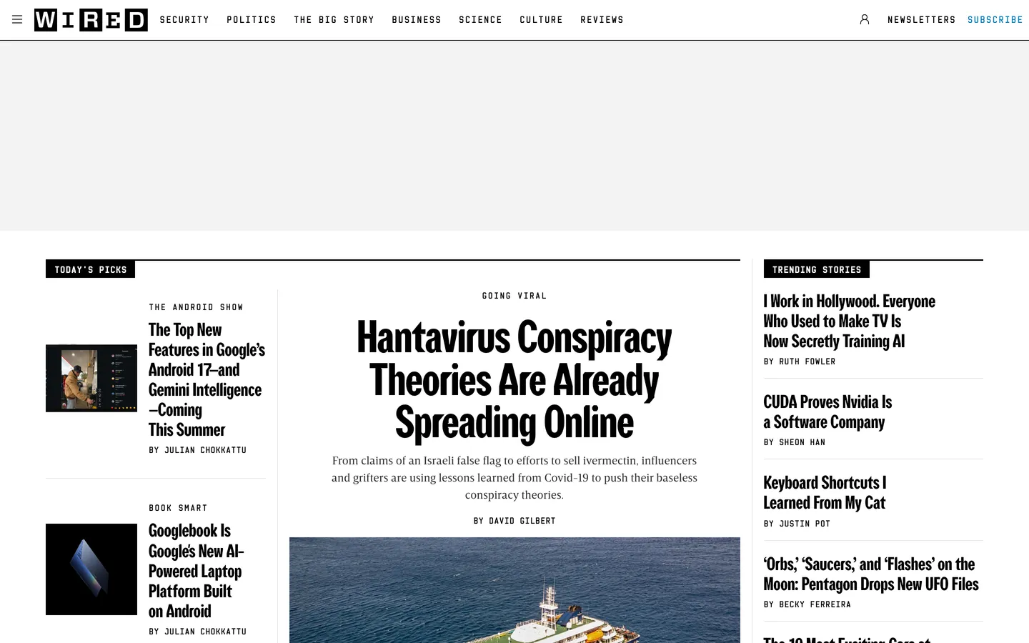
Wired in production, as captured. Scroll the window to see the whole page.

Wired's website at wired.com

9 colors

Wired's system runs on #000000 as its primary voltage, used in 3 of 25 components. Type is set in Apercu across 14 tokens from 12px to 64px, weights 400–700. Shape language is sharp — components average 0px corner radius, favoring crisp rectangles.

Brand & Accent

Sparing, CTA-only voltage · 1

Surface

Page and card backgrounds · 2

Text

Headlines, body, captions · 5

Borders & Hairlines

Dividers, outlines, rules · 1

14 type tokens

Set in Apercu across 14 tokens, from 12px to 64px, weights 400–700. Shown in its own stack: where the font isn't installed, the fallback the file names stands in.

  • display-hero64px · weight 400 · lh 59.52px · tracking -0.5pxThe quick brown fox jumps over the lazy dog
  • display-lg48px · weight 400 · lh 50.4px · tracking -0.4pxThe quick brown fox jumps over the lazy dog
  • display-md32px · weight 400 · lh 35.2px · tracking -0.3pxThe quick brown fox jumps over the lazy dog
  • display-sm26px · weight 400 · lh 28.08pxThe quick brown fox jumps over the lazy dog
  • display-xs20px · weight 700 · lh 24px · tracking -0.28pxThe quick brown fox jumps over the lazy dog
  • body-serif-lg19px · weight 400 · lh 27.93px · tracking 0.108pxThe quick brown fox jumps over the lazy dog
  • body-serif-md16px · weight 400 · lh 24px · tracking 0.09pxThe quick brown fox jumps over the lazy dog
  • body-md17px · weight 400 · lh 20pxThe quick brown fox jumps over the lazy dog
  • body-md-strong17px · weight 700 · lh 22px · tracking -0.144pxThe quick brown fox jumps over the lazy dog
  • body-sm14px · weight 400 · lh 18px · tracking 0.4pxThe quick brown fox jumps over the lazy dog
  • body-sm-strong14px · weight 700 · lh 18px · tracking 0.4pxThe quick brown fox jumps over the lazy dog
  • byline12.73px · weight 700 · lh 28px · tracking 0.108pxThe quick brown fox jumps over the lazy dog
  • caption12px · weight 400 · lh 16pxThe quick brown fox jumps over the lazy dog
  • button-md16px · weight 700 · lh 20px · tracking 0.3pxThe quick brown fox jumps over the lazy dog

Radii and spacing

2 corner radii and 9 spacing values. Shape language: sharp, on a 0px base radius.

Radii2

  • none0px
  • full9999px

Spacing9

  • xxs2px
  • xs4px
  • sm8px
  • md12px
  • lg16px
  • xl20px
  • 2xl24px
  • 3xl32px
  • 4xl48px

25 components

Each rendered from its tokens (color, type, radius, padding) on Wired's own canvas.

  • Nav Bar
    Nav Barnav-bar
  • Nav Link
    Nav Linknav-link
  • Button Primary
    Button Primarybutton-primary
  • Button Outline
    Button Outlinebutton-outline
  • Button Icon Circularbutton-icon-circular
  • Type here…
    Text Inputtext-input
  • Story Card Large
    Story Card Largestory-card-large
  • Story Card
    Story Cardstory-card
  • Story Row
    Story Rowstory-row
  • Category Eyebrow
    Category Eyebrowcategory-eyebrow
  • Byline Row
    Byline Rowbyline-row
  • Hero Band
    Hero Bandhero-band
  • Masthead Band
    Masthead Bandmasthead-band
  • Hairline Divider
    Hairline Dividerhairline-divider
  • Footer
    Footerfooter
  • Ex Pricing Tier
    Ex Pricing Tierex-pricing-tier
  • Ex Pricing Tier Featured
    Ex Pricing Tier Featuredex-pricing-tier-featured
  • Ex Product Selector
    Ex Product Selectorex-product-selector
  • Ex Cart Drawer
    Ex Cart Drawerex-cart-drawer
  • Ex App Shell Row
    Ex App Shell Rowex-app-shell-row
  • Ex Data Table Cell
    Ex Data Table Cellex-data-table-cell
  • Ex Auth Form Card
    Ex Auth Form Cardex-auth-form-card
  • Ex Modal Card
    Ex Modal Cardex-modal-card
  • Ex Empty State Card
    Ex Empty State Cardex-empty-state-card
  • Ex Toast
    Ex Toastex-toast

The system, in use

Wired's tokens on the kind of product it builds.

Marketing heroThe homepage: its nav, a headline and the main call to action.
Subscribe

The stories that shape the world, told well

Reporting, analysis and opinion from journalists around the world, every day.

SubscribeToday's edition
Subscribe
WorldPoliticsBusinessScienceCulture
Climate

The cities racing to adapt before the next flood

Coastal planners are rewriting the rules for how and where we build. Not everyone agrees on who should pay for it.

Wired staff · 12 min read

We are designing for water we have not seen yet. The people who build the places we live are starting to plan for decades, not seasons, and the work is already changing what gets made.

Wired design system FAQ

Wired's tokens, its components and how to use this DESIGN.md in your project.

What are the color tokens in the Wired DESIGN.md?

Wired's DESIGN.md has 9 color tokens: primary (#000000), on-primary (#ffffff), ink (#000000), ink-soft (#1a1a1a), body (#757575), hairline (#e0e0e0) and 3 more. Every value is a quoted hex you can copy.

What is Wired's primary color hex code?

The color token `primary` is #000000, used by 3 components. The surface behind it is `canvas` (#ffffff).

How do I use Wired's colors in Tailwind CSS?

Map the tokens to your CSS variables: `primary` (#000000) to `--primary`, `canvas` (#ffffff) to `--background`, `ink` (#000000) to `--foreground`. shadcn/ui's Tailwind setup maps them to classes such as `bg-primary` and `text-foreground`, so they then use Wired's palette.

What is Wired's primary brand color?

Wired's brand color is pure ink black at #000000. It carries the wordmark, every CTA button, the footer fill, and all headline type. The only second color in the entire system is the link blue #057dbc, which is reserved exclusively for inline body links inside long-form articles — never for UI buttons or navigation. The brand operates as a strict black-on-white duet against the #ffffff canvas with a single #e0e0e0 hairline for dividers.

Does Wired's design system have a dark mode?

No — Wired's public editorial surface is light-only. The canvas stays at pure white #ffffff with ink #000000 type. The footer band flips to a black surface at #000000 with white text at #ffffff, but that's a single inverted band rather than a full dark theme. The brand reads as a printed magazine, and print does not have a dark mode.

Use Wired Inspired in your project

One machine-readable file. Drop it into Claude Code, Cursor, VS Code or any AI tool that reads DESIGN.md.

Download DESIGN.md
  1. Download the DESIGN.md

    One machine-readable file: every color, type, radius, spacing, and component token of Wired Inspired.

  2. Feed it to your AI tool

    Drop it into Claude, Cursor, or GitHub Copilot. The agent writes React components and Tailwind classes that match Wired Inspired's visual language.

  3. Reference the tokens directly

    Or paste the values into your Tailwind config, CSS variables, or component library: every color, size and radius is a quoted, ready-to-copy value.

Read the full DESIGN.md overview, rationale, do’s and don’ts

Overview

Wired is the flagship technology-magazine brand under Condé Nast, and the web surface refuses to dress itself as a SaaS marketing site. The page is unmistakably an editorial product: a white canvas at {colors.canvas} (#ffffff), a strict black wordmark in the brand's proprietary WiredDisplay (a tall, narrow, high-contrast serif used at 64px weight 400), and stacked story cards that read as a printed magazine grid ported to the screen. There is no atmospheric gradient, no decorative chrome, no chromatic accent. The brand's only color beyond the black-and-white duet is the small {colors.link} (#057dbc) used for inline body links inside long-form articles.

Type carries the entire identity. Three families ladder the system: WiredDisplay (the proprietary high-contrast serif) for hero and section headlines; BreveText (a humanist serif) for long-form body and bylines; and Apercu (a humanist sans) for metadata, captions, eyebrow tags, and buttons. The pairing is editorial-grade — serifs for narrative, sans for navigation and structural labels.

Buttons are square. The brand uses {rounded.none} (0px corners) across the entire UI. Newsletter sign-ups, login forms, and "Read more" CTAs all render as sharp rectangles. The only circular shape is the button-icon-circular used for social-share affordances. There are no soft drop-shadows; the brand uses 1px hairline borders at {colors.hairline} (#e0e0e0) for elevation when needed.

Key Characteristics:

  • A strict black-and-white duet with no chromatic accent except the inline link blue {colors.link} (#057dbc). The brand reads as a printed magazine.
  • Three-face typographic system — WiredDisplay serif for display at 64px / 400, BreveText serif for body at 16–19px / 400, Apercu sans for metadata and buttons at 14–17px.
  • Square buttons ({rounded.none} 0px) — the brand never softens corners on interactive elements.
  • A magazine-style story grid: large feature card at top, two-up secondary, then a vertical stack of bylined story rows separated by {colors.hairline} (#e0e0e0) 1px dividers.
  • The brand's only signature decorative move is the masthead band — a thin white strip with the wordmark centered, no other decoration.
  • A pure black {colors.primary} (#000000) footer band, no graphics, just text columns and the wordmark repeating.

Known Gaps

  • Hover state colors: the story cards use subtle ink-to-link-blue transitions on headline hover that are hard to extract reliably from the captured surfaces.
  • Form validation states: error and success states are not separately tokenized — the brand uses ink #000000 plus body grey #757575 hierarchy with no semantic red, green, or amber palette.
  • Comment section sub-system: the article comment surface runs on a secondary Inter fallback face that does not appear in the main marketing or article surfaces and is not captured here.
  • Responsive image cropping: the rules governing cover-story 16:9 hero crops versus 4:3 secondary card crops at intermediate viewports are not documented.
  • Campaign-mode 2px ink border: the heavy 2px solid ink border used on certain Subscribe CTAs during campaign moments is described in the elevation table but not represented as a dedicated component token.

More systems like this

BuzzFeed, Financial Times, Ghost and 25 more in News & Publishing: each brand's colors, type and components in one file your AI agent builds from.

Build it with Pro

The DESIGN.md files are free. Pro adds 6,000+ blocks, premium templates and the MCP server, so your AI editor builds in your system for you.

4.9/5 out of 5 · 150+ reviewsfrom 150+ founders and developers.

Billed once a year in USD. Cancel anytime.

Individual

For personal projects & open source

$32instead of $49/mo

$389 billed yearly

  • How many people can use the license.Seats: 1 seat
  • Client work, SaaS products and anything you charge for.Commercial use: Personal & open source only
  • Page sections in 56 categories, from heroes and pricing tables to dashboards and settings, on every framework and UI library, in your theme.Blocks: All 6,181 blocks
  • Complete Next.js sites for startups, SaaS, agencies and portfolios, every page designed, ready to ship.Templates: All 14 templates
  • Your AI agent searches, previews and installs any component, block, icon or DESIGN.md from a prompt: 22 tools in Claude Code, Cursor, VS Code and 35 more clients.MCP server: 38 AI clients
  • Buttons with motion and states of their own, from an arrow that slides in to a burst of confetti.Animated buttons: All 35 buttons
  • Typewriters, scrambles, counters and more, for headlines, labels and numbers.Text effects: All 97 effects
  • Animated backgrounds for heroes, sections and cards, from a soft aurora to a flock that flees the cursor. Most are pure CSS.Backgrounds: All 100 backgrounds
  • WebGPU shaders, from a slow aurora to a black hole, each drawing only while it's on screen.Shaders: All 100 shaders
  • One design and one theme on all four: the components, blocks and effects are built for each framework.Frameworks: React, Vue, Svelte, Solid
  • React on Base UI, Radix UI, React Aria or Ark UI: install the version for the library your project already uses. Vue, Svelte and Solid run on Ark UI.UI libraries: Base UI, Radix, Aria, Ark
  • From a button to a date picker, a color picker or a guided tour: accessible, typed in TypeScript, each with live demos.Components: All 174 components
  • Real-world patterns built from the components, in 53 galleries: forms, tables, menus, dialogs and more.Examples: All 1,103 examples
  • Area, bar, line, pie, radar and radial charts on TanStack Charts, on every framework. React also gets the Recharts originals.Charts: All 70 charts
  • Debounce, local storage, media queries and more: each hook is one typed file you own.React hooks: All 35 hooks
  • From 222 libraries, Lucide, Heroicons, Tabler and Material Symbols among them, as SVG or a React component in one command.Icons: 294k+ icons
  • Stripe, Linear, Apple and 497 more: a brand's colors, typography and components in one file your AI agent builds from.DESIGN.md files: All 500 brands
  • Restyle every component and block at once: 8 styles, 7 grays, 18 colors and 5 radii, shared as a shadcn preset code.Theme builder: 8 styles × 18 colors
  • Priority requests are answered first.Support: Standard

Team

Most popular

For freelancers, agencies & startups

$66instead of $99/mo

$789 billed yearly · ≈ $13/dev/mo

Everything in Individual, plus

  • How many people can use the license.Seats: Up to 5 seats
  • Client work, SaaS products and anything you charge for.Commercial use: Included
  • Priority requests are answered first.Support: Priority

Organization

For companies with larger teams

$132instead of $199/mo

$1,589 billed yearly

Everything in Team, plus

  • How many people can use the license.Seats: Unlimited seats
  • Secure checkout via Stripe
  • Code lives in your repo
  • Keep what you've shipped if you cancel
  • License terms

4.9 out of 5 from 150+ developers

Your system, built for you

Every block, template and icon, installed by your AI agent in your design system. The DESIGN.md files stay free.

Get Pro
  • Cancel anytime
  • Keep what you've shipped