shadcn.io is an independent project built on shadcn/ui
Light, Dark, and System are the choices, and System starts selected. While a theme is set, an X beside the chevron clears it and the button returns to Select theme...
Use it for an optional field, where empty is a valid answer. A value people must keep should drop the X and stay a plain Select. In Solid, Ark UI does not add that clear button.
Installation
Anatomy
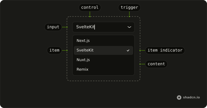
Usage
<div class="relative w-[200px]">
      <Combobox collection={_listCollection.collection()} onInputValueChange={handleInputValueChange} onValueChange={handleValueChange} positioning={{
      getAnchorElement: () => triggerRef
    }} selectionBehavior="clear" value={value()}>
        <ComboboxTrigger class={cn(buttonVariants({
        variant: "outline"
      }), "w-full justify-between pe-3")} ref={triggerRef}>
          {selected() ? selected()!.label : "Select theme..."}
        </ComboboxTrigger>
        <ComboboxContent>
          <ComboboxInput class="w-full" placeholder="Search themes..." showTrigger={false} />
          <ComboboxEmpty>No theme found.</ComboboxEmpty>
          <ComboboxList>
            {_listCollection.collection().items.map(theme => <ComboboxItem item={theme}>
                {theme.label}
              </ComboboxItem>)}
          </ComboboxList>
        </ComboboxContent>
      </Combobox>
      {selected() ? <Button aria-label="Clear theme" class="absolute end-8 top-1/2 -translate-y-1/2" onClick={handleClear} size="icon-xs" variant="ghost">
          <XIcon aria-hidden="true" />
        </Button> : null}
    </div>
FAQ
Where is the clear button?
In a relative wrapper around the combobox, positioned absolute end-8 so it lands just before the chevron. It sits next to the trigger, not inside it, since a button can't contain another button.
What does it do?
It empties the value the demo keeps in state, and the combobox shows its placeholder.
The value becomes [].
How is the button labelled?
It's a ghost icon-xs Button with an XIcon and aria-label Clear theme, since the icon has no text.
API Reference
Combobox
Sets collection={_listCollection.collection()}, onInputValueChange={handleInputValueChange}, onValueChange={handleValueChange}, positioning, getAnchorElement and cn. The rest is on the Combobox page.
Button
Sets aria-label="Clear theme", onClick={handleClear}, size="icon-xs" and variant="ghost". The rest is on the Button page.