shadcn.io is an independent project built on shadcn/ui
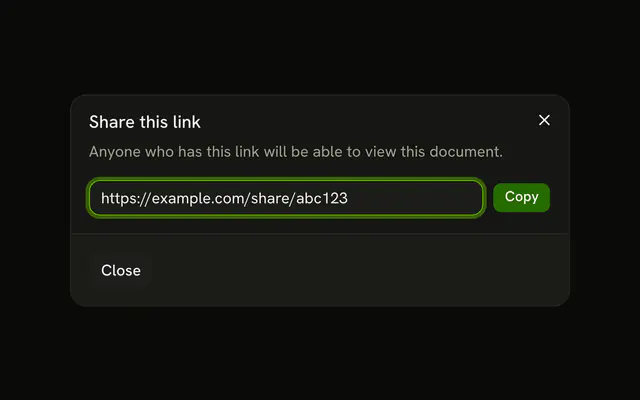
Share opens Share this page, with Facebook and Twitter buttons, a separator, and the line Or copy link. The link is read-only. The copy button writes it to the clipboard and shows a check.
Use it to keep sharing one click from the content. Facebook and Twitter do not post until you wire them. A share with permissions belongs in a Dialog. In Vue, Ark UI does not post the link.
Installation
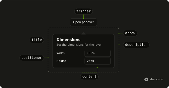
Anatomy
Usage
<Popover>
  <PopoverTrigger :asChild="true">
    <Button variant="outline">
      <Share2Icon aria-hidden="true" data-icon="inline-start" />Share
    </Button>
  </PopoverTrigger>
  <PopoverContent class="w-80 max-w-full">
    <PopoverTitle>Share this page</PopoverTitle>
    <div class="flex gap-2">
      <Button class="flex-1" variant="outline">
        <svg aria-hidden="true" data-icon="inline-start" fill="none" stroke="currentColor" stroke-linecap="round" stroke-linejoin="round" stroke-width="2" viewBox="0 0 24 24"><path d="M18 2h-3a5 5 0 0 0-5 5v3H7v4h3v8h4v-8h3l1-4h-4V7a1 1 0 0 1 1-1h3z"></path></svg>Facebook
      </Button>
      <Button class="flex-1" variant="outline">
        <svg aria-hidden="true" data-icon="inline-start" fill="none" stroke="currentColor" stroke-linecap="round" stroke-linejoin="round" stroke-width="2" viewBox="0 0 24 24"><path d="M22 4s-.7 2.1-2 3.4c1.6 10-9.4 17.3-18 11.6 2.2.1 4.4-.6 6-2C3 15.5.5 9.6 3 5c2.2 2.6 5.6 4.1 9 4-.9-4.2 4-6.6 7-3.8 1.1 0 3-1.2 3-1.2z"></path></svg>Twitter
      </Button>
    </div>
    <Separator />
    <div class="flex flex-col gap-2">
      <p class="text-muted-foreground text-xs">Or copy link</p>
      <div class="flex gap-2">
        <Input aria-label="Link" :readOnly="true" type="url" :value="shareUrl" />
        <Button
          :aria-label='isCopied ? "Copied" : "Copy link"'
          @click="handleCopy"
          size="icon-md"
          variant="outline"
        >
          <CheckIcon v-if="isCopied" aria-hidden="true" />
          <CopyIcon v-else aria-hidden="true" />
        </Button>
      </div>
<!-- The rest of the file is under Installation. -->
FAQ
API Reference
Popover
Sets asChild. The rest is on the Popover page.
Button
Sets variant="outline", aria-label="isCopied ? Copied : Copy link", click="handleCopy" and size="icon-md". The rest is on the Button page.
Separator
No extra props in this demo. The rest is on the Separator page.
Input
Sets aria-label="Link", readOnly, type="url" and value="shareUrl". The rest is on the Input page.