Join our Discord Community
Chai Builder template preview

Chai Builder

Sdk

C

Created by Chaibuilder

Last updated October 8, 2025

About This Template

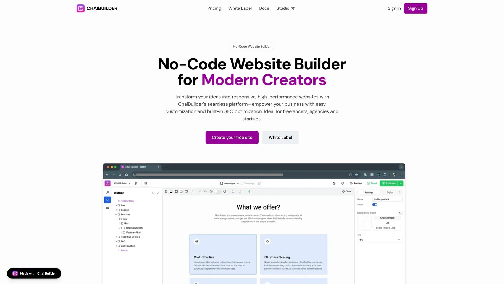
Chai Builder is an AI-enabled, open-source low-code visual builder for React and Tailwind CSS that allows developers and non-technical users to create web pages through intuitive drag-and-drop interactions. This innovative platform integrates seamlessly with React applications, uses Tailwind CSS for styling, supports custom block rendering, and provides a simple React component for embedding the builder directly into existing applications. The visual page building interface enables rapid web page development without extensive coding, making it possible for designers, product managers, and other team members to contribute to UI development while developers maintain control over component libraries and design systems. Perfect for agencies building client websites quickly, SaaS platforms offering customizable user-facing pages, marketing teams needing landing page flexibility without developer bottlenecks, or any project where visual development accelerates iteration cycles and enables non-technical stakeholders to participate in UI creation. As a community-driven, extensible platform with a Next.js starter project and live demo at chaibuilder-sdk.vercel.app, Chai Builder demonstrates how low-code tools can enhance rather than replace traditional development workflows, providing a bridge between visual design tools and production-ready React applications while maintaining code quality and customization capabilities.

Related Templates

Tremor template preview
Tremor
Tremor is a React component library featuring 35+ customizable, accessible components designed for building data-rich dashboards and analytics interfaces. Built with React, TypeScript, Tailwind CSS, and Radix UI, it provides pre-built chart components (line, bar, area, donut charts, sparklines), KPI cards, data tables, and layout components that follow accessibility best practices. Like shadcn/ui, Tremor uses a copy-paste approach, letting developers integrate component source code directly into projects for complete customization control. The library handles common dashboard requirements including loading states, error boundaries, empty states, and responsive breakpoints, with each component fully typed and integrating seamlessly with Tailwind CSS utilities. Actively maintained by Tremor Labs with comprehensive documentation at tremor.so and community support via Slack and Twitter, it's perfect for building internal tools, SaaS analytics dashboards, and business intelligence applications by providing battle-tested components for data visualization.
Kokonut UI template preview
Kokonut UI
Kokonut UI is a collection of animated, accessible UI components built with React, Tailwind CSS, and Framer Motion, providing production-ready components with smooth animations and modern design patterns. The open-source library offers copy-and-paste components following shadcn/ui's philosophy, including animated cards, interactive buttons, smooth transitions, and engaging micro-interactions that enhance user experience. Built with TypeScript for type safety, the components integrate Framer Motion's animation capabilities with Tailwind CSS utility classes, creating visually polished interfaces without complex animation code. Each component is designed for accessibility with proper ARIA attributes, keyboard navigation support, and responsive behavior across devices. Perfect for marketing websites, landing pages, SaaS applications, or any project requiring eye-catching animations and professional polish beyond basic UI primitives, Kokonut UI demonstrates how to combine animation libraries with utility-first CSS for components that are both beautiful and maintainable.
Prompt Kit template preview
Prompt Kit
Core building blocks for AI apps. High-quality, accessible, and customizable components for AI interfaces.