shadcn.io is an independent project built on shadcn/ui
Radix UI does not include this primitive, so this page uses the Ark UI component. The visuals match the Ark UI version.
A date input splits a date into segments, month, day and year in the order the locale writes them, and each segment takes digits or steps with the arrow keys. Use it for a date people already know, such as a birth date or a contract's start, where typing is faster than paging through a calendar.
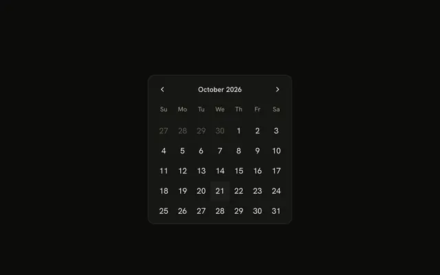
When people need to see the days of a month to choose one, use a Date Picker, which opens a calendar from a field.
Installation
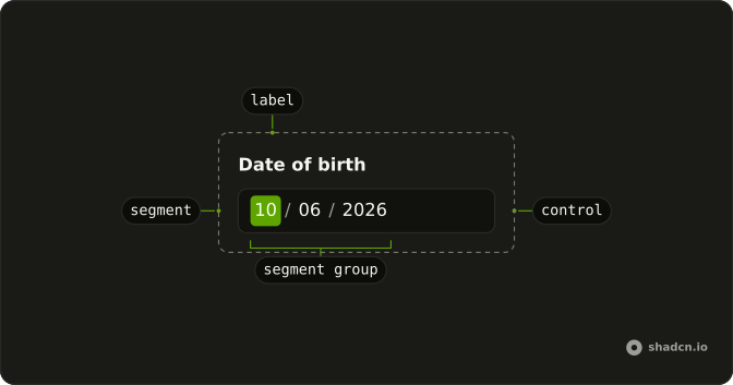
Anatomy
Usage
import { DateInput, DateInputLabel } from "@/components/ui/date-input";DateInputLabel goes inside DateInput, where it names the group of segments, and name sends the date with a form.
<DateInput className="w-full max-w-64" name="birthDate">
  <DateInputLabel>Date of birth</DateInputLabel>
</DateInput>
Accessibility
Each segment is a spin button named Month, Day or Year, or Hour, Minute and AM/PM once there is a time, and it reports its value and announces each change. Every segment is its own tab stop, and typing digits fills one and moves to the next once it is complete. The segments sit in a group that takes its name from DateInputLabel, so render one inside DateInput, or point ids at a label of your own, as the label question explains. aria-describedby on DateInput describes the same group, for a hint or an error message, and required on it marks each segment as required.
- Arrow Left
- Moves focus to the previous segment.
- Arrow Right
- Moves focus to the next segment.
- Arrow Up
- Adds one to the focused segment, wrapping from the highest value back to the lowest.
- Arrow Down
- Takes one from the focused segment, wrapping from the lowest value to the highest.
- Page Up
- Adds a larger step to the focused segment: 5 years, 2 months, 7 days, 2 hours, or 15 minutes or seconds.
- Page Down
- Takes the same larger step away from the focused segment.
- Home
- Sets the focused segment to its lowest value.
- End
- Sets the focused segment to its highest value.
- Backspace
- Removes the last digit of the focused segment, or moves to the previous segment when it is already empty.
- Delete
- Does the same as Backspace.
- Tab
- Moves focus to the next segment, and from the last one out of the field.
Demos
Context
A line above the segments reads the field back through DateInputContext and prints valueAsString, the date as the field formats it, or None while it is empty. The render function gets the whole input, so a readout or a hint can follow the field without a second copy of its state. Children of DateInput render before the segments, which is why the line sits on top.
Controlled
The date lives in state: value passes it in and the change handler writes the new array back, and the line underneath prints it with toString(), as an ISO date such as 2024-04-04, or (none). A date arrives in the array once all three segments are filled. Hold the state yourself when something else on the page reacts to the date.
Custom separator
A range field with an arrow icon between the start and the end, passed as separator in place of the default hyphen. The separator is hidden from screen readers, which hear the two dates as two groups of segments. Use an arrow when the span should read as from and to rather than as more punctuation inside a date.
Default value
defaultValue fills the segments on the first render with April 4, 2024, made with parseDate, and the field keeps its own state after that. Use it when the page knows a starting date and nothing else needs each change. In US English it shows as 04/04/2024, padded because this component forces leading zeros.
Disabled
disabled takes every segment out of the tab order, stops typing and the arrow keys, and dims the field. Use it for a date that can't change yet, such as a return date before the trip type is chosen, and say nearby why it is locked. Its hidden input is disabled too, so the date isn't sent with the form.
Granularity
granularity set to minute adds hour and minute segments after the date, plus AM/PM in US English, for a meeting or an appointment. hour stops at the hour, and second adds seconds. The value becomes a date with a time, so read its hour and minute along with the day.
Invalid
invalid turns the segments red and sets aria-invalid on each, while the typed date stays in place and stays editable. Set it when validation fails, for a missing or impossible date, and put the message next to the field so color isn't the only sign. isDateUnavailable sets the same state by itself for a date it rejects.
Leading zeros
shouldForceLeadingZeros set to false shows a single-digit month or day as 4 instead of 04 once it is typed. This component pads them unless you turn that off, which keeps a column of dates lined up. Typing works the same either way, and only the display of short numbers changes.
Min max
min and max keep the date inside 2024. When focus leaves the field, a date outside that window is pulled back inside it part by part, so a 2025 date keeps its month and day and becomes 2024. While someone is still typing, the value can sit outside the window, so check it again on submit.
Range
selectionMode set to range puts a start date and an end date in one field with a hyphen between them, and the value becomes an array of two dates. With a name, each date submits as its own hidden input. Use it for a hotel stay or a billing period that people type rather than pick.
Read only
readOnly shows April 4, 2024 and keeps every segment focusable, but typing and the arrow keys do nothing, Left and Right included, so people move through it with Tab. Use it for a confirmed booking or a date copied from another record. Unlike disabled, the field isn't dimmed and its hidden input still submits.
Root provider
useDateInput creates the field's state, with April 4, 2024 as its default, and DateInputRootProvider renders it. The Focus input button outside the field calls focus() on that same object, which moves focus to the first segment. Use the hook when a toolbar or a keyboard shortcut has to drive the field.
Size lg
size set to lg makes the field 36 pixels tall, for a date that leads its form, such as a check-in date. Only the height changes and the text keeps its size, so set the inputs and buttons around it to their large size as well.
Size md
md is the default size, the height of a text input, shown here to compare with the small and large fields. Leave size out to get it, and set it only when a wrapper of yours might pass another size down.
Size sm
size set to sm makes the field 28 pixels tall, for a filter bar, a table toolbar or a dense dialog. Only the height changes and the text keeps its size, so pair it with other small controls and the row lines up.
Time only
A formatter from useDateFormatter that asks only for the hour and minute, on a 12-hour clock, drops the date segments and adds AM/PM, with granularity at minute. The clock is the formatter's own hourCycle, since the field's hourCycle applies only when no formatter is passed. The value still holds today's date, so read only its hour and minute. Use it for an alarm or a shift start.
With clear button
showClear adds a Clear date button at the end of the field while it holds a date, and the field starts at April 4, 2024 here so the button shows. Pressing it empties the value through the same change handler that typing uses and moves focus to the first segment, since the button goes away. Add it to an optional date that people often remove, such as a deadline.
With field
A Date of birth label above the field and a hint under it asking for the local date format. The FieldLabel is wrapped in DateInputLabel with asChild, so it names the group of segments and a click on it focuses the month, and aria-describedby on DateInput points the group at the hint. Use Field this way when the date sits in a form among other labeled inputs.
FAQ
Should I use a Date Input or a Date Picker?
Use a Date Input when people already know the date and can type it faster than they could find it, such as a birth date, a passport's issue date or a contract start. Each segment takes digits, so there is nothing to open.
Use a Date Picker when people need to see the days of the month to choose, as for a booking or a delivery slot, or when the weekday matters. The picker also has a typed field of its own when you want both.
How do I get the value of a Date Input in React?
Read it in onValueChange, which gets details.value, an array of DateValue objects with one date, or two in range mode, and pass the array back as value, as the Controlled demo does. This Date Input is Ark UI's in every version of the site, so its dates come from @internationalized/date rather than Date. A date arrives once every segment is filled, and toString() gives an ISO string such as 2024-04-04.
How do I set a minimum and maximum date on a Date Input?
Pass min and max as date values made with parseDate, as the Min max demo does with the first and last days of 2024. When focus leaves the field, a date outside them is pulled back inside, year first and then month and day. While someone is typing the value can still fall outside, so check it again on submit.
To reject other dates, such as weekends, pass isDateUnavailable. It gets each date and the locale, and returning true marks the field invalid.
How do I add time to a Date Input?
Set granularity to hour, minute or second to add those segments after the date, as the Granularity demo does, and hourCycle to 12 or 24 to choose the clock. The value then carries a time along with the date.
For a time with no date, pass a formatter that asks only for the hour and minute, as in the Time only demo, and choose the clock in that formatter, since hourCycle on the field no longer applies. The value still holds a date, taken from today, so read only its hour and minute.
Can a Date Input take a date range?
Yes. Set selectionMode to range and the field shows a start date and an end date with a hyphen between them, as the Range demo does, and the value becomes an array of two dates. Pass separator to put something else between them, such as the arrow in the Custom separator demo.
With a name, the two dates submit as separate hidden inputs, name[0] and name[1], each in the field's own format.
How do I change the Date Input format for another locale?
Set locale, such as en-GB or de-DE, and the order of the segments, the separators between them and the placeholders all follow it, so en-GB reads day, month, year. This component pads single digits, 04 rather than 4, unless you set shouldForceLeadingZeros to false, as in the Leading zeros demo. For full control over which parts appear, pass your own formatter.
How do I add a label to the Date Input?
Render DateInputLabel inside DateInput, with its own text or wrapped around your FieldLabel with asChild, as the With field demo does. The group of segments takes its name from that label, and clicking the label focuses the first segment. A FieldLabel that only sits next to the field isn't connected, so a screen reader hears only Month, Day and Year, with no field name.
For a label elsewhere on the page, give it an id and pass DateInput an ids object whose label function returns that id. A hint or an error message is tied the same way through aria-describedby on DateInput, which reaches the group of segments.
Does the Date Input submit with a form?
Yes, once it has a name. A hidden input carries the date as the field formats it, such as 04/04/2024 in US English, not as an ISO string, so parse it on the server with the same locale or send the ISO value from value yourself.
A disabled field sends nothing. required on DateInput tells screen readers that each segment is required and reaches the hidden input, but browsers don't validate hidden inputs, so an empty field still submits: check it yourself before sending.
API Reference
DateInput
<div> data-slot="date-input"
value?DateValue[]
The controlled selected date(s).
defaultValue?DateValue[]
The initial selected date(s) when rendered. Use when you don't need to control the selected date(s).
onValueChange?(details: ValueChangeDetails) → void
Function called when the value changes.
- Type
(details: ValueChangeDetails) → void- Parameters
details– { value: DateValue[]; valueAsString: string[] }- Returns
void
allSegments?{ -readonly [K in keyof typeof EDITABLE_SEGMENTS]?: boolean
The computed segments map for the formatter.
- Type
{ -readonly [K in keyof typeof EDITABLE_SEGMENTS]?: boolean
createCalendar?(identifier: CalendarIdentifier) → Calendar
A function that creates a calendar object for a given calendar identifier. Use this to support non-Gregorian calendars (e.g., Persian, Islamic, Buddhist). import { createCalendar } from "@internationalized/date" { locale: "fa-IR", createCalendar }
- Type
(identifier: CalendarIdentifier) → Calendar- Parameters
identifier– CalendarIdentifier- Returns
Calendar
defaultPlaceholderValue?CalendarDate | CalendarDateTime | ZonedDateTime
The initial placeholder date when rendered.
- Type
CalendarDate | CalendarDateTime | ZonedDateTime
dir?"ltr" | "rtl"
The document's text/writing direction.
- Type
"ltr" | "rtl"- Default
"ltr"
disabled?boolean
Whether the date input is disabled.
form?string
The form attribute of the hidden input element.
format?(date: DateValue, details: FormatDateDetails) → string
The format function for converting a DateValue to a string.
- Type
(date: DateValue, details: FormatDateDetails) → string- Parameters
date– DateValuedetails– { locale: string; timeZone: string }- Returns
string
formatter?DateFormatter
The date formatter to use.
granularity?"day" | "hour" | "minute" | "second"
Determines the smallest unit that is displayed in the date input.
- Type
"day" | "hour" | "minute" | "second"- Default
"day"
hideTimeZone?boolean
Whether to hide the time zone segment when the value is a ZonedDateTime.
Has no effect for values without a time zone.
- Default
false
hourCycle?12 | 24
Whether to use 12-hour or 24-hour time format. By default, this is determined by the locale.
- Type
12 | 24
id?string
The unique identifier of the machine.
ids?object
The ids of the elements in the date input. Useful for composition.
- Type
{ root?: string; label?: (index: number) → string; control?: string; segmentGroup?: (index: number) → string; hiddenInput?: (index: number) → string }
invalid?boolean
Whether the date input is invalid.
isDateUnavailable?(date: DateValue, locale: string) → boolean
Returns whether a date is unavailable. When a committed date matches, the input is marked as invalid.
- Type
(date: DateValue, locale: string) → boolean- Parameters
date– DateValuelocale– string- Returns
boolean
locale?string
The locale (BCP 47 language tag) to use when formatting the date.
- Default
"en-US"
max?CalendarDate | CalendarDateTime | ZonedDateTime
The maximum date that can be selected.
- Type
CalendarDate | CalendarDateTime | ZonedDateTime
min?CalendarDate | CalendarDateTime | ZonedDateTime
The minimum date that can be selected.
- Type
CalendarDate | CalendarDateTime | ZonedDateTime
name?string
The name attribute of the input element.
onFocusChange?(details: FocusChangeDetails) → void
A function called when the date input gains or loses focus.
- Type
(details: FocusChangeDetails) → void- Parameters
details– { focused: boolean }- Returns
void
onPlaceholderChange?(details: PlaceholderChangeDetails) → void
A function called when the placeholder value changes.
- Type
(details: PlaceholderChangeDetails) → void- Parameters
details– { placeholderValue: DateValue }- Returns
void
placeholderValue?CalendarDate | CalendarDateTime | ZonedDateTime
The controlled placeholder date.
- Type
CalendarDate | CalendarDateTime | ZonedDateTime
readOnly?boolean
Whether the date input is read-only.
required?boolean
Whether the date input is required.
selectionMode?"single" | "range"
The selection mode. Must match the machine option.
- Type
"single" | "range"- Default
"single"
separator?string | React.ReactNode
The separator to show between the date input fields in range mode.
- Type
string | React.ReactNode- Default
"-"
shouldForceLeadingZeros?boolean
Whether to always show leading zeros in month, day, and hour fields.
When false, formatting follows the locale default (e.g. "1" instead of "01"). Ark default: false.
- Default
true
showClear?boolean
Whether to show the clear button.
- Default
false
size?DateInputSize
The size of the control.
- Default
"md"
timeZone?string
The time zone to use.
- Default
"UTC"
translations?object
The localized messages to use.
- Type
{ placeholder?: (locale: string) → Record<EditableSegmentType, string> }
asChild?boolean
Merge props onto the child element instead of rendering a host.
className?string
Merged with the part's classes.
data-disabled?string
Present when disabled.
data-invalid?string
Present when invalid.
data-readonly?string
Present when read-only.
data-size?string
Mirrors size.
DateInputLabel
<label> data-slot="date-input-label"
asChild?boolean
Merge props onto the child element instead of rendering a host.
className?string
Merged with the part's classes.
data-disabled?string
Present when disabled.
data-invalid?string
Present when invalid.
data-readonly?string
Present when read-only.
DateInputRootProvider
<div> data-slot="date-input"
valueReturnType<typeof useDateInput>
What useDateInput() returns: the state and API, made outside the component to control it.
- Type
ReturnType<typeof useDateInput>
selectionMode?"single" | "range"
The selection mode. Must match the machine option.
- Type
"single" | "range"- Default
"single"
separator?string | React.ReactNode
The separator to show between the date input fields in range mode.
- Type
string | React.ReactNode- Default
"-"
showClear?boolean
Whether to show the clear button.
- Default
false
size?DateInputSize
The size of the control.
- Default
"md"
asChild?boolean
Merge props onto the child element instead of rendering a host.
className?string
Merged with the part's classes.
data-disabled?string
Present when disabled is true.
data-invalid?string
Present when invalid is true.
data-readonly?string
Present when readOnly is true.
data-size?string
Mirrors size.
useDateInput
value?DateValue[]
The controlled selected date(s).
defaultValue?DateValue[]
The initial selected date(s) when rendered. Use when you don't need to control the selected date(s).
onValueChange?(details: ValueChangeDetails) → void
Function called when the value changes.
- Type
(details: ValueChangeDetails) → void- Parameters
details– { value: DateValue[]; valueAsString: string[] }- Returns
void
allSegments?{ -readonly [K in keyof typeof EDITABLE_SEGMENTS]?: boolean
The computed segments map for the formatter.
- Type
{ -readonly [K in keyof typeof EDITABLE_SEGMENTS]?: boolean
createCalendar?(identifier: CalendarIdentifier) → Calendar
A function that creates a calendar object for a given calendar identifier. Use this to support non-Gregorian calendars (e.g., Persian, Islamic, Buddhist). import { createCalendar } from "@internationalized/date" { locale: "fa-IR", createCalendar }
- Type
(identifier: CalendarIdentifier) → Calendar- Parameters
identifier– CalendarIdentifier- Returns
Calendar
defaultPlaceholderValue?CalendarDate | CalendarDateTime | ZonedDateTime
The initial placeholder date when rendered.
- Type
CalendarDate | CalendarDateTime | ZonedDateTime
dir?"ltr" | "rtl"
The document's text/writing direction.
- Type
"ltr" | "rtl"- Default
"ltr"
disabled?boolean
Whether the date input is disabled.
form?string
The form attribute of the hidden input element.
format?(date: DateValue, details: FormatDateDetails) → string
The format function for converting a DateValue to a string.
- Type
(date: DateValue, details: FormatDateDetails) → string- Parameters
date– DateValuedetails– { locale: string; timeZone: string }- Returns
string
formatter?DateFormatter
The date formatter to use.
granularity?"day" | "hour" | "minute" | "second"
Determines the smallest unit that is displayed in the date input.
- Type
"day" | "hour" | "minute" | "second"- Default
"day"
hideTimeZone?boolean
Whether to hide the time zone segment when the value is a ZonedDateTime.
Has no effect for values without a time zone.
- Default
false
hourCycle?12 | 24
Whether to use 12-hour or 24-hour time format. By default, this is determined by the locale.
- Type
12 | 24
id?string
The unique identifier of the machine.
ids?object
The ids of the elements in the date input. Useful for composition.
- Type
{ root?: string; label?: (index: number) → string; control?: string; segmentGroup?: (index: number) → string; hiddenInput?: (index: number) → string }
invalid?boolean
Whether the date input is invalid.
isDateUnavailable?(date: DateValue, locale: string) → boolean
Returns whether a date is unavailable. When a committed date matches, the input is marked as invalid.
- Type
(date: DateValue, locale: string) → boolean- Parameters
date– DateValuelocale– string- Returns
boolean
locale?string
The locale (BCP 47 language tag) to use when formatting the date.
- Default
"en-US"
max?CalendarDate | CalendarDateTime | ZonedDateTime
The maximum date that can be selected.
- Type
CalendarDate | CalendarDateTime | ZonedDateTime
min?CalendarDate | CalendarDateTime | ZonedDateTime
The minimum date that can be selected.
- Type
CalendarDate | CalendarDateTime | ZonedDateTime
name?string
The name attribute of the input element.
onFocusChange?(details: FocusChangeDetails) → void
A function called when the date input gains or loses focus.
- Type
(details: FocusChangeDetails) → void- Parameters
details– { focused: boolean }- Returns
void
onPlaceholderChange?(details: PlaceholderChangeDetails) → void
A function called when the placeholder value changes.
- Type
(details: PlaceholderChangeDetails) → void- Parameters
details– { placeholderValue: DateValue }- Returns
void
placeholderValue?CalendarDate | CalendarDateTime | ZonedDateTime
The controlled placeholder date.
- Type
CalendarDate | CalendarDateTime | ZonedDateTime
readOnly?boolean
Whether the date input is read-only.
required?boolean
Whether the date input is required.
selectionMode?"single" | "range"
The selection mode of the date input.
- single - only one date can be entered
- range - a range of dates can be entered (start and end)
- Type
"single" | "range"- Default
"single"
shouldForceLeadingZeros?boolean
Whether to always show leading zeros in month, day, and hour fields. When false, formatting follows the locale default (e.g. "1" instead of "01").
- Default
false
timeZone?string
The time zone to use.
- Default
"UTC"
translations?object
The localized messages to use.
- Type
{ placeholder?: (locale: string) → Record<EditableSegmentType, string> }