shadcn.io is an independent project built on shadcn/ui
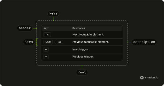
Keyboard Table lists shortcuts as rows, with the key caps in one column and what they do in the other. Use it for the keyboard section of a docs page, or a help panel that lists every shortcut an app has.
For one key inside a sentence or beside a menu item, a Kbd is enough. When the shortcuts need more columns, such as scope or platform, build the table from Table.
Installation
Anatomy
Usage
import {
  KeyboardTable, KeyboardTableItem,
} from "@/components/ui/keyboard-table";
Each row's keys is the shortcut, and the text inside the row is its description. A string is split on each plus sign, so Shift + Tab draws two caps.
<KeyboardTable className="w-full max-w-lg">
  <KeyboardTableItem keys="Tab">Next focusable element.</KeyboardTableItem>
  <KeyboardTableItem keys="Shift + Tab">
    Previous focusable element.
  </KeyboardTableItem>
  <KeyboardTableItem keys="ArrowDown">Next trigger.</KeyboardTableItem>
  <KeyboardTableItem keys="ArrowUp">Previous trigger.</KeyboardTableItem>
</KeyboardTable>
Accessibility
It renders a real <table> with Key and Description as its column headers, so a screen reader can move through it row by row and announce each cell with its column. Every key is a <kbd> element, and the plus signs between caps are read too, so a chord comes out as Shift + Tab. Nothing in it is a control, so it has no keys of its own. The table is named Keyboard shortcuts unless you pass aria-label or aria-labelledby to KeyboardTable, so give each table its own name when a page has several.
Demos
Combo
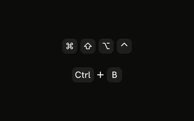
Three Command-key shortcuts, ⌘ K, ⌘ Shift P and ⌘ P, passed to keys as arrays, and Shift + Tab written as a string. The string is split on each plus sign, while an array draws one cap per entry and parses nothing. Use the array when a key's own label is a plus, or when your shortcuts already come as lists.
Size compact
The same Tab, Shift + Tab and arrow rows as the first preview, with size set to compact, which trims the vertical padding of the header and each row. Pick it for a narrow sidebar or a popover where the table sits beside other content. Keep the default when the shortcuts are the main subject of the page.
Variant default
kbdVariant set to default drops the border around each cap and keeps the muted fill, here on Space, Shift + Tab and ⌘ K. The table's own default is outline, which reads more like a physical key. Use the flat caps when the rows already have lines between them and a box around every key adds clutter.
FAQ
How do I write a key combination in a Keyboard Table?
Write it as a string in keys with a plus between the keys: Shift + Tab draws two caps, and the spaces around the plus are optional. Pass an array instead, such as ["⌘", "K"], to get one cap per entry with no parsing, as the Combo demo does.
The array is the only way to show the plus key itself, because a string drops every plus as a separator. Each cap prints exactly the text you give it, with no translation of names like ArrowDown, so write ↓ or Esc when that is what belongs on the key.
How do I fit a Keyboard Table in a narrow column?
Set size to compact, which trims the vertical padding of the header and every row, as the Size compact demo shows. It doesn't change the width. The table fills its container, and the caps in the key column never wrap while the description does, so the longest chord sets how narrow the table can get.
When a chord is wider than the room it has, the table scrolls sideways inside its own container instead of pushing the page wider. Shorter labels, such as ⌘ for Command, keep it from getting there.
How do I rename or translate the Keyboard Table column headers?
Set keyColumn and descriptionColumn on KeyboardTable. They replace the two column headers, which default to the English words Key and Description.
The table's accessible name, Keyboard shortcuts, is English too, so pass aria-label in the reader's language as well. On a site in several languages, pass all three from the same translations as the rest of the page.
Why do Keyboard Table shortcuts stay left to right in React?
Each row's caps sit in a group with dir set to ltr, so Ctrl + Shift + P keeps the order people press it in on an Arabic or Hebrew page. The rest of the table follows the page: the description column and the headers mirror in right to left.
To let shortcuts flip with the page too, remove dir from the key group in ShortcutKeys, inside components/ui/keyboard-table.
When should I use a Keyboard Table instead of Kbd?
Use a Keyboard Table when there are several shortcuts and each needs a sentence about what it does: the keyboard section of a component's docs, or a help dialog that lists an editor's commands. Use Kbd for one key or chord inside running text, a button or a menu item.
For shortcuts that need more than two columns, such as where each one works or which platform it's for, build the table from Table and put a Kbd in its cells.
How do I style the key caps in a Keyboard Table?
Edit components/ui/keyboard-table. On Radix UI it carries its own small copies of Kbd and the table parts so that it installs without them, which means restyling your Kbd file won't change these caps. kbdVariant on KeyboardTable switches every row between outlined caps, its default, and the flat default ones.
A class on KeyboardTable goes on the bordered card around the table, and one on KeyboardTableItem goes on that row.
Can I give each Keyboard Table on a page its own accessible name?
Yes. aria-label and aria-labelledby on KeyboardTable go to the table element itself, not to the card around it. Without either, every table is named Keyboard shortcuts, so a page with keyboard sections for three components would list three tables of the same name.
The neatest fix is a heading above each table and aria-labelledby set to that heading's id, so the visible heading and the table's name can't drift apart. Use aria-label when there is no heading to point to.
How do I make the shortcuts in a Keyboard Table work?
The table only displays them. It doesn't listen for keys or run commands, so bind the keys yourself with a keydown listener on the document or a hotkeys library.
Keep the shortcuts in one list, each with its keys as an array and a description, and use it both to register your handlers and to render the rows with KeyboardTableItem. The table then can't drift from what the app really does.
API Reference
KeyboardTable
<div>
descriptionColumn?string
Label for the second column.
- Default
"Description"
kbdVariant?KbdVariant
Kbd variant for every row. Outline reads as keycaps.
- Default
"outline"
keyColumn?string
Label for the first column.
- Default
"Key"
size?"default" | "compact"
Row density.
- Type
"default" | "compact"- Default
"default"
asChild?boolean
Merge props onto the child element instead of rendering a host.
className?string
Merged with the part's classes.
KeyboardTableItem
data-slot="keyboard-table-item"
keysstring | string[]
Shortcut. A string is split on + ("Shift + Tab" → Shift, Tab).
Pass an array to skip splitting.
- Type
string | string[]
children?React.ReactNode
Description of the shortcut.
className?string
Merged with the part's classes.