shadcn.io is an independent project built on shadcn/ui
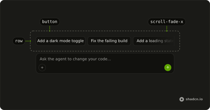
Suggestions are short prompts in a row above the message field, and clicking one sends it as the person's message. They help on the first turn, when someone doesn't know what to ask, and after a reply, for the follow-ups an agent can predict.
Each suggestion is an outline Button with the prompt as its label, in a row that scrolls sideways when the labels don't fit. For chips that pick an option rather than send a message, use a Toggle Group.
Installation
Suggestion is a pattern, so no suggestion file lands in your project. The command adds the two parts it's built from, Button and the scroll-fade utility, and the code to copy is the demo's.
Anatomy
Usage
import { Button } from "@/components/ui/button";The row is a div that scrolls sideways, and each prompt is a small outline Button that calls your send function with its own label.
const suggestions = ["Add a dark mode toggle", "Fix the failing build"];

export function Suggestions(props: { onSend: (prompt: string) => void }) {
  return (
    <div class="scrollbar-none flex scroll-fade-x gap-2 overflow-x-auto overscroll-x-contain">
      {suggestions.map((suggestion) => (
        <Button
          class="shrink-0"
          key={suggestion}
          onClick={() => props.onSend(suggestion)}
          size="sm"
          variant="outline"
        >
          {suggestion}
        </Button>
      ))}
    </div>
  );
}Button renders with type set to button unless you pass another, so the row can sit inside the message form without a click submitting it.
The snippet is the React version. The demo at the top of the page builds the same row in Solid, and its code is the one to copy.
Accessibility
Each suggestion is a real button whose label is the prompt it sends, so a screen reader reads out exactly what a press will say. The row around the buttons is a plain div with no role, and Tab visits the buttons one by one. Nothing is announced when a suggestion is sent, so the transcript has to report the new message, as the Scrolling demo does with a polite live line under the row.
- Tab
- Moves focus to the next suggestion, scrolling the row to show it, and after the last one to whatever follows the row.
- Shift+Tab
- Moves focus to the previous suggestion.
- Enter
- Sends the focused suggestion.
- Space
- Sends the focused suggestion.
Demos
Scrolling
Five suggestions for an email thread, from Summarize this thread to Make it shorter, in a column as narrow as a phone's composer, with a line underneath naming the one that was sent. The row scrolls sideways, shrink-0 keeps each label on one line, and overscroll-x-contain stops a swipe at the end from scrolling the page. Wrap the row instead when every label fits, as in Wrapped.
Wrapped
Four prompts for a pull request, from Summarize this pull request to Explain the diff, in a row with flex-wrap and no scrolling or fade. Every label stays in view, and the row grows a second line when they don't fit on one. Pick it for three or four short prompts in a wide composer, and the scrolling row on a phone.
Follow-ups
A build agent whose suggestions live in state. Picking one sends it and empties the row while the reply is on its way, then the row fills with the follow-ups that reply offers, such as Cache the dependencies after a question about a slow build. The reply sits in a polite live region, so a screen reader hears it arrive.
AI SDK
A suggestion's label is the message, so send it as it is.
AI SDK UI has no Solid package. Post the label to your chat route as the person's message.
Hide the row, or disable its buttons, while the reply streams, so a click can't drop a new message into the middle of a reply.
Migrating from AI SDK Elements
AI SDK Elements is for React. In Solid, start from the demo at the top of the page: its row is all there is to Suggestion.
FAQ
What should a Suggestion send when someone clicks it?
Its label, word for word, as the person's message, which is what every demo on this page does. People choose from what the button says, and a longer hidden prompt would put words in the transcript they never read. If a suggestion needs more context to work, put it in the system prompt or the request rather than in the message.
Keep labels short enough to read at a glance, about the length of the demo's "Fix the failing build".
How do I stop Suggestion buttons from sending while the agent is still replying?
Hide the row, or disable its buttons, while the chat is busy. That runs from the request until its streamed response ends. The Follow-ups demo empties the row while its reply is on the way.
To disable them, set disabled on each Button. Bring the row back, or a fresh set of follow-ups, once the reply ends.
How do I show follow-up suggestions after the agent replies?
Keep the suggestions in state rather than a constant, and replace them when a reply finishes, as the Follow-ups demo does. Your server decides what they are, either by asking the model for a few follow-ups alongside its answer or by deriving them from the conversation.
With the AI SDK, the route can stream them as a custom data part of the assistant's message, and the row reads them from the last message once the chat is ready again. Clear the row when the person sends, so old follow-ups don't linger under a new question.
Why does the Suggestion row fade at its edges?
The row has the scroll-fade-x class from the scroll-fade utility, which masks an edge so a cut-off label reads as more to scroll rather than a broken layout. In browsers with scroll-driven animations, an edge fades only while there is more past it, so the start stays sharp until you scroll. Other browsers keep a fade on both edges.
The fade flips sides in a right-to-left page. Remove the class, or add scroll-fade-none, on a row that wraps.
How do I wrap Suggestion buttons onto several lines instead of scrolling?
Change the row's classes: keep flex and gap-2, add flex-wrap, and drop overflow-x-auto, overscroll-x-contain, scrollbar-none and scroll-fade-x. Every button then stays in view, and a label that doesn't fit moves to the next line instead of off the edge, as in the Wrapped demo.
Wrapping suits three or four short prompts in a wide composer. With five or more on a phone, a wrapped row pushes the message field down by several lines, and the one-line row of the Scrolling demo fits better.
Can keyboard users reach Suggestion buttons in a scrolling row?
Yes. Each suggestion is a button in the tab order, so Tab moves through them in order and Enter or Space sends the focused one. When focus lands on a label that's scrolled out of view, the browser scrolls the row to show it, so the hidden ones are reachable without a mouse.
The row has no arrow-key navigation, so six suggestions are six Tab stops before the message field. That is one more reason to keep the list short.
Is this the same as AI SDK Elements' Suggestion?
AI SDK Elements is for React, so there is nothing to migrate in Solid. Suggestion here is the demo's row: a div with the scroll-fade utility around outline Buttons from the Solid kit, each one sending its own label, which covers what the Elements component did.
API Reference
Suggestion has no props of its own. Each suggestion is a Button, so variant, size and the click handler are Button's. The row is a div with the scroll-fade utility's scroll-fade-x class.