shadcn.io is an independent project built on shadcn/ui
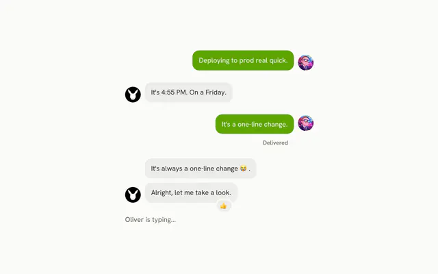
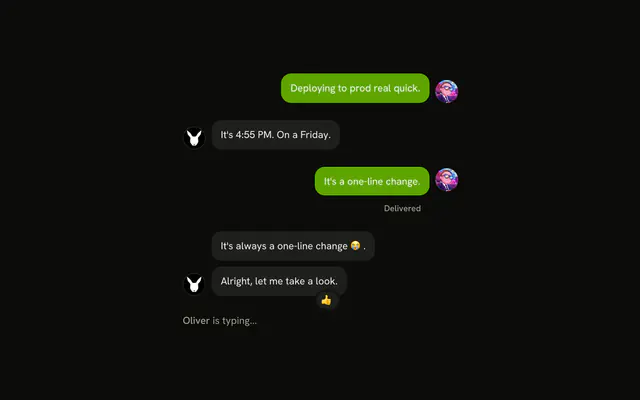
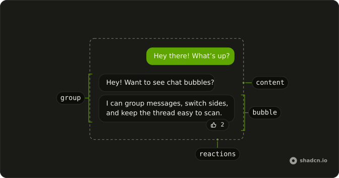
Bubble is the colored box around one line of a chat, on the side of whoever said it, with room for reactions over its edge. On its own it suits a compact thread with no names or pictures.
When a turn needs an avatar, a name, a time or a row of actions, put the bubble in a Message, which lays out the row around it and puts everything on the sender's side.
Installation
Anatomy
Usage
import {
  Bubble, BubbleContent, BubbleReactions,
} from "@/components/ui/bubble";<Bubble>
<BubbleContent>
I checked the registry output and removed the stale route.
</BubbleContent>
<BubbleReactions aria-label="Reaction: thumbs up" role="img">
<span>👍</span>
</BubbleReactions>
</Bubble>Accessibility
A bubble is a styled div with no role, so its color and its side are things people see but a screen reader never says. When it matters who spoke, name the sender in text, which Message has a header for. Emoji in BubbleReactions are read one at a time by their names, so the demo at the top gives each set role="img" and an aria-label that says it once. A BubbleContent rendered as a button or a link is named by its own text, but an icon-only button placed in BubbleReactions needs an aria-label.
Demos
Variants
All seven values of variant in one column, on alternating sides: default, secondary, muted, tinted, outline, destructive, and ghost, which drops the frame and the 80% width cap so a markdown reply can fill the row. Pick one color for each side, such as tinted for the reader and muted for the other side, and keep destructive for a failure.
Alignment
A muted bubble on the default start side, and a filled one with align set to end, where the reader's own messages go. End follows the writing direction, so on a right-to-left page it is the left. Inside a Message, set the side on the message instead and the bubble follows it.
Group
Three messages in a row from the reader sit in a BubbleGroup between two replies, packed closer than separate turns so they read as one person speaking. Each bubble keeps its own align. The last one's reaction has align set to start, so it hangs toward the middle of the thread instead of off the outer edge.
Links and buttons
Three suggested replies under a question, where the whole tinted box is the control. The first two render BubbleContent as a button that shows a toast naming it, and the third, which hands the person to a human, renders it as a link to a support page. Offer a few short choices like this when most people answer the same few ways.
Reactions
Four bubbles show what BubbleReactions can hold: two emoji, a count after the first few, emoji moved over the top edge with side set to top, and on a destructive bubble a Yes, run it button that answers the question. Reactions overlap the bubble's edge and take no space of their own, so leave a wider gap after a bubble that has them.
Collapsible
The reader's long note about an accessibility review shows its first 180 characters. A Show more button inside the bubble, the trigger of a Collapsible, swaps in the full text, and Show less cuts it back. Use this for a pasted log or a long reply that would push the rest of the thread off the screen.
Tooltip
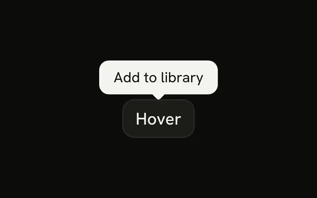
A read receipt: a check icon in BubbleReactions on the reader's message, with a Tooltip that gives the time it was read. Use it for a timestamp or a delivery state that would clutter the text. The check is an icon-only button, so it carries an aria-label of Read, and the time stays in the tooltip.
Popover
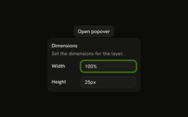
A failed command: a destructive bubble with an info button in BubbleReactions, named Show error details, that opens a Popover with the exit code and the missing file. Use a popover when the detail is longer than a tooltip can hold, or someone may want to select and copy it.
Markdown
The reader's short line is a muted bubble with one bold word, and the reply is three paragraphs in a ghost bubble, which removes the frame, the padding and the width cap. Bubble doesn't parse markdown. The demo's own small function draws the bold text and the code, and the bubble only supplies the box.
FAQ
What's the difference between Bubble and Message in a chat UI?
A Bubble is the colored box around the text, and all it knows is its color and the side it sits on. Message is the row around a turn, with a slot for an avatar, a header for the name and a footer for the time or actions, and it puts all of them on the sender's side.
Use Bubble alone for a compact thread with no names or pictures. Put it inside a Message as soon as a turn needs any of those.
How do I put sent chat messages on the right with Bubble?
Set align to end on each Bubble the reader sent, and leave the other side's on the default, start, as the Alignment demo does. The bubble moves to the end of its column, and its text goes with it.
End follows the writing direction, so on a right-to-left page the reader's messages sit on the left. Inside a Message, set align on the message, and the bubble follows it without a side of its own.
Which Bubble variant should I use for each side of the chat?
Pick one color per side and keep it. tinted or default for the reader's own messages and muted for the other side is a common pair, secondary and outline are quieter choices, destructive marks a failed send or an error, and ghost drops the frame for a long reply.
All seven are in the Variants demo. For a color of your own, add an eighth entry to the variants in components/ui/bubble, which is your code once installed, rather than a class on one bubble.
How do I group consecutive chat bubbles from the same person?
Wrap the run in BubbleGroup, as the Group demo does. It packs the bubbles closer together than separate turns usually sit, so they read as one person speaking several times. The group sets no side, so keep align on each Bubble.
Start a new group whenever the sender changes. If a bubble in the run has reactions, leave room under it, because they hang over its bottom edge.
How do I make a Bubble clickable, such as a suggested reply, in Solid?
Give BubbleContent an asChild function, as the Links and buttons demo does. It receives a props function, and spreading what that returns on a button or an a element puts the bubble's classes on it.
The bubble's text becomes the control's name, and focus and Enter come from the element itself. Suggested replies work best as two to four short choices under a question.
How do I add emoji reactions to a chat Bubble?
Put BubbleReactions inside the Bubble, after BubbleContent. It overlaps the bottom edge at the end corner, and side set to top moves it over the top edge, while align set to start moves it to the other corner. It takes no space of its own, so leave a wider gap after a bubble that has one.
A row of emoji is read one by one, so give BubbleReactions role="img" and an aria-label that names them once, such as "Reactions: thumbs up, fire".
How do I show a long AI reply with Markdown in a Bubble?
Use the ghost variant. It removes the background, the padding, the rounded corners and the 80% width cap, so the headings, lists and code from your markdown renderer get the whole width of the thread, as the Markdown demo shows.
Bubble doesn't parse markdown itself. Render the reply with a markdown library and pass the result to BubbleContent, and keep filled bubbles for the person's short messages.
How do I stop a long URL from overflowing a chat Bubble?
It wraps already. BubbleContent breaks a word that is too long for its line, so a URL or a commit hash wraps inside the box, and the bubble is capped at 80% of the width it sits in, except for ghost. What can't wrap, such as a wide code block or a table, is clipped at the edge, because BubbleContent hides its overflow.
Give that content a scroll of its own: wrap it in an element with overflow-x-auto inside the bubble.
API Reference
Bubble
<div> data-slot="bubble"
align?"start" | "end"
The side of the conversation it sits on: start (theirs) or end * (yours).
- Type
"start" | "end"- Default
"start"
variant?"default" | "destructive" | "ghost" | "muted" | "outline" | "secondary" | "tinted"
The visual style.
- Type
"default" | "destructive" | "ghost" | "muted" | "outline" | "secondary" | "tinted"- Default
"default"
class?string
Merged with the part's classes.
data-align?string
Mirrors align.
data-variant?string
Mirrors variant.
BubbleContent
<div> data-slot="bubble-content"
asChild?(props: ParentProps) => JSX.Element
Render your own element: a function that gets the part's props to spread on it.
- Type
(props: ParentProps) => JSX.Element- Default
false
class?string
Merged with the part's classes.
BubbleGroup
<div> data-slot="bubble-group"
class?string
Merged with the part's classes.
BubbleReactions
<div> data-slot="bubble-reactions"
align?"start" | "end"
Which end of the bubble the reactions sit at: start or end.
- Type
"start" | "end"- Default
"end"
side?"top" | "bottom"
Whether the reactions sit above (top) or below (bottom) the bubble.
- Type
"top" | "bottom"- Default
"bottom"
class?string
Merged with the part's classes.
data-align?string
Mirrors align.
data-side?string
Mirrors side.