shadcn.io is an independent project built on shadcn/ui
Trace lists what an AI agent did on the way to its answer, one line per step: the search it ran, the file it read, the command that failed. A line can stay plain text, open onto its output, link to a page or open a dialog.
The reply itself goes in a Message. For a tool call or a chain of thought that is ready to paste, start from Tool or Chain of Thought, which are built from these parts.
Installation
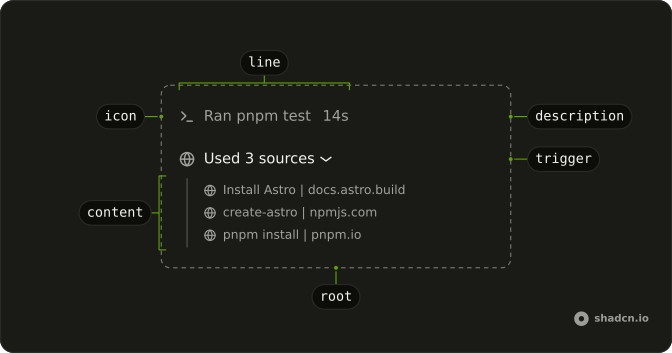
Anatomy
Usage
import { SearchIcon, TerminalIcon } from "lucide-react";
import {
  Trace, TraceCollapsible, TraceCollapsibleContent,
  TraceCollapsibleTrigger, TraceIcon, TraceLine, TraceTitle,
} from "@/components/ui/trace";<Trace className="max-w-sm">
<TraceLine>
<TraceIcon>
<SearchIcon aria-hidden="true" />
</TraceIcon>
<TraceTitle>Searched for minimumReleaseAge</TraceTitle>
</TraceLine>
<TraceCollapsible>
<TraceCollapsibleTrigger>
<TraceLine>
<TraceIcon>
<TerminalIcon aria-hidden="true" />
</TraceIcon>
<TraceTitle>Ran node --version</TraceTitle>
</TraceLine>
</TraceCollapsibleTrigger>
<TraceCollapsibleContent>v24.18.0</TraceCollapsibleContent>
</TraceCollapsible>
</Trace>TraceLine is the line in every case. To make it do something, put it inside that thing's trigger: TraceCollapsibleTrigger for a line that expands, as the second one here does, or a link, or a dialog's trigger.
Accessibility
Trace adds no role of its own. A TraceLine is a span, read as text and passed over by Tab, until you wrap it: inside TraceCollapsibleTrigger it becomes a <button> with aria-expanded, and inside a link or a dialog's trigger it takes that element's role and keys. TraceIcon is hidden from screen readers, so TraceTitle names the line. The red of an error and the shimmer of a running step are only visual, so put the state in the title's words: Running pnpm build, Failed to run pnpm lint. A link that opens a new tab should say so in an sr-only span, as the demos' links do.
- Enter
- When focus is on a line that expands, opens or closes it. On a link it follows the link, and on a dialog's or sheet's trigger it opens the overlay.
- Space
- When focus is on a line that expands, opens or closes it. On a dialog's or sheet's trigger, opens the overlay.
- Tab
- Moves focus to the next line that does something, or to anything focusable in an open line's content, such as its Code Block. Plain lines, and everything inside a closed line, are skipped.
- Shift+Tab
- Moves focus back through the same stops, to the previous line that does something or into an open line's content.
Demos
Static
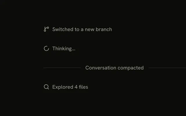
One line, a branch icon and Created branch fix/frozen-lockfile, with nothing behind it. A TraceLine on its own is a span, so a screen reader reads it as text and Tab passes over it. Use it for a step with no output worth opening, rather than wrapping every line in a trigger so they all look clickable.
Status
Four lines, one for each status: Ran pnpm install with none, Failed to run pnpm lint as error, Running pnpm build as running and Run pnpm test as pending. The error line turns destructive, the running title shimmers and the pending line fades. Each title is written in the tense of its state, because a screen reader hears no color.
Description
An edited file with +48 −12 after its path, a test run that took 14s and a search that found 8 results. TraceDescription never shrinks, so on a narrow line the long file path in the title is cut short first. Keep it to a number or a word. The diff stat sets dir to ltr, so it still reads +48 −12 on a right-to-left page.
Collapsible
Ran node --version opens onto its output in a Code Block. The TraceLine goes inside TraceCollapsibleTrigger, which adds the chevron after it, and the output goes in TraceCollapsibleContent, indented behind a thin rule. Use it when the detail is worth a look but not worth the room until someone asks for it.
Open
Ran node --version starts open, and Ran pnpm --version opens when pressed or from the Show the pnpm output button under it. Every line starts closed unless you set defaultOpen on its TraceCollapsible. Hold the open state yourself, as the second line does, when something outside the line has to open it.
Link
Two lines wrapped in links. Read apps/v4/lib/docs.ts goes to a page in the app and ends in a chevron, while the Astro install guide opens in a new tab, ends in an arrow pointing up and out, and tells screen readers so. Each link sits directly inside Trace, which lays it out as a row with a focus ring.
Dialog
Searched the web for cache keys opens a Dialog listing the three results the reply used, each a link that opens in a new tab. The line goes in the dialog's trigger, and the dialog brings its own focus trap, Escape and return of focus. Use it when the detail needs a surface of its own.
Sheet
Explored 4 files opens a Sheet from the side of the screen, with the paths of the four files the agent read. It is built the same way as the Dialog demo, with the line in the sheet's trigger. Pick a sheet when the detail is long, such as a diff or a file, and the reader wants the chat still in sight behind it.
Group
Searched for minimumReleaseAge, Read pnpm-workspace.yaml and Ran pnpm install, three plain lines in one Trace. Lines that follow each other belong in one list, which spaces them evenly and styles any link or trigger that wraps one. Start a new Trace where the reply's own text breaks the run, as the Turn demo does.
Sources
Used 3 sources starts open and holds a second Trace of links, one for each page the reply drew on, each opening in a new tab. Put it under an answer for its citations, and keep the count in the title so the line says how many there are while it is closed. The Sources pattern is built this way.
Steps
Looking into the slow deploy is a running summary that opens onto three steps: a search that expands into the two domains it hit, a link to the last twelve deploys, and a search still running. Trace doesn't read the steps, so set the summary's status and title from them yourself. Chain of Thought is this shape.
Commit
Committed a1b2c3: Fix the login redirect opens onto a line per changed file, with Added or Edited in the title and the line counts after it. Each file opens its diff in a Sheet. Show it after an agent commits, so the reader can check the change without leaving the chat.
Turn
A whole turn in three levels: Worked for 2m 4s, 1 command failed, then a thought and a summary of two commands, then the commands, where pnpm --version failed. The demo sets status to error on each line above the failure by hand, because Trace doesn't carry a child's state up. The agent's sentence between the steps sits between two Trace lists, not inside one.
Thinking
Press Send message to watch the reasoning stream in under the question. The line reads Thinking with a shimmer and stays open while the words arrive, then reads Thought and folds shut once the reasoning is done, unless the reader opened or closed it first. With the AI SDK this is a reasoning part, shown as a plain line until its first text arrives.
Tool calls
Press Send message and three commands run one after another: node --version and npm --version answer, and pnpm --version fails because pnpm isn't installed. Each line reads Running while it waits, then Ran or Failed to run, and opens onto its output in a Code Block. With the AI SDK these are tool parts, running in input-available and done in output-available or output-error.
Patterns built from these parts
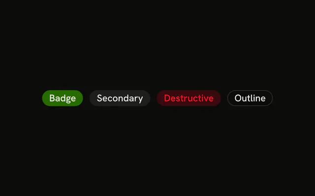
These pages have no component of their own. Each is a composition of Trace's parts, sometimes with a Code Block or a Badge, and the code to copy is in its demos.
| Pattern | Shows |
|---|---|
| Chain of Thought | A summary that expands into the steps behind it. |
| Plan | The steps the agent plans to take, and how far it has got. |
| Queue | The agent's todo list, split into what is left and what is done. |
| Reasoning | The agent's thinking as it streams. |
| Sources | The links the agent used for a reply. |
| Stack Trace | A failed tool call and its stack frames. |
| Subagent | A subagent run, with its tool calls and result. |
| Task | The steps the agent takes, as it takes them. |
| Terminal | A command the agent runs, with its output as it streams. |
| Test Results | A test run by the agent, with its suites and failures. |
| Tool | A tool call the agent makes, from input to output. |
FAQ
When should I use Trace instead of Steps or an Accordion?
Use Trace for a record of what an agent did or is doing: one line per step, with the detail a click away and most lines closed. Lines can nest, link out or open an overlay, and the list grows as the agent works.
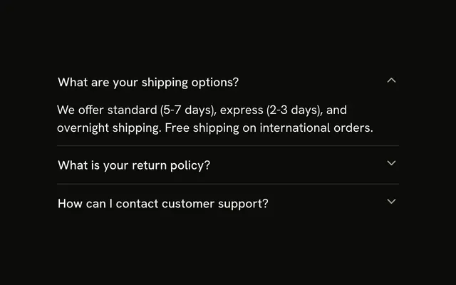
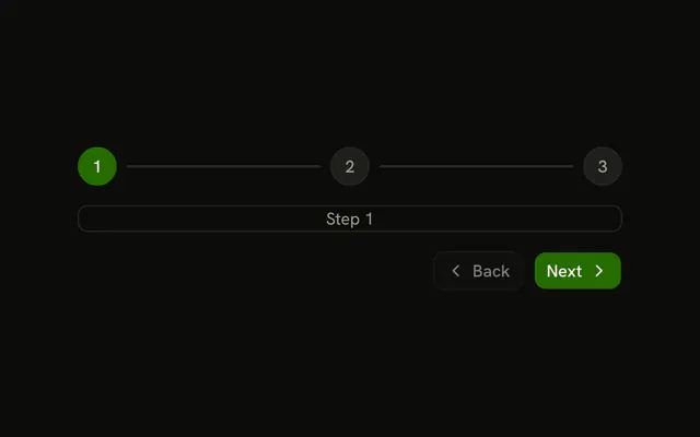
Steps is a numbered flow a person works through, such as a checkout or an onboarding form. An Accordion is a set of headed sections, like an FAQ, where the headings are the content people scan. For a single note between turns, use a Marker.
How do I make a Trace line expand in React?
Put the line inside a collapsible: TraceCollapsible around a TraceCollapsibleTrigger that holds the TraceLine, then the detail in TraceCollapsibleContent, as the Collapsible demo does. The trigger is the button, and it adds a chevron after the line that turns when the line opens.
Keep the TraceLine inside the trigger rather than giving the line a click handler. It is a span, so on its own it takes no focus and answers no keys.
How do I keep a Trace line open while the agent is still streaming?
Keep the reader's choice in state that starts as undefined. Pass open as that state once it is set and as your running flag until then, and store the boolean that onOpenChange receives.
The line then opens while the step runs and folds shut when it ends. Once the reader opens or closes it, their choice wins, as in the Thinking demo.
Do nested Trace lines keep their state when their parent closes?
Yes. The Collapsible that Trace builds on passes keepMounted to Base UI's panel, so a closed TraceCollapsibleContent stays in the page, hidden, and the lines inside keep whatever the reader opened. Set keepMounted to false on TraceCollapsibleContent to remove it once it closes.
While the parent is closed, the lines inside it are out of the tab order and hidden from screen readers.
How do I open a dialog or a sheet from a Trace line?
Put the TraceLine inside the overlay's trigger, DialogTrigger or SheetTrigger, as the Dialog and Sheet demos do. The trigger renders a button around the line, so it takes focus, opens on Enter or Space, and gets focus back when the overlay closes.
Keep the trigger a direct child of Trace, and it lays out as a row with the same focus ring as the lines that expand.
How do I show that a Trace step is running or failed?
Set status on TraceLine to running, error or pending. A running line sweeps a shimmer across its title, an error turns the line and its trigger's chevron destructive, and a pending one fades. Trace tracks no work itself, so the value comes from your data, and a summary line above a failure needs its own status, as in the Turn demo.
Say the state in the title as well, because color and motion don't reach a screen reader. The shimmer is the shimmer utility, which the install adds with Trace, and it stops for readers who ask for reduced motion.
API Reference
Trace
<div> data-slot="trace"
className?string
Merged with the part's classes.
TraceCollapsible
open?boolean
Whether the collapsible panel is currently open.
To render an uncontrolled collapsible, use the defaultOpen prop instead.
defaultOpen?boolean
Whether the collapsible panel is initially open.
To render a controlled collapsible, use the open prop instead.
- Default
false
onOpenChange?(open: boolean, eventDetails: CollapsibleRootChangeEventDetails) → void
Event handler called when the panel is opened or closed.
- Type
(open: boolean, eventDetails: CollapsibleRootChangeEventDetails) → void- Parameters
open– booleaneventDetails– CollapsibleRootChangeEventDetails- Returns
void
disabled?boolean
Whether the component should ignore user interaction.
- Default
false
render?ReactElement | ((props: object, state: object) => ReactElement)
Replace the host element or compose it with another component.
- Type
ReactElement | ((props: object, state: object) => ReactElement)
className?string
Merged with the part's classes.
TraceCollapsibleContent
data-slot="trace-collapsible-content"
disableAnimation?boolean
Opens and closes it at once, without the height animation.
hiddenUntilFound?boolean
Allows the browser's built-in page search to find and expand the panel contents.
Overrides the keepMounted prop and uses hidden="until-found"
to hide the element without removing it from the DOM.
- Default
false
keepMounted?boolean
Whether to keep the element in the DOM while the panel is hidden.
This prop is ignored when hiddenUntilFound is used.
- Default
false
render?ReactElement | ((props: object, state: object) => ReactElement)
Replace the host element or compose it with another component.
- Type
ReactElement | ((props: object, state: object) => ReactElement)
className?string
Merged with the part's classes.
--collapsible-panel-heightstringTraceCollapsibleTrigger
data-slot="trace-collapsible-trigger"
nativeButton?boolean
Whether the component renders a native <button> element when replacing it
via the render prop.
Set to false if the rendered element is not a button (for example, <div>).
- Default
true
render?ReactElement | ((props: object, state: object) => ReactElement)
Replace the host element or compose it with another component.
- Type
ReactElement | ((props: object, state: object) => ReactElement)
className?string
Merged with the part's classes.
TraceDescription
<span> data-slot="trace-description"
className?string
Merged with the part's classes.
TraceIcon
<span> data-slot="trace-icon"
className?string
Merged with the part's classes.
TraceLine
<span> data-slot="trace-line"
status?"running" | "error" | "pending"
The state of the work the line reports.
- Type
"running" | "error" | "pending"
className?string
Merged with the part's classes.
data-status?string
Mirrors status.
TraceTitle
<span> data-slot="trace-title"
className?string
Merged with the part's classes.