Garmin Design System
No brand color at all: grayscale chrome, Oswald display, Roboto body and hard 2px corners around product photos. Garmin's tokens for React and AI tools.
- Primary color
- #eeeeee
- Typeface
- Superscripts-Roboto
- Shape
- Sharp
- Base radius
- 0px
- Colors
- 6
- Type tokens
- 12
- Components
- 14
- Spacing values
- 8
About Garmin DESIGN.md
Curated by Dov Azencot, updated May 19, 2026. Source garmin.com (opens in a new tab).
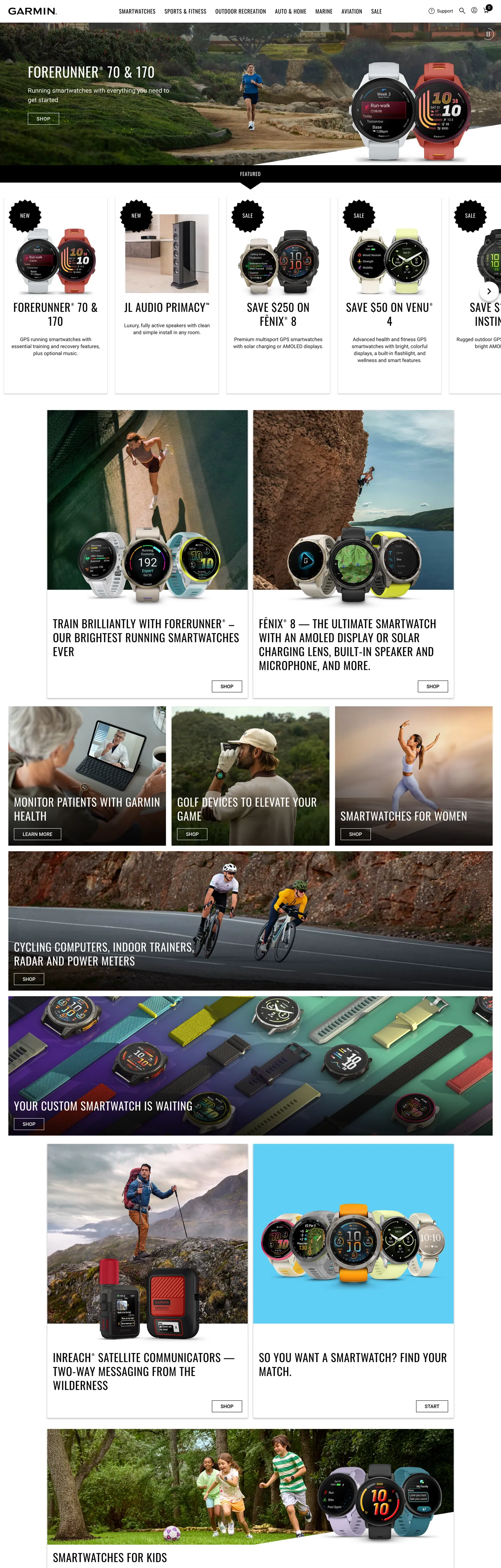
Garmin's home page does what very few consumer-electronics brands do: it skips brand voltage entirely. The captured surface has six color tokens, five of them grayscale (matte ink, soft ink, off-white, hairline gray, a single near-white) and one deep brick red used twice on a status flag. There is no Garmin Blue, no Garmin Orange, no chromatic accent on the marketing chrome anywhere above the fold. The page renders as monochrome plus product photography — the hero shows a runner mid-stride wearing a Forerunner 170, with a 40px Oswald headline ("FORERUNNER 70 & 170") in white over the photo and a thin uppercase eyebrow band above it. The brand carries itself on imagery and grayscale typography, the way an Outside Magazine spread does.
The DESIGN.md file packages the system into a machine-readable spec for React tooling. Inside: 6 colors tokens — pure white, pure black, a soft ink, a hairline gray, a deep brick-red status flag, and an off-white surface tint — covering the entire captured page; 13 typography tokens running on Oswald for every display tier and Roboto for every body and label tier, with weights 400, 500, and a single 700 emphasis; a deliberately tiny radius scale of just 2px and 100%; and 14 components covering the product-card grid, the dense secondary-product strip, the uppercase nav labels, the email-capture input, and the eyebrow status band that runs above the hero.
Feed this file to Claude or Cursor and it reproduces Garmin's specific moves: monochrome plus product photography rather than a chromatic brand voltage, Oswald at weight 400 as the display voice (not the heavy condensed default), Roboto body at 14.4px with the full CJK fallback stack, and the brutal 2px-or-circle radius binary. The one move worth borrowing if your product is hardware that photographs well: the willingness to skip brand color on the marketing surface and trust the imagery to carry chromatic interest. Most software brands cannot do this — the screen has no product photo, so the brand color has to do the heavy lifting. Garmin's hardware does the lifting; the chrome stays out of the way.
What makes it distinct
5 highlights
- Monochrome by choiceThe captured home page uses only six colors, all grayscale plus a single deep red used twice; no brand voltage fires on marketing chrome at all
- Oswald at weight 400Display headlines sit at 40px in regular weight rather than the bold-condensed default Oswald is known for; the lightness reads as engineering-restraint, not fitness-shout
- Roboto body, full CJK fallbackThe obfuscated wrapper Superscripts-Roboto stacks Noto Sans TC/SC/JP/KR/Prompt as fallback, signaling Garmin's global aviation and outdoor markets
- Hard-edge 2px radiusFive of six declared radii are 2px on cards, chips, and buttons; the sixth is 100% on a single circular avatar. No 4-6-8-12-16-24px tier anywhere
- Product photography as the chromeEvery category band leads with a lifestyle landscape (runner, cyclist, hiker) rather than an icon, illustration, or feature glyph
Live at garmin.com
Garmin in production, as captured. Scroll the window to see the whole page.
6 colors
Garmin's system anchors on #eeeeee (hairline-soft) as its primary color. Type is set in Superscripts-Roboto across 12 tokens from 11px to 40px, weights 400–700. Shape language is sharp — components average 1px corner radius, favoring crisp rectangles.
Surface
Page and card backgrounds · 1
Text
Headlines, body, captions · 2
Borders & Hairlines
Dividers, outlines, rules · 2
Other
Specialty colors · 1
12 type tokens
Set in Superscripts-Roboto across 12 tokens, from 11px to 40px, weights 400–700. Shown in its own stack: where the font isn't installed, the fallback the file names stands in.
- display-lg40px · weight 400 · lh 50px · tracking 0.8pxThe quick brown fox jumps over the lazy dog
- display-md32px · weight 400 · lh 40px · tracking 0.8pxThe quick brown fox jumps over the lazy dog
- heading-md20px · weight 400 · lh 32px · tracking 0.8pxThe quick brown fox jumps over the lazy dog
- heading-sm16px · weight 400 · lh 24px · tracking 0.64pxThe quick brown fox jumps over the lazy dog
- eyebrow-caps14.4px · weight 400 · lh 18px · tracking 0.8pxThe quick brown fox jumps over the lazy dog
- body-lg18px · weight 400 · lh 27pxThe quick brown fox jumps over the lazy dog
- body-md14.4px · weight 400 · lh 20pxThe quick brown fox jumps over the lazy dog
- body-emphasis14.4px · weight 700 · lh 21.6pxThe quick brown fox jumps over the lazy dog
- body-sm12.8px · weight 400 · lh 19.2pxThe quick brown fox jumps over the lazy dog
- nav-link12.8px · weight 400 · lh 24px · tracking 0.8pxThe quick brown fox jumps over the lazy dog
- nav-link-caps14px · weight 500 · lh 16.1px · tracking 0.8pxThe quick brown fox jumps over the lazy dog
- caption11px · weight 400 · lh 16.5pxThe quick brown fox jumps over the lazy dog
Radii and spacing
3 corner radii and 8 spacing values. Shape language: sharp, on a 0px base radius.
Radii3
- none0px
- xs2px
- full9999px
Spacing8
- xs4px
- sm8px
- base12px
- md16px
- lg24px
- xl32px
- 2xl50px
- 3xl64px
14 components
Each rendered from its tokens (color, type, radius, padding) on Garmin's own canvas.
- Hero SectionHero Sectionhero-section
- Hero HeadingHero Headinghero-heading
- Section HeadingSection Headingsection-heading
- Eyebrow BandEyebrow Bandeyebrow-band
- Body ParagraphBody Paragraphbody-paragraph
- Body Paragraph DarkBody Paragraph Darkbody-paragraph-dark
- Button PrimaryButton Primarybutton-primary
- Button SecondaryButton Secondarybutton-secondary
- Top NavTop Navtop-nav
- Nav LinkNav Linknav-link
- Product CardProduct Cardproduct-card
- Category TileCategory Tilecategory-tile
- Type here…Text Inputtext-input
- FooterFooterfooter
The system, in use
Garmin's tokens on the kind of product it builds.
Powerful. Personal. Made to last.
Thoughtful design and all-day performance, with everything working together.
Find the right plan
MonthlyYearly- Unlimited talk and text
- 5G access
- 50 GB data
- Unlimited data
- HD streaming
- 30 GB hotspot
- Premium data
- 4K streaming
- International calls
Garmin design system FAQ
Garmin's tokens, its components and how to use this DESIGN.md in your project.
What are the color tokens in the Garmin DESIGN.md?
What is Garmin's primary color hex code?
How do I use Garmin's colors in Tailwind CSS?
What is Garmin's primary brand color?
What fonts does Garmin use?
What is Garmin's type scale?
What can I use if I don't have Garmin's font?
What typography does Garmin use, and what should I substitute?
Why is Garmin's Oswald display at weight 400 rather than the typical bold weight?
Which components does the Garmin DESIGN.md define?
What corner radius and spacing does Garmin use?
How do I apply the Garmin design system to a shadcn/ui project?
How do I use the Garmin DESIGN.md with Claude Code or Cursor?
Is the Garmin DESIGN.md free to download?
How was the Garmin DESIGN.md made?
Is the Garmin DESIGN.md official?
Why are Garmin's corners so sharp?
Can I use this DESIGN.md to build my own hardware or outdoor-equipment marketing site in the Garmin design system?
Related reading
Specs, directories and component libraries that pair with this design system.
- Browse all design systemsThe full directory of DESIGN.md files on shadcn.io, with live mockups for each.shadcn.io
- Garmin — official siteGarmin's public marketing site — the source of truth for the live tokens captured in this file.garmin.com (opens in a new tab)
- The DESIGN.md specificationGoogle Labs' open spec for machine-readable design system files — the format this page is built on.github.com (opens in a new tab)
Use Garmin in your project
One machine-readable file. Drop it into Claude Code, Cursor, VS Code or any AI tool that reads DESIGN.md.
Download the DESIGN.md
One machine-readable file: every color, type, radius, spacing, and component token of Garmin.
Feed it to your AI tool
Drop it into Claude, Cursor, or GitHub Copilot. The agent writes React components and Tailwind classes that match Garmin's visual language.
Reference the tokens directly
Or paste the values into your Tailwind config, CSS variables, or component library: every color, size and radius is a quoted, ready-to-copy value.
Read the full DESIGN.md overview, rationale, do’s and don’ts
Overview
Garmin's marketing site inverts the consumer-electronics convention. Monochrome by choice. Where Apple frames its devices on a quiet near-white field with a single semantic accent (the green AppleCare badge, the red notification dot), Samsung leans on a saturated brand blue, and Fitbit on lime green, Garmin runs the captured home page with no chromatic accent on the chrome at all. Six color tokens — pure ink ({colors.ink} — #000000), a soft near-black for body text ({colors.ink-soft} — #1a1a1a), pure white ({colors.canvas}), a hairline gray ({colors.hairline} — #d9d9d9), an off-white ({colors.hairline-soft} — #eeeeee), and a single brick-red status flag ({colors.status-deep-red} — #920000) — cover every captured surface. The chromatic interest comes entirely from the product photography: a runner mid-stride, a cyclist on switchbacks, a hiker at altitude. The chrome stays out of the way.
The typographic system reinforces the engineering-instrument identity. Oswald-at-rest. Where Oswald is most often deployed at weight 700 with uppercase tracking on sports and outdoor brands (the typical "MARATHON 2024" headline), Garmin runs it at weight 400 — regular weight — across all four display tiers (40 / 32 / 20 / 16px). The hero h1 "FORERUNNER 70 & 170" sits in white over the running photo at 40px / 400 / 0.8px-tracked — visible without shouting. Roboto carries every body and label role at 14.4px / 400, with weight 500 only stepping in for the uppercase nav labels and weight 700 reserved for a single inline emphasis token (used twice on the page). This is not a fitness brand performing fitness; it is an instrument maker performing precision.
The radius scale is brutally binary. Only two values appear in the captured page: 2px (five occurrences on cards, chips, and the email-capture input) and 100% (one occurrence on a single circular avatar). There is no 4px, no 6px, no 8px, no 12-16-24px tier — surfaces are either hard-edged with a token chamfer or fully circular. This commits to the same instrument aesthetic the typography does: industrial precision rather than soft consumer-friendly.
Key Characteristics:
- Six total color tokens, all grayscale except a single deep brick red (
{colors.status-deep-red}— #920000) used twice as a status flag. No brand voltage on the marketing chrome. - Ink (
{colors.ink}— #000000) carries 765 occurrences (text 354, border 353, background 42, gradient 11) — pure black, not warmed near-black; the dominant tone by a wide margin. - Oswald display at weight 400 (not the typical 700) across 32-40px display tiers; Roboto body at 14.4px / weight 400; uppercase nav labels at weight 500 / 0.8px tracking — three weights, two families, every typographic role covered.
- Full CJK fallback stack on every Roboto declaration (Noto Sans TC, SC, JP, KR, Prompt) — Garmin's global aviation and outdoor markets baked into the font stack.
- Hard-edge radius scale:
{rounded.xs}2px on five surfaces,{rounded.full}on one circular avatar. No middle tier whatsoever. - Product photography carries the chromatic work — every category band leads with a runner / cyclist / hiker landscape rather than an icon, illustration, or feature glyph.
- Eyebrow band at the top of the hero (
{component.eyebrow-band}) uses Oswald 14.4px / 400 / uppercase / 0.8px tracked, white on ink — the brand's only consistent label treatment. - 16-and-8px dominate spacing (106 combined occurrences), with 32px (18 occurrences) and 50px (11 occurrences) carrying section padding.
Colors
Ink
- Ink (
{colors.ink}— #000000): frequency 765. Used as text (354), border (353), background (42), shadow (5), gradient (11). The load-bearing tone — top-nav background, eyebrow band, hero canvas behind the product photo, button-primary fill, and the dominant border on cards and dividers. Pure black, not a warmed near-black; Garmin commits to maximum contrast rather than softening. - Ink Soft (
{colors.ink-soft}— #1a1a1a): frequency 220 — 110 text, 110 border. The body-paragraph text color on the white surfaces — running text sits at this softer tone while headings stay at pure ink. The pairing creates a subtle two-step ladder within the dark-on-light reading band.
Surface
- Canvas (
{colors.canvas}— #ffffff): frequency 491 — 231 border, 232 text-on-dark, 28 background. Pure white, the page floor below the hero and the text-on-dark color above it. No off-white softening; the contrast against pure ink is uncompromising. - Hairline Soft (
{colors.hairline-soft}— #eeeeee): frequency 1, used as a single shadow tint. The lightest declared surface tone — likely reserved for hover states or subtle band fills that don't appear on the captured home page.
Hairline
- Hairline (
{colors.hairline}— #d9d9d9): frequency 19 — 18 shadow, 1 border. The single card-outline tone, used on product-card borders and the email-capture input outline. Notably it appears as shadow rather than border in 18 of 19 captures, suggesting it does most of its work as a 1-pixel soft shadow rather than a hard rule.
Status
- Status Deep Red (
{colors.status-deep-red}— #920000): frequency 2 — 1 text, 1 border. The single chromatic-non-grayscale color on the entire captured surface. Used as a status flag — likely on an "Out of stock" or "Limited availability" badge. A deep brick-red rather than a saturated emergency tone, reading as cautionary signage rather than as alarm.
Typography
Font Families
The system runs two families: Oswald for every display tier and Roboto for every body and label tier. Both are delivered through obfuscated wrapper names — Superscripts-Oswald and Superscripts-Roboto — that resolve to the real fonts via the foundry's licensing wrapper. Fallback stacks are extensive: every Roboto declaration walks Noto Sans TC, Noto Sans SC, Noto Sans JP, Noto Sans KR, Prompt, sans-serif, signaling Garmin's global aviation, marine, and outdoor markets where Traditional Chinese, Simplified Chinese, Japanese, Korean, and Thai script coverage is essential. Oswald falls back to Roboto Condensed then the same CJK stack.
Hierarchy
| Token | Family | Size | Weight | Line Height | Tracking | Transform | Use |
|---|---|---|---|---|---|---|---|
{typography.display-lg} | Oswald | 40px | 400 | 50px | 0.8px | none | Hero h1 ("FORERUNNER 70 & 170") |
{typography.display-md} | Oswald | 32px | 400 | 40px | 0.8px | none | Section displays below the hero |
{typography.heading-md} | Oswald | 20px | 400 | 32px | 0.8px | uppercase | Category-tile headings |
{typography.heading-sm} | Oswald | 16px | 400 | 24px | 0.64px | uppercase | Card sub-titles, eyebrow labels |
{typography.eyebrow-caps} | Oswald | 14.4px | 400 | 18px | 0.8px | uppercase | The black eyebrow band above the hero ("Featured") |
{typography.body-lg} | Roboto | 18px | 400 | 27px | 0 | none | Promotional pullquotes and large body |
{typography.body-md} | Roboto | 14.4px | 400 | 20px | 0 | none | Default running-text paragraph style |
{typography.body-emphasis} | Roboto | 14.4px | 700 | 21.6px | 0 | none | Inline strong / pricing emphasis within body (2 occurrences) |
{typography.body-sm} | Roboto | 12.8px | 400 | 19.2px | 0 | none | Caption rows and meta strips |
{typography.nav-link} | Roboto | 12.8px | 400 | 24px | 0.8px | none | Top-nav category labels |
{typography.nav-link-caps} | Roboto | 14px | 500 | 16.1px | 0.8px | uppercase | Uppercase button labels and section nav links |
{typography.caption} | Roboto | 11px | 400 | 16.5px | 0 | none | Legal text and footnote captions |
Principles
The defining typographic move is Oswald at weight 400 instead of weight 700. Most outdoor and sports brands deploy Oswald as a bold-condensed shouting display — Garmin runs it at regular weight across every display size, including the 40px hero. The lightness reads as engineering-restraint, repositioning Garmin from consumer-fitness brand into precision-instrument maker. The single weight-700 cell in the entire system is the inline body emphasis used twice on the page — every other typographic role sits at weight 400 or 500.
The CJK fallback stack on every Roboto declaration is the second distinguishing move. Most western marketing sites stop at Roboto, sans-serif as a fallback. Garmin walks the full Noto Sans CJK family explicitly, ensuring the marketing site renders correctly on every regional variant without per-locale CSS overrides. This is rare on a US-anchored marketing site.
Note on Font Substitutes
Both Oswald and Roboto are free from Google Fonts — substitute them at the same weights and the system reproduces directly. The obfuscated Superscripts- wrappers are licensing wrappers, not separate typefaces; using the foundry-direct files is equivalent. For the CJK fallback, Noto Sans CJK is also free from Google Fonts; the full TC / SC / JP / KR / Prompt stack is available without subscription. There is no display alternative to Oswald that captures its specific narrow-but-not-condensed aspect; if you need to swap, Bebas Neue is too condensed and Barlow Condensed is too soft — Oswald itself is the only direct match.
Layout
Spacing System
- Base unit: 8px, with 16px as the dominant gap value (56 occurrences) followed closely by 8px (50 occurrences).
- Tokens:
{spacing.xs}4px ·{spacing.sm}8px ·{spacing.base}12px ·{spacing.md}16px ·{spacing.lg}24px ·{spacing.xl}32px ·{spacing.2xl}50px ·{spacing.3xl}64px. - Section padding (vertical): the eyebrow band sits at 16x64px (
{spacing.md}x{spacing.3xl}). Hero photography is full-bleed with 0 padding. Section breaks below the fold run{spacing.xl}(32px) top-bottom. - Card internal padding:
{spacing.md}(16px) on product cards. - CSS spacing scale exposed on :root: Garmin declares
--g-spacing-xs0.25rem through--g-spacing-xxl5rem, a six-step rem-based scale that maps to the captured pixel values.
Grid & Container
- Max content width: 1440px (declared as
--g-breakpoint-xxl). Below-fold sections cap around 1200px (--g-breakpoint-lg) for text columns. - Breakpoint scale: declared as
--g-breakpoint-xs480px /-sm768px /-md1024px /-lg1200px /-xl1350px /-xxl1440px /-xxxl1824px — a seven-step breakpoint ladder that's wider than the typical Bootstrap-style four-step. - Hero block: full-bleed product photography, headline overlay centered at ~365px text-block width.
- Product grid: dense 4-up cards below the hero with 16px gutters, alternating with 2-up landscape-photography category bands.
Rhythm
The page rhythm alternates between dense product grid and single-photo category band. The hero is a single edge-to-edge photo. The eyebrow band above it is a thin black strip. Below the fold, a 4-up product card grid sits at full width, followed by a 2-up landscape-photography category band (running on the left, cycling on the right), then another 4-up product grid, then another 2-up band. There is no atmospheric transition between bands — every section terminates at a hard edge, the way an REI catalog spread does.
Elevation
The system has essentially no shadow tier. The captured page has 5 occurrences of {colors.ink} used as shadow ink and 18 occurrences of {colors.hairline} used as a soft shadow tint — a small total relative to the 765 ink and 491 white occurrences. Card depth comes from the 1-pixel hairline outline rather than a layered drop shadow.
- Flat (no shadow): hero, all photography bands, the category tiles, the footer — 99% of surfaces.
- Card elevation: product cards carry a 1-pixel
{colors.hairline}(#d9d9d9) shadow that reads more as a soft outline than as a drop shadow. - Modal scrim: not exposed on the captured surfaces.
Shapes
The radius scale is brutally binary — just two values appear in the captured page:
{rounded.none}0px — the dominant treatment. Hero, eyebrow band, category tiles, top-nav, footer, every section divider, and most surface fills. The page reads as a stack of hard-edged rectangles.{rounded.xs}2px — 5 occurrences. Product cards, secondary chips, the email-capture input. A barely-perceptible chamfer rather than a styled radius; reads as engineered rather than as decorative.{rounded.full}— 1 occurrence. A single circular avatar on a user-account badge.
There is no 4px, no 6px, no 8px, no 12-16-24px tier. Surfaces are either hard-edged with a token chamfer or fully circular as a one-off avatar. The lack of middle radii is the same commitment the grayscale palette and weight-400 Oswald make: industrial precision rather than soft consumer-friendly chrome.
Components
hero-section — Full-bleed photography with the headline overlay, 0 padding. The product photo extends edge-to-edge; the text block centers at ~365px width.
hero-heading — White text on the product photo, Oswald 40px / 400 / 0.8px-tracked. The display tier — visible without shouting.
section-heading — Same family one step down (32px / 400). Used for the section displays below the hero ("Train precisely with Forerunner", "Wherever you ride, ride with Garmin").
eyebrow-band — Ink {colors.ink} fill, white text, Oswald 14.4px / 400 / uppercase / 0.8px-tracked, 16x64px padding, 50px height. The thin black strip above the hero — runs across the full page width as a category eyebrow.
body-paragraph — Ink-soft {colors.ink-soft} running text at {typography.body-md} (14.4px Roboto / 400 / 20px line-height). The default body style on white surfaces.
body-paragraph-dark — White variant for body on dark surfaces (hero overlays, footer copy).
button-primary — Ink {colors.ink} fill, white text, Roboto 14px / 500 / uppercase / 0.8px-tracked, {rounded.xs} 2px radius, 8x24px padding, 40px height. No border. The primary CTA — "SHOP NOW", "LEARN MORE" — sits as a hard-edged black rectangle.
button-secondary — White {colors.canvas} fill, ink text, 1px ink border, same dimensions and typography. The inverse — used for secondary actions on light surfaces.
top-nav — Ink {colors.ink} band, 56px height, full-width. Garmin wordmark left, category labels center (Fitness / Outdoor / Marine / Aviation / Automotive — the brand's five market verticals), search + cart + account right.
nav-link — Transparent background, white text in {typography.nav-link} (Roboto 12.8px / 400 / 0.8px tracking), 0x12.8px padding. Category labels at title case with the wide tracking — not all-caps despite the precision aesthetic.
product-card — White {colors.canvas} fill, ink-soft text, 1px {colors.hairline} border (rendered as a soft shadow in most captures), {rounded.xs} 2px radius, 16px internal padding. Holds product thumbnail, title in {typography.heading-sm}, price in {typography.body-emphasis} (Roboto 14.4px / 700).
category-tile — Ink {colors.ink} fill, white text, no radius, 32x0x16px padding. The 2-up landscape-photo bands sit on a black surface with white Oswald headings overlaid on the right or below the image.
text-input — White fill, ink text, 1px {colors.hairline} border, no radius (0px), 10x8px padding, 40px height, Arial fallback at 16px. The email-capture row — the only input on the captured marketing surface, and notably the only major component that doesn't use the 2px {rounded.xs} chamfer.
footer — Ink {colors.ink} canvas, white text, 32px padding. Multi-column link list at {typography.body-sm}.
Do's and Don'ts
Do trust photography to do the chromatic work. The system reserves color for product imagery and runner / cyclist / hiker lifestyle shots; adding a brand-voltage CTA fill breaks the monochrome-plus-photography move and reads as a marketing-conversion afterthought.
Do keep Oswald at weight 400 across every display tier. The lightness is the engineering-instrument signature; bumping to weight 700 turns the brand into a generic outdoor-sports shout and undercuts the precision identity.
Do declare the full CJK fallback stack on every body-and-label token. Garmin operates in aviation, marine, and outdoor markets globally; dropping Noto Sans TC / SC / JP / KR / Prompt would leave non-Latin scripts rendering in system fallback fonts that break the typographic discipline.
Do use {rounded.xs} (2px) on all tappable surfaces except inputs. Inputs go to {rounded.none} 0px — the email-capture row is the one component that commits fully to the hard edge. Following this rule is what separates the system's industrial chamfer from a generic 4-8px rounded card.
Don't add a brand-voltage accent color to the marketing chrome. The captured surface has six colors and that is the whole palette — introducing a Garmin Blue (or any chromatic CTA fill) violates the grayscale discipline and pulls the eye away from the product photography.
Don't use {colors.status-deep-red} (#920000) for anything except a stock-status flag. It appears twice on the entire captured page and is the only chromatic moment in the system — overusing it dilutes the single status-warning signal.
Don't introduce a 4px or 8px radius tier. The system runs 2px or 100%, with nothing in between. A 4-8px corner reads as borrowed from a generic SaaS card library rather than as Garmin's engineered chamfer.
Don't swap Oswald for a softer humanist sans (Manrope, DM Sans, Inter) on the display tier. Oswald's narrow-but-not-condensed aspect is the typographic fingerprint that ties the marketing site to Garmin's instrument-cluster industrial design; substituting a wider sans loses the visual link.
Known Gaps
- Brand color suppression: the captured home page has no brand-voltage color. Garmin's better-known corporate blue lives on packaging, the Forerunner product configurator, and the Connect app — but it does not appear on the captured marketing chrome. This DESIGN.md captures the no-voltage marketing surface only.
- Hover and focus states: documented for none of the buttons; the captured surface exposes only resting states. The full state matrix (focus rings, active press, disabled tints) is not visible.
- Form input variants:
{component.text-input}carries only the email-capture row at the bottom of the page. Search inputs, filter dropdowns, and product-configurator inputs live on deeper product pages and are not represented. - Dark mode: the system is light-default with dark accent bands (hero, top-nav, footer, category tiles). There is no separate dark-mode CSS variable tier — the same tokens drive both surface treatments.
- Motion: the hero photography may auto-rotate; the spec captures end-state values only.
- Product surfaces: this DESIGN.md captures the global
garmin.comhome page only. The Garmin Connect app, the Forerunner product configurator, the Aviation and Marine vertical sites, and the Garmin Pilot app carry their own component sets with chromatic accents (notably the Aviation cockpit-blue family) that are not represented here. - CJK rendering: the declared Noto Sans fallback stack is comprehensive but the captured page only renders Latin script — the rendered metrics on TC / SC / JP / KR / Prompt may differ from the captured Roboto values.
More systems like this
Analogue, Apple, AT&T and 23 more in Consumer Electronics: each brand's colors, type and components in one file your AI agent builds from.
Build it with Pro
The DESIGN.md files are free. Pro adds 6,000+ blocks, premium templates and the MCP server, so your AI editor builds in your system for you.
4.9/5 out of 5 · 150+ reviewsfrom 150+ founders and developers.
Billing
Billed once a year in USD. Cancel anytime.
- How many people can use the license.
- Client work, SaaS products and anything you charge for.
- Page sections in 56 categories, from heroes and pricing tables to dashboards and settings, on every framework and UI library, in your theme.
- Complete Next.js sites for startups, SaaS, agencies and portfolios, every page designed, ready to ship.
- Your AI agent searches, previews and installs any component, block, icon or DESIGN.md from a prompt: 22 tools in Claude Code, Cursor, VS Code and 35 more clients.
- Buttons with motion and states of their own, from an arrow that slides in to a burst of confetti.
- Typewriters, scrambles, counters and more, for headlines, labels and numbers.
- Animated backgrounds for heroes, sections and cards, from a soft aurora to a flock that flees the cursor. Most are pure CSS.
- WebGPU shaders, from a slow aurora to a black hole, each drawing only while it's on screen.
- One design and one theme on all four: the components, blocks and effects are built for each framework.
- React on Base UI, Radix UI, React Aria or Ark UI: install the version for the library your project already uses. Vue, Svelte and Solid run on Ark UI.
- From a button to a date picker, a color picker or a guided tour: accessible, typed in TypeScript, each with live demos.
- Real-world patterns built from the components, in 53 galleries: forms, tables, menus, dialogs and more.
- Area, bar, line, pie, radar and radial charts on TanStack Charts, on every framework. React also gets the Recharts originals.
- Debounce, local storage, media queries and more: each hook is one typed file you own.
- From 222 libraries, Lucide, Heroicons, Tabler and Material Symbols among them, as SVG or a React component in one command.
- Stripe, Linear, Apple and 497 more: a brand's colors, typography and components in one file your AI agent builds from.
- Restyle every component and block at once: 8 styles, 7 grays, 18 colors and 5 radii, shared as a shadcn preset code.
- Priority requests are answered first.
Individual
For personal projects & open source
$32instead of $49/mo
$389 billed yearly
- Seats: 1 seat
- Commercial use: Personal & open source only
- Blocks: All 6,181 blocks
- Templates: All 14 templates
- MCP server: 38 AI clients
- Animated buttons: All 35 buttons
- Text effects: All 97 effects
- Backgrounds: All 100 backgrounds
- Shaders: All 100 shaders
- Frameworks: React, Vue, Svelte, Solid
- UI libraries: Base UI, Radix, Aria, Ark
- Components: All 174 components
- Examples: All 1,103 examples
- Charts: All 70 charts
- React hooks: All 35 hooks
- Icons: 294k+ icons
- DESIGN.md files: All 500 brands
- Theme builder: 8 styles × 18 colors
- Support: Standard
Team
Most popularFor freelancers, agencies & startups
$66instead of $99/mo
$789 billed yearly · ≈ $13/dev/mo
- Seats: Up to 5 seats
- Commercial use: Included
- Blocks: All 6,181 blocks
- Templates: All 14 templates
- MCP server: 38 AI clients
- Animated buttons: All 35 buttons
- Text effects: All 97 effects
- Backgrounds: All 100 backgrounds
- Shaders: All 100 shaders
- Frameworks: React, Vue, Svelte, Solid
- UI libraries: Base UI, Radix, Aria, Ark
- Components: All 174 components
- Examples: All 1,103 examples
- Charts: All 70 charts
- React hooks: All 35 hooks
- Icons: 294k+ icons
- DESIGN.md files: All 500 brands
- Theme builder: 8 styles × 18 colors
- Support: Priority
Organization
For companies with larger teams
$132instead of $199/mo
$1,589 billed yearly
- Seats: Unlimited seats
- Commercial use: Included
- Blocks: All 6,181 blocks
- Templates: All 14 templates
- MCP server: 38 AI clients
- Animated buttons: All 35 buttons
- Text effects: All 97 effects
- Backgrounds: All 100 backgrounds
- Shaders: All 100 shaders
- Frameworks: React, Vue, Svelte, Solid
- UI libraries: Base UI, Radix, Aria, Ark
- Components: All 174 components
- Examples: All 1,103 examples
- Charts: All 70 charts
- React hooks: All 35 hooks
- Icons: 294k+ icons
- DESIGN.md files: All 500 brands
- Theme builder: 8 styles × 18 colors
- Support: Priority
Billed once a year in USD. Cancel anytime.
Individual
For personal projects & open source
$32instead of $49/mo
$389 billed yearly
- How many people can use the license.Seats: 1 seat
- Client work, SaaS products and anything you charge for.Commercial use: Personal & open source only
- Page sections in 56 categories, from heroes and pricing tables to dashboards and settings, on every framework and UI library, in your theme.Blocks: All 6,181 blocks
- Complete Next.js sites for startups, SaaS, agencies and portfolios, every page designed, ready to ship.Templates: All 14 templates
- Your AI agent searches, previews and installs any component, block, icon or DESIGN.md from a prompt: 22 tools in Claude Code, Cursor, VS Code and 35 more clients.MCP server: 38 AI clients
- Buttons with motion and states of their own, from an arrow that slides in to a burst of confetti.Animated buttons: All 35 buttons
- Typewriters, scrambles, counters and more, for headlines, labels and numbers.Text effects: All 97 effects
- Animated backgrounds for heroes, sections and cards, from a soft aurora to a flock that flees the cursor. Most are pure CSS.Backgrounds: All 100 backgrounds
- WebGPU shaders, from a slow aurora to a black hole, each drawing only while it's on screen.Shaders: All 100 shaders
- One design and one theme on all four: the components, blocks and effects are built for each framework.Frameworks: React, Vue, Svelte, Solid
- React on Base UI, Radix UI, React Aria or Ark UI: install the version for the library your project already uses. Vue, Svelte and Solid run on Ark UI.UI libraries: Base UI, Radix, Aria, Ark
- From a button to a date picker, a color picker or a guided tour: accessible, typed in TypeScript, each with live demos.Components: All 174 components
- Real-world patterns built from the components, in 53 galleries: forms, tables, menus, dialogs and more.Examples: All 1,103 examples
- Area, bar, line, pie, radar and radial charts on TanStack Charts, on every framework. React also gets the Recharts originals.Charts: All 70 charts
- Debounce, local storage, media queries and more: each hook is one typed file you own.React hooks: All 35 hooks
- From 222 libraries, Lucide, Heroicons, Tabler and Material Symbols among them, as SVG or a React component in one command.Icons: 294k+ icons
- Stripe, Linear, Apple and 497 more: a brand's colors, typography and components in one file your AI agent builds from.DESIGN.md files: All 500 brands
- Restyle every component and block at once: 8 styles, 7 grays, 18 colors and 5 radii, shared as a shadcn preset code.Theme builder: 8 styles × 18 colors
- Priority requests are answered first.Support: Standard
Team
Most popularFor freelancers, agencies & startups
$66instead of $99/mo
$789 billed yearly · ≈ $13/dev/mo
Everything in Individual, plus
- How many people can use the license.Seats: Up to 5 seats
- Client work, SaaS products and anything you charge for.Commercial use: Included
- Priority requests are answered first.Support: Priority
Organization
For companies with larger teams
$132instead of $199/mo
$1,589 billed yearly
Everything in Team, plus
- How many people can use the license.Seats: Unlimited seats
- Secure checkout via Stripe
- Code lives in your repo
- Keep what you've shipped if you cancel
- License terms
4.9 out of 5 from 150+ developers


Your system, built for you
Every block, template and icon, installed by your AI agent in your design system. The DESIGN.md files stay free.
- Cancel anytime
- Keep what you've shipped