Miele Design System
Miele's binary black-and-white chrome with an amber #f59b00 promo accent and a Helvetica Neue weight stack, as a DESIGN.md for React and AI tools.
- Primary color
- #191919
- Typeface
- HelveticaNeueW01-55Roma
- Shape
- Sharp
- Base radius
- 0px
- Colors
- 10
- Type tokens
- 10
- Components
- 15
- Spacing values
- 8
About Miele DESIGN.md
Curated by Dov Azencot, updated May 19, 2026. Source miele.com (opens in a new tab).
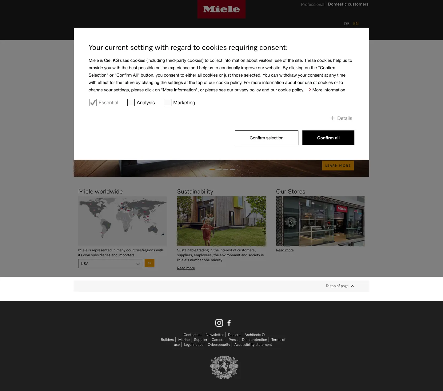
Miele's marketing site is built on an axiom most appliance brands avoid: the page is black and white, and the gold is an exception, not a rule. The nav bar is pure black (#000000) with white text. The hero below is a blurred product photograph. The editorial grid below that is white canvas with black text, hairline-separated cards, and sharp corners throughout. The amber-gold (#f59b00) CTA button visible in the bottom quarter of the screenshot — "LEARN MORE" — is the only chromatic element in the captured chrome, appearing 9 times total as a promotional badge or button fill. Where Bosch uses a blue accent across every interactive element and LG holds a magenta-red across CTAs and nav highlights, Miele places its gold so rarely that it functions almost as a luxury signal rather than a UI convention — you notice it precisely because nothing else competes.
The DESIGN.md file packages the system into machine-readable tokens for React and AI tools. Inside: 10 colors tokens drawn from a pure binary system — black ink at four densities, white canvas at one, a light-mid grey for disabled states, and the amber-gold as the sole brand-layer token. Ten typography tokens span a proprietary four-weight Helvetica Neue stack: HelveticaNeueW01-45Ligh for light body and h3 subheadings, HelveticaNeueW01-55Roma for running text, HelveticaNeueW01-65Medi for uppercase category labels, and HelveticaNeueW01-75Bold for nav links and strong emphasis. 15 components cover the black primary button, the amber promotional CTA, the sharp-corner hairline card, the top-nav dark band, and the footer.
Feed this file to Claude or Cursor and it reproduces Miele's specific moves: binary black/white chrome, amber accent used at maximum scarcity, Helvetica Neue in four explicit weights, zero border-radius at every surface, and a 17-variable CSS custom-property system that drives button geometry consistently. The system is an argument for restraint by technical precision: where other appliance brands use accent colors to create visual excitement, Miele uses the complete absence of accent color as the excitement — and drops the gold at exact intervals as a reward for attention.
What makes it distinct
5 highlights
- Binary black/white chrome#000000 and #ffffff carry 260 of 300+ combined occurrences; no grey surface or gradient appears in the above-fold hero
- Amber-gold accent held in reserve#f59b00 appears 9 times total, only on promotional CTA buttons and product badges, never as a general UI accent
- Proprietary Helvetica Neue weight stackFour weights (45Ligh, 55Roma, 65Medi, 75Bold) mapped to distinct typographic roles via font-face names
- CSS custom-property button system17 declared variables including --obj-button-height (3rem), --obj-button-padding-horizontal (2.9375rem), hover/focus/disabled states
- Zero border-radius throughoutSharp-corner geometry at every scale from buttons to cards to input fields
Live at miele.com
Miele in production, as captured. Scroll the window to see the whole page.
10 colors
Miele's system runs on #191919 as its primary voltage, used in 2 of 15 components. Type is set in HelveticaNeueW01-55Roma across 10 tokens from 11px to 24px, weights 400–800. Shape language is sharp — components average 0px corner radius, favoring crisp rectangles.
Brand & Accent
Sparing, CTA-only voltage · 1
Surface
Page and card backgrounds · 2
Text
Headlines, body, captions · 7
10 type tokens
Set in HelveticaNeueW01-55Roma across 10 tokens, from 11px to 24px, weights 400–800. Shown in its own stack: where the font isn't installed, the fallback the file names stands in.
- display-md24px · weight 400 · lh 29pxThe quick brown fox jumps over the lazy dog
- heading-md20px · weight 400 · lh 23pxThe quick brown fox jumps over the lazy dog
- body-md12px · weight 400 · lh 16pxThe quick brown fox jumps over the lazy dog
- body-lg16px · weight 400 · lh 16pxThe quick brown fox jumps over the lazy dog
- label-md11px · weight 400 · lh 14px · tracking 1pxThe quick brown fox jumps over the lazy dog
- nav-link14px · weight 400 · lh 10pxThe quick brown fox jumps over the lazy dog
- button-md14px · weight 800 · lh 16pxThe quick brown fox jumps over the lazy dog
- caption12px · weight 400 · lh 14pxThe quick brown fox jumps over the lazy dog
- form-label16px · weight 400 · lh 20pxThe quick brown fox jumps over the lazy dog
- link-sm14px · weight 400 · lh 21pxThe quick brown fox jumps over the lazy dog
Radii and spacing
2 corner radii and 8 spacing values. Shape language: sharp, on a 0px base radius.
Radii2
- none0px
- full9999px
Spacing8
- xxs2px
- xs5px
- sm9px
- base10px
- md16px
- lg28px
- xl48px
- 2xl160px
15 components
Each rendered from its tokens (color, type, radius, padding) on Miele's own canvas.
- Button PrimaryButton Primarybutton-primary
- Button Primary HoverButton Primary Hoverbutton-primary-hover
- Button Primary DisabledButton Primary Disabledbutton-primary-disabled
- Button SecondaryButton Secondarybutton-secondary
- Button AmberButton Amberbutton-amber
- Top NavTop Navtop-nav
- Nav LinkNav Linknav-link
- Hero HeadingHero Headinghero-heading
- Body ParagraphBody Paragraphbody-paragraph
- Label UppercaseLabel Uppercaselabel-uppercase
- Card HairlineCard Hairlinecard-hairline
- Card ImageCard Imagecard-image
- FooterFooterfooter
- Link TextLink Textlink-text
- Form LabelForm Labelform-label
The system, in use
Miele's tokens on the kind of product it builds.
Powerful. Personal. Made to last.
Thoughtful design and all-day performance, with everything working together.
Miele design system FAQ
Miele's tokens, its components and how to use this DESIGN.md in your project.
What are the color tokens in the Miele DESIGN.md?
What is Miele's primary color hex code?
How do I use Miele's colors in Tailwind CSS?
What is Miele's primary brand color?
What color does Miele use for hover states on text links?
What fonts does Miele use?
What is Miele's type scale?
What can I use if I don't have Miele's font?
What typeface does Miele use, and how are the weights organized?
Which components does the Miele DESIGN.md define?
What corner radius and spacing does Miele use?
How does Miele's button system work?
How do I apply the Miele design system to a shadcn/ui project?
How do I use the Miele DESIGN.md with Claude Code or Cursor?
Is the Miele DESIGN.md free to download?
How was the Miele DESIGN.md made?
Is the Miele DESIGN.md official?
Can I use this DESIGN.md to build an appliance marketing site in the Miele design system?
Related reading
Specs, directories and component libraries that pair with this design system.
- Browse all design systemsThe full directory of DESIGN.md files on shadcn.io, with live mockups for each.shadcn.io
- Miele — official siteMiele's public marketing site — the source of truth for the live tokens captured in this file.miele.com (opens in a new tab)
- The DESIGN.md specificationGoogle Labs' open spec for machine-readable design system files — the format this page is built on.github.com (opens in a new tab)
Use Miele in your project
One machine-readable file. Drop it into Claude Code, Cursor, VS Code or any AI tool that reads DESIGN.md.
Download the DESIGN.md
One machine-readable file: every color, type, radius, spacing, and component token of Miele.
Feed it to your AI tool
Drop it into Claude, Cursor, or GitHub Copilot. The agent writes React components and Tailwind classes that match Miele's visual language.
Reference the tokens directly
Or paste the values into your Tailwind config, CSS variables, or component library: every color, size and radius is a quoted, ready-to-copy value.
Read the full DESIGN.md overview, rationale, do’s and don’ts
Overview
Miele's marketing page builds its identity on a binary axiom that few appliance brands hold. Black-white precision. The navigation band is pure black (#000000), the page body is pure white, and the two tones account for over 260 of the 300+ total captured color occurrences. Unlike Bosch (which uses a blue accent across every interactive element) or Samsung (which deploys gradient fills and colored chip UI), Miele allocates its single chromatic token — amber-gold (#f59b00) — to exactly 9 page occurrences, all as promotional button fills or product-badge fills. The amber appears only when Miele wants to mark something as a direct commercial action; it does not appear in navigation, does not appear in card grids, and does not appear as a text color anywhere on the page.
Typography runs a proprietary Helvetica Neue stack — four weights accessed via separate font-face names (45Ligh, 55Roma, 65Medi, 75Bold) — with all declared fontWeight values at 400 because the weight differentiation is encoded inside the font files rather than the CSS weight property. The button system is the most technically declared surface in the extraction: 17 CSS custom properties govern height (3rem), horizontal padding (2.9375rem), and four interaction states (default, hover, focus, disabled).
Key Characteristics:
- Pure binary chrome: #000000 ink (217 occurrences) and #ffffff canvas (43 occurrences) — no grey surface in the hero or editorial sections.
- Amber-gold #f59b00 at maximum scarcity — 9 total occurrences, exclusively as promotional CTA fill or product badge, classified as layer:brand.
- Four-weight Helvetica Neue family (45Ligh / 55Roma / 65Medi / 75Bold) accessed via separate web-font face names, all at CSS fontWeight:400.
- 17-variable CSS custom-property button system with explicit hover, focus, and disabled states.
- Zero border-radius throughout — every button, card, input, and select element is sharp-cornered.
- Dense micro-spacing: 5px, 9px, 10px are the primary internal spacing values; card padding at 16px; section padding sparse.
- Crimson link-hover (#8c0014) declared in CSS variables but never rendered in the static capture — exists entirely in the interactive state layer.
Colors
Ink
- Ink (
{colors.ink}— #000000): frequency 217. Used as text (114), border (101), background (2). The dominant page tone — fills the navigation band, every hairline border, and the primary button background. Pure black, not near-black. - Ink Near (
{colors.ink-near}— #191919): frequency 24. Used as text (10), border (11), background (3). Clustered from two near-black hex values in the extraction. Wired as--obj-button-background--defaultand--obj-link-color. The near-black that carries the button-primary fill and the link text color. - Ink Mid (
{colors.ink-mid}— #808080): frequency 4. Used as text (2), border (2). Clustered from two near-grey hex values in the extraction. Mid-grey for secondary metadata text. - Ink Light (
{colors.ink-light}— #c4c4c4): frequency 12. Used as text (6), border (6). The light-grey hairline tone for card borders and dividers.
Canvas
- Canvas (
{colors.canvas}— #ffffff): frequency 43. Used as text (18), border (18), background (7). Clustered from three near-white hex values in the extraction. The page body floor and button text color. Wired as--obj-button-color. - Canvas Disabled (
{colors.canvas-disabled}— #e2e2e2): zero rendered occurrences — declared only as--obj-button-background--disabled. Reserved for disabled button states.
Brand
- Accent Amber (
{colors.accent-amber}— #f59b00): frequency 9. Used as background (5), text (2), border (2). The sole brand-layer color in the system. Appears on the "LEARN MORE" promotional CTA in the hero and on product-tier badge fills. Absent from navigation, card chrome, and body text.
Interactive States
- Button Hover (
{colors.button-hover}— #6b6b6b): zero rendered occurrences — declared as--obj-button-background--hoverand--obj-button-background--focus. The mid-grey that replaces the near-black button fill on hover. - Link Hover (
{colors.link-hover}— #8c0014): zero rendered occurrences — declared as--obj-link-hover-color,--obj-link-hover-icon-color,--obj-link-icon-color. A deep crimson-red that fires on text-link hover. Not part of the visible chrome; part of the interactive state layer.
Typography
Font Family
The system runs Helvetica Neue in a proprietary four-weight web-font stack where each weight is loaded as a separately-named face: HelveticaNeueW01-45Ligh (Light), HelveticaNeueW01-55Roma (Roman/Regular), HelveticaNeueW01-65Medi (Medium), HelveticaNeueW01-75Bold (Bold). All CSS declarations use fontWeight: 400 — the actual optical weight comes from the loaded font file. This pattern means that swapping to a standard Helvetica Neue fallback will flatten all text to a single weight.
Hierarchy
| Token | Size | Weight Face | Line Height | Use |
|---|---|---|---|---|
{typography.display-md} | 24px | 55Roma | 29px | Section headings (h3 content) |
{typography.heading-md} | 20px | 45Ligh | 23px | h3 product titles, editorial sub-headers |
{typography.body-md} | 12px | 55Roma | 16px | Primary body text and captions |
{typography.body-lg} | 16px | 55Roma | 16px | Nav links, form text at standard size |
{typography.label-md} | 11px | 65Medi | 14px | Uppercase category labels (1px tracking) |
{typography.nav-link} | 14px | 75Bold | 10px | Top-nav link labels |
{typography.button-md} | 14px | Helvetica Neue 800 | 16px | Button label text |
{typography.caption} | 12px | 45Ligh | 14px | Secondary captions, footnotes |
{typography.form-label} | 16px | Helvetica Neue 400 | 20px | Form field labels |
{typography.link-sm} | 14px | 55Roma | 21px | Inline text links ("Read more") |
Principles
The 12px body text at 16px line-height (1.33 ratio) is the tightest body rhythm in this directory for a marketing surface — appropriate for a brand whose page functions more like a product catalog than an editorial magazine. The nav band runs Bold at 14px with a collapsed 10px line-height, giving top-bar links the density of a German engineering spec sheet.
Note on Font Substitutes
The HelveticaNeueW01 family requires a Linotype license. Inter covers all four weight roles cleanly; use font-weight 300 / 400 / 500 / 700 to approximate the four face names. Work Sans is a slightly narrower alternative at display sizes.
Layout
Spacing System
- Base unit: 5px micro-unit, with 10px as the primary module.
- Tokens:
{spacing.xxs}2px ·{spacing.xs}5px ·{spacing.sm}9px ·{spacing.base}10px ·{spacing.md}16px ·{spacing.lg}28px ·{spacing.xl}48px ·{spacing.2xl}160px. - Button padding:
--obj-button-padding-horizontal: 2.9375rem(~47px) — an unusually precise value set by CSS custom property rather than a round spacing token. - Card internal padding: 16px on editorial content cards.
- Section padding: sparse — the page delivers content in dense blocks with minimal inter-section breathing room compared to the luxury peers in this directory.
Grid & Container
- Nav band: full-width pure black, ~48px height, with centered wordmark and right-aligned customer-type toggle (Trade / Domestic customers).
- Hero: full-bleed product photography with promotional CTA overlay (amber button bottom-right).
- Below-fold editorial grid: 3-column card layout with product photography + minimal text + "Read more" links.
- Footer: full-width pure black footer with white text — mirrors the nav band geometry.
Rhythm
The page alternates between dense (full-bleed photography, tight card grid) and sparse (single editorial paragraph, map element) bands. Unlike Van Cleef & Arpels' generous 60–90px section margins, Miele packs more content per vertical unit — the aesthetic is catalog efficiency rather than editorial breathing room.
Elevation
The captured surface has no shadow tier. Zero shadow occurrences in the extraction. Cards are separated from the background by hairline borders ({colors.ink-light} — #c4c4c4) and by flat white-on-white surface contrast rather than any elevation. The nav band sits flush with a hard background-color break rather than a drop shadow. The absence of shadow reinforces the binary flatness of the system.
Shapes
The radius vocabulary is zero everywhere. No border-radius values appear in the extraction for any button, card, input, or container. The single radius token {rounded.none} covers the entire system; the full-pill token ({rounded.full}) is included as an available value but not rendered in the captured marketing surface. Miele's hard corners are the typographic equivalent of a product spec sheet — no softening, no rounding, no concession.
Components
button-primary — Near-black {colors.ink-near} fill, white text at {typography.button-md} (14px / 800), zero radius, 47px horizontal padding, 48px height. Driven by the --obj-button-* CSS custom-property system. The most geometrically precise component in the system.
button-primary-hover — Mid-grey {colors.button-hover} (#6b6b6b) fill replaces the near-black on hover. Same dimensions. Wired to --obj-button-background--hover.
button-primary-disabled — Light grey {colors.canvas-disabled} (#e2e2e2) fill, mid-grey text. Wired to --obj-button-background--disabled.
button-secondary — Transparent fill, black text, 1px black border. Same dimensions as primary. Used for the "Confirm selection" secondary action on the cookie consent panel.
button-amber — Amber {colors.accent-amber} fill, white text in uppercase {typography.label-md} (11px Medium), 6×8px padding, 32px height, zero radius. The promotional CTA button — "LEARN MORE" in the hero bottom-right. The only chromatic button in the system.
top-nav — Pure black {colors.ink} surface, white text, 48px height. Miele logo in white centered; a customer-type toggle (Trade / Domestic) sits right-aligned. Bottom hairline in white at very low opacity.
nav-link — Transparent background, white text in {typography.nav-link} (14px Bold). 0×7px padding (right-gapped).
hero-heading — Black text on transparent background at {typography.display-md} (24px Roma). Note: the extraction's heroHeading captured a cookie-consent h3 rather than the true marketing hero headline, which is behind the cookie overlay.
body-paragraph — Black text, {typography.body-md} (12px / 16px). The tight 1.33 line-height is the defining body-copy characteristic.
label-uppercase — Medium weight {typography.label-md} (11px / 1px tracking), uppercase, for category chip labels and section annotators.
card-hairline — White canvas, black text, 1px light-grey border ({colors.ink-light}), zero radius, 16px padding. The editorial content card.
card-image — White canvas, photography-first — product image fills the card face with text below. Zero padding on image, text portion at 16px.
footer — Pure black {colors.ink} fill, white text, 28px vertical padding. Mirrors the nav band. Social icons, legal links, and site-map links in white.
link-text — Transparent background, near-black {colors.ink-near} text in {typography.link-sm} (14px / 21px). "Read more" links with crimson hover state declared in CSS variables.
form-label — Transparent, black text at {typography.form-label} (16px / 20px). Form field labels on the cookie consent panel.
Do's and Don'ts
Do limit the amber {colors.accent-amber} (#f59b00) to direct commercial actions only — promotional CTAs, product-tier badges, and selection submit buttons. Using it for navigation highlights, card borders, or icon fills would destroy the scarcity that makes it read as a luxury signal rather than a promotional decoration.
Do use the --obj-button-* CSS custom-property system for all button variants. The 17 declared variables cover height, padding, color, and all four interaction states — implementing buttons outside this system will produce inconsistent geometry.
Do keep body text at 12px in {typography.body-md}. The tight 16px line-height is a deliberate catalog-density choice. Bumping to 16px text at 24px line-height shifts the register from product specification toward editorial commentary.
Do hold the top-nav and footer at pure black {colors.ink} (#000000). The binary black header / white body / black footer sandwich is the structural signature of the page; using a near-black or dark-grey for either band loses the graphic precision.
Don't add border-radius to any button or card. The entire system is zero-radius — even 4px rounded corners would introduce softness that conflicts with the German-engineering specification aesthetic. If the button or card needs to feel approachable, change the text, not the corners.
Don't use {colors.ink-light} (#c4c4c4) for text. It is a hairline-border-only token (6 text occurrences, all on border elements, zero on pure prose). For secondary text, use {colors.ink-mid} (#808080).
Don't apply {colors.link-hover} (#8c0014) to any static element. The crimson is an interactive-state-only token that fires on hover — using it as a static text color or icon fill would confuse it with an error or warning semantic.
Don't use the amber {colors.accent-amber} for text at body sizes. Its 9 occurrences split 5 background / 2 text / 2 border, and the 2 text occurrences are on button labels against the amber fill. At 12–14px on a white canvas, amber text falls below accessible contrast ratios.
Known Gaps
- Hero marketing content: the extractor captured the cookie-consent overlay as the primary content surface; the actual hero product photography, hero headline, and promotional carousel are blocked behind it and not represented in the component extraction.
- Product detail pages: this DESIGN.md covers the home/landing surface. Miele's product pages (washing machines, refrigerators, vacuum cleaners) likely expose additional comparison table, specification grid, and configurator tokens.
- Dark canvas surfaces: the nav and footer are dark, but no mid-dark surface (charcoal, dark grey) appears in the system. If dark-mode or dark-canvas editorial sections exist in product-specific marketing, they are not represented here.
- Animation and transitions: Miele's product carousels and scroll reveals use CSS transitions; timing and easing are not captured by the static extractor.
- International variants: the extracted URL is the global English site; regional variants (DE, US, UK) may use different section ordering, promotional colors, or typography scales.
More systems like this
Analogue, Apple, AT&T and 23 more in Consumer Electronics: each brand's colors, type and components in one file your AI agent builds from.
Build it with Pro
The DESIGN.md files are free. Pro adds 6,000+ blocks, premium templates and the MCP server, so your AI editor builds in your system for you.
4.9/5 out of 5 · 150+ reviewsfrom 150+ founders and developers.
- Secure checkout via Stripe
- Code lives in your repo
- Keep what you've shipped if you cancel
- License terms
4.9 out of 5 from 150+ developers


Your system, built for you
Every block, template and icon, installed by your AI agent in your design system. The DESIGN.md files stay free.
- Cancel anytime
- Keep what you've shipped