Panic Design System
Panic's playful developer site as a DESIGN.md: near-black canvas, one electric blue call to action and billboard-style Booton type, for React and AI tools.
- Primary color
- #0852ff
- Typeface
- Booton
- Shape
- Sharp
- Base radius
- 22.5px
- Colors
- 17
- Type tokens
- 10
- Components
- 15
- Spacing values
- 7
About Panic DESIGN.md
Curated by Dov Azencot, updated May 15, 2026. Source panic.com (opens in a new tab).
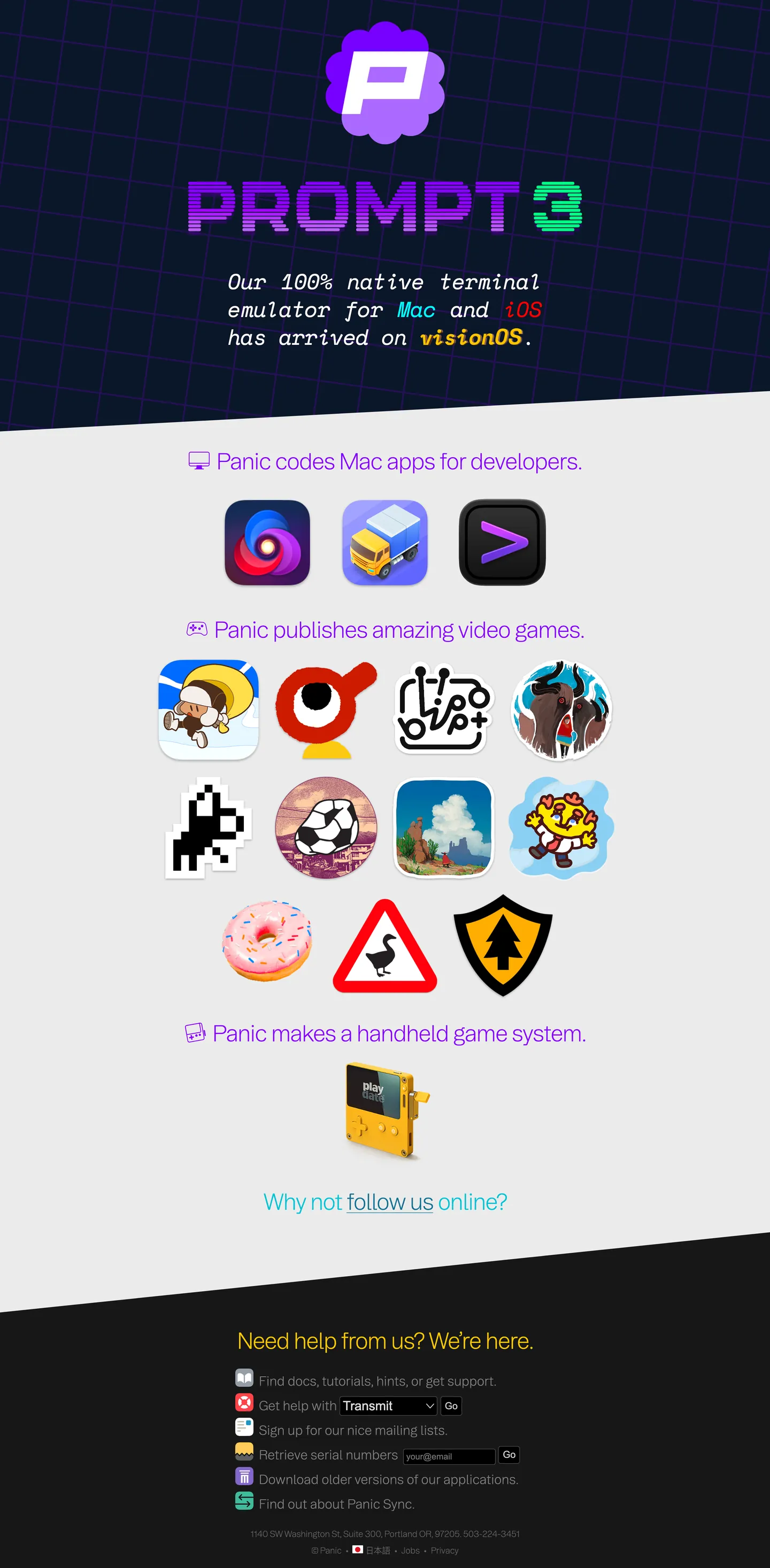
The first thing you notice on Panic’s site is the stark contrast between a near‑black hero band and a bright electric blue button that seems to pulse with intent. The hero heading stretches to eighty pixels in Booton, demanding attention while the rest of the page retreats into a palette of muted grays, letting the single accent do the heavy lifting. It feels like a terminal that got dressed up for a date, where the code remains the star and the UI merely whispers.
The palette choice reads like a deliberate experiment in restraint. Rather than scattering colors across the page, Panic isolates one electric blue for primary actions, while the background settles into a near‑black canvas and the text lives in layers of gray. Where Stripe leans on indigo gradients and Vercel opts for matte black, Panic’s decision keeps the visual noise low, letting developers focus on the content. The use of a single accent mirrors the Playdate handheld’s limited color screen, reinforcing the brand’s hardware roots.
What does this mean for a designer or developer pulling the spec into a tool? The system forces you to think about hierarchy before hue, encouraging you to use the electric blue sparingly and let typographic scale carry emphasis. It also means any component you build will inherit a clear elevation strategy: borders in pure white act as subtle lifts, while the gray text hierarchy defines depth. Stealing this restraint can make any product feel more purposeful, especially when the audience values code over cosmetics.
What makes it distinct
4 highlights
- Single electric accentOne electric blue hue appears only on primary calls‑to‑action, forcing every other element to stay in grayscale and preserving visual hierarchy.
- Booton dominanceAll headings use the Booton family, from massive 80 px display text down to compact 15 px labels, giving the brand a consistent typographic voice.
- Gray‑scale depthA hierarchy of muted grays ink, muted, darkgray provides contrast without introducing additional colors, echoing the monochrome aesthetic of the Playdate console.
- Border minimalismThe only border color is pure white, used sparingly for input outlines, which makes borders feel like subtle elevation rather than decorative frames.
Live at panic.com
Panic in production, as captured. Scroll the window to see the whole page.
17 colors
Panic's system runs on #0852ff as its primary voltage, used in 3 of 15 components. Type is set in Booton across 10 tokens from 15px to 80px, weights 300–600. Shape language is sharp — components average 0px corner radius, favoring crisp rectangles.
Brand & Accent
Sparing, CTA-only voltage · 2
Surface
Page and card backgrounds · 1
Text
Headlines, body, captions · 3
Borders & Hairlines
Dividers, outlines, rules · 1
Other
Specialty colors · 10
10 type tokens
Set in Booton across 10 tokens, from 15px to 80px, weights 300–600. Shown in its own stack: where the font isn't installed, the fallback the file names stands in.
- display-8080px · weight 300 · lh 104px · tracking -0.5pxThe quick brown fox jumps over the lazy dog
- heading-4848px · weight 600 · lh 48px · tracking -0.5pxThe quick brown fox jumps over the lazy dog
- heading-4242px · weight 300 · lh 45px · tracking -2.1pxThe quick brown fox jumps over the lazy dog
- heading-4040px · weight 300 · lh 52px · tracking -0.5pxThe quick brown fox jumps over the lazy dog
- body-15-bold15px · weight 600 · lh 20px · tracking -0.5pxThe quick brown fox jumps over the lazy dog
- body-15-regular15px · weight 300 · lh 20px · tracking -0.5pxThe quick brown fox jumps over the lazy dog
- body-16-regular16px · weight 300 · lh 20px · tracking -0.5pxThe quick brown fox jumps over the lazy dog
- body-16-compact16px · weight 300 · lh 16px · tracking -0.5pxThe quick brown fox jumps over the lazy dog
- mono-4040px · weight 400 · lh 52px · tracking -0.5pxThe quick brown fox jumps over the lazy dog
- heading-2424px · weight 300 · lh 46px · tracking -0.5pxThe quick brown fox jumps over the lazy dog
Radii and spacing
4 corner radii and 7 spacing values. Shape language: sharp, on a 22.5px base radius.
Radii4
- large22.5px
- small4px
- full9999px
- none0px
Spacing7
- spacing-1010px
- spacing-3-753.75px
- spacing-4040px
- spacing-30-7230.72px
- spacing-1616px
- spacing-00px
- spacing-55px
15 components
Each rendered from its tokens (color, type, radius, padding) on Panic's own canvas.
- Primary ButtonPrimary Buttonprimary-button
- Hero HeadingHero Headinghero-heading
- H2H2h2
- Body TextBody Textbody-text
- Nav LinkNav Linknav-link
- InputInputinput
- CardCardcard
- BadgeBadgebadge
- FooterFooterfooter
- ModalModalmodal
- TooltipTooltiptooltip
- SidebarSidebarsidebar
- List ItemList Itemlist-item
- Button PrimaryButton Primarybutton-primary
- Button SecondaryButton Secondarybutton-secondary
The system, in use
Panic's tokens on the kind of product it builds.
Plan, build and ship in one place
Bring your team's work together, from the first idea to the final release.
Panic design system FAQ
Panic's tokens, its components and how to use this DESIGN.md in your project.
What are the color tokens in the Panic DESIGN.md?
What is Panic's primary color hex code?
How do I use Panic's colors in Tailwind CSS?
how does the playdate palette influence the marketing site in the Panic design system?
what is the role of the white border color in inputs in the Panic design system?
What fonts does Panic use?
What is Panic's type scale?
What can I use if I don't have Panic's font?
is booton a free typeface i can use too in the Panic design system?
Which components does the Panic DESIGN.md define?
What corner radius and spacing does Panic use?
how many components are defined in the panic design system?
How do I apply the Panic design system to a shadcn/ui project?
How do I use the Panic DESIGN.md with Claude Code or Cursor?
Is the Panic DESIGN.md free to download?
How was the Panic DESIGN.md made?
Is the Panic DESIGN.md official?
why does panic use a single electric blue accent?
Related reading
Specs, directories and component libraries that pair with this design system.
- Browse all design systemsThe full directory of DESIGN.md files on shadcn.io, with live mockups for each.shadcn.io
- Panic — official sitePanic's public marketing site — the source of truth for the live tokens captured in this file.panic.com (opens in a new tab)
- The DESIGN.md specificationGoogle Labs' open spec for machine-readable design system files — the format this page is built on.github.com (opens in a new tab)
Use Panic in your project
One machine-readable file. Drop it into Claude Code, Cursor, VS Code or any AI tool that reads DESIGN.md.
Download the DESIGN.md
One machine-readable file: every color, type, radius, spacing, and component token of Panic.
Feed it to your AI tool
Drop it into Claude, Cursor, or GitHub Copilot. The agent writes React components and Tailwind classes that match Panic's visual language.
Reference the tokens directly
Or paste the values into your Tailwind config, CSS variables, or component library: every color, size and radius is a quoted, ready-to-copy value.
Read the full DESIGN.md overview, rationale, do’s and don’ts
Overview
Panic’s visual language is built around restraint and hierarchy. Hairline-as-elevation.
Unlike many tech sites that splash multiple brand colors across the page, Panic isolates a single electric blue for calls‑to‑action and lets a spectrum of grays handle the rest. This approach forces designers to think about scale and spacing before hue, creating a layout that feels purposeful rather than decorative.
Key Characteristics:
- Electric blue accent limited to primary actions, creating a clear visual hierarchy.
- Booton typeface dominates headings, ranging from 80 px display to 15 px labels.
- Gray text hierarchy ink, muted, darkgray provides depth without extra colors.
- Pure white borders act as subtle elevation cues on inputs and cards.
- Near‑black canvas nearblack anchors the hero section, echoing Playdate’s hardware aesthetic.
- Rounded corners are modest (4 px) except for fully rounded badges, keeping the UI sharp.
- Spacing tokens are consistent, with a base 10 px unit guiding padding and margins.
- Components reference tokens directly, ensuring any new element inherits the same visual language.
- The system includes fifteen core components, from headings to modals, all tied to the token set.
- Typography line heights are deliberately tight, reinforcing the developer‑focused tone.
Known Gaps
- The token set lacks explicit definitions for hover or focus states, meaning designers must infer interaction styles or add them manually.
- No dedicated color token for success or warning messages, which could limit feedback UI without extending the palette.
- The spacing list contains several complex values that are not represented as atomic tokens, reducing reuse in layout utilities.
- Input components reference a hard‑coded Arial font, breaking the otherwise consistent Booton typographic system.
- The design does not provide a dark‑mode variant; all background and text colors assume a light‑or‑near‑black canvas.
- Rounded values stop at 22.5 px, offering limited options for more pronounced curvature in modern UI patterns.
More systems like this
Adobe, Boursorama, Bun and 23 more in Design & Creative Tools: each brand's colors, type and components in one file your AI agent builds from.
Build it with Pro
The DESIGN.md files are free. Pro adds 6,000+ blocks, premium templates and the MCP server, so your AI editor builds in your system for you.
4.9/5 out of 5 · 150+ reviewsfrom 150+ founders and developers.
Billing
Billed once a year in USD. Cancel anytime.
- How many people can use the license.
- Client work, SaaS products and anything you charge for.
- Page sections in 56 categories, from heroes and pricing tables to dashboards and settings, on every framework and UI library, in your theme.
- Complete Next.js sites for startups, SaaS, agencies and portfolios, every page designed, ready to ship.
- Your AI agent searches, previews and installs any component, block, icon or DESIGN.md from a prompt: 22 tools in Claude Code, Cursor, VS Code and 35 more clients.
- Buttons with motion and states of their own, from an arrow that slides in to a burst of confetti.
- Typewriters, scrambles, counters and more, for headlines, labels and numbers.
- Animated backgrounds for heroes, sections and cards, from a soft aurora to a flock that flees the cursor. Most are pure CSS.
- WebGPU shaders, from a slow aurora to a black hole, each drawing only while it's on screen.
- One design and one theme on all four: the components, blocks and effects are built for each framework.
- React on Base UI, Radix UI, React Aria or Ark UI: install the version for the library your project already uses. Vue, Svelte and Solid run on Ark UI.
- From a button to a date picker, a color picker or a guided tour: accessible, typed in TypeScript, each with live demos.
- Real-world patterns built from the components, in 53 galleries: forms, tables, menus, dialogs and more.
- Area, bar, line, pie, radar and radial charts on TanStack Charts, on every framework. React also gets the Recharts originals.
- Debounce, local storage, media queries and more: each hook is one typed file you own.
- From 222 libraries, Lucide, Heroicons, Tabler and Material Symbols among them, as SVG or a React component in one command.
- Stripe, Linear, Apple and 497 more: a brand's colors, typography and components in one file your AI agent builds from.
- Restyle every component and block at once: 8 styles, 7 grays, 18 colors and 5 radii, shared as a shadcn preset code.
- Priority requests are answered first.
Individual
For personal projects & open source
$32instead of $49/mo
$389 billed yearly
- Seats: 1 seat
- Commercial use: Personal & open source only
- Blocks: All 6,181 blocks
- Templates: All 14 templates
- MCP server: 38 AI clients
- Animated buttons: All 35 buttons
- Text effects: All 97 effects
- Backgrounds: All 100 backgrounds
- Shaders: All 100 shaders
- Frameworks: React, Vue, Svelte, Solid
- UI libraries: Base UI, Radix, Aria, Ark
- Components: All 174 components
- Examples: All 1,103 examples
- Charts: All 70 charts
- React hooks: All 35 hooks
- Icons: 294k+ icons
- DESIGN.md files: All 500 brands
- Theme builder: 8 styles × 18 colors
- Support: Standard
Team
Most popularFor freelancers, agencies & startups
$66instead of $99/mo
$789 billed yearly · ≈ $13/dev/mo
- Seats: Up to 5 seats
- Commercial use: Included
- Blocks: All 6,181 blocks
- Templates: All 14 templates
- MCP server: 38 AI clients
- Animated buttons: All 35 buttons
- Text effects: All 97 effects
- Backgrounds: All 100 backgrounds
- Shaders: All 100 shaders
- Frameworks: React, Vue, Svelte, Solid
- UI libraries: Base UI, Radix, Aria, Ark
- Components: All 174 components
- Examples: All 1,103 examples
- Charts: All 70 charts
- React hooks: All 35 hooks
- Icons: 294k+ icons
- DESIGN.md files: All 500 brands
- Theme builder: 8 styles × 18 colors
- Support: Priority
Organization
For companies with larger teams
$132instead of $199/mo
$1,589 billed yearly
- Seats: Unlimited seats
- Commercial use: Included
- Blocks: All 6,181 blocks
- Templates: All 14 templates
- MCP server: 38 AI clients
- Animated buttons: All 35 buttons
- Text effects: All 97 effects
- Backgrounds: All 100 backgrounds
- Shaders: All 100 shaders
- Frameworks: React, Vue, Svelte, Solid
- UI libraries: Base UI, Radix, Aria, Ark
- Components: All 174 components
- Examples: All 1,103 examples
- Charts: All 70 charts
- React hooks: All 35 hooks
- Icons: 294k+ icons
- DESIGN.md files: All 500 brands
- Theme builder: 8 styles × 18 colors
- Support: Priority
Billed once a year in USD. Cancel anytime.
Individual
For personal projects & open source
$32instead of $49/mo
$389 billed yearly
- How many people can use the license.Seats: 1 seat
- Client work, SaaS products and anything you charge for.Commercial use: Personal & open source only
- Page sections in 56 categories, from heroes and pricing tables to dashboards and settings, on every framework and UI library, in your theme.Blocks: All 6,181 blocks
- Complete Next.js sites for startups, SaaS, agencies and portfolios, every page designed, ready to ship.Templates: All 14 templates
- Your AI agent searches, previews and installs any component, block, icon or DESIGN.md from a prompt: 22 tools in Claude Code, Cursor, VS Code and 35 more clients.MCP server: 38 AI clients
- Buttons with motion and states of their own, from an arrow that slides in to a burst of confetti.Animated buttons: All 35 buttons
- Typewriters, scrambles, counters and more, for headlines, labels and numbers.Text effects: All 97 effects
- Animated backgrounds for heroes, sections and cards, from a soft aurora to a flock that flees the cursor. Most are pure CSS.Backgrounds: All 100 backgrounds
- WebGPU shaders, from a slow aurora to a black hole, each drawing only while it's on screen.Shaders: All 100 shaders
- One design and one theme on all four: the components, blocks and effects are built for each framework.Frameworks: React, Vue, Svelte, Solid
- React on Base UI, Radix UI, React Aria or Ark UI: install the version for the library your project already uses. Vue, Svelte and Solid run on Ark UI.UI libraries: Base UI, Radix, Aria, Ark
- From a button to a date picker, a color picker or a guided tour: accessible, typed in TypeScript, each with live demos.Components: All 174 components
- Real-world patterns built from the components, in 53 galleries: forms, tables, menus, dialogs and more.Examples: All 1,103 examples
- Area, bar, line, pie, radar and radial charts on TanStack Charts, on every framework. React also gets the Recharts originals.Charts: All 70 charts
- Debounce, local storage, media queries and more: each hook is one typed file you own.React hooks: All 35 hooks
- From 222 libraries, Lucide, Heroicons, Tabler and Material Symbols among them, as SVG or a React component in one command.Icons: 294k+ icons
- Stripe, Linear, Apple and 497 more: a brand's colors, typography and components in one file your AI agent builds from.DESIGN.md files: All 500 brands
- Restyle every component and block at once: 8 styles, 7 grays, 18 colors and 5 radii, shared as a shadcn preset code.Theme builder: 8 styles × 18 colors
- Priority requests are answered first.Support: Standard
Team
Most popularFor freelancers, agencies & startups
$66instead of $99/mo
$789 billed yearly · ≈ $13/dev/mo
Everything in Individual, plus
- How many people can use the license.Seats: Up to 5 seats
- Client work, SaaS products and anything you charge for.Commercial use: Included
- Priority requests are answered first.Support: Priority
Organization
For companies with larger teams
$132instead of $199/mo
$1,589 billed yearly
Everything in Team, plus
- How many people can use the license.Seats: Unlimited seats
- Secure checkout via Stripe
- Code lives in your repo
- Keep what you've shipped if you cancel
- License terms
4.9 out of 5 from 150+ developers


Your system, built for you
Every block, template and icon, installed by your AI agent in your design system. The DESIGN.md files stay free.
- Cancel anytime
- Keep what you've shipped