Penpot Design System
Penpot's open-source look as a DESIGN.md: cyan #14ceca accent, Work Sans type, a light #fafafa canvas and dark ink, with components for React and AI tools.
- Primary color
- #14ceca
- Typeface
- Work Sans
- Shape
- Sharp
- Base radius
- 8px
- Colors
- 16
- Type tokens
- 10
- Components
- 14
- Spacing values
- 9
About Penpot DESIGN.md
Curated by Dov Azencot, updated May 14, 2026. Source penpot.app (opens in a new tab).
Penpot’s live interface opens on a near‑white canvas (#fafafa) framed by dark ink (#151035) for headings and body copy, while the brand accent cyan (#14ceca) highlights primary actions, navigation icons, and interactive states. The typography hierarchy is anchored by a 72px Work Sans display headline, followed by 52px and 48px headings, and a consistent 16px body baseline, all rendered with a line‑height of 1.5 and normal letter‑spacing. This visual language avoids gratuitous ornamentation, focusing instead on clear information hierarchy and collaborative tooling cues.
Inside this DESIGN.md file you will find 16 colors tokens grouped into primary, ink, canvas, hairline, body, muted, surface‑dark, success, warning, error, link, and several accent shades; 10 typography tokens ranging from display‑xxl to caption; 6 rounded values from none to full; a spacing scale covering nine incremental steps from 8px to 48px; and 14 components definitions that cover buttons, cards, modals, inputs, badges, avatars, tooltips, dropdowns, tables, and navigation links. The token set follows the Google Labs spec for design token naming and is ready for export to Tailwind, CSS‑variables, or direct consumption by Claude, Cursor, and Copilot.
To use the file, import the JSON into your build pipeline, map the token references (e.g., {colors.primary}, {typography.body-md}) to your styling framework, and reference the rounded and spacing values in component props. The system’s emphasis on token consistency and open‑source accessibility makes Penpot a valuable case study for teams seeking a transparent, extensible design language that scales from prototype to production.
What makes it distinct
4 highlights
- Primary chromatic accentThe cyan #14ceca appears on CTA buttons, header highlights, and interactive icons, establishing brand identity across the UI.
- Dominant text toneInk #151035 powers headings, body copy, and form labels, ensuring legibility against both light and dark surfaces.
- Border definitionHairline #d3d3d3 is used for 1 px dividers, input outlines, and card edges, providing subtle visual separation without visual noise.
- Success signalingThe green #b7eb8f token marks positive feedback badges, progress bars, and validation messages, reinforcing user confidence.
Live at penpot.app
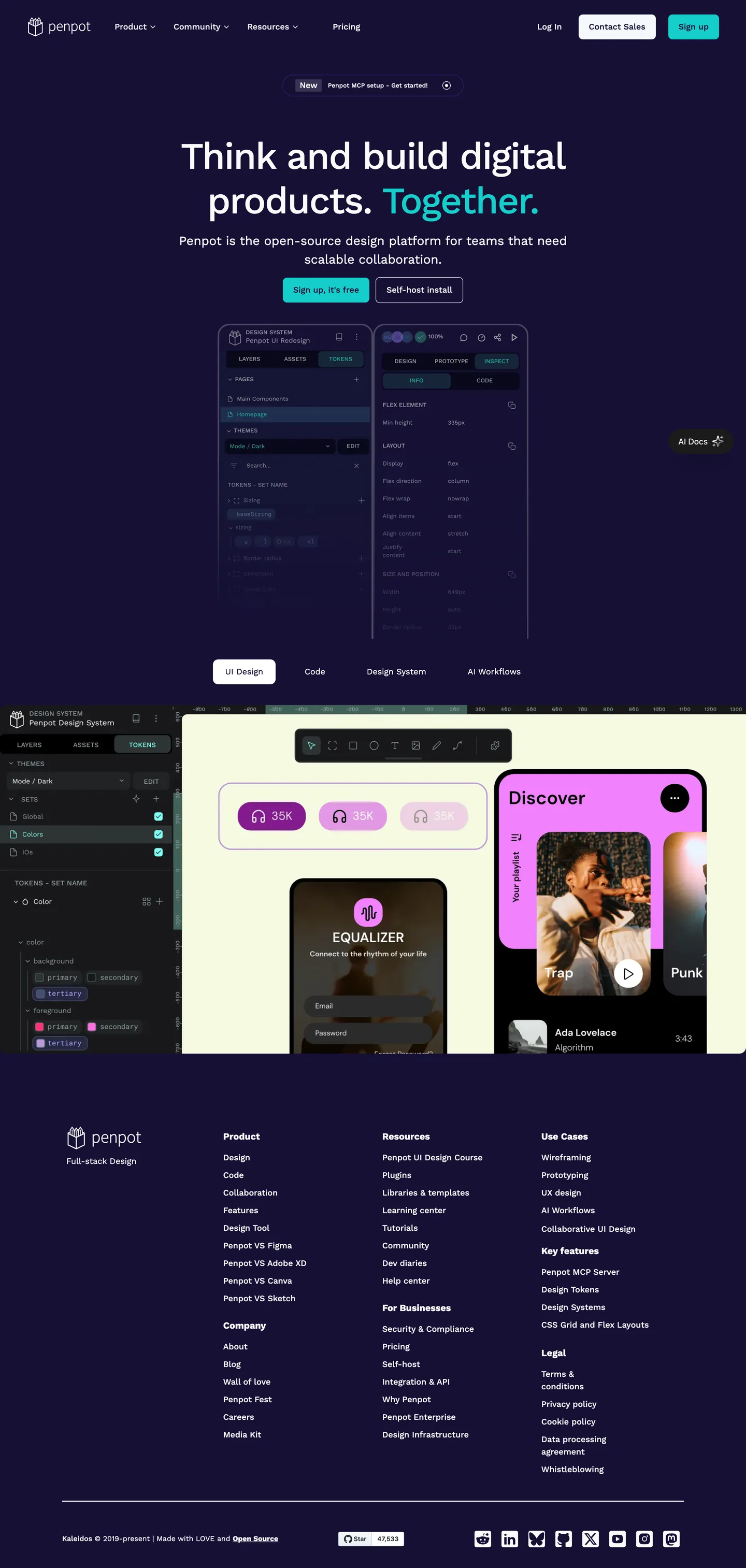
Penpot in production, as captured. Scroll the window to see the whole page.
16 colors
Penpot's system runs on #14ceca as its primary voltage, used in 1 of 14 components. Type is set in Work Sans across 10 tokens from 12px to 72px, weights 400–700. Shape language is sharp — components average 0px corner radius, favoring crisp rectangles.
Brand & Accent
Sparing, CTA-only voltage · 6
Surface
Page and card backgrounds · 2
Text
Headlines, body, captions · 4
Borders & Hairlines
Dividers, outlines, rules · 1
Semantic
Status, errors, success, links · 3
10 type tokens
Set in Work Sans across 10 tokens, from 12px to 72px, weights 400–700. Shown in its own stack: where the font isn't installed, the fallback the file names stands in.
- display-xxl72px · weight 500 · lh 86.4px · tracking -2pxThe quick brown fox jumps over the lazy dog
- display-xl52px · weight 500 · lh 62.4pxThe quick brown fox jumps over the lazy dog
- heading-lg48px · weight 700 · lh 52.8pxThe quick brown fox jumps over the lazy dog
- heading-md24px · weight 400 · lh 36pxThe quick brown fox jumps over the lazy dog
- body-lg18px · weight 700 · lh 27pxThe quick brown fox jumps over the lazy dog
- body-md16px · weight 500 · lh 24pxThe quick brown fox jumps over the lazy dog
- body-sm14px · weight 400 · lh 21pxThe quick brown fox jumps over the lazy dog
- caption12px · weight 500 · lh 18pxThe quick brown fox jumps over the lazy dog
- label14px · weight 500 · lh 21pxThe quick brown fox jumps over the lazy dog
- link14px · weight 500 · lh 21pxThe quick brown fox jumps over the lazy dog
Radii and spacing
6 corner radii and 9 spacing values. Shape language: sharp, on a 8px base radius.
Radii6
- none0px
- sm2px
- md8px
- lg10px
- xl20px
- full9999px
Spacing9
- xxs8px
- xs12px
- sm16px
- md20px
- base32px
- lg40px
- xl48px
- 2xl64px
- 3xl80px
14 components
Each rendered from its tokens (color, type, radius, padding) on Penpot's own canvas.
- Button PrimaryButton Primarybutton-primary
- Button SecondaryButton Secondarybutton-secondary
- Card DefaultCard Defaultcard-default
- Modal HeaderModal Headermodal-header
- Modal BodyModal Bodymodal-body
- Nav LinkNav Linknav-link
- Input TextInput Textinput-text
- Badge SuccessBadge Successbadge-success
- Badge WarningBadge Warningbadge-warning
- Badge ErrorBadge Errorbadge-error
- AvatarAvataravatar
- TooltipTooltiptooltip
- DropdownDropdowndropdown
- Table HeaderTable Headertable-header
The system, in use
Penpot's tokens on the kind of product it builds.
Plan, build and ship in one place
Bring your team's work together, from the first idea to the final release.
Penpot design system FAQ
Penpot's tokens, its components and how to use this DESIGN.md in your project.
What are the color tokens in the Penpot DESIGN.md?
What is Penpot's primary color hex code?
How do I use Penpot's colors in Tailwind CSS?
What is Penpot’s primary brand color and where does it appear?
What fonts does Penpot use?
What is Penpot's type scale?
What can I use if I don't have Penpot's font?
How does the typography system scale across headings and body text in the Penpot design system?
Which components does the Penpot DESIGN.md define?
What corner radius and spacing does Penpot use?
What is the purpose of the “Hairline‑as‑elevation” principle in Penpot’s design?
How are spacing tokens derived and applied in the component library in the Penpot design system?
How do I apply the Penpot design system to a shadcn/ui project?
How do I use the Penpot DESIGN.md with Claude Code or Cursor?
Is the Penpot DESIGN.md free to download?
How was the Penpot DESIGN.md made?
Is the Penpot DESIGN.md official?
What is the recommended workflow for developers to consume Penpot’s design tokens?
Related reading
Specs, directories and component libraries that pair with this design system.
- Browse all design systemsThe full directory of DESIGN.md files on shadcn.io, with live mockups for each.shadcn.io
- Penpot — official sitePenpot's public marketing site — the source of truth for the live tokens captured in this file.penpot.app (opens in a new tab)
- The DESIGN.md specificationGoogle Labs' open spec for machine-readable design system files — the format this page is built on.github.com (opens in a new tab)
Use Penpot in your project
One machine-readable file. Drop it into Claude Code, Cursor, VS Code or any AI tool that reads DESIGN.md.
Download the DESIGN.md
One machine-readable file: every color, type, radius, spacing, and component token of Penpot.
Feed it to your AI tool
Drop it into Claude, Cursor, or GitHub Copilot. The agent writes React components and Tailwind classes that match Penpot's visual language.
Reference the tokens directly
Or paste the values into your Tailwind config, CSS variables, or component library: every color, size and radius is a quoted, ready-to-copy value.
Read the full DESIGN.md overview, rationale, do’s and don’ts
Overview
Hairline‑as‑elevation. Penpot’s visual language builds on a disciplined token hierarchy that treats the 1 px hairline tone as a subtle elevation cue, allowing depth without heavy shadows. Where most design systems rely on layered card shadows to convey hierarchy, Penpot instead uses the hairline color #d3d3d3 combined with rounded corners to separate sections, creating a lightweight yet distinct visual structure. The system’s canvas (#fafafa) provides a neutral stage for content, while the ink #151035 ensures strong legibility across both light and dark contexts. Primary actions are highlighted with cyan #14ceca, reinforcing the open‑source brand identity. Typography follows a clear scale from 72px display headlines down to 12px captions, all set in Work Sans for consistency. Spacing tokens are expressed in a simple 8‑12‑16‑20‑32‑40‑48‑64‑80 px progression, supporting predictable layout composition. Rounded values range from sharp corners to fully rounded pills, giving designers flexibility while preserving visual harmony. Component definitions reference these tokens directly, enabling developers to import the JSON and generate CSS‑variables or Tailwind config without manual token mapping.
Key Characteristics:
- Primary cyan accent (#14ceca) applied to CTA elements and interactive states.
- Ink #151035 for headings, body copy, and form labels, guaranteeing contrast.
- Hairline border tone (#d3d3d3) used as elevation cue across cards and inputs.
- A modular typography scale anchored by Work Sans, spanning display‑xxl to caption.
- Spacing system based on an 8‑12‑16‑20‑32‑40‑48‑64‑80 px progression.
- Rounded token set from none to full, supporting diverse component shapes.
- Component library of 15+ tokens that reference colors, typography, spacing, and radii.
- Alignment with Google Labs design‑token spec for easy integration.
- Open‑source licensing that encourages community contribution and extension.
- Consistent use of token references ({colors.}, {typography.}) for maintainability.
Known Gaps
- The token set lacks explicit dark‑mode variants; designers must manually invert colors for a true dark theme, which adds overhead for projects requiring theme switching.
- No dedicated motion or animation tokens are defined, limiting the ability to standardize transition timing across components.
- Surface‑light token is absent because a pure white background is not represented in the extracted colors, reducing flexibility for high‑contrast layouts.
- Accessibility contrast checks are not baked into the token definitions, so developers need to verify WCAG compliance separately for each component.
- The current spacing scale does not include fractional values (e.g., 4px), which can be useful for fine‑grained layout adjustments in dense UI areas.
- Component definitions omit states such as disabled, focus, and active for many elements, requiring additional manual styling.
- Integration guidance for CSS‑in‑JS libraries (e.g., styled‑components) is not provided, which could hinder adoption in certain React ecosystems.
More systems like this
Adobe, Boursorama, Bun and 23 more in Design & Creative Tools: each brand's colors, type and components in one file your AI agent builds from.
Build it with Pro
The DESIGN.md files are free. Pro adds 6,000+ blocks, premium templates and the MCP server, so your AI editor builds in your system for you.
4.9/5 out of 5 · 150+ reviewsfrom 150+ founders and developers.
- Secure checkout via Stripe
- Code lives in your repo
- Keep what you've shipped if you cancel
- License terms
4.9 out of 5 from 150+ developers


Your system, built for you
Every block, template and icon, installed by your AI agent in your design system. The DESIGN.md files stay free.
- Cancel anytime
- Keep what you've shipped