Sonos Design System
Sonos's design system as a DESIGN.md file.
About Sonos DESIGN.md
Curated by Dov AzencotUpdated Source sonos.com
- Consumer Electronics
- Music, Video & Streaming
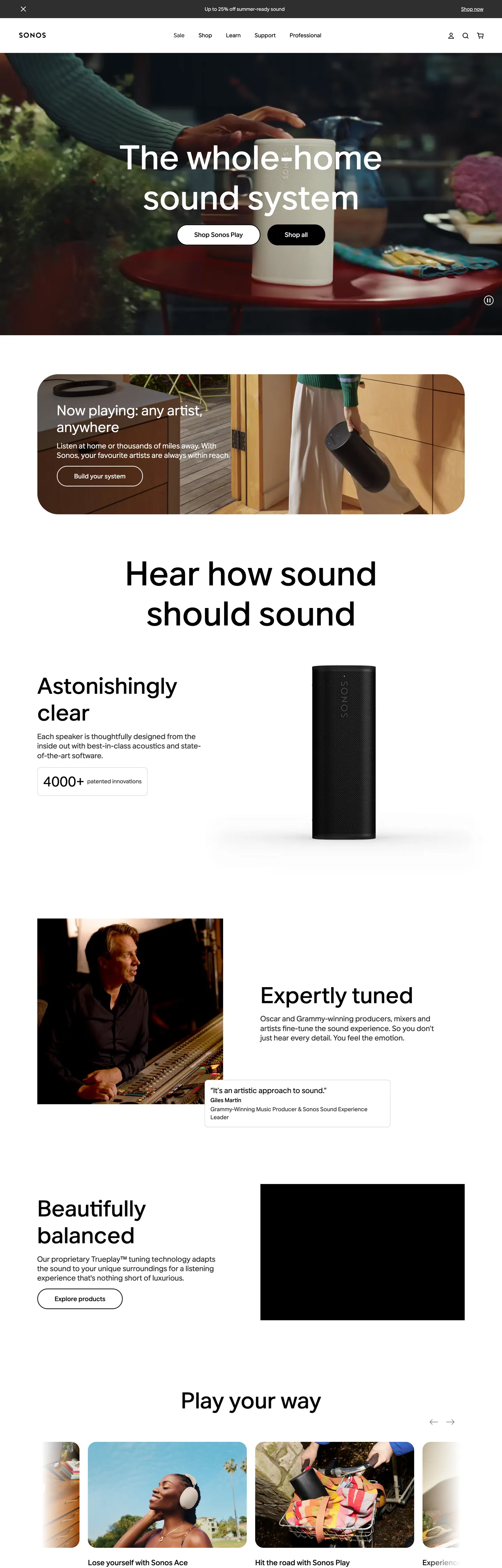
Sonos's homepage is a black showroom shot through a single soft-pill cookie-cutter. Above the fold, a near-full-bleed photograph of a speaker on a dim kitchen counter carries the entire mood; on top sits a 96px / weight-500 aktiv-grotesk headline — "The whole-home sound system" — flanked by two stacked 80px-radius pill CTAs ("Shop all" in black, "Sign in" in a black outline). The black CTA pill is the page's primary geometry: a 16×48px-padded slab with a 59px height and a corner radius (80px) just shy of a full capsule. Below the fold the canvas flips white, the typography stays inside the same aktiv-grotesk family, and product copy ("Astonishingly clear", "Expertly tuned", "Beautifully balanced") sits beside a single column of vertical speaker photography.
This page captures Sonos's web presence as a DESIGN.md file — Google Labs' open spec for machine-readable design tokens. Inside: 22 color tokens covering the two-voltage chrome (black and white at 569 and 442 occurrences respectively), the four near-grey ladder tones (#bfbfbf, #2e2e2e, #e0e0e0, #f4f4f4) used for hairlines and disabled chrome, plus a reserve palette of 14 named accent hexes (coral "#ec5770", walnut "#947051", cobalt "#1f30ca", parakeet green "#03c04a", linen "#f9f5f1") that the brand's CSS publishes but the homepage refuses to spend; 14 typography tokens running entirely on aktiv-grotesk with sizes 14 / 16 / 18 / 21 / 40 / 48 / 64 / 72 / 96 and weights 400 / 500 / 700; six radius tokens led by the signature 80px super-pill (count 20); and 26 component definitions covering hero, nav, product card, footer newsletter input, and the four-tier surface ladder.
Drop the file into Claude, Cursor, GitHub Copilot, or any AI assistant that reads structured tokens. The agent will produce React components that match Sonos's chrome — two-voltage black/white discipline, 80px stretched-pebble pills, magazine-pace 21px body type — rather than a generic e-commerce theme. Reference the tokens directly when auditing an existing product surface, when building a hardware-marketing landing page, or when teaching the difference between a brand that publishes a wide color reserve and one that spends it. Sonos publishes the reserve, then prints the homepage in black ink — restraint as a productivity decision, not a stylistic one.
What makes it distinct
- Two-voltage chromepure black (#000000, 569 occurrences) and pure white (#ffffff, 442 occurrences) carry every nav, button, and surface
- The 80px super-pillcount 20, the most-used radius on the page; not a 9999px capsule, not a 12px button, an in-between curve that reads as a stretched pebble
- One typeface ladderaktiv-grotesk at sizes 14/16/18/21/40/48/64/72/96, weights 400/500/700, with weight 500 doing the load-bearing display work
- Reserve color palette22 named accent tokens (coral, walnut, sunset, parakeet green, cobalt) defined in CSS, zero painted on the homepage
- Hero at 96px / 1.2display copy 'The whole-home sound system' breathes across 230px of vertical space with normal tracking, no negative letterspacing
Live at sonos.com
A snapshot of the brand in production. Hover the frame to scroll the page; click to visit.
 sonos.com
Explore Sonos
Pick what you want to see — mockups, colors, typography, layout, or the full component list.
Surface
Page and card backgrounds.
Text
Headlines, body, captions, muted.
Borders & Hairlines
Dividers, outlines, structural rules.
Other
Specialty colors.
Sonos design system FAQ
Common questions about Sonos's tokens, components, and how to use this DESIGN.md in your project.
Related reading
Specs, directories, and component libraries that pair with this design system.
Browse all design systems
The full directory of DESIGN.md files on shadcn.io, with live mockups for each.
Sonos — official site
The black-canvas consumer-audio homepage this DESIGN.md file documents.
The DESIGN.md specification
Google Labs' open spec for machine-readable design system files — the format this page is built on.