Spline Design System
Spline's marketing page is a 3D scene: floating shapes on near-black, Spline Sans and a single cobalt #0062ff CTA. Its tokens, for React and AI tools.
- Primary color
- #0062ff
- Typeface
- Spline Sans
- Shape
- Soft
- Base radius
- 12px
- Colors
- 13
- Type tokens
- 11
- Components
- 16
- Spacing values
- 8
About Spline DESIGN.md
Curated by Dov Azencot, updated May 18, 2026. Source spline.design (opens in a new tab).
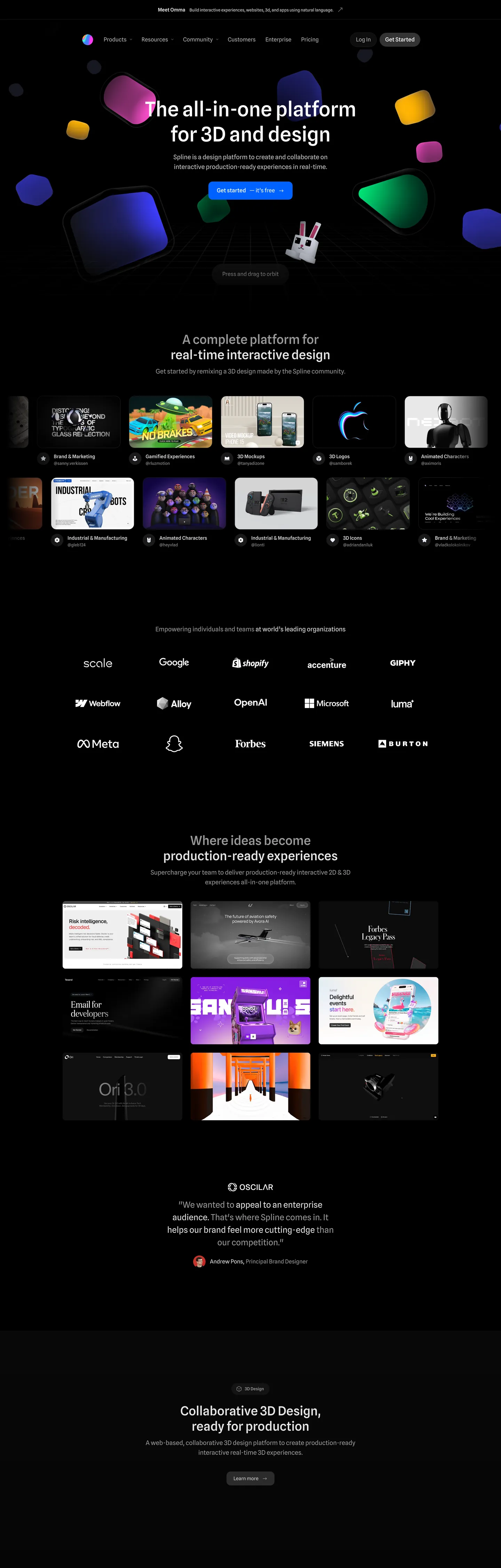
Spline's marketing site does something almost no other design-tool brand attempts: the hero is literally a Spline scene. A beveled blue tablet rotates next to a yellow rounded tile, a green pill, a magenta rounded square, and a purple-blue block — and the headline, "The all-in-one platform for 3D and design," sits at the center as if it were another object placed in the scene. The cursor reads "Press and drag to edit." There is no decorative chrome between the brand and the product; the page IS the product, running in the same engine you would build with. Where Figma keeps its marketing surface flat and trusts photography of the canvas, Spline inverts the relationship — the marketing canvas is the editor.
The DESIGN.md file packages the system into a machine-readable spec for React tooling. Inside: 13 colors tokens drawn from a pure-black canvas and a single cobalt-blue voltage (#0062ff) used exactly once above the fold for the primary CTA pill; 11 typography tokens running Spline Sans (a custom proprietary sans) at modest weights — 58px display at weight 500 is the heaviest typographic moment, with body and labels at 400; 6 corner-radius tokens centered on a 16px default with circular icons at 50%; 8 spacing values on a 4px base; and 16 components definitions covering the cobalt-pill primary button, hairline-edged cards, the dark dropdown menu surface, and the dark text input.
Feed this file to an AI coding tool and it reproduces Spline's specific moves: pure-black canvas instead of charcoal, single cobalt-blue accent reserved for the single most important action, generous 16px corner rounding rather than tight 4-8px, and Spline Sans across every tier. The one thing worth borrowing only if your product is itself a visually-rich canvas tool: the willingness to put NO brand chrome above the product. Spline gets away with it because the product is the brand. Most teams need an interstitial layer.
What makes it distinct
5 highlights
- Product-as-heroThe floating shapes around the headline are Spline scenes, not brand decoration; the marketing surface and the editor canvas use the same near-black floor
- Single cobalt-blue voltage#0062ff appears just once above the fold as the CTA pill, the only chromatic brand element on a system where every other color comes from user scenes
- Spline Sans at modest weightsDisplay sits at 36-58px in weight 500, body at 14-18px in weight 400, no heavy 700+ tier anywhere on the page
- 16px default roundingButtons sit at 12px, large cards at 24px, customer-logo chips fully circular at 50% radius; the radius scale is generous-soft rather than sharp
- Hairline-on-black cardsThe customer 3D scene grid uses 16px-rounded tiles with no border, no shadow, just dark surfaces lifted against the pure-black floor
Live at spline.design
Spline in production, as captured. Scroll the window to see the whole page.
13 colors
Spline's system runs on #0062ff as its primary voltage, used in 1 of 16 components. Type is set in Spline Sans across 11 tokens from 12px to 58px, weights 400–500. Shape language is soft — components average 13px corner radius, with no sharp interactive edges.
Brand & Accent
Sparing, CTA-only voltage · 5
Surface
Page and card backgrounds · 2
Text
Headlines, body, captions · 2
Borders & Hairlines
Dividers, outlines, rules · 1
Other
Specialty colors · 3
11 type tokens
Set in Spline Sans across 11 tokens, from 12px to 58px, weights 400–500. Shown in its own stack: where the font isn't installed, the fallback the file names stands in.
- display-xl58px · weight 500 · lh 56pxThe quick brown fox jumps over the lazy dog
- display-md36px · weight 500 · lh 44pxThe quick brown fox jumps over the lazy dog
- heading-md20px · weight 500 · lh 30pxThe quick brown fox jumps over the lazy dog
- body-lg18px · weight 400 · lh 28pxThe quick brown fox jumps over the lazy dog
- body-md16px · weight 400 · lh 24pxThe quick brown fox jumps over the lazy dog
- body-sm14px · weight 400 · lh 20pxThe quick brown fox jumps over the lazy dog
- label-md14px · weight 500 · lh 24pxThe quick brown fox jumps over the lazy dog
- caption12px · weight 400 · lh 16pxThe quick brown fox jumps over the lazy dog
- button-md16px · weight 400 · lh 24pxThe quick brown fox jumps over the lazy dog
- nav-link14px · weight 400 · lh 16.1pxThe quick brown fox jumps over the lazy dog
- mono-sm14px · weight 400 · lh 21pxThe quick brown fox jumps over the lazy dog
Radii and spacing
7 corner radii and 8 spacing values. Shape language: soft, on a 12px base radius.
Radii7
- none0px
- sm8px
- md12px
- lg16px
- xl24px
- pill56px
- full9999px
Spacing8
- xs4px
- sm8px
- md12px
- base16px
- lg24px
- xl32px
- 2xl48px
- 3xl64px
16 components
Each rendered from its tokens (color, type, radius, padding) on Spline's own canvas.
- Button PrimaryButton Primarybutton-primary
- Button Primary HoverButton Primary Hoverbutton-primary-hover
- Button SecondaryButton Secondarybutton-secondary
- Top NavTop Navtop-nav
- Nav LinkNav Linknav-link
- Hero HeadingHero Headinghero-heading
- Section HeadingSection Headingsection-heading
- Body ParagraphBody Paragraphbody-paragraph
- Body Paragraph MutedBody Paragraph Mutedbody-paragraph-muted
- Card DarkCard Darkcard-dark
- Scene TileScene Tilescene-tile
- Logo ChipLogo Chiplogo-chip
- Type here…Text Inputtext-input
- Testimonial CardTestimonial Cardtestimonial-card
- Code BlockCode Blockcode-block
- FooterFooterfooter
The system, in use
Spline's tokens on the kind of product it builds.
Plan, build and ship in one place
Bring your team's work together, from the first idea to the final release.
Simple pricing for every team
MonthlyYearly- Up to 3 projects
- Unlimited members
- Community support
- Unlimited projects
- Advanced reports
- Priority support
- SSO and SCIM
- Audit log
- Dedicated manager
Spline design system FAQ
Spline's tokens, its components and how to use this DESIGN.md in your project.
What are the color tokens in the Spline DESIGN.md?
What is Spline's primary color hex code?
How do I use Spline's colors in Tailwind CSS?
What is Spline's primary brand color?
What fonts does Spline use?
What is Spline's type scale?
What can I use if I don't have Spline's font?
What typeface does Spline use, and what should I use as a substitute?
Which components does the Spline DESIGN.md define?
What corner radius and spacing does Spline use?
What is Spline's corner-radius philosophy?
How do I apply the Spline design system to a shadcn/ui project?
How do I use the Spline DESIGN.md with Claude Code or Cursor?
Is the Spline DESIGN.md free to download?
How was the Spline DESIGN.md made?
Is the Spline DESIGN.md official?
Why does Spline use pure black instead of a softer charcoal?
Can I use this DESIGN.md to build my own 3D-platform marketing site in the Spline design system?
Related reading
Specs, directories and component libraries that pair with this design system.
- Browse all design systemsThe full directory of DESIGN.md files on shadcn.io, with live mockups for each.shadcn.io
- Spline — official siteSpline's public marketing site — the source of truth for the live tokens captured in this file.spline.design (opens in a new tab)
- The DESIGN.md specificationGoogle Labs' open spec for machine-readable design system files — the format this page is built on.github.com (opens in a new tab)
Use Spline in your project
One machine-readable file. Drop it into Claude Code, Cursor, VS Code or any AI tool that reads DESIGN.md.
Download the DESIGN.md
One machine-readable file: every color, type, radius, spacing, and component token of Spline.
Feed it to your AI tool
Drop it into Claude, Cursor, or GitHub Copilot. The agent writes React components and Tailwind classes that match Spline's visual language.
Reference the tokens directly
Or paste the values into your Tailwind config, CSS variables, or component library: every color, size and radius is a quoted, ready-to-copy value.
Read the full DESIGN.md overview, rationale, do’s and don’ts
Overview
Spline's marketing site does something almost no other design-tool brand attempts. Product-as-hero. The hero is literally a Spline scene — a beveled blue tablet rotates next to a yellow rounded tile, a green pill, a magenta rounded square, and a purple-blue block, with the headline placed among them as if it were another object in the composition. The cursor caption reads "Press and drag to edit." Where Figma keeps its marketing surface flat and trusts photography of the canvas, and where most SaaS brands paint a hero gradient and overlay text, Spline inverts the relationship: the marketing canvas IS the editor.
The system's chromatic restraint reinforces the move. There is exactly one brand color — cobalt blue ({colors.primary} — #0062ff) — and it appears just three times in the captured page, all as background fills (the primary CTA pill, an inline highlight, an accent in the feature grid). Every other color visible above the fold belongs to user-created 3D scenes, not the brand chrome. This is the inverse of single-voltage discipline at Airbnb or Cloudflare: instead of holding one accent in reserve against a white canvas, Spline holds one accent in reserve against a pure-black canvas, and lets the product's colors do every other chromatic job. The remaining declared CSS variables ({colors.primary-light}, {colors.accent-purple}, {colors.accent-emerald}) are part of the broader product palette but never appear in the marketing chrome.
Typography is Spline Sans across every tier — a custom proprietary sans that does the work of display, heading, body, button, and label without a second family. Display tops out at 58px in weight 500; body sits at 14-18px in weight 400; there is no heavier weight on the page. The hero h1 at 58px / 500 is the loudest typographic moment in the system, deliberately measured so the 3D scene around it remains the protagonist.
Key Characteristics:
- Pure black canvas (
{colors.canvas}— #000000), not the slightly-blue charcoal that Linear and Vercel use — the contrast with the rendered 3D shapes needs to be maximum. - Single cobalt-blue voltage (
{colors.primary}) reserved for the primary CTA pill above the fold. Three total occurrences on the captured page. - Spline Sans across every typographic tier, with modest weights (400 body / 500 display) — no 700+ moment.
- Generous-soft radius scale: 16px default, 12px on buttons, 24px on larger cards, full circles on logo chips and icon buttons.
- Customer 3D scene grid (5 x 2) below the fold uses hairline-edged dark tiles with no shadow, no border — depth comes from surface-color contrast against the pure-black floor.
- Logo wall (Google, Shopify, Webflow, Microsoft, Meta, Snapchat, Forbes, Burton, etc.) renders all marks in white at uniform size — every customer logo flattens to monochrome to keep brand voltage singular.
- Spline Mono (system mono) appears only inside code-style annotations — never in headings or body.
Colors
Brand
- Cobalt Primary (
{colors.primary}— #0062ff): frequency 3. Used as background only — the primary CTA pill, an inline highlight, a single accent in the feature grid. Wired in CSS as--color-blue. The single chromatic brand moment on the page; everything else is either pure white text or 3D-scene colors. - Cobalt Light (
{colors.primary-light}— #5797ff): declared as--color-blue-lighter. Not rendered in the captured marketing surface; reserved for the product editor's selection states. - Cobalt Dark (
{colors.primary-dark}— #217ce5): declared as--color-blue-dark. Reserved for hover/press states on the primary CTA. - Accent Purple (
{colors.accent-purple}— #a770ff): declared as--color-purple-bright. Part of the broader product palette but doesn't appear in the marketing chrome. - Accent Emerald (
{colors.accent-emerald}— #008761): declared as--color-super-darker. Reserved for the "Super" subscription tier badge in the product; not rendered in marketing.
Surface
- Canvas (
{colors.canvas}— #000000): pure black, the page floor. Wired as--color-bg. Maximum contrast with the rendered 3D shapes is intentional — slightly-blue near-blacks would muddy the depth illusion. - Surface-1 (
{colors.surface-1}— #191a1d): frequency 28 — used on the dropdown menus, the dark cards in the scene grid, the text input field, and the testimonial card. Wired as--color-menu-dropdown. The single "elevated" dark tone in the system.
Text
- Ink (
{colors.ink}— #ffffff): frequency 710 as text — the dominant text color across every tier. Pure white on pure black, no muted variant for body copy. The contrast is uncompromising. - Ink Muted (
{colors.ink-muted}— #888888): frequency 5 as text — used sparingly for sub-labels and metadata under scene tiles.
Hairlines
- Hairline (
{colors.hairline}— #ffffff at low opacity): frequency 709 as border — the dominant border tone. Since the canvas is pure black, white-with-alpha is the only border color that reads softly without disappearing.
Syntax (product surface)
- Syntax Blue (
{colors.syntax-blue}— #569cd6), Syntax Orange ({colors.syntax-orange}— #ce9178), Syntax Green ({colors.syntax-green}— #6a9955): these are VS Code Dark+ palette values that appear in the embedded code-snippet sections showing API examples. Not brand chrome — borrowed from the IDE syntax-highlighting convention.
Typography
Font Family
The system runs Spline Sans for everything — a custom proprietary sans-serif Spline ships with their marketing site. Fallbacks walk system-ui, -apple-system, "system-ui", "Segoe UI", Roboto, sans-serif. There is no separate display family or serif tier; one variable-weight sans does every job. Spline Mono (the system monospace stack) appears only inside code-style annotations.
Hierarchy
| Token | Size | Weight | Line Height | Use |
|---|---|---|---|---|
{typography.display-xl} | 58px | 500 | 56px | Hero h1 ("The all-in-one platform for 3D and design") |
{typography.display-md} | 36px | 500 | 44px | Section h2 ("A complete platform for real-time interactive design") |
{typography.heading-md} | 20px | 500 | 30px | Sub-section titles |
{typography.body-lg} | 18px | 400 | 28px | Hero sub-paragraph |
{typography.body-md} | 16px | 400 | 24px | Default running text |
{typography.body-sm} | 14px | 400 | 20px | Caption rows beneath scene tiles |
{typography.label-md} | 14px | 500 | 24px | h3 / button label / category chip |
{typography.caption} | 12px | 400 | 16px | Metadata, dates, small labels |
{typography.button-md} | 16px | 400 | 24px | Primary CTA label |
{typography.nav-link} | 14px | 400 | 16.1px | Top-nav link labels |
{typography.mono-sm} | 14px | 400 | 21px | Code-style annotations only |
Principles
Display weight tops out at 500, never 700+. The hero h1 at 58px / 500 is the loudest typographic moment — deliberately measured so the 3D scene around it remains visually dominant. Body and labels share weight 400. Weight 500 is the system's "emphasis" treatment, used for headings, buttons, and small labels alike — there is no separate semibold tier.
Note on Font Substitutes
Spline Sans is proprietary. Inter at the same weights is the closest open-source substitute; the proportions transfer cleanly and Inter's slightly looser counters read close to Spline Sans at the 16-18px body sizes. If you need a tighter alternative for the 58px display tier, Geist (Vercel's open-source sans) has comparable cap height. For the mono tier, the system stack (ui-monospace, SFMono-Regular, Consolas) is already what Spline ships.
Layout
Spacing System
- Base unit: 4px (with 8px as the dominant module).
- Tokens:
{spacing.xs}4px ·{spacing.sm}8px ·{spacing.md}12px ·{spacing.base}16px ·{spacing.lg}24px ·{spacing.xl}32px ·{spacing.2xl}48px ·{spacing.3xl}64px. - Section padding (vertical): ~96px between major sections on the dark canvas.
- Card internal padding:
{spacing.lg}(24px) on testimonial and large scene tiles;{spacing.base}(16px) on the smaller scene-grid tiles. - Hero padding: 0 horizontal — the 3D scene extends edge-to-edge, with the headline floating in the centered safe zone.
Grid & Container
- Max content width: ~1080px on the hero, ~1280px on the scene grid and logo wall.
- Hero: full-bleed black canvas with the 3D scene rendered behind the centered headline + CTA stack.
- Scene grid: 5-column grid at desktop showing customer-submitted 3D scenes (titled "Brand & Marketing," "3D Mockups," "3D Logos," "Animated Characters," etc.), collapsing to 2-column on tablet.
- Logo wall: 6-column grid of monochrome customer logos (Google, Shopify, accenture, GIPHY, Webflow, OpenAI, Microsoft, Meta, Snap, Forbes, Siemens, Burton).
- "Production-ready" gallery: 3-column grid of full-color scene thumbnails — the page's only chromatic moment besides the cobalt CTA.
Rhythm
The page alternates between edge-to-edge product (the hero scene) and constrained dark editorial (typography-anchored sections below the fold). There is no atmospheric gradient between bands — every section terminates on the same pure-black canvas, and depth comes from elevated {colors.surface-1} tiles rather than from background-color shifts.
Elevation
The system has essentially no shadow tier. The canvas is too dark for traditional drop shadows to read — instead, hierarchy comes from {colors.surface-1} cards lifted off the {colors.canvas} floor by ~25% lightness contrast alone. The customer scene tiles, dropdown menus, testimonial cards, and input fields all use the same {colors.surface-1} tone.
- Flat (no shadow): body, hero, footer, every editorial band — 99% of surfaces.
- Tonal lift:
{colors.surface-1}(#191a1d) cards sit on{colors.canvas}(#000000) — the 25-point lightness gap reads as elevation without any shadow being drawn. - Hairline outlines:
{colors.hairline}(white at low opacity) marks dropdown borders and the code-block edge. White-with-alpha is the only border tone that survives on pure black.
Shapes
The radius scale is generous-soft, centered on 16px:
{rounded.none}0px — only on code-block annotations.{rounded.sm}8px — small UI surfaces (dropdown items, input field corners).{rounded.md}12px — the primary button ({component.button-primary}).{rounded.lg}16px — default rounding for cards, scene tiles, large surfaces.{rounded.xl}24px — larger feature cards.{rounded.pill}56px /{rounded.full}9999px — pill CTAs and circular logo chips / icon buttons (50% radius renders as full circle on square elements).
There is no 4px tier. Even the smallest surfaces start at 8px. The scale is deliberately soft to keep the dark canvas feeling approachable rather than industrial.
Components
button-primary — The signature CTA. Cobalt-blue {colors.primary} fill, white text, {rounded.md} 12px radius, 16x24 padding, 56px height. "Get started — it's free" is the canonical instance, sitting at the center of the hero scene.
button-primary-hover — Background flips to {colors.primary-dark} (#217ce5) — a slightly darker cobalt for the press state.
button-secondary — Transparent fill with white text and a 1px white-alpha border. {rounded.md} radius, 12x20 padding, 44px height. Used for "Login" in the top nav and "Learn more" tertiary CTAs.
top-nav — Dark {colors.surface-1} surface with full pill rounding ({rounded.full}), 48px height, 8x16 padding. Floats above the hero scene rather than sitting flush at the page top. Houses the Spline wordmark, the product-nav links (Products, Resources, Community, Customers, Enterprise, Pricing), and the right-aligned Login / Get Started cluster.
nav-link — Transparent background, white text in {typography.nav-link} (14px / 400), 8x12 padding. No hover background visible in the captured surface.
hero-heading — White text on the transparent hero, {typography.display-xl} (58px / 500). 0 padding horizontally because the 3D scene extends edge-to-edge.
section-heading — White text, {typography.display-md} (36px / 500). Used for "A complete platform for real-time interactive design," "Where ideas become production-ready experiences," "Collaborative 3D Design, ready for production."
body-paragraph — Default white text at {typography.body-lg} (18px / 400). The hero sub-paragraph and section leads.
body-paragraph-muted — {colors.ink-muted} (#888888) text at {typography.body-md} for secondary labels under scene tiles.
card-dark — {colors.surface-1} fill, white text, {rounded.lg} 16px radius, 16px internal padding. The default content card on the dark canvas.
scene-tile — {colors.surface-1} fill, {rounded.lg} 16px radius, 0 padding (the 3D scene fills the tile edge-to-edge). Used in the 5-column customer scene grid.
logo-chip — Transparent fill, white logo at uniform size, fully circular treatment for the icon-only logos. The customer logo wall renders all marks in monochrome white at 40px height regardless of source color.
text-input — {colors.surface-1} fill, white text, {rounded.md} 12px radius, 12x16 padding, 44px height.
testimonial-card — {colors.surface-1} fill, white text, {rounded.lg} 16px radius, 24px padding. The single quote card on the page ("We wanted to appeal to an enterprise audience…").
code-block — Pure-black {colors.canvas} fill, white-alpha hairline border, {rounded.sm} 8px radius, 16px padding. Uses {typography.mono-sm} with the syntax colors borrowed from VS Code Dark+ (cobalt for keywords, orange for strings, green for comments).
footer — Black canvas, muted-gray text, 48x24 padding. No surface contrast against the page floor — the footer just continues the canvas.
Do's and Don'ts
Do treat the brand voltage as a single, scarce cobalt-blue moment. The system has exactly one CTA pill above the fold; multiplying it into multiple cobalt elements would dilute the only chromatic brand signal on the page.
Do use {colors.surface-1} (#191a1d) — NOT a shadow — to lift cards off the pure-black canvas. Shadows don't read on pure black; tonal lift does the entire elevation job.
Do keep display weight at 500 max. The hero h1 at 58px / 500 is the loudest typographic moment in the system. Bumping to 700 turns the editorial dek into a generic SaaS shout and undercuts the "product is the protagonist" principle.
Do render the customer-logo wall in monochrome white. Each customer logo in its native brand color would create 12 competing chromatic voices and destroy the single-voltage discipline.
Don't use the syntax colors ({colors.syntax-blue}, {colors.syntax-orange}, {colors.syntax-green}) anywhere outside code blocks. They are borrowed VS Code values for inline code samples, not part of the brand palette.
Don't swap the canvas from pure #000000 to a slightly-blue near-black. The maximum contrast against the rendered 3D shapes is intentional — softening it would make the 3D objects read as flat illustrations rather than as objects in depth.
Don't introduce a 4px corner radius tier. The system is deliberately generous-soft starting at 8px; adding tight corners would feel borrowed from a dev-tools system (Vercel, Linear) rather than from Spline's own visual identity.
Don't render multi-color brand decorations around the hero. The "decoration" around Spline's headline is the product itself — replacing the live 3D scene with brand-colored shapes would lose the entire point of the "product-as-hero" move.
Known Gaps
- Hover and focus states: documented for
{component.button-primary-hover}only; the full state matrix (focus rings, disabled tints, error states) is not captured from the marketing surface. - Form input error states:
{component.text-input}carries the resting state; error / validation styling lives inside the product editor and is not exposed on the marketing site. - Light mode: the captured marketing surface is dark-only. A light variant exists in the product editor's preference panel but is not represented here.
- Motion: the hero 3D scene continuously animates (auto-rotation, parallax on mouse-move) but the spec captures end-state values only. Easing curves, rotation rate, and parallax depth live in the live Spline runtime.
- Product surfaces: this DESIGN.md captures the marketing site only. The Spline editor itself (
my.spline.design) carries a much richer token system — panel layouts, gizmo colors, viewport gridlines, syntax-aware inspectors — that is not represented here. - Subscription-tier accents: the declared
{colors.accent-emerald}(#008761, wired as--color-super-darker) and{colors.accent-purple}(#a770ff, wired as--color-purple-bright) belong to the "Super" subscription tier and the AI features respectively; neither appears in the captured marketing chrome.
More systems like this
Adobe, Boursorama, Bun and 23 more in Design & Creative Tools: each brand's colors, type and components in one file your AI agent builds from.
Build it with Pro
The DESIGN.md files are free. Pro adds 6,000+ blocks, premium templates and the MCP server, so your AI editor builds in your system for you.
4.9/5 out of 5 · 150+ reviewsfrom 150+ founders and developers.
Billing
Billed once a year in USD. Cancel anytime.
- How many people can use the license.
- Client work, SaaS products and anything you charge for.
- Page sections in 56 categories, from heroes and pricing tables to dashboards and settings, on every framework and UI library, in your theme.
- Complete Next.js sites for startups, SaaS, agencies and portfolios, every page designed, ready to ship.
- Your AI agent searches, previews and installs any component, block, icon or DESIGN.md from a prompt: 22 tools in Claude Code, Cursor, VS Code and 35 more clients.
- Buttons with motion and states of their own, from an arrow that slides in to a burst of confetti.
- Typewriters, scrambles, counters and more, for headlines, labels and numbers.
- Animated backgrounds for heroes, sections and cards, from a soft aurora to a flock that flees the cursor. Most are pure CSS.
- WebGPU shaders, from a slow aurora to a black hole, each drawing only while it's on screen.
- One design and one theme on all four: the components, blocks and effects are built for each framework.
- React on Base UI, Radix UI, React Aria or Ark UI: install the version for the library your project already uses. Vue, Svelte and Solid run on Ark UI.
- From a button to a date picker, a color picker or a guided tour: accessible, typed in TypeScript, each with live demos.
- Real-world patterns built from the components, in 53 galleries: forms, tables, menus, dialogs and more.
- Area, bar, line, pie, radar and radial charts on TanStack Charts, on every framework. React also gets the Recharts originals.
- Debounce, local storage, media queries and more: each hook is one typed file you own.
- From 222 libraries, Lucide, Heroicons, Tabler and Material Symbols among them, as SVG or a React component in one command.
- Stripe, Linear, Apple and 497 more: a brand's colors, typography and components in one file your AI agent builds from.
- Restyle every component and block at once: 8 styles, 7 grays, 18 colors and 5 radii, shared as a shadcn preset code.
- Priority requests are answered first.
Individual
For personal projects & open source
$32instead of $49/mo
$389 billed yearly
- Seats: 1 seat
- Commercial use: Personal & open source only
- Blocks: All 6,181 blocks
- Templates: All 14 templates
- MCP server: 38 AI clients
- Animated buttons: All 35 buttons
- Text effects: All 97 effects
- Backgrounds: All 100 backgrounds
- Shaders: All 100 shaders
- Frameworks: React, Vue, Svelte, Solid
- UI libraries: Base UI, Radix, Aria, Ark
- Components: All 174 components
- Examples: All 1,103 examples
- Charts: All 70 charts
- React hooks: All 35 hooks
- Icons: 294k+ icons
- DESIGN.md files: All 500 brands
- Theme builder: 8 styles × 18 colors
- Support: Standard
Team
Most popularFor freelancers, agencies & startups
$66instead of $99/mo
$789 billed yearly · ≈ $13/dev/mo
- Seats: Up to 5 seats
- Commercial use: Included
- Blocks: All 6,181 blocks
- Templates: All 14 templates
- MCP server: 38 AI clients
- Animated buttons: All 35 buttons
- Text effects: All 97 effects
- Backgrounds: All 100 backgrounds
- Shaders: All 100 shaders
- Frameworks: React, Vue, Svelte, Solid
- UI libraries: Base UI, Radix, Aria, Ark
- Components: All 174 components
- Examples: All 1,103 examples
- Charts: All 70 charts
- React hooks: All 35 hooks
- Icons: 294k+ icons
- DESIGN.md files: All 500 brands
- Theme builder: 8 styles × 18 colors
- Support: Priority
Organization
For companies with larger teams
$132instead of $199/mo
$1,589 billed yearly
- Seats: Unlimited seats
- Commercial use: Included
- Blocks: All 6,181 blocks
- Templates: All 14 templates
- MCP server: 38 AI clients
- Animated buttons: All 35 buttons
- Text effects: All 97 effects
- Backgrounds: All 100 backgrounds
- Shaders: All 100 shaders
- Frameworks: React, Vue, Svelte, Solid
- UI libraries: Base UI, Radix, Aria, Ark
- Components: All 174 components
- Examples: All 1,103 examples
- Charts: All 70 charts
- React hooks: All 35 hooks
- Icons: 294k+ icons
- DESIGN.md files: All 500 brands
- Theme builder: 8 styles × 18 colors
- Support: Priority
Billed once a year in USD. Cancel anytime.
Individual
For personal projects & open source
$32instead of $49/mo
$389 billed yearly
- How many people can use the license.Seats: 1 seat
- Client work, SaaS products and anything you charge for.Commercial use: Personal & open source only
- Page sections in 56 categories, from heroes and pricing tables to dashboards and settings, on every framework and UI library, in your theme.Blocks: All 6,181 blocks
- Complete Next.js sites for startups, SaaS, agencies and portfolios, every page designed, ready to ship.Templates: All 14 templates
- Your AI agent searches, previews and installs any component, block, icon or DESIGN.md from a prompt: 22 tools in Claude Code, Cursor, VS Code and 35 more clients.MCP server: 38 AI clients
- Buttons with motion and states of their own, from an arrow that slides in to a burst of confetti.Animated buttons: All 35 buttons
- Typewriters, scrambles, counters and more, for headlines, labels and numbers.Text effects: All 97 effects
- Animated backgrounds for heroes, sections and cards, from a soft aurora to a flock that flees the cursor. Most are pure CSS.Backgrounds: All 100 backgrounds
- WebGPU shaders, from a slow aurora to a black hole, each drawing only while it's on screen.Shaders: All 100 shaders
- One design and one theme on all four: the components, blocks and effects are built for each framework.Frameworks: React, Vue, Svelte, Solid
- React on Base UI, Radix UI, React Aria or Ark UI: install the version for the library your project already uses. Vue, Svelte and Solid run on Ark UI.UI libraries: Base UI, Radix, Aria, Ark
- From a button to a date picker, a color picker or a guided tour: accessible, typed in TypeScript, each with live demos.Components: All 174 components
- Real-world patterns built from the components, in 53 galleries: forms, tables, menus, dialogs and more.Examples: All 1,103 examples
- Area, bar, line, pie, radar and radial charts on TanStack Charts, on every framework. React also gets the Recharts originals.Charts: All 70 charts
- Debounce, local storage, media queries and more: each hook is one typed file you own.React hooks: All 35 hooks
- From 222 libraries, Lucide, Heroicons, Tabler and Material Symbols among them, as SVG or a React component in one command.Icons: 294k+ icons
- Stripe, Linear, Apple and 497 more: a brand's colors, typography and components in one file your AI agent builds from.DESIGN.md files: All 500 brands
- Restyle every component and block at once: 8 styles, 7 grays, 18 colors and 5 radii, shared as a shadcn preset code.Theme builder: 8 styles × 18 colors
- Priority requests are answered first.Support: Standard
Team
Most popularFor freelancers, agencies & startups
$66instead of $99/mo
$789 billed yearly · ≈ $13/dev/mo
Everything in Individual, plus
- How many people can use the license.Seats: Up to 5 seats
- Client work, SaaS products and anything you charge for.Commercial use: Included
- Priority requests are answered first.Support: Priority
Organization
For companies with larger teams
$132instead of $199/mo
$1,589 billed yearly
Everything in Team, plus
- How many people can use the license.Seats: Unlimited seats
- Secure checkout via Stripe
- Code lives in your repo
- Keep what you've shipped if you cancel
- License terms
4.9 out of 5 from 150+ developers


Your system, built for you
Every block, template and icon, installed by your AI agent in your design system. The DESIGN.md files stay free.
- Cancel anytime
- Keep what you've shipped