Contrast checker.
Check a text color on its background against WCAG 2.2 and APCA, see it at real sizes, and get the nearest color that passes. The fix moves only lightness, so your hue stays yours.
Contrast checker.
Need the UI around it? With Pro, your AI agent builds the form, the result card and the rest of the page from a prompt.
Get ProHow it works
3 steps, no account. It runs in your browser and nothing is uploaded.
Set the two colors
Type them in any CSS notation or pick them; Swap colors flips text and background.
Read the result
The ratio, the five WCAG checks and the APCA level update as you type.
Fix what fails
Choose a target and press Use on the suggested color to apply it.
Related tools
More color tools. Every one free, in the browser.
Pricing
Build it with Pro
The tool is free. Pro adds 6,000+ blocks, premium templates and the MCP server, so your AI editor builds the product around it.
4.9/5 out of 5 · 150+ reviewsfrom 150+ founders and developers.
- Secure checkout via Stripe
- Code lives in your repo
- Keep what you've shipped if you cancel
- License terms
Questions and answers
Before you trust the result: what to know about the format, the limits, your data and the tools next to it.
4.5:1 for normal text and 3:1 for large text at level AA (success criterion 1.4.3), 7:1 and 4.5:1 at AAA (1.4.6), and 3:1 for the parts of an interface you need to see: borders of inputs, icons, focus rings and chart marks (1.4.11).
24px and up, or 18.66px (14pt) and up when bold. Below that, text is normal text and needs the higher ratio.
APCA, the Accessible Perceptual Contrast Algorithm, is the method proposed for WCAG 3. It gives a lightness contrast, Lc, from about 0 to 106 for dark text on light and to -108 for light text on dark, and it weighs polarity, which the WCAG 2 ratio ignores: white on orange can pass WCAG 2 and still read poorly. APCA isn't a requirement yet, so the checker shows it beside the ratio, not instead of it.
WCAG says a ratio passes only if it meets the threshold, with no rounding up: 4.499:1 fails 4.5:1. The checker cuts the ratio to two decimals rather than rounding, so a 4.50:1 shown is a real pass.
It keeps the hue of your text color, and its chroma unless sRGB can't hold it, and moves only its OKLCH lightness until the pair passes the target you choose (AA 4.5, AAA 7, Lc 60 or Lc 75). It offers the nearest passing color first and the one in the other direction second, each rounded to a hex code that still passes.
Yes. Give the text an alpha (#3b82f680, or the opacity in the picker) and the checker paints it over the background first, as the browser does, then measures what you'd actually see.
The pair is written into the page address once you change it, so Copy link (or the address bar) gives a link that opens on the same two colors.
No. The ratio and the APCA value are computed in this page; nothing is sent anywhere, and the only trace is the pair in your own address bar.
No. The "Contrast checker" tool is free and opens without a sign-in, an account or an install.
Nothing. The "Contrast checker" tool holds your input in the page's memory, so closing or reloading the tab clears it, and it saves nothing in this browser.
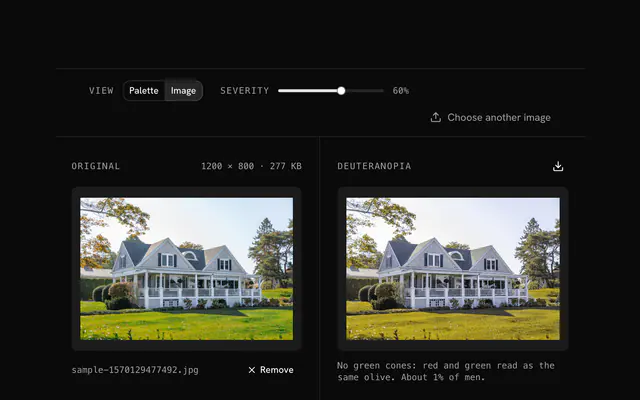
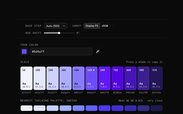
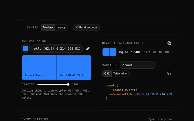
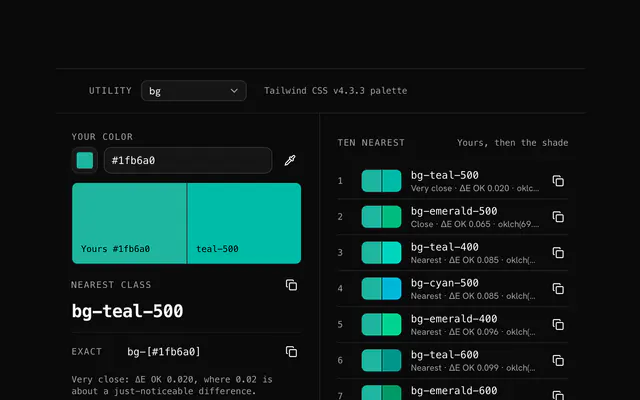
Closest to the "Contrast checker" tool: Color blindness simulator, Tailwind color generator, Color converter, Tailwind color finder. Each opens on its own page, free and in the browser.
The "Contrast checker" tool is one of 17 in its group. The group's page, /tools/color, lists them all.
The tool is free. Its interface is built from shadcn.io's own components (Button, Input, Slider and the rest of the registry under /ui), which come in React, Vue, Svelte and Solid. Pro adds the blocks and templates for the product around it.
4.9 out of 5 from 150+ developers


Build the product around it
Every block, template and icon, installed by your AI agent in your theme. The tools stay free.
Get Pro