CSS filter generator.
Run an image through CSS filters as you watch: blur, brightness, contrast, hue and the rest, a drop shadow, or a backdrop filter for frosted panels. Try them on your own picture, kept on your device.
CSS filter generator.
Need the UI around it? With Pro, your AI agent builds the form, the result card and the rest of the page from a prompt.
Get ProHow it works
4 steps, no account. It runs in your browser and nothing is uploaded.
Pick a picture
The drawn landscape, or your own image dropped on the preview; nothing is uploaded.
Set the functions
Move the sliders or start from a preset; a function left at no change stays out of the code.
Compare
Drag the split to see the original beside the result, or switch to backdrop filter.
Copy the code
CSS in Tailwind's function order, or the matching Tailwind classes.
Related tools
More CSS generators. Every one free, in the browser.
Pricing
Build it with Pro
The tool is free. Pro adds 6,000+ blocks, premium templates and the MCP server, so your AI editor builds the product around it.
4.9/5 out of 5 · 150+ reviewsfrom 150+ founders and developers.
- Secure checkout via Stripe
- Code lives in your repo
- Keep what you've shipped if you cancel
- License terms
Questions and answers
Before you trust the result: what to know about the format, the limits, your data and the tools next to it.
It runs an element's rendered pixels through functions: blur, brightness, contrast, grayscale, hue-rotate, invert, opacity, saturate, sepia and drop-shadow, applied one after another in the order written. It works on any element, an image, a video, an SVG or text, and never changes the file itself.
filter changes the element itself and everything in it. backdrop-filter leaves the element alone and filters whatever shows through from behind it, which is how frosted glass panels are made; it only shows when the element's own background is at least partly see-through.
Each function works on the result of the one before, so sepia then hue-rotate tints differently from hue-rotate then sepia. Tailwind always joins its filter utilities in one fixed order, so the tool writes the CSS in that same order and the classes draw the same picture.
drop-shadow() follows the alpha of what's drawn: a transparent PNG or an SVG icon gets a shadow in its own shape, while box-shadow always draws the box's rectangle. It has no spread and no inset. The Sticker preset shows it: the balloon's shadow follows its outline out of the frame.
The color functions are cheap and usually run on the GPU. blur() and drop-shadow() cost more as the radius grows, since every pixel reads its neighbours, and backdrop-filter has to redraw whenever what's behind it moves, as on every scroll frame under a sticky header. Keep blur radii modest on large areas and avoid animating them.
filter works unprefixed in every current browser. backdrop-filter is in Chrome and Edge 76 and later, Firefox 103 and later, and Safari, which needed the -webkit- prefix until Safari 18; the generated CSS writes both lines.
Yes: press Use your image or drop a picture on the preview. It's shown from an object URL inside this tab and never uploaded; Sample brings the drawing back.
Drag the handle across the preview, or focus it and use the arrow keys (Shift moves ten) and Home or End. Left of it is the original, right of it the filtered picture. In backdrop mode the panel is the filtered area and the original shows around it.
One class per function that changes something: blur-md or blur-[3px], brightness-110, hue-rotate-90, grayscale at full strength, drop-shadow-[…], and the backdrop- versions in backdrop mode. Tailwind has no filter opacity, so the filter's opacity becomes opacity-80, the opacity property, which applies after the filter and looks the same.
No request carries your input. The CSS filter generator runs in your browser: nothing you enter is sent anywhere.
No. The CSS filter generator is free and opens without a sign-in, an account or an install.
Nothing. The CSS filter generator holds your input in the page's memory, so closing or reloading the tab clears it, and it saves nothing in this browser.
For filter: blur, brightness, contrast, grayscale, hue-rotate, invert, saturate, sepia, drop-shadow, then opacity. For backdrop-filter: blur, brightness, contrast, grayscale, hue-rotate, invert, opacity, saturate, sepia. That is Tailwind's own order, so the CSS and the classes agree, and a function left at its no-change value is not written at all.
None, Vintage, Noir, Warm, Cool, Faded, Dramatic, Dreamy, Dark mode, and Sticker. Dark mode is invert(100%) with hue-rotate(180deg), which turns a light picture dark while keeping its hues; Sticker is a drop shadow alone.
blur 0 to 20px, brightness 0 to 200%, contrast 0 to 200%, saturate 0 to 300%, grayscale 0 to 100%, sepia 0 to 100%, hue rotate 0 to 360°, invert 0 to 100%, and opacity 0 to 100%. CSS accepts more (brightness has no upper limit), but these cover what looks useful; a value can also be typed in the box beside each slider.
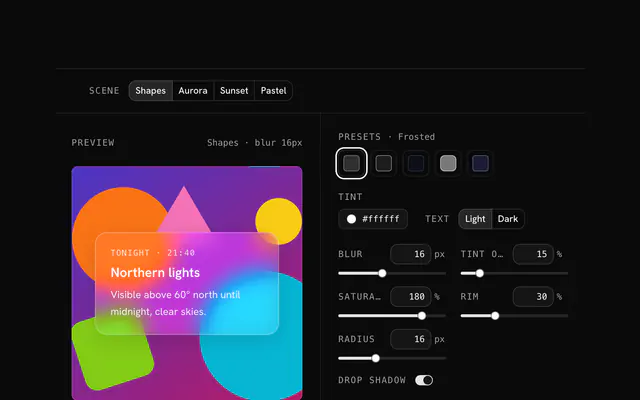
Switch Apply as to Backdrop filter and add some blur, with a little saturate or brightness; the panel in the preview shows it over the picture. The glassmorphism generator adds the tint, border and shadow a full glass card needs.
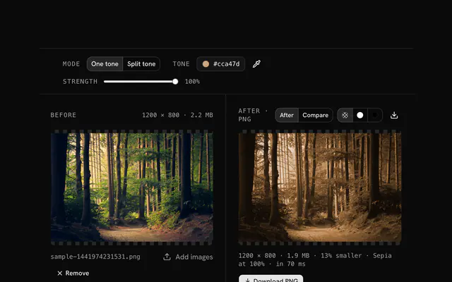
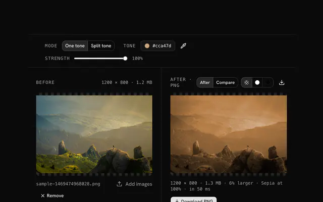
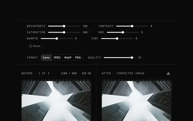
Closest to the CSS filter generator: Glassmorphism generator, Photo color filter, Sepia effect generator, Color correction. Each opens on its own page, free and in the browser.
The CSS filter generator is one of 10 in its group. The group's page, /tools/css, lists them all.
The tool is free. Its interface is built from shadcn.io's own components (Button, Input, Slider and the rest of the registry under /ui), which come in React, Vue, Svelte and Solid. Pro adds the blocks and templates for the product around it.
4.9 out of 5 from 150+ developers


Build the product around it
Every block, template and icon, installed by your AI agent in your theme. The tools stay free.
Get Pro