Box shadow generator.
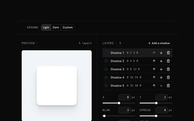
Stack shadow layers on a live card, each with its own offset, blur, spread, color and opacity, or spread one into a smooth ramp. Copy it as CSS, a Tailwind class or a v4 theme token.
Box shadow generator.
Need the UI around it? With Pro, your AI agent builds the form, the result card and the rest of the page from a prompt.
Get ProHow it works
4 steps, no account. It runs in your browser and nothing is uploaded.
Start from a preset
Smooth, floating, sharp, glow and pressed, or Tailwind's own shadow-sm, shadow-lg and shadow-2xl.
Tune the layers
Offsets, blur, spread, color and opacity for each layer; the first one is painted on top.
Smooth it
Spread the largest shadow into 3 to 6 layers, each twice the last, for a soft, natural falloff.
Copy the code
As CSS, as a shadow-[…] class, or as an @theme token used as shadow-<name>.
Related tools
More CSS generators. Every one free, in the browser.
Pricing
Build it with Pro
The tool is free. Pro adds 6,000+ blocks, premium templates and the MCP server, so your AI editor builds the product around it.
4.9/5 out of 5 · 150+ reviewsfrom 150+ founders and developers.
- Secure checkout via Stripe
- Code lives in your repo
- Keep what you've shipped if you cancel
- License terms
Questions and answers
Before you trust the result: what to know about the format, the limits, your data and the tools next to it.
The horizontal offset (positive moves it right), the vertical offset (positive moves it down), the blur radius, and the spread, which grows the shadow before it is blurred, or shrinks it when negative. A negative spread with a downward offset keeps the shadow under the box and off its sides.
A real object casts a dark, sharp shadow where it nearly touches the surface and a wide, faint one further out. One box-shadow is a single blur, so it is either too soft near the edge or too hard far away. Several layers, each larger and fainter than the last, add up to that falloff.
It draws the shadow inside the box instead of outside, as if the box were pressed into the page: wells, input fields, pressed buttons. Inset and outer layers can share one box-shadow list.
A shadow is painted, not laid out, so changing it never moves anything else. Large blurs do cost paint time, and animating box-shadow repaints every frame; the usual trick is to put the larger shadow on a pseudo-element and fade its opacity, which the compositor handles.
No: box-shadow follows the element's border box and its border-radius, never the transparent pixels of an image inside it. For the outline of a PNG or an SVG shape, use filter: drop-shadow() instead.
The first layer in the list is painted on top and the last at the bottom, as CSS does. Move a layer with its arrows; the CSS and the classes follow the list's order.
It takes the largest layer and rebuilds the shadow as 3 to 6 layers, each twice the offset, blur and spread of the one before, up to the original. Each layer's opacity is set so that where all of them overlap they add up to the opacity the layers had together.
Pick Dark or Custom as the ground. Shadows barely show on dark surfaces, so dark interfaces lean on stronger, darker shadows, a lighter surface for raised things, or a faint light edge such as the Glossy edge preset's inset highlight.
No request carries your input. The Box shadow generator runs in your browser: nothing you enter is sent anywhere.
No. The Box shadow generator is free and opens without a sign-in, an account or an install.
Nothing. The Box shadow generator holds your input in the page's memory, so closing or reloading the tab clears it, and it saves nothing in this browser.
Up to 10, and never fewer than one. Each layer has its own offsets, blur, spread, color, opacity and inset switch, and the list's order is the order CSS paints them in, first on top.
Smooth, Ring and lift, Subtle (shadow-sm), Raised (shadow-lg), High (shadow-2xl), Floating, Long and soft, Sharp, Stacked, Glow, Pressed, and Glossy edge. Each fills the layer list, so a preset is a starting point to edit rather than a fixed style.
Yes: switch a layer's Inset on and it is drawn inside the box. The Pressed preset is one inset layer, and Glossy edge mixes an inset highlight with two outer shadows.
Radius and Box color change the card in the preview, so the shadow can be judged on something like the real element. They are not written into the code, which holds the shadow alone.
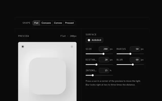
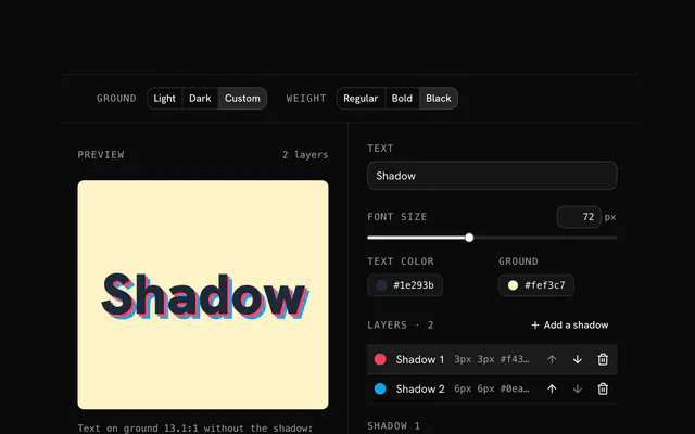
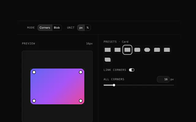
Closest to the Box shadow generator: Tailwind box shadow generator, Neumorphism generator, Text shadow generator, Border radius generator. Each opens on its own page, free and in the browser.
The Box shadow generator is one of 10 in its group. The group's page, /tools/css, lists them all.
The tool is free. Its interface is built from shadcn.io's own components (Button, Input, Slider and the rest of the registry under /ui), which come in React, Vue, Svelte and Solid. Pro adds the blocks and templates for the product around it.
4.9 out of 5 from 150+ developers


Build the product around it
Every block, template and icon, installed by your AI agent in your theme. The tools stay free.
Get Pro