Text shadow generator.
Stack text shadows on your own words: offset, blur, color and opacity for each layer, with neon, long shadow, 3D and outline presets. Copy it as CSS or a Tailwind class.
Text shadow generator.
Need the UI around it? With Pro, your AI agent builds the form, the result card and the rest of the page from a prompt.
Get ProHow it works
4 steps, no account. It runs in your browser and nothing is uploaded.
Type your text
Set its size, its weight, its color and the ground it sits on.
Start from a preset
Retro, neon, long shadow, 3D, outline and more, each with colors that suit it.
Tune the layers
Pick a layer to change its offset, blur, color and opacity, or add and reorder them.
Copy the code
A text-shadow declaration, or one Tailwind class for v4.1 and later.
Related tools
More CSS generators. Every one free, in the browser.
Pricing
Build it with Pro
The tool is free. Pro adds 6,000+ blocks, premium templates and the MCP server, so your AI editor builds the product around it.
4.9/5 out of 5 · 150+ reviewsfrom 150+ founders and developers.
- Secure checkout via Stripe
- Code lives in your repo
- Keep what you've shipped if you cancel
- License terms
Questions and answers
Before you trust the result: what to know about the format, the limits, your data and the tools next to it.
Each shadow is an x offset, a y offset, an optional blur radius and a color, and a comma-separated list stacks several with the first painted on top. Unlike box-shadow there is no spread and no inset, and the shadow takes the shape of the letters. It never changes the text's size or moves the layout.
By stacking layers. A long shadow repeats a hard shadow (no blur) one pixel further each time; neon stacks blurs of growing size in a bright color around a white core; 3D extrudes hard shadows straight down, each a shade darker, then adds a soft one under the block.
Eight hard shadows one or two pixels out in every direction draw an outline that works in every browser. -webkit-text-stroke draws a true stroke but centers it on the glyph's edge, eating into thin letters; past 2 or 3 pixels the shadow trick shows gaps at the corners, so use it for thin outlines.
A faint shadow can lift text off a busy photo, but glows and long shadows behind body text blur the letters' edges and slow reading. WCAG measures contrast between the text and its background without the shadow, so the text color has to reach 4.5:1 (3:1 for large text) on its own; the tool shows that ratio under the preview.
A few layers cost next to nothing. Large blur radii and dozens of layers, like a 24-step long shadow, take more painting, which shows when the text animates or sits in a part of the page that repaints often. For a static heading they're fine.
Pick it in the list and its X, Y, blur, opacity and color appear under it. Add a shadow puts a new layer after the last one, twice as far out with 2px more blur; the arrows reorder layers and the bin removes one. The list holds up to 40.
One arbitrary class, text-shadow-[…], holding every layer with spaces written as underscores. The text-shadow utilities arrived in Tailwind CSS 4.1; Tailwind reads each color through var(--tw-text-shadow-color, …), so adding a class such as text-shadow-sky-500 recolors all the layers.
Yes. Type the text, set its size from 12 to 160px and its weight, and pick its color and a light, dark or custom ground. A preset sets the text and ground colors that suit it, which you can change afterwards.
No request carries your input. The Text shadow generator runs in your browser: nothing you enter is sent anywhere.
No. The Text shadow generator is free and opens without a sign-in, an account or an install.
Nothing. The Text shadow generator holds your input in the page's memory, so closing or reloading the tab clears it, and it saves nothing in this browser.
Up to 40, and never fewer than one. Each has its own offsets, blur, color and opacity, and the first in the list paints on top, as in the CSS.
Retro, Neon, Soft, Lifted, Long shadow, 3D, Outline, Letterpress, and Glow. Each also sets the text and ground colors, since a neon glow and a letterpress need very different ones.
Yes. Under the preview it gives the WCAG contrast ratio between the text color and the ground without the shadow, and says whether that is enough for body text (4.5:1), for large text only (3:1), or neither, when only the shadow makes the letters readable.
No. They set up the preview; the code holds the text-shadow alone, so it can go on any heading whatever its font and colors.
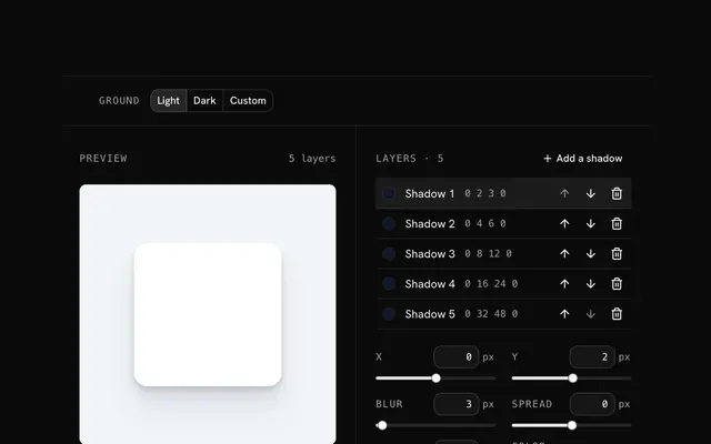
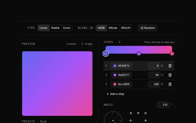
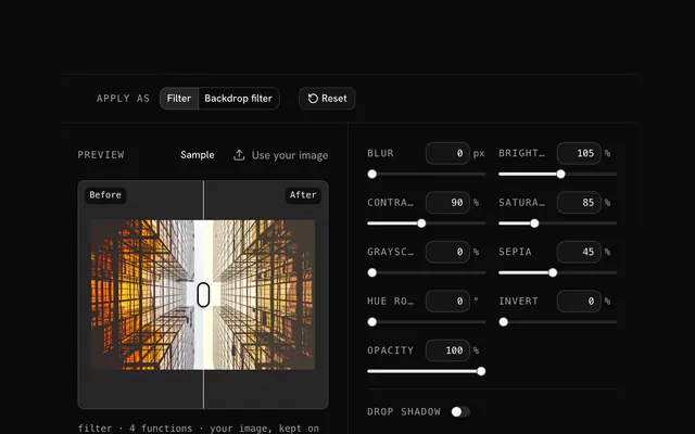
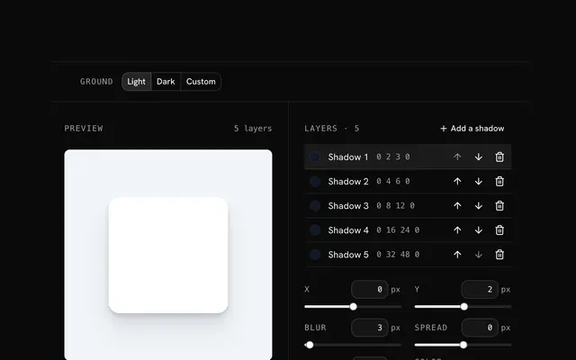
Closest to the Text shadow generator: Box shadow generator, CSS gradient generator, CSS filter generator, Tailwind box shadow generator. Each opens on its own page, free and in the browser.
The Text shadow generator is one of 10 in its group. The group's page, /tools/css, lists them all.
The tool is free. Its interface is built from shadcn.io's own components (Button, Input, Slider and the rest of the registry under /ui), which come in React, Vue, Svelte and Solid. Pro adds the blocks and templates for the product around it.
4.9 out of 5 from 150+ developers


Build the product around it
Every block, template and icon, installed by your AI agent in your theme. The tools stay free.
Get Pro