Glassmorphism generator.
Make a frosted glass panel: blur and saturate what's behind it, tint it, give it a rim, and see whether its text stays readable. Copy it as CSS with the Safari prefix, or as Tailwind classes.
Glassmorphism generator.
Need the UI around it? With Pro, your AI agent builds the form, the result card and the rest of the page from a prompt.
Get ProHow it works
4 steps, no account. It runs in your browser and nothing is uploaded.
Choose a scene
Four drawn backdrops, from hard-edged shapes to a soft aurora, show what the blur does.
Tune the glass
Blur, tint and its opacity, saturation, the white rim, the radius and a drop shadow.
Check the text
The line under the preview estimates the contrast of the card's text over the scene.
Copy the code
CSS with -webkit-backdrop-filter for older Safari, or Tailwind classes.
Related tools
More CSS generators. Every one free, in the browser.
Pricing
Build it with Pro
The tool is free. Pro adds 6,000+ blocks, premium templates and the MCP server, so your AI editor builds the product around it.
4.9/5 out of 5 · 150+ reviewsfrom 150+ founders and developers.
- Secure checkout via Stripe
- Code lives in your repo
- Keep what you've shipped if you cancel
- License terms
Questions and answers
Before you trust the result: what to know about the format, the limits, your data and the tools next to it.
backdrop-filter filters whatever is painted behind the element: blur() frosts it and saturate() brings back the color a blur washes out. A semi-transparent background tints the glass, and a thin light border reads as its edge catching the light. The element's own content stays sharp.
Chrome since version 76, Firefox since 103, and Safari since 9 with the -webkit- prefix, unprefixed only from Safari 18. The prefixed line keeps older iPhones and Macs working. Where the filter isn't supported the panel shows just its tint, so keep the tint strong enough to read on its own.
It is one of the costlier CSS effects: the browser paints everything behind the panel into a separate layer and blurs it, again whenever that content scrolls, moves or animates. The cost grows with the blur radius and the panel's area. A few small panels are fine; a full-width blurred header over a scrolling feed or a video can drop frames on low-end phones. Avoid animating the blur.
The text sits on whatever shows through, so its contrast changes across the panel. Raise the tint's opacity, blur more so detail behind it turns into flat color, or place the panel over a calm part of the background. WCAG asks 4.5:1 for body text and 3:1 for large text, at the weakest spot rather than on average.
Glass needs something behind it. Over a flat color, blur has nothing to soften and the panel reads as a plain tinted box, so use it over photos, gradients, shapes or moving content.
The page draws the scene into a canvas, reads the pixels under the card, averages them in patches about as wide as the blur reaches, lays the tint over each patch at its opacity and measures your text color against every one. Saturation and the browser's exact blur are left out, so treat the figure as a guide.
bg-white/15 (or an arbitrary hex with its opacity), a backdrop-blur step when the blur is 4, 8, 12, 16, 24, 40 or 64 px and backdrop-blur-[…] otherwise, backdrop-saturate, border border-white for the rim, a rounded class and the shadow as an arbitrary value. Tailwind v4 adds the -webkit- prefix itself.
No. The four scenes are drawn in SVG by the page itself, and nothing is fetched or uploaded; the contrast estimate reads them in your browser.
No request carries your input. The Glassmorphism generator runs in your browser: nothing you enter is sent anywhere.
No. The Glassmorphism generator is free and opens without a sign-in, an account or an install.
Shapes (hard-edged circles on a gradient), Aurora (soft glows and stars on near-black), Sunset (a sun over mountains) and Pastel (soft blobs behind lines of dark text). Each sets the card's text to the color that suits it, which you can change.
Frosted, Clear, Smoked, Milk, and Tinted. Each sets the blur, tint, opacity, saturation, rim and radius together, and every value stays editable.
Yes: pick a dark tint such as black or slate and raise its opacity. The Smoked preset is slate at 35 % with 24px of blur, and light text reads best on it.
Blur runs from 0 to 40px and saturation from 100 % (unchanged) to 200 %. Past about 30px most backgrounds are already flat color, while the work for the browser keeps growing with the radius.
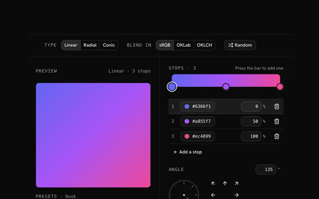
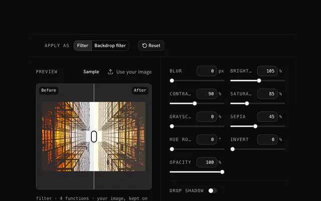
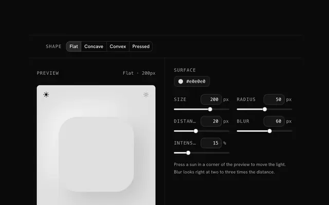
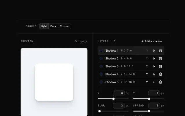
Closest to the Glassmorphism generator: CSS gradient generator, CSS filter generator, Neumorphism generator, Box shadow generator. Each opens on its own page, free and in the browser.
The Glassmorphism generator is one of 10 in its group. The group's page, /tools/css, lists them all.
The tool is free. Its interface is built from shadcn.io's own components (Button, Input, Slider and the rest of the registry under /ui), which come in React, Vue, Svelte and Solid. Pro adds the blocks and templates for the product around it.
4.9 out of 5 from 150+ developers


Build the product around it
Every block, template and icon, installed by your AI agent in your theme. The tools stay free.
Get Pro