shadcn.io is an independent project built on shadcn/ui
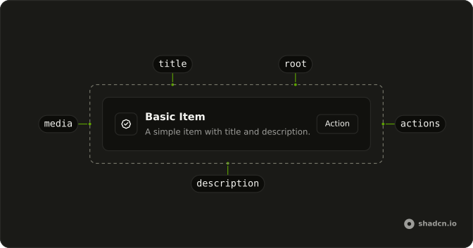
An item is one row of a list: an icon, avatar or thumbnail at the start, a title with a line of description, and a button or chevron at the end. Use it for team members, files, notification settings or search results, and turn the whole row into a link when it leads somewhere.
When one subject needs a header, a body and a footer of its own, use a Card. For a list people pick from with the arrow keys, use a Listbox.
Installation
Anatomy
Usage
import { BadgeCheckIcon, ChevronRightIcon } from "lucide-react";
import { Button } from "@/components/ui/button";
import {
  Item, ItemActions, ItemContent, ItemDescription, ItemMedia, ItemTitle,
} from "@/components/ui/item";
ItemContent holds the title and description and takes the free width, so ItemMedia and ItemActions keep their own size at either end of the row.
<div className="flex w-full max-w-md flex-col gap-6">
  <Item variant="outline">
    <ItemContent>
      <ItemTitle>Basic Item</ItemTitle>
      <ItemDescription>
        A simple item with title and description.
      </ItemDescription>
    </ItemContent>
    <ItemActions>
      <Button size="sm" variant="outline">
        Action
      </Button>
    </ItemActions>
  </Item>
  <Item asChild size="sm" variant="outline">
    <a href="#">
      <ItemMedia>
        <BadgeCheckIcon aria-hidden="true" className="size-5" />
      </ItemMedia>
      <ItemContent>
        <ItemTitle>Your profile has been verified.</ItemTitle>
      </ItemContent>
      <ItemActions>
        <ChevronRightIcon aria-hidden="true" className="size-4" />
      </ItemActions>
    </a>
  </Item>
</div>Accessibility
An item is a plain div with no role, and it takes focus only when you render it as a link. ItemGroup tells screen readers it is a list, and an Item inside it gets the listitem role unless you render it as another element through asChild. A row that is a link keeps the link's role that way, so wrap it in a div with role="listitem", as the Image demo does. An ItemSeparator in a group is hidden from screen readers, since a list holds only items. Hide decorative icons with aria-hidden, and give an icon-only button in ItemActions an aria-label.
Demos
Variant
Three rows with the same inbox icon. default has no background and a transparent border, outline shows the border, and muted fills the row with a soft background. Use default inside a container that already draws the edges, outline when each row stands alone, and muted for a quieter row under something more important.
Size
The inbox row at default, sm and xs, each outlined so the three can be compared. xs has the least padding in every style, while sm is tighter than default in Vega, Maia, Luma, Sera and Rhea but matches it in Nova, the default style. Use default for a settings list people read line by line and xs for a menu or popover, as the Dropdown demo does.
Icon
A security alert with a shield in ItemMedia set to variant="icon", a line about a login from an unknown device and a Review button in ItemActions. The icon variant sizes a bare SVG for you. Use it for status and system messages, and keep the icon aria-hidden when the title already says what happened.
Avatar
Two rows built around avatars. One shows a single person with a round plus button to invite them, and the other an empty team, with overlapping avatars beside a text Invite button. Avatars go in ItemMedia on its default variant, which leaves their own size alone. The plus button carries an aria-label, since it has no text for a screen reader to read.
Image
Three songs, each a whole-row link with album art in ItemMedia set to variant="image" and the duration in a second ItemContent that keeps to the end of the row. Each link sits in a div with role="listitem", so it stays a link inside the group's list. The image variant crops to a square that shrinks with the item's size, the right fit for covers and file previews.
Group
People you might invite: three outlined rows in an ItemGroup, each with an avatar, a username, an email and a plus button named after that person. The group stacks the rows with an even gap and tightens it for smaller sizes. It tracks no selection, so when the point is to pick one person, the Dropdown demo's menu is the better home.
Header
Three AI models in a three-column grid, each an outlined item whose ItemHeader holds a square cover above the name and a one-line description. The header takes the item's full width, so the picture sits on top instead of beside the text. Use it for a gallery of templates, models or products, and ItemMedia when the picture should be a thumbnail at the start of the row.
Link
Two rows that are links from edge to edge, made with asChild: the documentation, with a chevron, and an external resource that opens in a new tab, with an external-link icon. Make the whole row the link when the title and description lead to one place. Keep buttons out of it, since a button inside a link is invalid HTML.
Dropdown
A Select button opens a menu of three people, each menu item holding an xs item with an avatar, a username and an email. The menu handles focus, the arrow keys and choosing, while the item only lays out the row. Use this when a plain text label would lose the email people want to see before they pick.
RTL
The two rows from the top of the page in Arabic, inside a wrapper with dir="rtl": a basic item with its button, and a verified-profile link. Media, content and actions follow the inline direction, so the markup stays as it is. Only the chevron needs a class of its own, rtl:rotate-180, so it points toward the end of the row.
FAQ
How do I make an Item a link in React?
Add asChild to Item and give it a single anchor as its only child, which takes the item's classes and props. A router's link component works as that child too, so Next.js Link keeps navigation on the client.
Keep buttons out of a linked row. A button inside a link is invalid HTML, and the two fight over the same click.
Should I use an Item or a Card?
Use an Item for one row in a list of similar things: a person, a file, a setting, a search result. It lays out media, text and actions on one line and stays short, so twenty of them still scan well.
A Card is a block for one subject, with a header, a body and a footer, sized for a form, a plan or an event. When several blocks need one heading or footer around them, a Frame holds them as panels in one shell.
How do I group Items into a list with dividers?
Wrap them in ItemGroup, which stacks the rows with an even gap and tightens it when the items are sm or xs, as the Group demo does. Put an ItemSeparator between two items for a horizontal rule with some space above and below it. Inside a group, screen readers skip that rule.
ItemGroup has role="list" and gives each item inside it the listitem role. A row rendered as a link keeps its own role instead, so wrap each linked row in a div with role="listitem", as the Image demo does, and the link stays a link.
How do I show an icon, avatar or image in an Item?
Put it in ItemMedia and choose the variant for what it holds. icon sizes a bare SVG to 16 pixels unless it carries a size class of its own. image crops a picture to a square that shrinks with the item's size, and default leaves its content alone, which suits an avatar with its own size.
When the row has a description, the media lines up with the top of the text instead of its middle. Hide decorative icons with aria-hidden, and give a picture an empty alt when the title already names what it shows.
Can Items be selected with the keyboard like a list of options?
Not on their own. Item lays out a row and has no selected state, no arrow-key handling and no role you don't give it. For a list people choose from, put items inside a component that owns that behavior: a menu, as the Dropdown demo does, or a Listbox when the choice should stay on screen.
For settings that turn on and off, keep the rows as they are and put a Switch or a Checkbox in ItemActions, with an accessible name that matches the row's title.
How do I change the padding or hover color of an Item?
Try size first, as the Size demo shows: xs tightens the padding in every style, and sm does so in some styles while matching default in Nova. For an exact value, add classes such as px-4 py-3 to Item, which win over its own, or edit components/ui/item so every row changes at once.
A row rendered as a link gets a hover background from an [a]:hover class in that file, while a plain row has none. Leave it that way unless the plain row does something on click, because a hover effect promises that it can be clicked.
API Reference
Item
size?"default" | "sm" | "xs"
The size.
- Type
"default" | "sm" | "xs"- Default
"default"
variant?"default" | "muted" | "outline"
The visual style.
- Type
"default" | "muted" | "outline"- Default
"default"
asChild?boolean
Merge props onto the child element instead of rendering a host.
- Default
false
className?string
Merged with the part's classes.
ItemGroup
className?string
Merged with the part's classes.
ItemSeparator
data-slot="item-separator"
decorative?boolean
Whether or not the component is purely decorative. When true, accessibility-related attributes are updated so that the rendered element is removed from the accessibility tree.
orientation?(typeof Orientation)[keyof typeof Orientation]
Either vertical or horizontal. Defaults to horizontal.
- Type
(typeof Orientation)[keyof typeof Orientation]- Default
horizontal
asChild?boolean
Merge props onto the child element instead of rendering a host.
className?string
Merged with the part's classes.
ItemMedia
<div> data-slot="item-media"
variant?"default" | "icon" | "image"
The visual style.
- Type
"default" | "icon" | "image"- Default
"default"
className?string
Merged with the part's classes.
data-variant?string
Mirrors variant.
ItemContent
<div> data-slot="item-content"
className?string
Merged with the part's classes.
ItemTitle
<div> data-slot="item-title"
className?string
Merged with the part's classes.
ItemDescription
<p> data-slot="item-description"
className?string
Merged with the part's classes.
ItemActions
<div> data-slot="item-actions"
className?string
Merged with the part's classes.
ItemHeader
<div> data-slot="item-header"
className?string
Merged with the part's classes.
ItemFooter
<div> data-slot="item-footer"
className?string
Merged with the part's classes.