shadcn.io is an independent project built on shadcn/ui
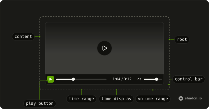
Video Player puts a native video element above a control bar you build from parts, drawn with your theme's buttons and ranges. The browser still does the decoding, buffering and captions, and the player adds keyboard shortcuts on top. Reach for it for product demos and course videos, where the browser's own controls look out of place.
A muted background loop needs no controls at all, only a plain video element set to autoplay and loop. For sound alone, use the Audio Player.
Installation
Anatomy
Usage
import {
  VideoPlayer, VideoPlayerContent, VideoPlayerControlBar,
  VideoPlayerMuteButton, VideoPlayerPlayButton, VideoPlayerTimeDisplay,
  VideoPlayerTimeRange, VideoPlayerVolumeRange,
} from "@/components/ui/video-player";
VideoPlayerContent is the video element and takes any of its attributes. Each control finds the video through VideoPlayer, so the controls can sit in any order inside the bar.
<VideoPlayer className="max-w-2xl">
  <VideoPlayerContent poster="/intro.webp" src="/intro.mp4" />
  <VideoPlayerControlBar>
    <VideoPlayerPlayButton />
    <VideoPlayerTimeRange />
    <VideoPlayerTimeDisplay showDuration />
    <VideoPlayerMuteButton />
    <VideoPlayerVolumeRange />
  </VideoPlayerControlBar>
</VideoPlayer>
Accessibility
The control bar is a group named "Video controls". Each button is named for what a press does now (Play or Pause, Mute or Unmute, Back 10 seconds), and the captions button reports aria-pressed and is marked aria-disabled while the video has no captions track. The seek and volume bars are native range inputs that read out as "1:04 of 3:12" and "40%". The video takes focus too, and a click on it plays or pauses. The names are English strings in components/ui/video-player, and captions and a transcript for the speech are yours to supply.
The shortcuts work while focus is anywhere inside the player. Keys pressed with Ctrl, Alt or Cmd are left to the browser.
- Space
- Plays or pauses the video while the video itself has focus. On a focused button, Space presses that button instead, and on a focused range it leaves playback alone.
- K
- Plays or pauses the video.
- Arrow Left
- Seeks back 5 seconds. On a focused range, moves that range instead.
- Arrow Right
- Seeks forward 5 seconds. On a focused range, moves that range instead.
- J
- Seeks back 10 seconds.
- L
- Seeks forward 10 seconds.
- Arrow Up
- Raises the volume by 5 percent. On a focused range, moves that range instead.
- Arrow Down
- Lowers the volume by 5 percent. On a focused range, moves that range instead.
- M
- Mutes or unmutes. Unmuting a video whose volume is at zero sets it to half.
- C
- Turns the first captions or subtitles track on or off.
- Home
- Goes to the start of the video. On a focused range, moves that range to its minimum.
- End
- Goes to the end of the video. On a focused range, moves that range to its maximum.
Demos
Seek
Skip buttons on both sides of play jump 15 seconds, set with seekOffset (10 when you leave it out), and the clock counts down with remaining. The video starts two minutes in and loads nothing until it's played, so the clock reads --:-- and the skip buttons do nothing until then. Pick this for lectures and long walkthroughs where people jump around.
Captions
A short clip from MDN with an English captions track marked default, so the words show from the start, and a captions button that turns them off and on again. The clip and its captions come from another origin, so the video sets crossOrigin to anonymous and the server sends CORS headers. Use this layout for any video with speech in it.
Overlay
The control bar floats over the bottom of the picture on a translucent, blurred background, and shows only while the pointer is over the player, focus is inside it or the video is paused. The paused case reads data-state on VideoPlayer, which is playing or paused. Pick this when the video is the page's centerpiece and a bar below it would cost height.
Minimal
A square clip that starts muted and loops, with only a play button in the secondary variant and a seek bar. Each part works on its own inside VideoPlayer, so the bar holds only what this clip needs. Choose it for short product loops in a grid or a card, where captions and volume would be clutter.
FAQ
How do I add my own video file and poster to the Video Player?
Pass the file's URL as src on VideoPlayerContent, and an image as poster for the frame shown before playback. For more than one format, put source elements inside it in place of src, and the browser plays the first one it supports.
The player loads only the video's length at first, since preload is metadata. Set it to none to load nothing until someone presses play, which saves data on a page with several videos. A YouTube or Vimeo link is a web page rather than a video file, so it won't play here: use their embed code instead.
Which controls does the Video Player have? Is there a fullscreen button?
There are eight parts for the bar: play, seek back, seek forward, a seek bar, the time, captions, mute and volume. Use any of them, in any order, inside VideoPlayerControlBar, as the Minimal demo does with two.
There is no fullscreen, playback speed or picture-in-picture control. Add your own Button for one: call requestFullscreen() on the player's root, the element with data-slot set to video-player, so the bar goes full screen with the picture. On an iPhone, Safari doesn't let a page change a video's volume, so the volume range stays at full there and only Mute works.
How do I add captions or subtitles to the Video Player?
Put a track element inside VideoPlayerContent, with kind set to captions or subtitles, a label, and a WebVTT file as its src. Add default to show it from the start, as the Captions demo does. The browser draws the text, and VideoPlayerCaptionsButton or the C key turns it on and off.
With several tracks, the button only switches the first one, so a language menu means setting each track's mode yourself. A file on another origin needs crossOrigin set to anonymous on the video, and CORS headers on the file.
Why do the Video Player keyboard shortcuts only work after I click it?
The shortcuts listen on the player itself, so they only work while focus is inside it: after a click on the video, or once Tab reaches the video or one of its controls. Pressing K elsewhere on the page does nothing, which keeps the letter keys free for your own inputs and the rest of the page.
A focused range keeps the arrow keys, Home and End, and a focused button keeps Space, so K is the play key that works wherever focus sits in the player. Before the video's length has loaded, the seek keys do nothing. The Accessibility section lists every shortcut.
How do I autoplay a video in the React Video Player?
Add autoPlay and muted to VideoPlayerContent, and loop for a clip that repeats.
Browsers let a muted video start on its own and hold back one with sound under their autoplay rules. When the browser blocks it, the video stays paused and the button shows Play, so a press starts it. The player also marks the video to play inline, so an iPhone doesn't open its own full-screen player when playback begins.
How do I play, pause or seek the Video Player from my own code?
Use the video element itself. Pass a ref to VideoPlayerContent, which lands on that element, then call play() or pause() on it, or set currentTime to a number of seconds.
The controls follow on their own, because the player reads the video again on each of its events, such as play, pause, timeupdate and volumechange, whatever caused them. A playlist is the same idea: change src on VideoPlayerContent, or render a new one for the next video. It hands itself to the player when it mounts, so it can also appear later, after a loading state.
How do I put the Video Player controls over the video?
Position VideoPlayerControlBar absolutely at the bottom of VideoPlayer, which is already relative, with classes on the bar, as the Overlay demo does. To hide it during playback, start it at zero opacity and bring it back with group variants on hover, on focus within the player, and on data-state reading paused.
On its own the bar is opaque, on background with a border along its top. The demo gives it a full border, rounded corners, bg-background/80 and a backdrop blur, so the picture shows through, and the ghost buttons and primary ranges keep your theme in light and dark mode.
Why don't the Video Player controls mirror in right-to-left text?
Media controls follow the timeline, not the reading direction. The seek bar fills from left to right and the back button points left in Arabic and Hebrew too, as on most players, so the bar, the seek bar and the time all set dir to ltr. The text around the player still runs right to left.
Setting dir to rtl on VideoPlayerControlBar overrides its own and reverses the order of the buttons, but the seek bar keeps its left-to-right direction.
API Reference
VideoPlayer
className?string
Merged with the part's classes.
VideoPlayerContent
<video> data-slot="video-player-content"
autoPlay?boolean
Starts playing as soon as it can (browsers allow it muted).
crossOrigin?"" | "anonymous" | "use-credentials"
anonymous to load captions tracks from another origin that allows it.
- Type
"" | "anonymous" | "use-credentials"
loop?boolean
Plays it again from the start when it ends.
muted?boolean
Starts it without sound.
poster?string
The image shown before it plays.
preload?"" | "none" | "metadata" | "auto"
How much to load before it plays: none waits for a press, metadata
loads its length, auto may load it all.
- Type
"" | "none" | "metadata" | "auto"- Default
"metadata"
src?string
The video's URL; or give <source> children.
className?string
Merged with the part's classes.
VideoPlayerControlBar
<div> data-slot="video-player-control-bar"
className?string
Merged with the part's classes.
VideoPlayerPlayButton
data-slot="video-player-play-button"
clickEffect?boolean
Apply a click effect to the button.
- Default
true
focusableWhenDisabled?boolean
Whether the button should be focusable when disabled.
- Default
false
isLoading?boolean
Show a loading indicator.
- Default
false
nativeButton?boolean
Whether the component renders a native <button> element when replacing it
via the render prop.
Set to false if the rendered element is not a button (for example, <div>).
- Default
true
render?ReactElement | ((props: object, state: object) => ReactElement)
Replace the host element or compose it with another component.
- Type
ReactElement | ((props: object, state: object) => ReactElement)
className?string
Merged with the part's classes.
VideoPlayerSeekBackwardButton
data-slot="video-player-seek-backward-button"
render?ReactElement | ((props: object, state: object) => ReactElement)
Replace the host element or compose it with another component.
- Type
ReactElement | ((props: object, state: object) => ReactElement)
className?string
Merged with the part's classes.
VideoPlayerSeekForwardButton
data-slot="video-player-seek-forward-button"
render?ReactElement | ((props: object, state: object) => ReactElement)
Replace the host element or compose it with another component.
- Type
ReactElement | ((props: object, state: object) => ReactElement)
className?string
Merged with the part's classes.
--video-player-range-fillstringVideoPlayerTimeRange
<div> data-slot="video-player-time-range"
className?string
Merged with the part's classes.
VideoPlayerTimeDisplay
<span> data-slot="video-player-time-display"
remaining?boolean
Counts down the time left instead of up.
- Default
false
showDuration?boolean
Shows the duration after the time, 0:42 / 3:12.
- Default
false
className?string
Merged with the part's classes.
VideoPlayerMuteButton
data-slot="video-player-mute-button"
clickEffect?boolean
Apply a click effect to the button.
- Default
true
focusableWhenDisabled?boolean
Whether the button should be focusable when disabled.
- Default
false
isLoading?boolean
Show a loading indicator.
- Default
false
nativeButton?boolean
Whether the component renders a native <button> element when replacing it
via the render prop.
Set to false if the rendered element is not a button (for example, <div>).
- Default
true
render?ReactElement | ((props: object, state: object) => ReactElement)
Replace the host element or compose it with another component.
- Type
ReactElement | ((props: object, state: object) => ReactElement)
className?string
Merged with the part's classes.
VideoPlayerVolumeRange
<div> data-slot="video-player-volume-range"
className?string
Merged with the part's classes.
VideoPlayerCaptionsButton
data-slot="video-player-captions-button"
clickEffect?boolean
Apply a click effect to the button.
- Default
true
focusableWhenDisabled?boolean
Whether the button should be focusable when disabled.
- Default
false
isLoading?boolean
Show a loading indicator.
- Default
false
nativeButton?boolean
Whether the component renders a native <button> element when replacing it
via the render prop.
Set to false if the rendered element is not a button (for example, <div>).
- Default
true
render?ReactElement | ((props: object, state: object) => ReactElement)
Replace the host element or compose it with another component.
- Type
ReactElement | ((props: object, state: object) => ReactElement)
className?string
Merged with the part's classes.