Border radius generator.
Round the corners of a box, together or one at a time, or drag four handles into an organic blob with the eight-value border radius. Copy it as CSS or as Tailwind classes.
Border radius generator.
Need the UI around it? With Pro, your AI agent builds the form, the result card and the rest of the page from a prompt.
Get ProHow it works
4 steps, no account. It runs in your browser and nothing is uploaded.
Pick a mode
Corners rounds each corner in px or %; Blob draws a shape with the eight-value syntax.
Drag the handles
Each corner has a handle on the preview, or each edge in Blob mode; the sliders and boxes take exact values.
Start from a shape
Presets for cards, pills, chat bubbles, tabs and leaves, eight blob shapes, and Random for new blobs.
Copy the code
The shortest border-radius shorthand, or Tailwind classes.
Related tools
More CSS generators. Every one free, in the browser.
Pricing
Build it with Pro
The tool is free. Pro adds 6,000+ blocks, premium templates and the MCP server, so your AI editor builds the product around it.
4.9/5 out of 5 · 150+ reviewsfrom 150+ founders and developers.
- Secure checkout via Stripe
- Code lives in your repo
- Keep what you've shipped if you cancel
- License terms
Questions and answers
Before you trust the result: what to know about the format, the limits, your data and the tools next to it.
One value rounds all four corners. Two set top left and bottom right, then top right and bottom left. Three set top left, the top-right and bottom-left pair, then bottom right. Four go clockwise from the top left. The generator writes the shortest form that means the same thing.
Each corner can be a quarter of an ellipse, with a horizontal and a vertical radius. Write the four horizontal radii, a slash, then the four vertical ones: 30% 70% 70% 30% / 30% 30% 70% 70%. In percent of the box's width and height, those eight values draw organic blobs, the trick 9elements' Fancy Border Radius made popular.
When the two radii along one side add up to more than that side, the browser scales every radius down by the same factor until they fit. That is why a huge value such as 9999px makes a pill, and why Blob mode keeps the two radii on each edge at 100 % between them.
Pixels keep the same curve at any size, which suits cards, buttons and inputs. Percentages follow the box: 50% turns a square into a circle and a rectangle into an ellipse, and a blob in percent scales with its element.
It rounds the element's background, border and shadow, but children still paint over the corners unless the element has overflow: hidden or overflow: clip. An image at the top of a rounded card needs one of those, or its own radius.
Turn off Link corners, then set each one with its slider, its box or its handle on the preview. A focused handle moves with the arrow keys, ten at a time with Shift.
When every corner is a pixel value on Tailwind's scale (2, 4, 6, 8, 12, 16, 24 or 32 px), it writes named classes, joined by side where it can (rounded-t-2xl rounded-b-none). Anything else is one rounded-[…] class. The named steps are Tailwind's defaults; a shadcn/ui theme redefines them from --radius.
It moves the four handles to new places between 15 % and 85 % of their edges, from a seed that moves on with each press, so the same run of shapes comes back on every visit.
No request carries your input. The Border radius generator runs in your browser: nothing you enter is sent anywhere.
No. The Border radius generator is free and opens without a sign-in, an account or an install.
Nothing. The Border radius generator holds your input in the page's memory, so closing or reloading the tab clears it, and it saves nothing in this browser.
Corner shapes, all in px: Square, Subtle, Card, Soft, Pill, Chat bubble, Tab, and Leaf. Blob shapes: Pebble, Circle, Drop, Wave, Leaf, Comet, Egg, and Bean. Each is a starting point; every value stays editable.
Up to 120px or 50% per corner. Switching between px and % converts the values against a 160px side, the preview's height, so the shape stays close to what it was.
A circle: the Circle blob, or 50% on every corner of a square element. A pill: the Pill preset, 80px on the preview's 160px-high box; on your own element any radius of at least half its height does it, and a very large value such as 9999px works at every size.
Yes. Each handle on the preview is a slider: tab to it and use the arrow keys, ten steps at a time with Shift. The sliders under the shape set the same values.
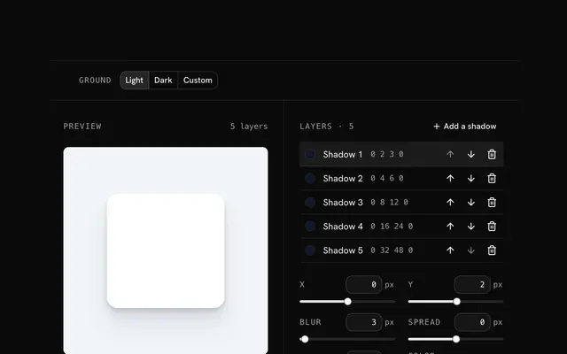
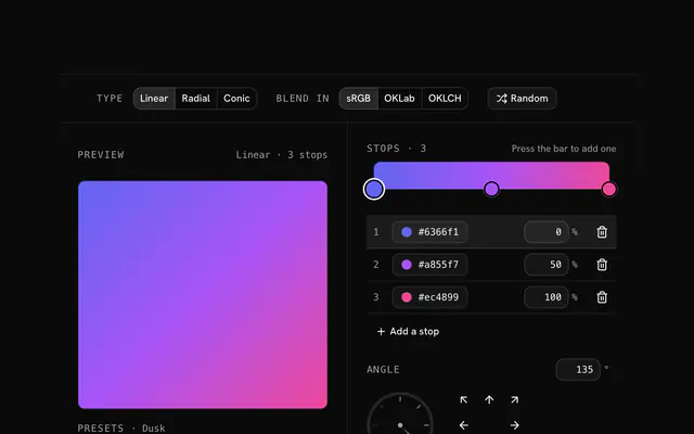
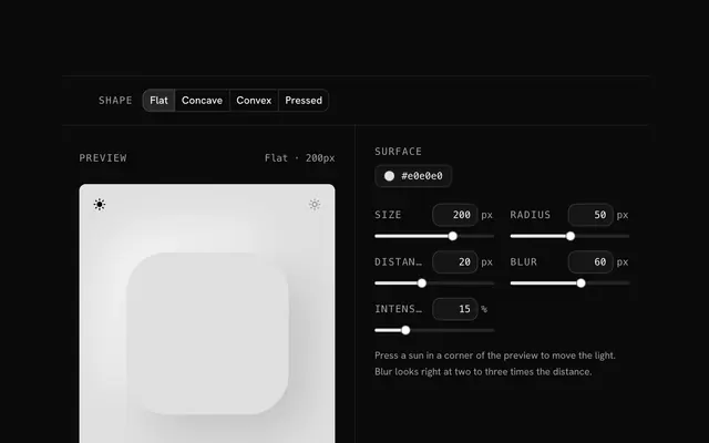
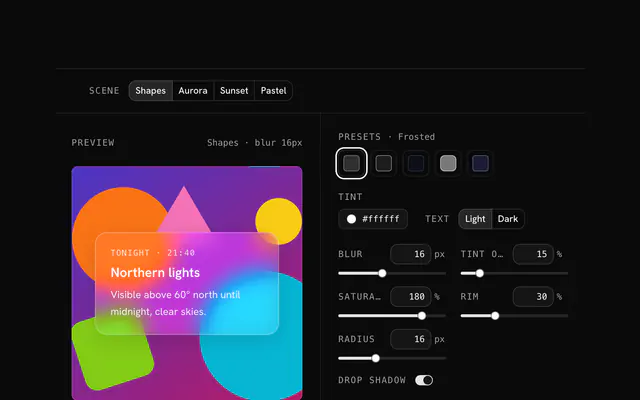
Closest to the Border radius generator: Box shadow generator, CSS gradient generator, Neumorphism generator, Glassmorphism generator. Each opens on its own page, free and in the browser.
The Border radius generator is one of 10 in its group. The group's page, /tools/css, lists them all.
The tool is free. Its interface is built from shadcn.io's own components (Button, Input, Slider and the rest of the registry under /ui), which come in React, Vue, Svelte and Solid. Pro adds the blocks and templates for the product around it.
4.9 out of 5 from 150+ developers


Build the product around it
Every block, template and icon, installed by your AI agent in your theme. The tools stay free.
Get Pro