CSS gradient generator.
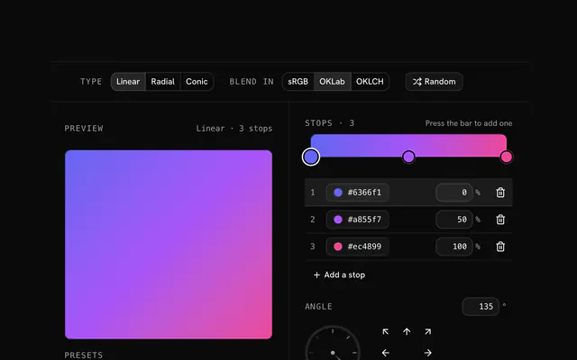
Build a linear, radial or conic gradient on a live preview: drag the stops, turn the angle, move the center. Copy it as CSS with a fallback, or as Tailwind v4 classes.
CSS gradient generator.
Need the UI around it? With Pro, your AI agent builds the form, the result card and the rest of the page from a prompt.
Get ProHow it works
4 steps, no account. It runs in your browser and nothing is uploaded.
Pick a type
Linear runs along an angle, radial spreads from a center, conic turns around one.
Place the stops
Press the bar to add a stop, drag it into place, and give it a color and an opacity.
Shape it
Turn the dial or drag the center on the preview; blend in OKLCH for brighter middles.
Copy the code
CSS with a solid fallback, or Tailwind classes ready for a className.
Related tools
More CSS generators. Every one free, in the browser.
Pricing
Build it with Pro
The tool is free. Pro adds 6,000+ blocks, premium templates and the MCP server, so your AI editor builds the product around it.
4.9/5 out of 5 · 150+ reviewsfrom 150+ founders and developers.
- Secure checkout via Stripe
- Code lives in your repo
- Keep what you've shipped if you cancel
- License terms
Questions and answers
Before you trust the result: what to know about the format, the limits, your data and the tools next to it.
A linear gradient changes color along a straight line at an angle. A radial one spreads out from a center as a circle or an ellipse. A conic one sweeps around a center like the hand of a clock, which is how pie charts, color wheels and metallic sheens are drawn in pure CSS.
CSS measures it clockwise from the top: 0deg runs from bottom to top, 90deg from left to right, 180deg from top to bottom. The old -webkit- syntax counted from the right and turned the other way, which is why angles copied from old code sometimes look rotated.
Blending in sRGB, the browser's default, takes the straight line between two colors, and between far-apart hues that line passes through gray. OKLab and OKLCH are perceptual spaces: a blend in them keeps its brightness and color through the middle. Chrome 111, Safari 16.2 and Firefox 127 read the in oklch syntax.
Two stops at the same position. The color changes there with no blend, which is how stripes, flags and progress fills are drawn with gradients alone.
A gradient is drawn by the browser, so there is nothing to download, and a static one costs about as much to paint as a flat color. Animating its colors or stops repaints the area every frame; moving it with transform or background-position is cheaper. A large, subtle gradient can show bands on 8-bit screens, which a little noise on top hides.
Press the bar where you want it, or press Add a stop to fill the widest gap. Drag a handle to move it; with a handle focused, the arrow keys move it by 1 % (10 % with Shift) and Delete removes it. A gradient keeps 2 to 10 stops.
With three stops or fewer it writes bg-linear-<angle>, bg-radial or bg-conic with from-, via- and to- colors, and positions such as from-10% only where they differ from Tailwind's own. More stops become one arbitrary bg-[…] class holding the whole gradient. Every class compiles with Tailwind v4.
Tailwind v4 blends gradients in OKLab unless told otherwise, while plain CSS blends in sRGB. So an sRGB gradient gets the /srgb modifier (bg-linear-135/srgb), and the classes paint the same colors as the CSS.
It draws a gradient from a seed: two to four saturated colors on neighboring or split hues, in one of the three types. Each press moves to the next seed, so the sequence is the same every visit and a gradient you liked can be found again.
No request carries your input. The CSS gradient generator runs in your browser: nothing you enter is sent anywhere.
No. The CSS gradient generator is free and opens without a sign-in, an account or an install.
Nothing. The CSS gradient generator holds your input in the page's memory, so closing or reloading the tab clears it, and it saves nothing in this browser.
2 to 10. A stop added on the bar takes the color the gradient already has at that point, mixed from the two stops beside it, so the picture barely changes until you edit it.
Yes. Each stop's color picker has an alpha slider, and a see-through stop is written as rgb(r g b / a). The Fade out preset runs one color to fully transparent, and the checkerboard behind the preview shows what shows through.
It is the color halfway along the gradient, set as background-color under the image. It paints if the gradient can't, and it keeps text readable if the image is turned off or fails.
Not here: the stops always run from 0 to 100 % of one gradient. Repeating gradients are what the CSS pattern generator writes for stripes and grids.
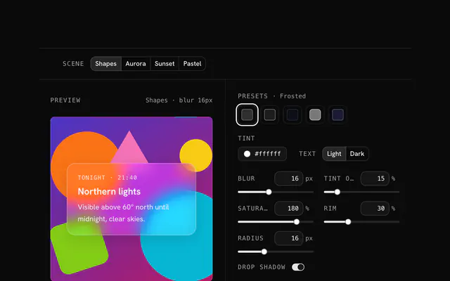
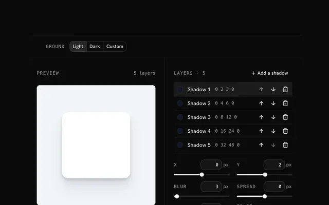
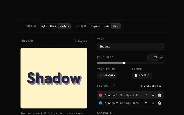
Closest to the CSS gradient generator: Tailwind gradient generator, Glassmorphism generator, Box shadow generator, Text shadow generator. Each opens on its own page, free and in the browser.
The CSS gradient generator is one of 10 in its group. The group's page, /tools/css, lists them all.
The tool is free. Its interface is built from shadcn.io's own components (Button, Input, Slider and the rest of the registry under /ui), which come in React, Vue, Svelte and Solid. Pro adds the blocks and templates for the product around it.
4.9 out of 5 from 150+ developers


Build the product around it
Every block, template and icon, installed by your AI agent in your theme. The tools stay free.
Get Pro